The Working Parts of a Chart
Introduction
According to data visualizer Nathan Yau, charts can be broken up into sets of so-called ‘working parts.’ Understanding what these parts are can help you make intelligent design choices and help you better critique the data visualizations you see every day.
For our purposes, there are four different working parts you should be aware of: visual cues, the coordinate system, scale, and context.
Visual cues refer to the shapes, sizes, colors, and so on, that help represent values and relationships. The coordinate system refers to the system used to determine the position of geometric elements in a given space. Scale refers to the visual spacing that corresponds to differences in values. And, context refers to the information that helps the viewer understand the visualization.
Visual Cues
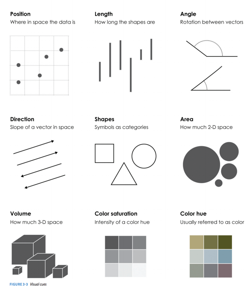
Position refers to the location a data point appears in within a given space. This allows us to compare values in relation to where others are placed. For example, space can be used as a cue to illustrate clusters in a scatterplot.
Length, or the distance between start and end points in a shape, is often used in bar charts, where longer rectangles are used to denote larger values. Length is also often used in line charts to indicate the duration of some item.
Angles, or the rotation between two vectors, range from 0 to 360 (a full circle) and are a visual cue often found in pie and donut charts to give a sense of the area that is occupied by some category.
Direction, or the slope of a vector in space, helps illustrate trends. For example, in a line chart, we might see bigger slopes, which indicate a large upward trend, followed by a smaller slope, indicating a smaller upward trend, perhaps followed by a change in direction, illustrating a shift to a downward trend.
Shapes, or symbols that denote categories, can be used for differentiation. For example, we can have a scatterplot where triangles represent universities in the Northeast, squares represent those in the Southeast, and circles represent those in the Midwest.
Area, or the amount of two-dimensional space being occupied, can be used to denote the values for a certain variable. For example, we might see bubbles overlaid atop a map, with the smaller circles indicating locations with fewer crimes and larger circles indicating locations with more crimes.
Volume is similar to area, but it focuses on three-dimensional space. Three dimensional figures are not frequently used because they typically make the visual more complex — and thus harder for an individual to process — without adding too much more information. It is usually best to avoid these unless you have a good reason to use each dimension to represent a different variable.
Color hue refers to what we commonly think of as color. Colors can be very effective in communicating range, such as by having a gradient that shows different colors, in steps along a spectrum, to show a subset of ranges (e.g., from 0 to 20, 21 to 40, 41 to 60, and so on). Like shapes, colors can also be very effective for separating categories, where each category is assigned a distinct color. One thing to keep in mind with visual cues is that about 8 percent of the population is red-green deficient, so those colors can be especially hard for them to decode.
Color saturation, or the intensity of a color hue, is also an effective visual cue. A very saturated red, for example, will be a deep red, whereas an unsaturated red will be a light, faded red. Saturation is often used to guide the viewer across steps in a gradient, with more saturated colors used to denote greater intensity (e.g., more crime relative to the less-saturated midpoint in the gradient).
Coordinate Systems
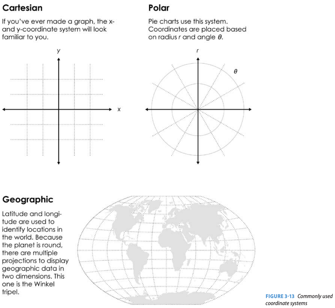
There are three main coordinate systems you should be aware of.
The first is a Cartesian plane, which is the base of most commonly used charts, such as bar charts, scatterplots, and line charts. With a Cartesian plane, coordinates are typically just an (x, y) pairing, meaning each geometric shape within the chart can be easily denoted by using Cartesian coordinates for each point connecting that shape.
Polar coordinates are most commonly seen in circular charts, such as pie charts and donut graphs. Here, we use angles and a radius to plot information on a plane.
While there are a number of different geographic projections worth being aware of, nearly all rely on a geographic coordinate system that relies on a latitude-longitude pairing to denote a location. These pairings refer to the distances from the Equator and the Prime Meridian. We will cover the different map projections in a separate lesson.
Scales
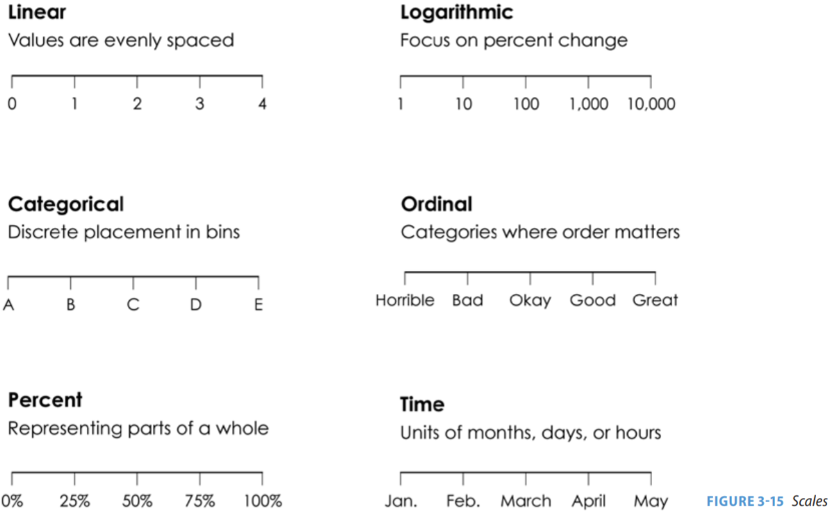
There are six different scales of note, and they can be combined within a single chart. For example, a bar chart might have one scale on the X axis and a different one on the Y axis.
The first is the linear scale, which is a form of numeric spacing where the distance is the same regardless of where you are on the axis. Thus, if we compare the distance between two points at the low end of the scale, such as 0 to 1, the spacing will be the same as on the high end of the scale, such as from 3 to 4.
The logarithmic scale is also numeric, but it is quite different in that the scale becomes condensed as we increase the values. So, while the difference between the first and second stop on the scale — so from 1 to 10 — is just 9 units, the difference between the fourth and fifth stops are 9,000 units. The logarithmic scale is used less often than the linear scale in data visualizations geared toward general audiences because it is harder to understand. However, we still see the logarithmic scale on occasion since it is useful when we’re comparing data with a really big range. For example, if we are talking about GDP, the majority of the world’s economies would be clustered together at the very bottom because a few major economies are much bigger. With a logarithmic scale, we can to space things out to make it easier to see those smaller economies. This is similarly the case with the spread of infectious disease during a pandemic, as such spread can be exponential.
The percent scale is a form of a linear scale, but we see it often enough where it is worth separating it out. Here, the value may not refer to the absolute value of a unit, but rather some relative value — such as the proportion of a whole that an item accounts for.
The time scale allow us to plot temporal data. We can alternate between a linear scale for values like the number of days that lapsed since an event, and an ordinal scale for values like the month within a given year.
The categorical scale refers to the discrete placement of data into bins. It is often seen in bar charts where the X axis is simply the label for an item, such as the names of different universities that are being compared. Here, the spacing is arbitrary and set based on visual appeal.
Finally, there is the ordinal scale. It is similar to a categorical scale, except that there is some meaning to the order. For example, if the axis contains information for data sorted into different steps along a continuum ranging from horrible to great, the categories will be placed accordingly.
Context
Finally, we have context, which refers to the information that helps the viewer understand the visualization.
This includes things like the title of the chart, which will typically provide a brief summary of the contents of the chart or a particular interpretation of it. It also includes any explicit description of the chart, such as a short paragraph below the title that clarifies the nature of the chart. Any labels, such as those clarifying the data sources or the information contained on an axis, are also a form of context. Finally, the legend is also a form of context, and can be used to connect colors and shapes to categories.
As designer and scholar Alberto Cairo notes, the context around a visualization is sometimes just as important as the information in it. As such, you should consider carefully how you are framing the information. Sometimes, you may simply want to describe the information around an exploratory visualization. However, you may also choose to highlight a point (or even make an assertion) when presenting an explanatory visualization. Given that the context is often the first thing the viewer comes across, it serves an important priming function.
Understanding the different working parts of a chart will help ensure that you are making thoughtful choices for accurately representing data and helping the viewer make sense of it.