Generating Story Ideas from Data
Introduction
Much of the time, it is a story idea that guides a journalist’s selection of a dataset. For example, perhaps the journalist wants to write about the impacts of COVID-19 on people living in the Global South so they seek out one dataset about international mortality figures and another about economic outputs.
However, there are also plenty of times when the story starts with the dataset. This happens most often when the journalist is alerted to the release of new data. They might not know what to do with those data at first, but the journalist might get the feeling that there’s something interesting in there.
So, what do you do in those cases? Start by exploring.
From Brainstorming to Story Idea
The Brainstorming Stage
A great way to start the exploration is by looking at any supporting documentation, such as the data dictionary for the dataset or a methodological supplement. That documentation is valuable because it tells you information about the variables that are part of the dataset.
There are times when a dataset will be simple enough that you can just glance at it and get a good sense of the variables measured in it. However, in isolation, those datasets will often limit you to fairly simple stories. In those instances, you’ll either want to look for a richer dataset or a second dataset to pair with the simple data.
At this stage, you are a little less concerned about what the data actually show — that’s for later. What you should be interested in is figuring out ways to combine the information contained in the dataset to yield potentially interesting stories. It is thus helpful to treat this as a brainstorming exercise. You may want to ask yourself: What kinds of connections might exist between the variables in this dataset? Are there any groups that merit comparison? Is there a time component worth exploring? Those questions might not lead you anyplace interesting in the end, but they do give you a good starting point — which is all we are looking for at this stage.
Then, go ahead an open up your dataset and start getting a sense for the observations and values it contains. For example, we know that there’s a variable called country that covers all the different countries featured in the dataset — but what actual countries are included? Similarly, we may know that there is a called year, but what are the actual years covered by these data? With small- to mid-sized datasets, it is often helpful to perform this step using spreadsheet software like Google Sheets, Microsoft Excel, or LibreOffice.
Factoring in the Audience
Once you have a good sense of the variables and values in your dataset, start thinking about your audience(s): What do they need to know about the issue(s) connected to these data, and what might that audience be interested in learning?
Ideally, those two answers intersect. If they don’t, it is important to hit on both: You have a duty as a journalist to inform people about important affairs. However, you are far more likely to succeed in getting people to consume (and care) about your story if it also connects with your audience’s preexisting interests.
Additionally, you’ll want to pose a third question: What do they already know about that issue(s) connect to these data?
This last question is important because you don’t want to just rehash a story that is already out there. Instead, you’ll want to offer something new and fresh. Perhaps the ’new’ component simply comes from the fact that you have more recent information than anything else that has been published. However, it might also mean that you’re covering an angle that previous stories have failed to meaningfully engage with. For example, perhaps your audience has likely seen stories on the way COVID-19 has impacted the mortality rates in different places, but few stories have looked at how they’ve impacted educational outcomes. A good story, then, might look at how the average standardized test scores changed from 2018-2019 to 2020-2021 across different kinds of communities.
In order to address any of these three questions, you need to have an understanding of the audience you want to reach as well as the existing audience for the venue you’re publishing in. For example, the audience for ESPN is very different from that of STAT.
From Interview Questions to Story Idea
Next, your goal is to connect those audience interests and information needs with the data from your dataset.
A great way to start that process is to translate your brainstorming questions into interview questions that you could ask your data in order to inform you audience. One way to think about this is to transport your audience into your shoes, such that your interview questions reflect the questions your audience are likely to need/want answers to.
As you ask your questions, you’ll probably get some unexpected answers from the data and need to ask follow-up questions. Similarly, you may find a more interesting story idea as you start to get more answers and thus shift your story in a new direction. This is normal, and even encouraged. The goal is to have the most informative and interesting story in the end.
The journey rarely ends with the data, though. You’ll often find that the answers from the data raise even more questions, which the data are unable to answer. That’s where good expert sourcing comes in, which may lead you to change the direction of your story yet again.
Example: Crime in Minneapolis
Consider this simple dataset from the Minneapolis Police Department. It doesn’t come with a data dictionary, but it is simple enough where we can get by without detailed documentation.
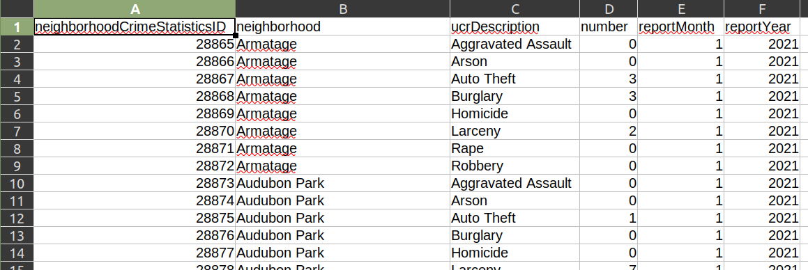
I have three sets of variables here: information about each neighborhood in the city (neighborhood), the incidence of eight different types of crimes (ucrDescription and number), and the temporal range covered by that observation (reportMonth and reportYear).
Right away, I know I can explore a simple but important question: Which neighborhoods are most dangerous in the city of Minneapolis right now? If I’m a journalist working for The Minneapolis Star Tribune (my former employer!), this is a question that is likely to be important for my readers. After all, people care about their personal safety.
I also know I can explore a related question: Are there hotbeds for certain types of crime? For example, is there a neighborhood in Minneapolis that has an unusually high amount of rape? This will similarly be of interest to my readers, especially if it turns out that a highly frequented neighborhood with trendy bars is particularly dangerous when it comes to sexual crimes.
We will want to be conscious of the size of the neighborhood when looking at these figures. Some neighborhoods are bigger than others, so a per capita statistic would probably be most useful if our goal is to offer comparisons. These data don’t include the population size of each neighborhood (which we would need for calculating a per capita rate), so we’d need to combine this dataset with another dataset that includes population data.
If I wanted to, I could also group these neighborhoods into broader areas for comparison. For example, I could compare North Minneapolis with South Minneapolis by grouping these data by using new combinations based on the neighborhood variable.
These data also include a temporal dimension: at the time of writing, I can go back to 2017 with this dataset. This allows me to ask questions like: Has overall crime gone down over the past decade and a half? Has there been a shift in the localization of particular types of crime in Minneapolis over the past decade and a half? As one neighborhood was “cleaned up,” did the same crimes simply migrate somewhere else?
Even though this dataset only goes back to 2017, the Minneapolis Police Department also makes data from previous years available. These are also public records, meaning that I can make a legal request for data from previous years.
From that dataset, I can write a simple story about the incidence of different types of crime in the city. In fact, the Star Tribune has run multiple stories using data from this regularly updated dataset. Here’s another story from 2021 looking at crime in different neighborhoods, and how the COVID-19 pandemic and the George Floyd protests may have intersected with a rise in crime. Similarly, here’s another story from 2015 showing that violent crime in the city had increased for the fifth straight year.
While statistics about increases in crime are interesting in their own right, an even more informative story might focus on the “why” question: Why has crime gone up in Minneapolis during those stretches?
The simple dataset we looked at doesn’t have the answer to that question. Instead, it would be useful to speak to experts who can unpack that question in ways our dataset cannot, such as criminologists, members of the police department, and citizens living in those communities. Indeed, that is what the Star Tribune frequently does when it runs those kinds of stories.
Example: California Campaign Finance
There are times when the dataset will be far more complicated, and you will want to start with the data documentation.
For example, the California Civic Data Coalition maintains a clean database of itemized transactions derived from the state’s CAL-ACCESS database, which tracks campaign finance and lobbying activity in California politics. This is a huge dataset that encompasses more than 53 million rows of data, which makes it too big to quickly open up in Excel. Instead, it’s helpful to look at the documentation for that dataset and see what kind of information is contained in it.
For example, I can tell that the dataset on campaign finance and lobbying activities includes the following key variables for each transaction: the officeholder’s or candidate’s name (CAND_NAMF and CAND_NAML), the name of the contributor (CTRIB_NAMF and CTRIB_NAML), the contributor’s ZIP code (CTRIB_ZIP4), the contribution amount (AMOUNT), and the date of the transaction (RCPT_DATE). (There are several more variables, too!)
My mind is already racing with questions: Which candidates and parties are receiving the most donations? Who are the biggest donors? Are there geographical areas that are donating a disproportionate amount of money? If so, are they donating them to particular candidates? (Might that introduce conflicts of interest?) Has the number and amount of donations changed over time? Might there be a link between the timing of contributions to a particular candidate and an action they might have taken that might benefit the contributors?
This is just a sampling of the potential questions that can take me in many different directions for a story that includes information that would be of value and interest to audiences throughout California.
And I’m not alone. The Los Angeles Times has used these data to great effect, producing automatically updating projects like this one and this one, and producing stories like this one that tackles particular ballot issues. Once again, this isn’t new: Here’s a 2016 story examining the amount of money being thrown at candidates during that summer’s primary season, and identifying some of the chief beneficiaries of that.
The general picture of how much money is going into politics, and which candidates are benefiting most, makes for an interesting story on its own. But in the process of digging into those data, you may find an even more interesting idea involving a smaller set of individuals.
Again, as with any story, your ideas will change over the course of the reporting, so don’t feel like you are married to them. Your output should change as you get new inputs — that is just good reporting. However, brainstorming a solid set of potential story ideas and executing a good interview with the data will give you a great foundation to build from.