Creating Production-Quality Charts with R
Introduction
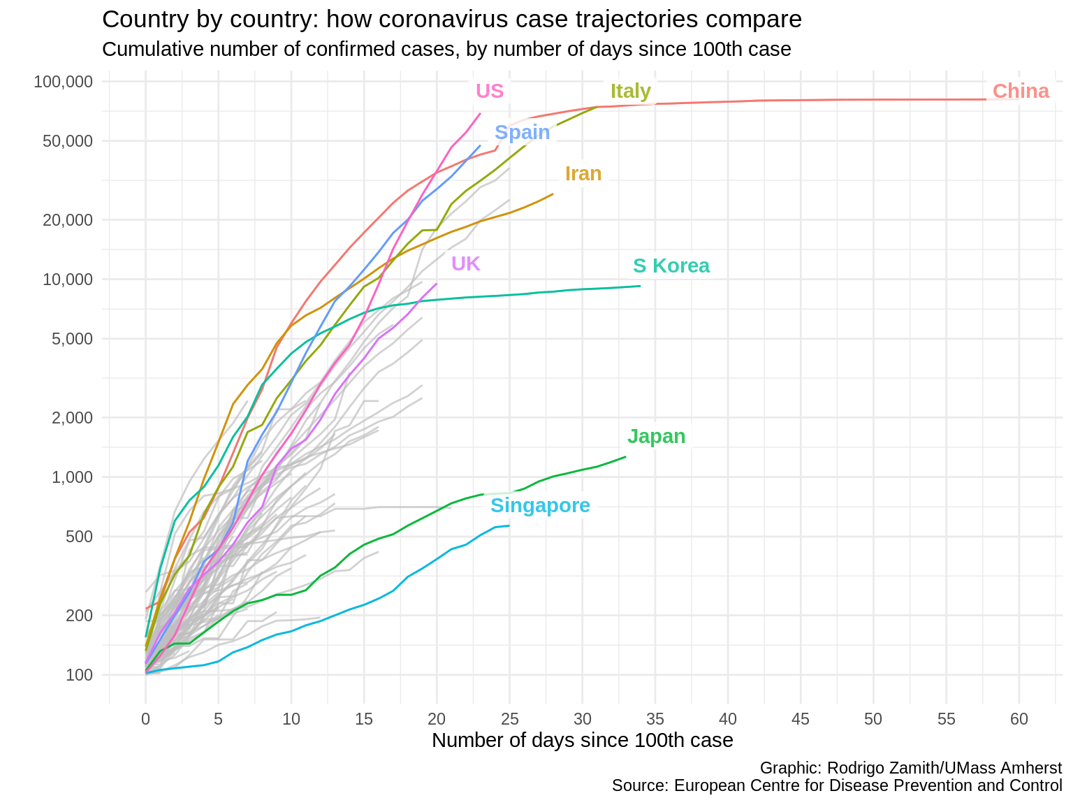
For this tutorial, we will be recreating this chart that was published by the Financial Times on their website during the early months of the COVID-19 pandemic.
This chart received a lot of attention, and for good reason. It shows the cumulative number of confirmed cases in a country for each day after the one-hundredth case was reported in that country. We have information for several dozen countries but the Financial Times highlighted just a few countries that are likely to be of particular interesting to their audiences.
The chart is simple and fairly clean given how much information it conveys. It has a title that tells us what the chart is about, as well as a short subtitle that gives me more contextual information about what these particular data represent. It also has a clear source label at the bottom, so I know where the data are coming from.
The chart also labels the highlighted lines and sometimes adds a little extra information. It’s also worth noting that the Y axis uses a logarithmic scale. This means that the spaces between the lines represent exponential growth. This is necessary because of the nature of these infections. Using a regular scale would result in a line that is mostly flat until the end.
Let’s try to recreate this visualization.
A Quick Word about R and Visualizations
We will be using R (and its ggplot2 package) to recreate this data visualization. Indeed, it wouldn’t surprise me if the Financial Times used R to begin creating their visualization themselves. That’s because many large newsrooms — the Financial Times included — now start their data visualizations with R. After all, they are already using it to analyze the data and R has some pretty good data visualization capabilities as well.
However, after the foundation of the visualization is set using R — that is, the data are plotted in a proportional way and the core elements of the chart are set — many newsrooms will move from R to a dedicated graphic design tool. A popular tool used by newsrooms to put those finishing touches is called Adobe Illustrator. You can use R to export a vector graphic that can be imported into Illustrator for the touch-ups. (Additionally, the vectorized nature of the graphic means that it can be upscaled without getting pixelated. Thus, it is a great option for exporting graphics that are look good on different screen sizes, in addition to print.)
That said, R is sometimes used from start to finish (or with minor touch ups done in post production). This is especially the case with charts that are updated on a regular basis, as new information comes in.
Loading the Packages
We will start by loading 3 packages into R:
-
tidyversegives us access to a range of tools for reshaping and visualizing our data. -
scalesgives us nice wrapper functions for relabeling some of our data, so it looks more appealing on a chart. -
gghighlightmakes it easier for us to highlight certain parts of our data.
We can do that like so:
library(tidyverse)
library(scales)
library(gghighlight)
Make sure you install those packages before trying to load them. You can install packages in RStudio by going to Tools -→ Install Packages, and entering the package names in the text box that will appear.
Loading the Data
For this example, we will be using the read_csv() function from tidyverse to read this dataset into an object called corona_data like so:
corona_data <- read_csv("https://dds.rodrigozamith.com/files/covid19_cases_by_country_20200326.csv")
## Rows: 6931 Columns: 13

## ── Column specification ────────────────────────────────────────────────────────
## Delimiter: ","
## chr  (3): countriesAndTerritories, geoId, countryCode
## dbl  (9): day, month, year, cases, deaths, popData2018, cumulativeCases, cum...
## date (1): dateRep

##
## ℹ Use `spec()` to retrieve the full column specification for this data.
## ℹ Specify the column types or set `show_col_types = FALSE` to quiet this message.
Checking the Data
head(corona_data)
| dateRep | day | month | year | cases | deaths | countriesAndTerritories | geoId | countryCode | popData2018 | cumulativeCases | cumulativeDeaths | daysSince100 |
|---|---|---|---|---|---|---|---|---|---|---|---|---|
| 2019-12-31 | 31 | 12 | 2019 | 0 | 0 | Afghanistan | AF | AFG | 37172386 | 0 | 0 | -1 |
| 2020-01-01 | 1 | 1 | 2020 | 0 | 0 | Afghanistan | AF | AFG | 37172386 | 0 | 0 | -1 |
| 2020-01-02 | 2 | 1 | 2020 | 0 | 0 | Afghanistan | AF | AFG | 37172386 | 0 | 0 | -1 |
| 2020-01-03 | 3 | 1 | 2020 | 0 | 0 | Afghanistan | AF | AFG | 37172386 | 0 | 0 | -1 |
| 2020-01-04 | 4 | 1 | 2020 | 0 | 0 | Afghanistan | AF | AFG | 37172386 | 0 | 0 | -1 |
| 2020-01-05 | 5 | 1 | 2020 | 0 | 0 | Afghanistan | AF | AFG | 37172386 | 0 | 0 | -1 |
These data are in long format, with each row representing information for a particular date and for a particular country.
For example, we see that the first row represents the number of COVID-19 cases and deaths reported in Afghanistan and 12/31/2019. We have a number of variables that include information about each country but the ones that are of greatest interest to us are countriesAndTerritories, cumulativeCases, and daysSince100.
These data come from the European Centre for Disease Prevention and Control, which produces daily datasets using information that they have collected from health agencies in all of those countries. The two cumulative variables add a running count of the cases and deaths variable up until the date of that row. The daysSince100 variable tracks how many days have passed since that country hit 100 total cases. (If the country hasn’t reached that threshold, that variable simply records a -1 value.)
Reshaping the Data
Even though our data are in good shape, we still need to do just a little more data reshaping for this particular chart.
Specifically, will be applying two filters. The first filter tells R to include rows from countries only after they have reached 100 cumulative cases. This way, we’re not plotting information outside of our time span of interest. The second filter tells R to limit our data to a specific number of days past that threshold. That’s because some countries have passed that threshold a long time ago and they would occupy too much of our horizontal space at the time of writing.
We begin by calling our data frame object and passing it on to the filter() function with a pipe (%>%). With the filter() function, we’ll use two condition statements to set the lower and upper bounds of the number of days that we want to consider. We separate each condition with an ampersand (&) to denote that it is an AND operation — that is, the row needs to meet both criteria in order to be included.
corona_data %>%
  filter(daysSince100>=0 & daysSince100<=60) %>%
  head()
| dateRep | day | month | year | cases | deaths | countriesAndTerritories | geoId | countryCode | popData2018 | cumulativeCases | cumulativeDeaths | daysSince100 |
|---|---|---|---|---|---|---|---|---|---|---|---|---|
| 2020-03-24 | 24 | 3 | 2020 | 11 | 2 | Albania | AL | ALB | 2866376 | 100 | 4 | 0 |
| 2020-03-25 | 25 | 3 | 2020 | 23 | 1 | Albania | AL | ALB | 2866376 | 123 | 5 | 1 |
| 2020-03-26 | 26 | 3 | 2020 | 23 | 0 | Albania | AL | ALB | 2866376 | 146 | 5 | 2 |
| 2020-03-23 | 23 | 3 | 2020 | 8 | 5 | Algeria | DZ | DZA | 42228429 | 102 | 15 | 0 |
| 2020-03-24 | 24 | 3 | 2020 | 87 | 2 | Algeria | DZ | DZA | 42228429 | 189 | 17 | 1 |
| 2020-03-25 | 25 | 3 | 2020 | 42 | 0 | Algeria | DZ | DZA | 42228429 | 231 | 17 | 2 |
We could have also expressed that filter() statement more succinctly by using the between() function like so: filter(between(daysSince100, 0, 60)). That function took just 3 arguments: the name of the variable, the lower bound, and the upper bound.
As you can see, we now only have rows for countries on the day of, and after, they hit 100 cumulative cases.
Creating a Plot With a Base Layer
Now that we have only the data we are interested in, we can start plotting it using the ggplot() function from the ggplot2 package (which is part of the tidyverse metapackage).
We can pass the result of that earlier code to the ggplot() function by adding a pipe to the last line and adding a line with the ggplot() function and its parameters:
corona_data %>%
  filter(daysSince100>=0 & daysSince100<=60) %>%
  ggplot(aes(x=daysSince100, y=cumulativeCases, color=countriesAndTerritories))
Here, I’m just specifying a single parameter (for the mapping= argument): the aes() function.
With the aes() function, I specify 3 parameters for the aesthetic mappings for my chart. The first is the variable that will include information for my X axis values. The second is the variable that will include information about my Y axis values. And the third is a grouping variable that tells R to automatically give each unique value under the specified variable a different color.
In this case, the daysSince100 variable goes on my X axis. cumulativeCases goes on the Y axis. And I’ll create a different line, and give each line a different color, by using the color argument and assigning the variable countriesAndTerritories.
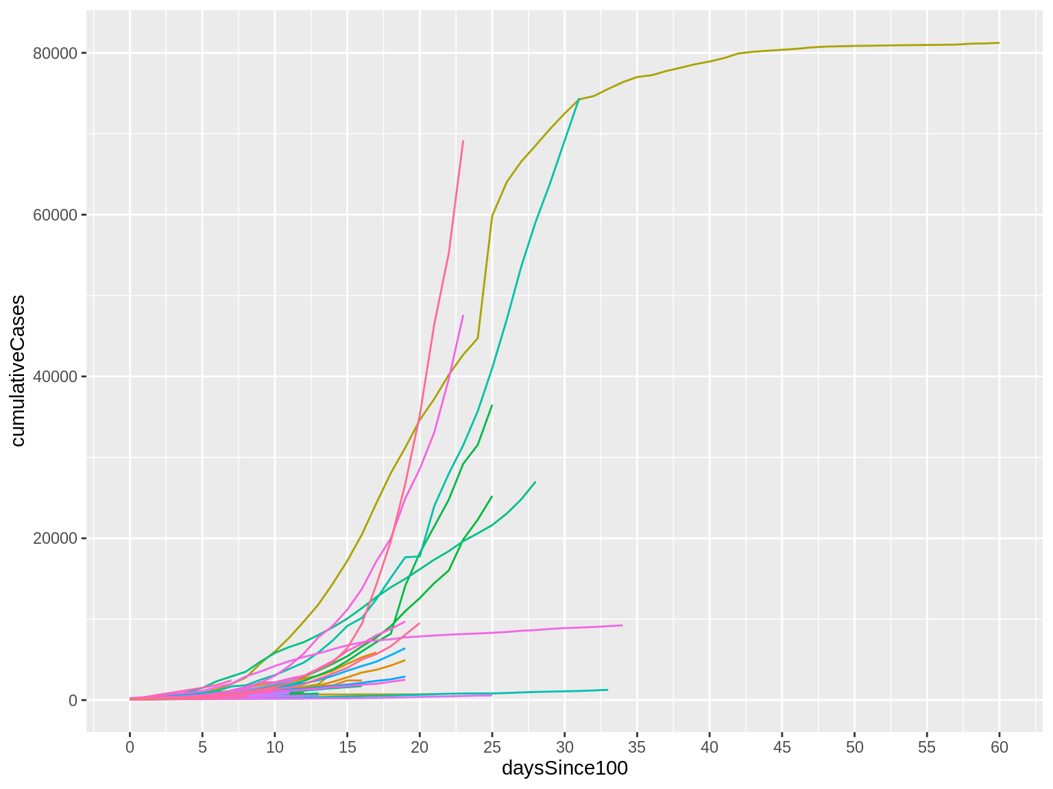
Here’s what that code produces:
The result is a mostly blank plot. However, it is not totally blank. Look at the X axis: We have the number of days, from the minimum value to the maximum value in our data. It also has a label that tells us what variable that information is coming from. Similarly look at the Y axis: We have the minimum and maximum ranges for the values listed under that variable, as well as a label for the variable name.
Adding a Line Graph
If we want to add line to our ggplot, we need to add a new layer to our chart. Whenever we want to add a layer, we add a plus sign (+) at the end of the last layer that we had. This is similar in principle to the pipe (%>%), which tells us to carry output forward. However, while the pipe simply passes the result of the operation to the next function, the plus sign adds information to an existing object.
Will use the geom_line() function to add our line. Because we already specified the aesthetic mappings in our ggplot() line, it inherits all of that information by default.
corona_data %>%
  filter(daysSince100>=0 & daysSince100<=60) %>%
  ggplot(aes(x=daysSince100, y=cumulativeCases, color=countriesAndTerritories)) +
    geom_line()
Here’s what that code produces:
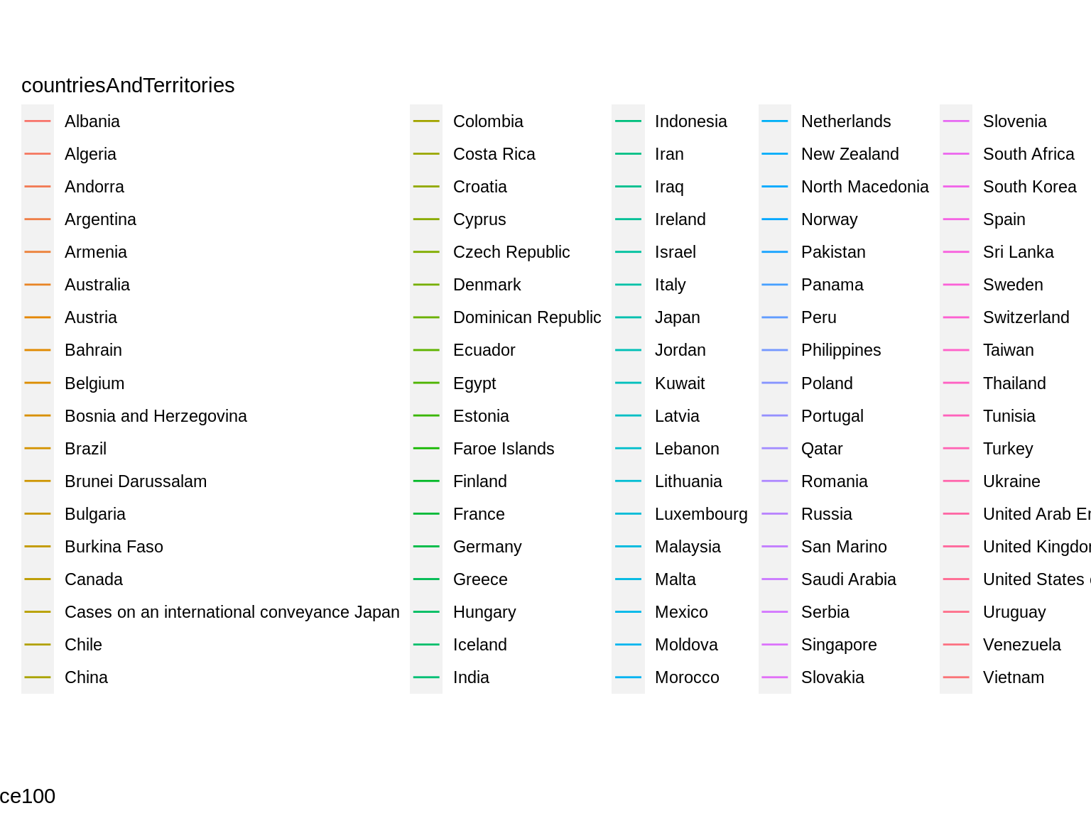
Where are the lines? I want lines!
The lines are actually there but ggplot automatically adds a legend when we include feature-based grouping attributes (like color argument), since it figures that will want to be able to match the lines to the corresponding items — the countries in this case — in order to make sense of the visualization.
Clearing the Legend
In this case, the legend is actually distracting the viewer and we don’t want it.
To get rid of the legend, we will add a new layer that just provides rendering information to our ggplot. Specifically, we will use the theme() function, which allows us to customize different parts of how the visualization looks. We’ll return to this later. However, for now, we’ll just set the attribute legend.position to "hide". This just tells ggplot to not show any legends at all.
corona_data %>%
  filter(daysSince100>=0 & daysSince100<=60) %>%
  ggplot(aes(x=daysSince100, y=cumulativeCases, color=countriesAndTerritories)) +
    geom_line() +
    theme(legend.position="hide")
Here’s what that code produces:
I finally have my lines!
There are lots of them, though, and they’re all kind of overlapping right now. This makes it hard to make sense of things.
Making Our X Axis Look Nicer
Before we take care of that business, I’d like to take a quick pause to make my axes look a little nicer.
I’ll start with my X axis. Our X axis variable is made up of continuous data, meaning that they can take any value within a range, and that value has a numerical meaning. In this case, we have ratio data, where 0 is a meaningful value and every numerical increment is equally spaced (in this case, as a day).
As such, we will use the scale_x_continuous() function to change the numbers appearing below our X axis. Instead of using ggplot’s default intervals, I’ll specify my own intervals to make that visualization a little easier to read.
To specify those intervals, I’ll set the breaks attribute to include just the intervals that I want. Instead of manually typing out each interval, I can use the seq() function to create a vector with a sequence of numbers. Specifically, I’ll provide the seq() function with the lowest interval (0), the highest interval (60), and the increments that I’d like between the intervals (5).
corona_data %>%
  filter(daysSince100>=0 & daysSince100<=60) %>%
  ggplot(aes(x=daysSince100, y=cumulativeCases, color=countriesAndTerritories)) +
    geom_line() +
    theme(legend.position="hide") +
    scale_x_continuous(breaks=seq(0, 60, 5))
Here’s what that code produces:
Now, look at the X axis. Notice that we have more intervals than we did before, making it easier to match a line with a value. The goal here is to find the right balance between providing information to the reader without overwhelming them with too much information or overcrowding the graphic.
Making Our Y Axis Look Nicer
I will want to do the same thing with the Y axis, but this one is a little trickier. As before, we have a continuous variable for our Y axis, so we are going to use the scale_y_continuous() function and include that as a new layer.
However, instead of using a linear scale (which is the default), I want to apply a logarithmic transformation using the base value of 10 to capture exponential growth. What this means is that every one unit change in our Y axis corresponds to a multiplication of the original value by 10. So, a value of 1 on a linear scale now corresponds to 10. A value of 2 would correspond to 100. And 3 would correspond to 1,000, and so on.
I can have R automatically calculate and adjust my plot by setting the trans attribute to "log10".
I will again set the intervals with the breaks argument but this time I will manually set them. Notice that they don’t follow a completely regular pattern. This is based on my reading of the visualization and recognition of that a lot of the lines are going to cluster around certain values. Thus, I can space them out to make it easier to read some of the labels. The irregularity also catches the reader’s eye, which is useful here since we want to call attention to the fact that the variables are increasing exponentially — which is a different scale from what they may be used to.
Finally, because the values are getting pretty high I will use the comma labeler provided by the scales package to tell ggplot to rewrite my value labels to include comma (,) separators for the thousands. This just makes it a lot easier to read those labels.
corona_data %>%
  filter(daysSince100>=0 & daysSince100<=60) %>%
  ggplot(aes(x=daysSince100, y=cumulativeCases, color=countriesAndTerritories)) +
    geom_line() +
    theme(legend.position="hide") +
    scale_x_continuous(breaks=seq(0, 60, 5)) +
    scale_y_continuous(trans="log10", breaks=c(100, 200, 500, 1000, 2000, 5000, 10000, 20000, 50000, 100000), label=comma)
Here’s what that code produces:
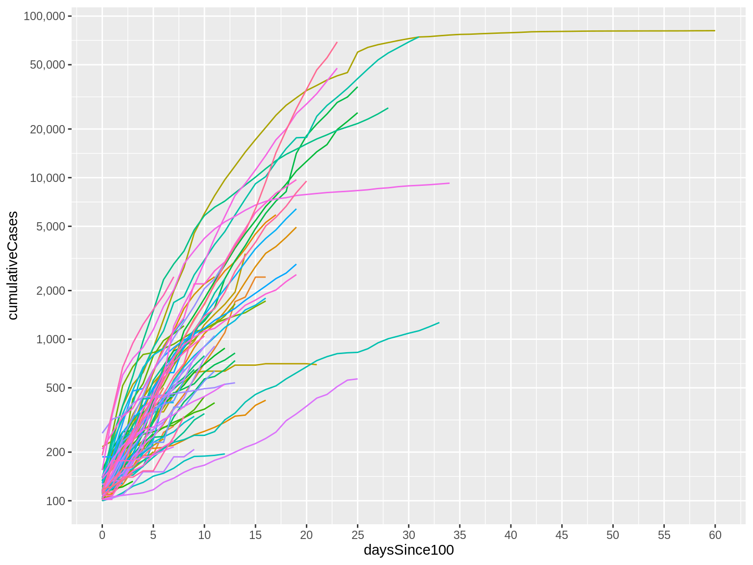
Now, notice that our Y axis labels look much nicer and are much easier to read.
But it’s not just a minor change to the labels. Look at the trajectory of the lines themselves: They are no longer just flat for the first several days before quickly increasing. We now see a more gradual change that helps us to see the early part of the trajectory better.
This isn’t to say that the earlier visual was bad or wrong. It just communicates a different point and highlights and obscures different features of our data.
Adding Context (Titles)
Let’s continue adding context to our visualization. Let’s start by adding a new layer with the labs() function. This is a pretty simple function that allows us to label many of the different aesthetic features of our chart in one line.
Specifically I’ll add a more human-readable title to my X axis and to my Y axis. I will also give the entire chart a title that describes what the chart is about — you can think of that as a headline for the visualization. And, I will offer a bit more detail with a (less prominent) subtitle. Finally, I can use the caption attribute to add credits or identify the source of the data at the bottom of the chart.
corona_data %>%
  filter(daysSince100>=0 & daysSince100<=60) %>%
  ggplot(aes(x=daysSince100, y=cumulativeCases, color=countriesAndTerritories)) +
    geom_line() +
    theme(legend.position="hide") +
    scale_x_continuous(breaks=seq(0, 60, 5)) +
    scale_y_continuous(trans="log10", breaks=c(100, 200, 500, 1000, 2000, 5000, 10000, 20000, 50000, 100000), label=comma) +
    labs(x="Number of days since 100th case", y="", title="Country by country: how coronavirus case trajectories compare", subtitle="Cumulative number of confirmed cases, by number of days since 100th case", caption="Graphic: Rodrigo Zamith/UMass Amherst\nSource: European Centre for Disease Prevention and Control")
Notice that I can use some special characters in those labels. For example, if I want to add a line break so that my caption information appears on two separate lines, I can write forward slash and n (\n) in my string and that will create a new line.
Here’s what that code produces:
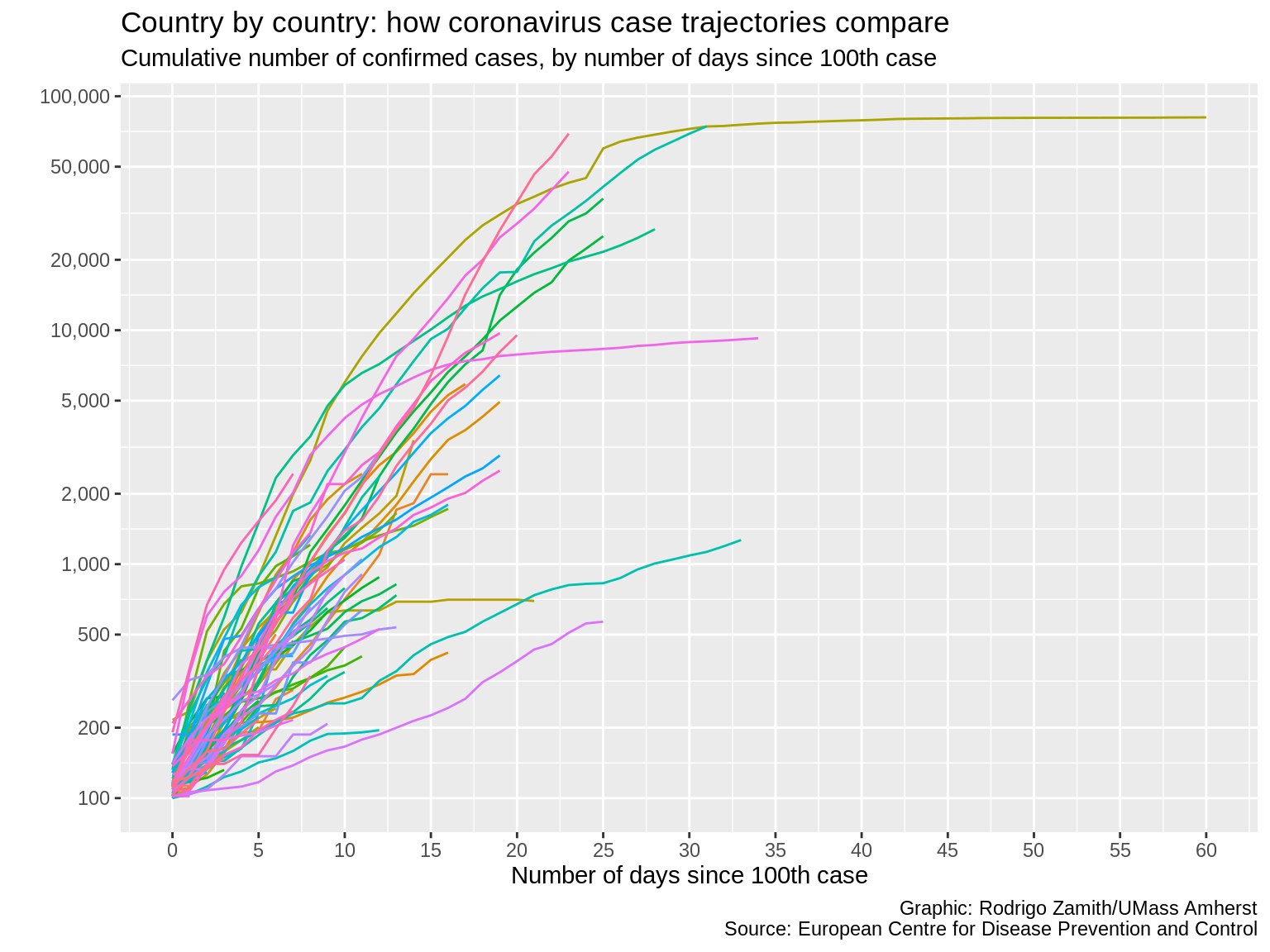
We now have all of that additional contextual information on our plot, which gives us more confidence that our reader will be able to correctly read our data visualization.
This is important as it helps us ensure that they don’t misinterpret the information. Remember, we’ve been working with the information longer than they have. What is apparent to us may not be apparent to them. This is also useful when you are trying to explain something with your data visualization instead of just letting the reader explore the data. Use the contextual information to convey your take-home point and to call attention to particular observations that are especially interesting.
Highlighting Observations
When you want to call attention to certain observations, a good way to do that is to highlight them in the visualization. You can do this by making the less-interesting data points looks similar and the more-interesting ones stand out through different colors or other aesthetics.
One convenient way to do that is to add a new layer with the gghighlight() function, which comes from the gghighlight package. This function will highlight certain information in your data based on some condition that you specify.
In this case, I only want to highlight a few countries of interest. Thus, my logic is simply that the value for the countriesAndTerritories variable must be present in the vector that I’m creating with the c() function, which lists the specific countries that I’d like to highlight. I can also supply the argument label_key and tell it to pull all the information from my corresponding labels in the countriesAndTerritories variable.
If I want to tweak how those labels look, I can use the label_params argument to specify a list containing number of different style attributes. For example, I can tell it to disable borders around my label with the label.size=NA argument; to include a white background behind my text with the fill="white" argument; make the font of my label bold by using fontface="bold"; space the labels a little better with the nudge_x and nudge_y arguments; and give the labels a little more transparency with the segment.alpha and alpha arguments.
corona_data %>%
  filter(daysSince100>=0 & daysSince100<=60) %>%
  mutate(countriesAndTerritories=recode(countriesAndTerritories, "South Korea"="S Korea", "United Kingdom"="UK", "United States of America"="US")) %>%
  ggplot(aes(x=daysSince100, y=cumulativeCases, color=countriesAndTerritories)) +
    geom_line() +
    theme(legend.position="hide") +
    scale_x_continuous(breaks=seq(0, 60, 5)) +
    scale_y_continuous(trans="log10", breaks=c(100, 200, 500, 1000, 2000, 5000, 10000, 20000, 50000, 100000), label=comma) +
    labs(x="Number of days since 100th case", y="", title="Country by country: how coronavirus case trajectories compare", subtitle="Cumulative number of confirmed cases, by number of days since 100th case", caption="Graphic: Rodrigo Zamith/UMass Amherst\nSource: European Centre for Disease Prevention and Control") +
    gghighlight(countriesAndTerritories %in% c("US", "UK", "Spain", "Italy", "China", "Iran", "S Korea", "Japan", "Singapore", "Hong Kong"), label_key=countriesAndTerritories, label_params=list(label.size=NA, fill="white", fontface="bold", nudge_y=.1, nudge_x=3, segment.alpha=0, alpha=.8))
I added a mutate() argument near the top of our code (line 3). This just renames some of the country names, making the labels shorter so that way they won’t overcrowd our visual.
Here’s what that code produces:
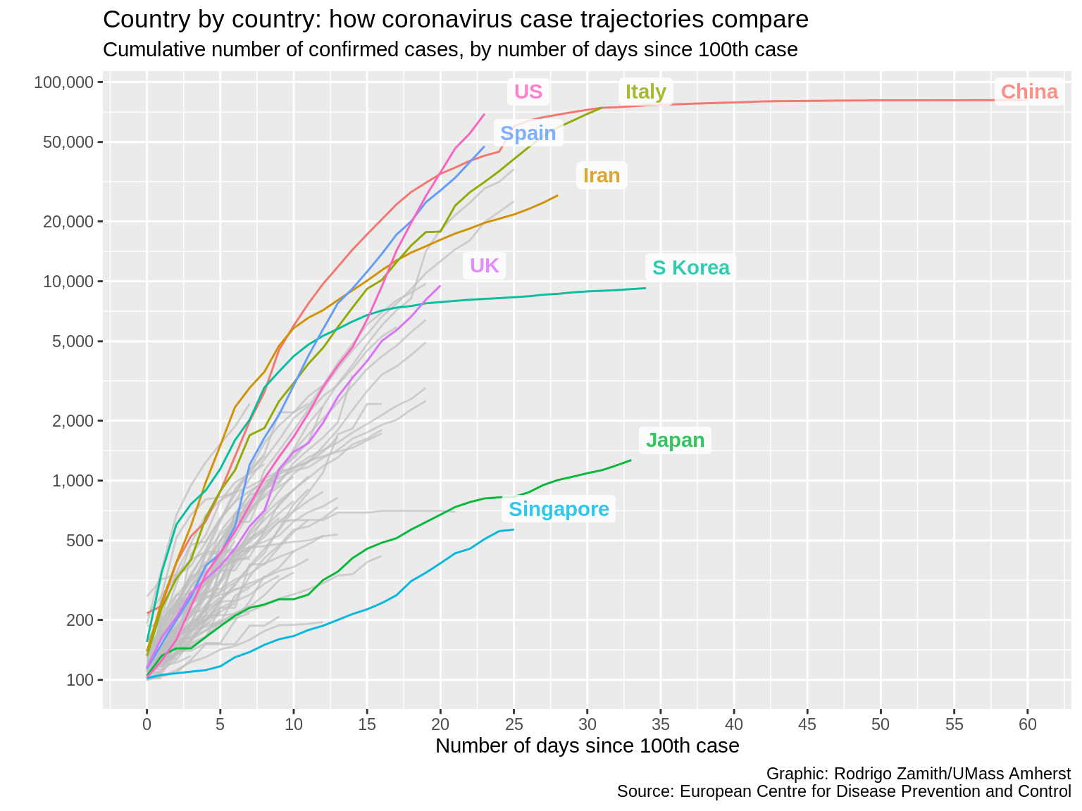
That looks much nicer, and I can really zero in the countries that interest me the most.
Simplifying the Aesthetics
I like simplicity, so instead of having that off-color background behind my line, I’d like to make almost everything white. Alternatively, if we were to export our visual, we could also make the background transparent.
I could manually set a range of different attributes with the theme() function. Or, I could even use themes created by others by loading extra packages in R. In fact, many news organizations have created their own custom themes that they use when creating plots in order to make their visuals look consistent without having to set a whole bunch of properties the same way every time.
For this example, I will just use the theme_minimal() function that comes with ggplot2 to set some of those properties for me and to get me closer to a minimalist chart.
corona_data %>%
  filter(daysSince100>=0 & daysSince100<=60) %>%
  mutate(countriesAndTerritories=recode(countriesAndTerritories, "South Korea"="S Korea", "United Kingdom"="UK", "United States of America"="US")) %>%
  ggplot(aes(x=daysSince100, y=cumulativeCases, color=countriesAndTerritories)) +
    geom_line() +
    theme(legend.position="hide") +
    scale_x_continuous(breaks=seq(0, 60, 5)) +
    scale_y_continuous(trans="log10", breaks=c(100, 200, 500, 1000, 2000, 5000, 10000, 20000, 50000, 100000), label=comma) +
    labs(x="Number of days since 100th case", y="", title="Country by country: how coronavirus case trajectories compare", subtitle="Cumulative number of confirmed cases, by number of days since 100th case", caption="Graphic: Rodrigo Zamith/UMass Amherst\nSource: European Centre for Disease Prevention and Control") +
    gghighlight(countriesAndTerritories %in% c("US", "UK", "Spain", "Italy", "China", "Iran", "S Korea", "Japan", "Singapore", "Hong Kong"), label_key=countriesAndTerritories, label_params=list(label.size=NA, fill="white", fontface="bold", nudge_y=.1, nudge_x=3, segment.alpha=0, alpha=.8)) +
    theme_minimal()
Here’s what that code produces:
That looks more professional to me. Plus, the fact that we have fewer competing colors throughout the visual tells the reader that color is important, and it immediately draws their attention to the lines of interest.
Customizing Aesthetics
I can keep tweaking my visualization by setting additional theme() attributes that were not set by my chosen theme, or even overriding a few of the attributes that I didn’t like.
For my final set of touches, I’ll be adjusting my grid lines so I have fewer gray lines in the background that guide me to the values in my X and Y axes to, again, reduce overcrowding.
I’m also going to change the font colors for my contextual labels to add some clearer visual hierarchy. What this means is that I want my viewer’s eye to immediately head to the most important contextual label on my chart: the title. So, I will tweak all of my other labels to be a little less dark, and thus have less contrast against the white background. The lower contrast means that my reader is less likely to go there first, but it will still be dark enough to read when they’re interested in reading it.
You’ll see those values have these weird sequence of letters and numbers after a pound sign (#). These are called hexadecimal color codes and they’re often used in web development to denote particular variations of colors. We could just write "blue" as our color but if we want to use a particular saturation and hue of blue, we will want to specify it with the hex code. There are lots of websites that you can look at to help you pick out colors and get their hex codes.
corona_data %>%
  filter(daysSince100>=0 & daysSince100<=60) %>%
  mutate(countriesAndTerritories=recode(countriesAndTerritories, "South Korea"="S Korea", "United Kingdom"="UK", "United States of America"="US")) %>%
  ggplot(aes(x=daysSince100, y=cumulativeCases, color=countriesAndTerritories)) +
    geom_line() +
    theme(legend.position="hide") +
    scale_x_continuous(breaks=seq(0, 60, 5)) +
    scale_y_continuous(trans="log10", breaks=c(100, 200, 500, 1000, 2000, 5000, 10000, 20000, 50000, 100000), label=comma) +
    labs(x="Number of days since 100th case", y="", title="Country by country: how coronavirus case trajectories compare", subtitle="Cumulative number of confirmed cases, by number of days since 100th case", caption="Graphic: Rodrigo Zamith/UMass Amherst\nSource: European Centre for Disease Prevention and Control") +
    gghighlight(countriesAndTerritories %in% c("US", "UK", "Spain", "Italy", "China", "Iran", "S Korea", "Japan", "Singapore", "Hong Kong"), label_key=countriesAndTerritories, label_params=list(label.size=NA, fill="white", fontface="bold", nudge_y=.1, nudge_x=3, segment.alpha=0, alpha=.8)) +
    theme_minimal() +
    theme(panel.grid.minor=element_blank(), plot.subtitle=element_text(color="#867e7a"), plot.caption=element_text(color="#867e7a"), axis.title.x=element_text(color="#55504d"))
And here you’ll see the fruits of our labor:
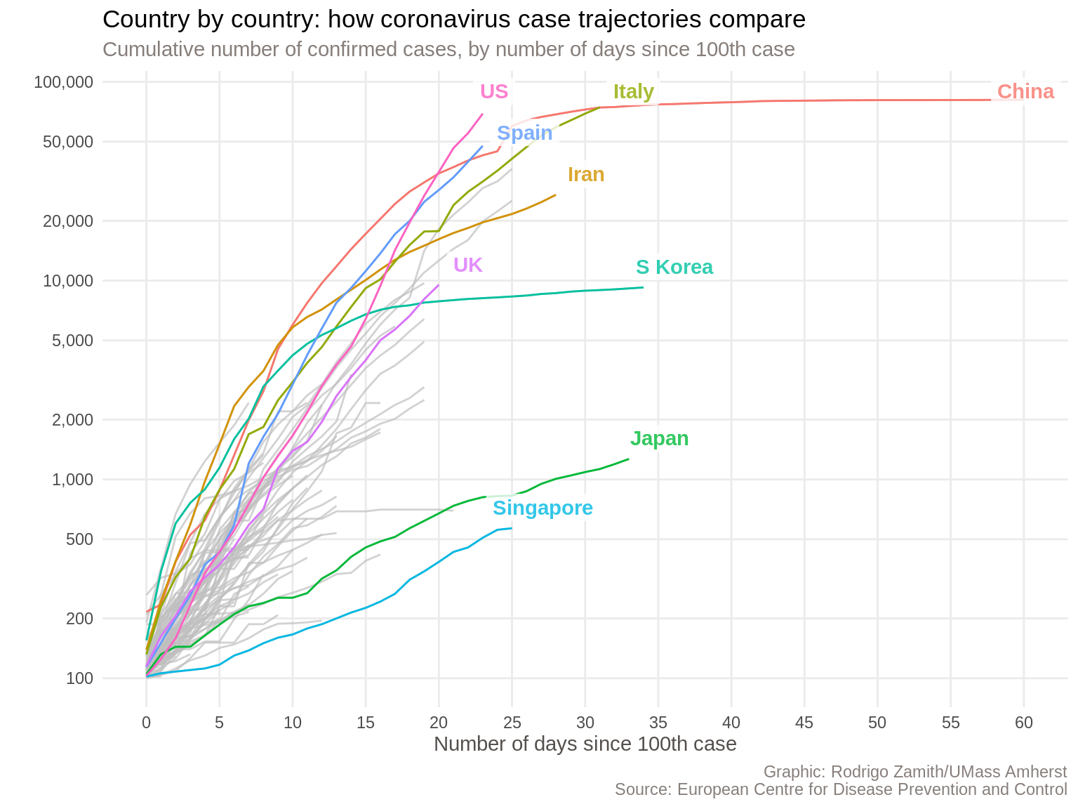
We have a data visualization that is nearly ready for distribution. I would still like to make a few more aesthetic tweaks to call attention to some specific elements (such as by increasing the size of the font in the plot title and adding a newline before the X axis title). Additionally, I’d want to re-color my lines to use the continent (a variable we do not currently have) as the grouping variable. Finally, I’m partial to explanatory visualizations, so I would want to add a more insightful title and subtitle.
Still, this doesn’t look too shabby at all, and I would feel comfortable publishing a chart like this.
Exporting the Visualization
You can easily save your visualization to a file using the ggsave() function, which you could supply as an additional layer to your ggplot in order to not break our chain.
That function just requires you to give the visualization a file name (or path, if you want to save it in a different folder).
You can also set a few different parameters for the output, such as the height and width of the plot, which we can express in via specific units (e.g., inches, or "in") and even set a specific resolution (dpi="300"). We can also set the format for our export by using the device argument. The PNG file format ("png") is a popular choice and works well on websites. It is similar to a JPEG but better optimized for computer graphics. However, you can also export it using a vectorized format, such as EPS or PDF, which would allow you to do post-production Adobe Illustrator with no loss of quality.
corona_data %>%
  filter(daysSince100>=0 & daysSince100<=60) %>%
  mutate(countriesAndTerritories=recode(countriesAndTerritories, "South Korea"="S Korea", "United Kingdom"="UK", "United States of America"="US")) %>%
  ggplot(aes(x=daysSince100, y=cumulativeCases, color=countriesAndTerritories)) +
    geom_line() +
    theme(legend.position="hide") +
    scale_x_continuous(breaks=seq(0, 60, 5)) +
    scale_y_continuous(trans="log10", breaks=c(100, 200, 500, 1000, 2000, 5000, 10000, 20000, 50000, 100000), label=comma) +
    labs(x="Number of days since 100th case", y="", title="Country by country: how coronavirus case trajectories compare", subtitle="Cumulative number of confirmed cases, by number of days since 100th case", caption="Graphic: Rodrigo Zamith/UMass Amherst\nSource: European Centre for Disease Prevention and Control") +
    gghighlight(countriesAndTerritories %in% c("US", "UK", "Spain", "Italy", "China", "Iran", "S Korea", "Japan", "Singapore", "Hong Kong"), label_key=countriesAndTerritories, label_params=list(label.size=NA, fill="white", fontface="bold", nudge_y=.1, nudge_x=3, segment.alpha=0, alpha=.8)) +
    theme_minimal() +
    theme(panel.grid.minor=element_blank(), plot.subtitle=element_text(color="#867e7a"), plot.caption=element_text(color="#867e7a"), axis.title.x=element_text(color="#55504d")) +
    ggsave("my_visualization.png", device="png", width=7, height=5, units="in", dpi=300)
How About a Faceted Chart?
When I scrolled down the Financial Times’ article, I also came across another visualization that I liked.
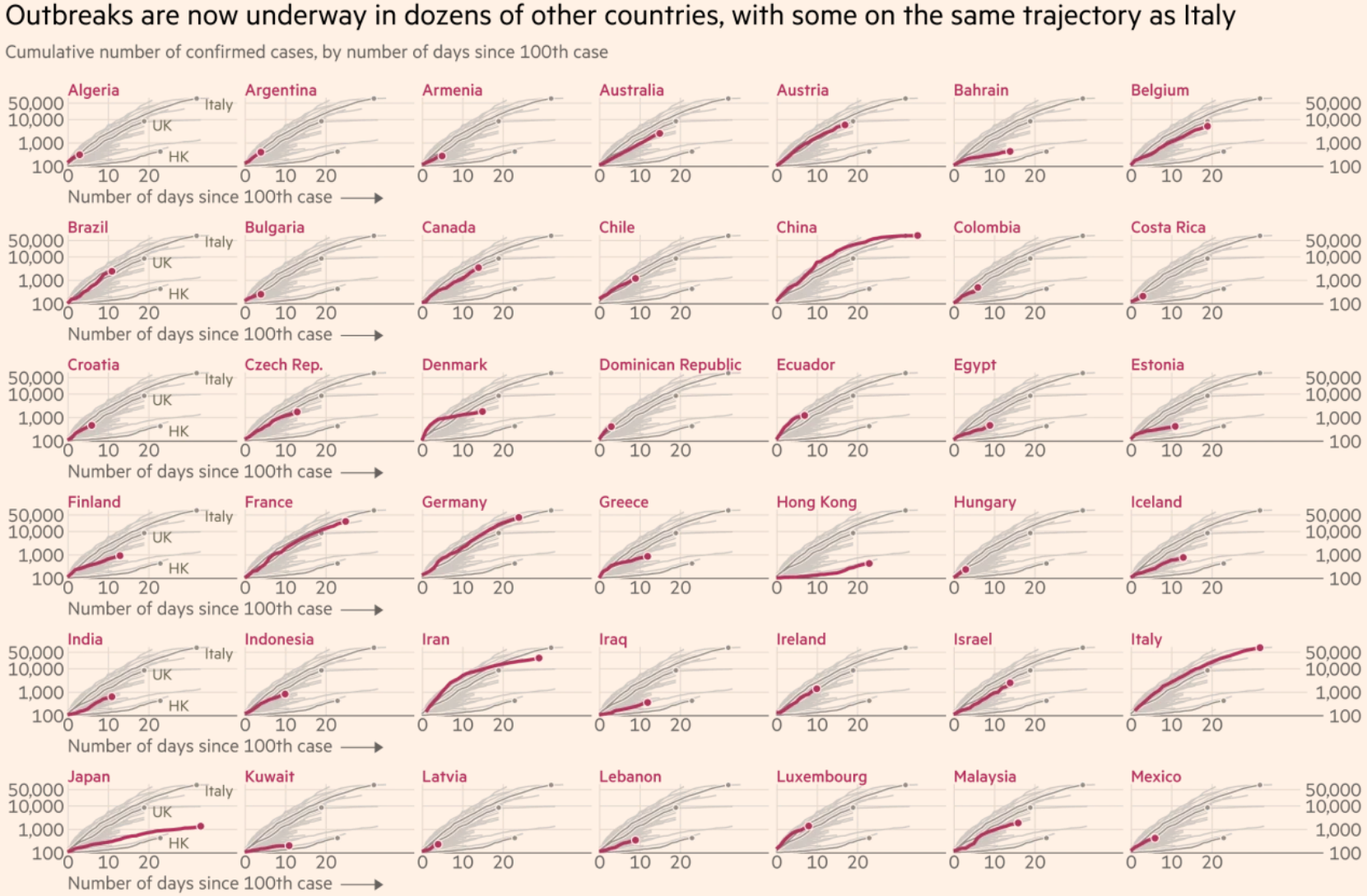
This one allows me to quickly find the country that I’m most interested in and to see how that particular country compares against all of the other ones. This visualization is even more exploratory than the earlier one since the goal is now to allow me to find the most interesting data points. It’s a very tall chart though, and I’m only showing the top half of it here.
In just a couple of minutes, we can recreate this one as well. We will be reusing much of our earlier code to create this new chart, but I’ll just discuss all of those steps in one shot:
-
The first thing we will want to change is that we’re going to add a new
groupaesthetic to ourggplot()function that will tell us to treat all of the rows from the samecountriesAndTerritoriesvalue as a single line in our chart. That’s effectively what we were doing before with thecoloraesthetic. But now, I’m just going to set the color to"red". I could give it a hex code like we did before as well but I’m choosing to name the color for this example. This means that every single line of interest to us will be red. -
Second, I’ll tweak the
scale_x_continuous()andscale_y_continuous()functions to use fewer breaks since things are going to get much more crowded than they were before. -
Third, I’ll change the title of my chart since this is intended to convey something a bit different from before and I will do that tweaking the
labs()function. -
Fourth, I’m going to tweak the
gghighlight()function to no longer highlight only certain countries but instead highlight all of them by setting my condition toTRUE. This may sound counter intuitive but this will make sense shortly. I will also delete all of my labels by setting theuse_direct_labelargument toFALSE. -
Fifth — and this is the key thing that we’re adding to completely change our visual — I’m going to add a new layer and apply the
facet_wrap()function. This function creates a different sub-chart, or facet, for each country. I only need to give it one argument: bycountriesAndTerritories. That tilde represents ‘by’, and it is followed by the variable of interest — again,countriesAndTerritoriesin this case. -
Finally, adding the facets creates a new legend so I need to tell ggplot to hide it again. This line effectively makes my earlier instruction to hide it redundant, so I could also delete that earlier line.
corona_data %>%
  filter(daysSince100>=0 & daysSince100<=60) %>%
  mutate(countriesAndTerritories=recode(countriesAndTerritories, "South Korea"="S Korea", "United Kingdom"="UK", "United States of America"="US")) %>%
  ggplot(aes(x=daysSince100, y=cumulativeCases, group=countriesAndTerritories, color="red")) +
    geom_line() +
    theme(legend.position="hide") +
    scale_x_continuous(breaks=seq(0, 60, 20)) +
    scale_y_continuous(trans="log10", breaks=c(100, 4000, 100000), label=comma) +
    labs(x="Number of days since 100th case", y="", title="Outbreaks are now underway in dozens of other countries", subtitle="Cumulative number of confirmed cases, by number of days since 100th case", caption="Graphic: Rodrigo Zamith/UMass Amherst\nSource: European Centre for Disease Prevention and Control") +
    gghighlight(TRUE, label_key=countriesAndTerritories, use_direct_label=FALSE) +
    theme_minimal() +
    theme(panel.grid.minor=element_blank(), plot.subtitle=element_text(color="#867e7a"), plot.caption=element_text(color="#867e7a"), axis.title.x=element_text(color="#55504d")) +
    facet_wrap(~countriesAndTerritories) +
    theme(legend.position="hide")
And behold, we have our new chart:
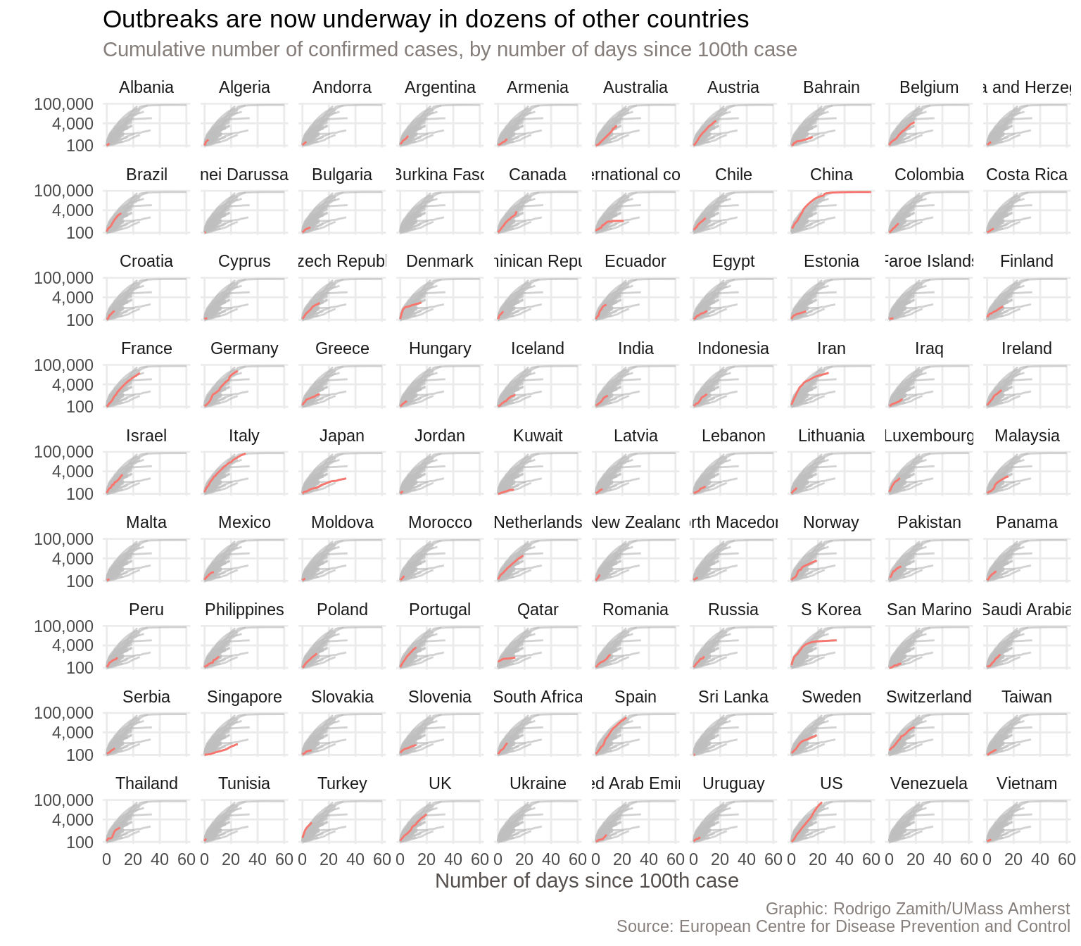
This one fits all of the countries in a single visualization, so it’s smaller than the Financial Times’ chart. Nevertheless, we’re pretty good shape.
There are, of course, some more things that we could tweak. For example, some of the country names are getting cut off right now. Additionally, the Financial Times also colored the country names (facet headings) to match the line and left-aligned them, which I think looks quite nice. With some more tweaking, we could do all of that within R as well.
Scratching the Surface
As you can see, R has a very powerful graphics engine that can produce visualizations that can be dropped straight into a story.
While doing some post production work in Illustrator to touch up some of the smaller things can make the charts look nicer, it’s not always necessary. In particular, when you have a constantly updating story, getting as close to the final product as possible within R will make updating those charts a lot easier.
Additionally, ggplot has a lot of additional customization options that we haven’t yet touched upon, and there are even more packages out there to give it extra functionality. In short, even though we can already accomplish a lot, there is still much we can learn.