Creating Static Maps with R
Introduction
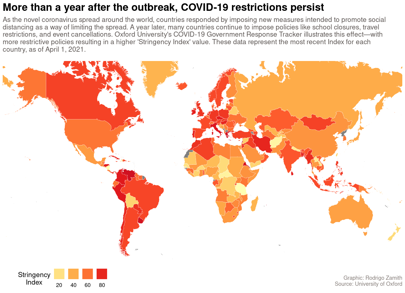
For this tutorial, we will be using R create a static (non-interactive) map using R’s ggplot2 package. Our map will show how different governments around the world responded to the spread of COVID-19 during its early phases. Here’s what that map will look like:
Loading the Data
Our data are derived from The Oxford COVID-19 Government Response Tracker, which provides regularly updated data files about different policy responses governments have adopted.
In particular, we are going to focus on their overall “Stringency Index,” which is a number from 0 to 100 that describes the number and strength of 20 different policy indicators, such as school closures, travel restrictions, events cancellations. More detail about those indicators is available here.
We will be working with a subset of their dataset that includes the country’s name (CountryName) and code (CountryCode), the date (Date) of measurement, the number of confirmed COVID-19 cases (ConfirmedCases) and deaths (ConfirmedDeaths), and the Stringency Index (StringencyIndex). The higher the StringencyIndex, the more policies a country has enacted in response.
You can load the dataset into an object called covid19_stringency by using the readr::read_csv() function to read data from this CSV file.
library(tidyverse)
covid19_stringency <- read_csv("https://dds.rodrigozamith.com/files/covid19_stringency_20210402.csv")
## Rows: 85374 Columns: 6

## ── Column specification ────────────────────────────────────────────────────────
## Delimiter: ","
## chr (2): CountryName, CountryCode
## dbl (4): Date, ConfirmedCases, ConfirmedDeaths, StringencyIndex

##
## ℹ Use `spec()` to retrieve the full column specification for this data.
## ℹ Specify the column types or set `show_col_types = FALSE` to quiet this message.
This is what our dataset looks like:
head(covid19_stringency)
| CountryName | CountryCode | Date | ConfirmedCases | ConfirmedDeaths | StringencyIndex |
|---|---|---|---|---|---|
| Aruba | ABW | 20200101 | NA | NA | 0 |
| Aruba | ABW | 20200102 | NA | NA | 0 |
| Aruba | ABW | 20200103 | NA | NA | 0 |
| Aruba | ABW | 20200104 | NA | NA | 0 |
| Aruba | ABW | 20200105 | NA | NA | 0 |
| Aruba | ABW | 20200106 | NA | NA | 0 |
Each observation refers to a country’s index and case/death count on a particular date. For example, the first observation tells us that on January 1, 2020, Aruba had a Stringency Index of 0, and we did not have information about its confirmed case and death counts.
Filtering the Relevant Data
Our dataset contains more information than we need. In particular, we only need the observations from April 1, 2021 and for just three of our variables (CountryName, CountryCode, and StringencyIndex).
It is helpful to get your dataset to the smallest possible size before you start adding shape information to it. That’s because the more precise the shape is, the more geometric points it is likely to have. That, in turn, can end up overwhelming your system’s memory capacity, or significantly slow down the rendering process.
However, it is also possible that we won’t have data for a specific country on that date. (That is, the value for StringencyIndex would be NA.) What we can do instead is to filter in the most recent data for that country instead.
Here’s how we could do that:
covid19_stringency_mini <- covid19_stringency %>%
  filter(Date<="20210401" & !is.na(StringencyIndex)) %>%
  group_by(CountryCode) %>%
  top_n(1, Date) %>%
  ungroup() %>%
  select(CountryName, CountryCode, Date, StringencyIndex)
This is what our new dataset looks like:
head(covid19_stringency_mini)
| CountryName | CountryCode | Date | StringencyIndex |
|---|---|---|---|
| Aruba | ABW | 20210322 | 56.48 |
| Afghanistan | AFG | 20210301 | 12.04 |
| Angola | AGO | 20210329 | 56.48 |
| Albania | ALB | 20210322 | 60.19 |
| Andorra | AND | 20210323 | 55.56 |
| United Arab Emirates | ARE | 20210330 | 53.70 |
Working with Shapefiles
Before we can map anything, we first need to download a map of the region we want to lay our data on top of. In our case, we will be drawing on a map of the entire world (since we have data for multiple countries that span the globe).
In order to draw that map, we first need to download what’s called a shapefile, which is a geospacial vector data format. (There are other formats, such as GeoJSON, but we won’t cover them here.)
There are multiple websites that contain copies of shapefiles for all sorts of geographies. I’ll be working with a shape file from IGISMAP that covers the entire world.
We will be using this shapefile. Be sure to save that file in your project directory before proceeding. Additionally, in order to use that shapefile, you will need to install the sf package.
We can read that world shapefile into an object called world_map by using the sf::st_read() function. That function requires a single argument: the location of the .shp file.
Shapefiles are often distributed as compressed files (e.g., .zip). However, the st_read() function can only read .shp files. Thus, if you download a compressed file with a shapefile, be sure to extract it first. The zip file may contain supplemental metadata files, which you will need to keep alongside the .shp file itself.
In the code below, I am providing a workflow that will extract the zip file to a temporary directory on your computer using the unzip() function in R, and then load the shapefile from that temporary location using the st_read() function.
library(sf)
world_borders_file <- tempfile() # Use this line if you're loading the data _remotely_
download.file("https://dds.rodrigozamith.com/files/TM_WORLD_BORDERS-0.3.zip", world_borders_file, mode="wb") # Use this line if you're loading the data _remotely_
unzip(world_borders_file, exdir=tempdir()) # Use this line if you're loading the data _remotely_
#unzip("TM_WORLD_BORDERS-0.3.zip", exdir=tempdir()) # Use this line if you're loading the data _directly from your computer_
world_map <- st_read(paste0(tempdir(), "/", "TM_WORLD_BORDERS-0.3.shp"))
You will need to install the sf package before you can run it for the first time. This may require you to install some additional software on your system.
The shapefile we loaded contains information about 11 variables for 246 observations (i.e., countries). What is most pertinent to us, though, are following three variables: iso3 (the country’s code), name (the country’s name), and geometry (a polygonal shape that represents a country’s borders).
Joining the Data
We now have two datasets: One with our Oxford stringency data (covid19_stringency_mini) and the other with our map shapes (world_map). What we need to do next is combine those two datasets.
We can do that by using the tidyr::left_join() function. tidyr provides a few different ‘join’ functions to help us combine two different datasets. We will use left_join() because that function examines all of the observations in a target data frame (object x) and appends all of the data pertaining to those observations from a secondary data frame (object y). In this case, the primary data frame is the world_map object because we want to map the entire world, and it is plausible that we will not have information for certain countries (but still want them to appear on the map, so as to avoid missing countries or other weird gaps).
How does the left_join() function know how to append the data correctly? It does so by looking for a common identifier(s). Thus, our primary data frame (world_map) has an iso3 variable that directly corresponds to the information contained in the CountryCode variable in the secondary data frame (covid19_stringency_mini).
Put another way, we’ll use left_join() to combine the world_map object (first argument) with the covid19_stringency_mini object (second argument), specifying that the iso3 and CountryCode variables are the common identifiers. We’ll reassign the resulting data (which includes all rows from world_map appended with the matching variables from covid19_stringency_mini–as we don’t have all of the countries in our stringency data) to a new object called map_data:
map_data <- left_join(x=world_map, y=covid19_stringency_mini, by=c("iso3"="CountryCode"))
The by argument is how we supply the common identifier. Given that we have different variable names for our common identifier (iso3 in one data frame and CountryCode in the other), we use that quirky expression to signify the equivalency.
Creating a Map with ggplot2
We will be using the ggplot2 package to create our map. While that package is commonly associated with chart creation, it has sophisticated geospatial capabilities as well, and other packages have been developed to add even more mapping functionality to it.
As with other ggplots, the process works through the addition of layers. Thus, to illustrate the creation of our map, I’m going to be adding one layer at a time.
Base Layer
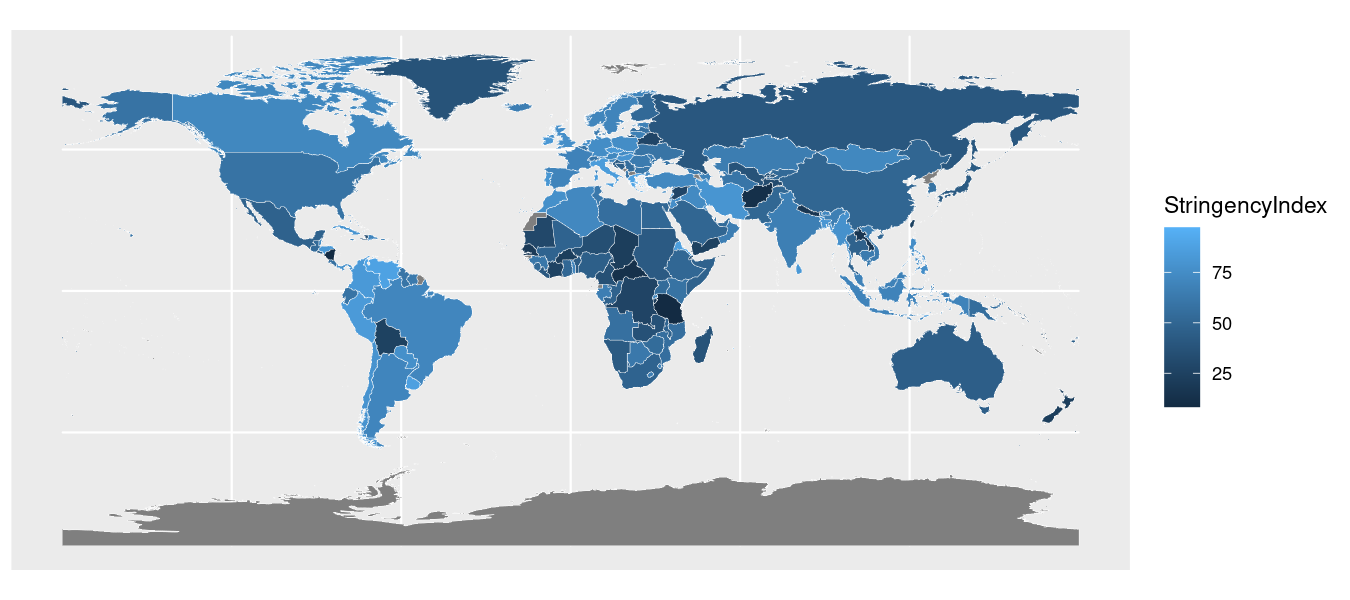
We’ll start by creating our base layer in ggplot. This will appear blank but it will contain our map data in the background. Notably, I’ll specify the lone aesthetic (with the aes() function), which specifies that our shapes should be filled (coloring for polygons) with information from our StringencyIndex variable:
map_data %>%
  ggplot(aes(fill=StringencyIndex))
Here’s what that code produces:

Adding Country Shapes
Next, we are going to add in our country shapes using the geom_sf() function, which draws the geometric shapes from the supplied shapefile information.
We can specify the boundaries of the shape to be a certain color with the color argument and size with the size argument.
map_data %>%
  ggplot(aes(fill=StringencyIndex)) +
    geom_sf(color="white", size=.1)
Here’s what that code produces:
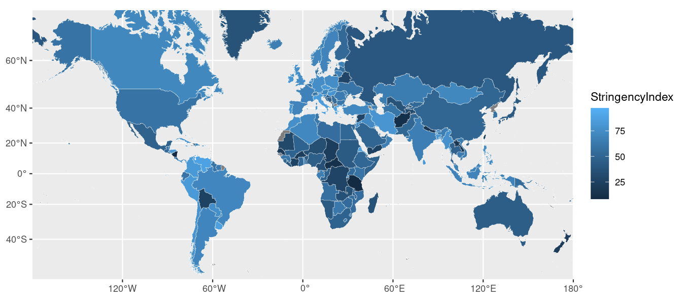
Changing the Projection
This looks okay, but I don’t particularly like our current map projection. By default, ggplot2 uses EPSG Geodetic Parameter Dataset projection number 4326–which is the default for some services but looks a little weird in a small, rectangular graphic. Indeed, look how tiny Europe looks here!
Instead, I’m going to convert our projection to EPSG number 3857, which is the one Google Maps and others use. That projection translates better to a computer or phone screen.
In order to accomplish all of this, I will need to use some functions from the sf package to create a box around the regions I want to show with my new projection. The first thing I need to get the latitudinal and longitudinal coordinates for the highest and lowest points I want to display on my map—which would effectively allow me to cut out a geography like Antarctica, which isn’t needed here. To do that, I can use a helpful tool like this one to get the coordinates for a bounding box. I would then supplement those values below.
Once I have my bounding box coordinates, I can use the sf::st_sfc() function to translate those coordinates into simple map features that ggplot understands. In particular, I need to give st_sfc() the latitude-longitude coordinates for the bottom-left point in the bounding box as the first argument, and the coordinates for the top-right point in the box as the second argument. I also need to specify what our current projection is (crs=4326).
Then, to convert those points to our new projection, I’ll use the sf:st_transform() function, specifying the projection I want to use going forward (crs=3857).
Here’s what the code for doing all of this will look like:
st_transform(st_sfc(st_point(c(-168.9, -57.4)), st_point(c(-168.5, 72.3)), crs = 4326), crs=3857)
And, here’s the result of that operation:
## Geometry set for 2 features
## Geometry type: POINT
## Dimension:     XY
## Bounding box:  xmin: -18801860 ymin: -7842319 xmax: -18757330 ymax: 11862140
## Projected CRS: WGS 84 / Pseudo-Mercator

## POINT (-18801862 -7842319)

## POINT (-18757334 11862137)
You can now just plug the new ylim values (a vector with ymin and ymax) into the sf::coord_sf() function, alongside the new projection (crs argument). Here’s how we would accomplish that:
map_data %>%
  ggplot(aes(fill=StringencyIndex)) +
    geom_sf(color="white", size=.1) +
    coord_sf(crs=st_crs(3857), ylim = c(-7842319, 12123480), expand = FALSE)
Here’s what that code produces:
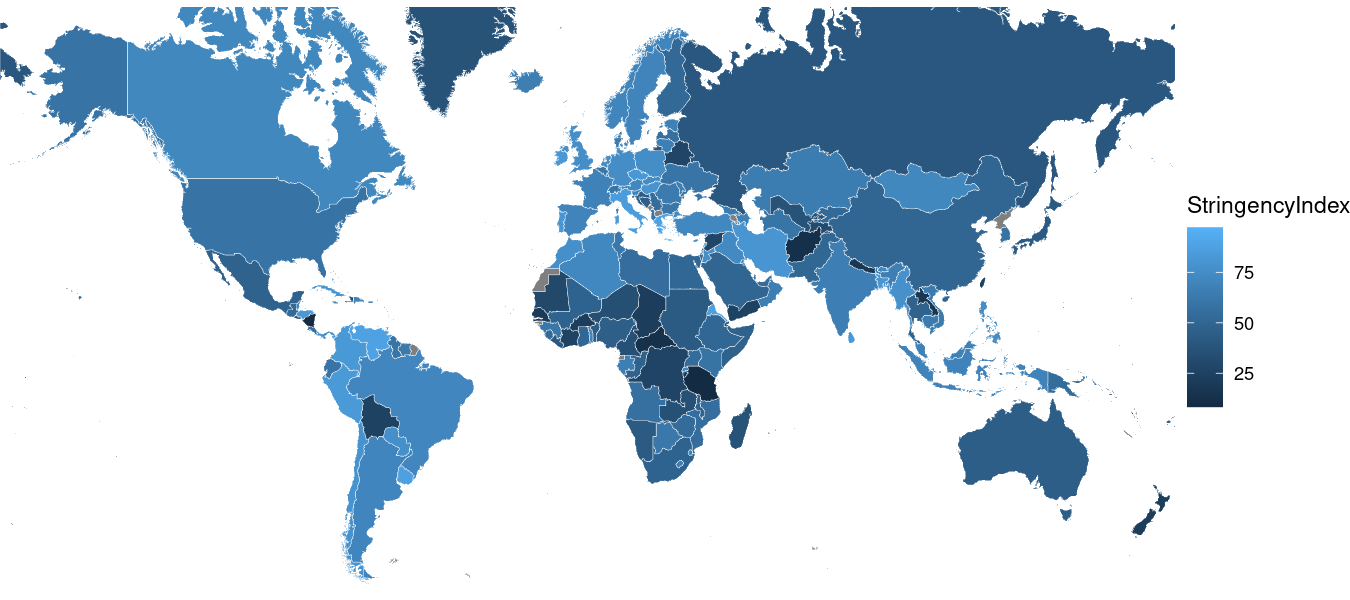
Getting Rid of the Background
Next, let’s get rid of all of that ugly gray in the background by applying the ggplot2::theme_void() function, which simply pre-fills some theming options for us.
map_data %>%
  ggplot(aes(fill=StringencyIndex)) +
    geom_sf(color="white", size=.1) +
    coord_sf(crs=st_crs(3857), ylim = c(-7842319, 12123480), expand = FALSE) +
    theme_void()
Here’s what that code produces:
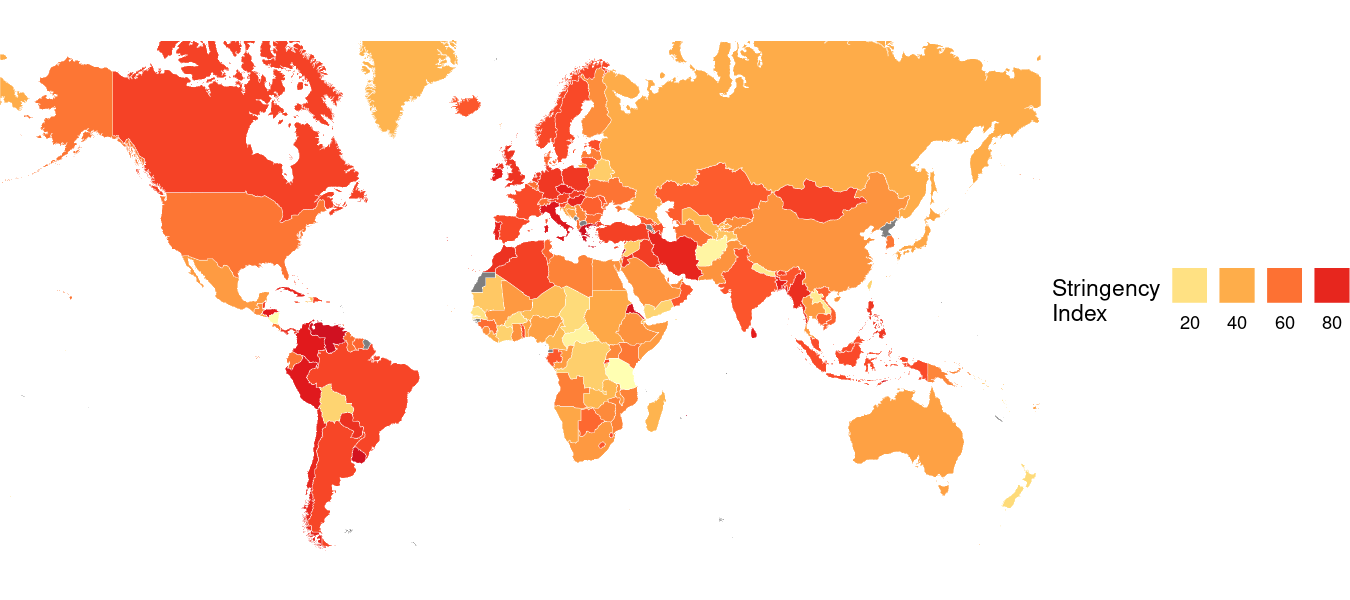
Changing the Choropleth Bins
That is already looking much nicer. However, I don’t like the current coloring scheme, and I’d like to base the coloring on just a few ‘steps’ (or ‘bins’), rather than a continuous gradient.
To do that, I can use the ggplot2::scale_fill_distiller() function. To replace the continuous gradient with a few different levels, I can supply the breaks argument. To change the colors to a palette that is easier to see and more accessible for people with visual impairments, I can supply the palette argument. To reverse the order of the colors so that the lightest color corresponds to the lowest value, I can supply the direction argument. To style my legend, I can supply the guide argument (and add a few styling options via the guide_legend() function). Finally, to give my legend a title, I can supply the name argument.
Here’s what all of that would look like in my code:
map_data %>%
  ggplot(aes(fill=StringencyIndex)) +
    geom_sf(color="white", size=.1) +
    coord_sf(crs=st_crs(3857), ylim = c(-7842319, 12123480), expand = FALSE) +
    theme_void() +
    scale_fill_distiller(breaks=c(0,20,40,60,80,100), palette="YlOrRd", direction=1, guide=guide_legend(label.position="bottom", title.position="left", nrow=1), name="Stringency\nIndex")
Here’s what that code produces:
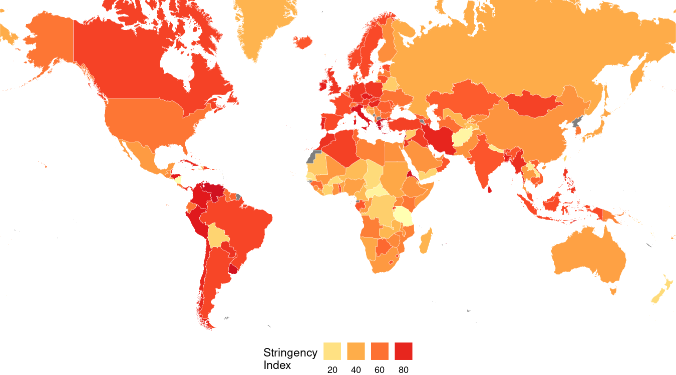
Moving the Legend
To move my legend to the bottom of the map—given that my occupies more horizontal space than vertical space, it makes sense to move the legend below the map—I can apply the theme() function and supply it the legend.position argument like so:
map_data %>%
  ggplot(aes(fill=StringencyIndex)) +
    geom_sf(color="white", size=.1) +
    coord_sf(crs=st_crs(3857), ylim = c(-7842319, 12123480), expand = FALSE) +
    theme_void() +
    scale_fill_distiller(breaks=c(0,20,40,60,80,100), palette="YlOrRd", direction=1, guide=guide_legend(label.position="bottom", title.position="left", nrow=1), name="Stringency\nIndex") +
    theme(legend.position="bottom")
Here’s what that code produces:
Adding Scaffolding Information
To ensure that my viewer fully understands the key take-away from my visualization, I will add some scaffolding information with the ggplot2::labs() function.
First, I’ll give it a title (title argument) that describes the take-home message. In this case, I want to call attention to the growing severity of the responses. Underneath the title, I’d like to add a short block of text (via the subtitle argument) that sets up the context for the visualization. Finally, I’ll add a small label at the bottom-right corner of my chart with the source and image credits by supplying the caption argument.
Here is the code for doing all of that.
map_data %>%
  ggplot(aes(fill=StringencyIndex)) +
    geom_sf(color="white", size=.1) +
    coord_sf(crs=st_crs(3857), ylim = c(-7842319, 12123480), expand = FALSE) +
    theme_void() +
    scale_fill_distiller(breaks=c(0,20,40,60,80,100), palette="YlOrRd", direction=1, guide=guide_legend(label.position="bottom", title.position="left", nrow=1), name="Stringency\nIndex") +
    theme(legend.position="bottom") +
    labs(title="More than a year after the outbreak, COVID-19 restrictions persist", subtitle="As the novel coronavirus spread around the world, countries responded by imposing new measures intended to promote social \ndistancing as a way of limiting the spread. A year later, many countries continue to impose policies like school closures, travel \nrestrictions, and event cancellations. Oxford University's COVID-19 Government Response Tracker illustrates this effect\u2015with \nmore restrictive policies resulting in a higher 'Stringency Index' value. These data represent the most recent Index for each\ncountry, as of April 1, 2021.\n", caption="\n\nGraphic: Rodrigo Zamith\nSource: University of Oxford\n")
ggplot2 does not manually wrap the text. Instead, I need to use \n to add line breaks to my labels (e.g., the subtitle). This requires some trial and error to get the spacing to look right for the image I intend to create.
Here’s what that code produces:
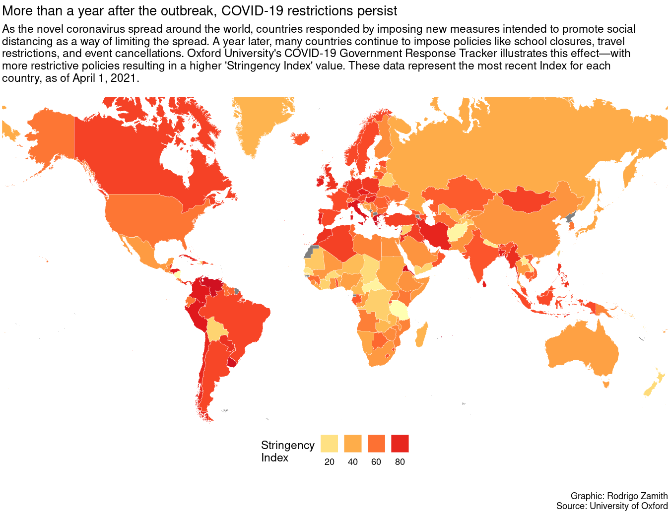
Touching Up the Theming Options
Finally, I’ll apply some more theming options with the theme() function to touch up some minor bits and ends:
-
I’ll move the legend to the bottom-left with the
legend.positionargument and center the text with thelegend.titleargument. -
I’ll make the title stand out with by tweaking the
plot.titleargument. -
I’ll make the subtitle have a little less contrast than the title by tweaking the
plot.subtitleargument. -
I’ll make the caption have even less contrast by tweaking the
plot.captionargument.
This is the result of my work
map_data %>%
  ggplot(aes(fill=StringencyIndex)) +
    geom_sf(color="white", size=.1) +
    coord_sf(crs=st_crs(3857), ylim = c(-7842319, 12123480), expand = FALSE) +
    theme_void() +
    scale_fill_distiller(breaks=c(0,20,40,60,80,100), palette="YlOrRd", direction=1, guide=guide_legend(label.position="bottom", title.position="left", nrow=1), name="Stringency\nIndex") +
    theme(legend.position="bottom") +
    labs(title="More than a year after the outbreak, COVID-19 restrictions persist", subtitle="As the novel coronavirus spread around the world, countries responded by imposing new measures intended to promote social \ndistancing as a way of limiting the spread. A year later, many countries continue to impose policies like school closures, travel \nrestrictions, and event cancellations. Oxford University's COVID-19 Government Response Tracker illustrates this effect\u2015with \nmore restrictive policies resulting in a higher 'Stringency Index' value. These data represent the most recent Index for each\ncountry, as of April 1, 2021.\n", caption="\n\nGraphic: Rodrigo Zamith\nSource: University of Oxford\n") +
    theme(legend.position=c(.15,-.09), legend.title=element_text(hjust=.5), plot.title=element_text(size=rel(1.5), family="sans", face="bold"), plot.subtitle=element_text(color="#5e5855"), plot.caption=element_text(color="#867e7a"))
Here’s what that code produces:
Exporting the Map
When you’re satisfied with how your map looks, you can save it to your computer using the ggsave() function. You can supply it as an additional layer to your ggplot in order to not break our chain.
That function just requires you to give the visualization a file name (or path, if you want to save it in a different folder). However, you can also set a few different parameters for the output, such as the height and width of the plot, which we can express in via specific units (e.g., inches, or "in") and even set a specific resolution (dpi="300"). We can also set the format for our export by using the device argument. The PNG file format ("png") is a popular choice and works well on websites. It is similar to a JPEG but better optimized for computer graphics. However, you can also export it using a vectorized format, such as EPS or PDF, which would allow you to do post-production Adobe Illustrator with no loss of quality.
Here’s how I saved the final map image:
map_data %>%
  ggplot(aes(fill=StringencyIndex)) +
    geom_sf(color="white", size=.1) +
    coord_sf(crs=st_crs(3857), ylim = c(-7842319, 12123480), expand = FALSE) +
    theme_void() +
    scale_fill_distiller(breaks=c(0,20,40,60,80,100), palette="YlOrRd", direction=1, guide=guide_legend(label.position="bottom", title.position="left", nrow=1), name="Stringency\nIndex") +
    theme(legend.position="bottom") +
    labs(title="More than a year after the outbreak, COVID-19 restrictions persist", subtitle="As the novel coronavirus spread around the world, countries responded by imposing new measures intended to promote social \ndistancing as a way of limiting the spread. A year later, many countries continue to impose policies like school closures, travel \nrestrictions, and event cancellations. Oxford University's COVID-19 Government Response Tracker illustrates this effect\u2015with \nmore restrictive policies resulting in a higher 'Stringency Index' value. These data represent the most recent Index for each\ncountry, as of April 1, 2021.\n", caption="\n\nGraphic: Rodrigo Zamith\nSource: University of Oxford\n") +
    theme(legend.position=c(.15,-.09), legend.title=element_text(hjust=.5), plot.title=element_text(size=rel(1.5), family="sans", face="bold"), plot.subtitle=element_text(color="#5e5855"), plot.caption=element_text(color="#867e7a")) +
    ggsave("ggplot-map-stringency-final.png", device="png", width=9, height=6.5, units="in", dpi=150)
This will save the image to your working directory. If you are using an RStudio project, that will typically be your project folder.