Intermediate Exploratory Data Visualization in R
Introduction
In this tutorial, we will be using a few more functions from the DataExplorer package to help us perform some more exploratory visual analyses of county-level data from the Eviction Lab. We’ll also expand on our existing knowledge about the ggplot2 package to produce slightly more sophisticated visualizations—though they will still be geared toward internal/exploratory consumption. Specifically, we’ll be learning how to:
-
Generate correlation heatmaps.
-
Quickly generate a sequence of scatter plots for multiple bivariate relationships.
-
Deal with issues involving special characters in variable names.
-
Quickly generate a sequence of box plots to assess central tendencies and dispersion for multiple variables.
-
Create our own scatter plots.
-
Add additional aesthetics to an interactive ggplot.
The Dataset
The Eviction Lab has collected data from 80 million records around the country and you can read about the methodology here. As always, it is helpful to review the data dictionary to understand the meaning of the different variables (what each variable name corresponds to). If you want more detail about any of the variables, I encourage you to review the full Methodology Report.
Pre-Analysis Steps
Load the data
The first step, of course, is to read in the data. We’ll use the readr::read_csv() function (readr can be loaded by the tidyverse metapackage):
library(tidyverse)
## ── Attaching packages ─────────────────────────────────────── tidyverse 1.3.1 ──

## ✓ ggplot2 3.3.5     ✓ purrr   0.3.4
## ✓ tibble  3.1.3     ✓ dplyr   1.0.7
## ✓ tidyr   1.1.3     ✓ stringr 1.4.0
## ✓ readr   2.0.1     ✓ forcats 0.5.1

## ── Conflicts ────────────────────────────────────────── tidyverse_conflicts() ──
## x dplyr::filter()     masks stats::filter()
## x dplyr::group_rows() masks kableExtra::group_rows()
## x dplyr::lag()        masks stats::lag()
ma_counties <- read_csv("https://dds.rodrigozamith.com/files/evictions_ma_counties.csv")
## Rows: 238 Columns: 27

## ── Column specification ────────────────────────────────────────────────────────
## Delimiter: ","
## chr  (2): name, parent-location
## dbl (25): GEOID, year, population, poverty-rate, renter-occupied-households,...

##
## ℹ Use `spec()` to retrieve the full column specification for this data.
## ℹ Specify the column types or set `show_col_types = FALSE` to quiet this message.
Confirm it imported correctly
Normally, we would make sure the data imported correctly. Because we’ve previously evaluated the data from this data source, we can just take a quick look at the first few observations to confirm that the data were imported correctly.
head(ma_counties)
| GEOID | year | name | parent-location | population | poverty-rate | renter-occupied-households | pct-renter-occupied | median-gross-rent | median-household-income | median-property-value | rent-burden | pct-white | pct-af-am | pct-hispanic | pct-am-ind | pct-asian | pct-nh-pi | pct-multiple | pct-other | eviction-filings | evictions | eviction-rate | eviction-filing-rate | low-flag | imputed | subbed |
|---|---|---|---|---|---|---|---|---|---|---|---|---|---|---|---|---|---|---|---|---|---|---|---|---|---|---|
| 25001 | 2000 | Barnstable County | Massachusetts | 222230 | 6.89 | 21035 | 22.18 | 723 | 45933 | 178800 | 27.7 | 93.38 | 1.73 | 1.35 | 0.52 | 0.61 | 0.02 | 1.56 | 0.83 | NA | NA | NA | NA | 0 | 0 | 0 |
| 25001 | 2001 | Barnstable County | Massachusetts | 222230 | 6.89 | 21096 | 22.18 | 723 | 45933 | 178800 | 27.7 | 93.38 | 1.73 | 1.35 | 0.52 | 0.61 | 0.02 | 1.56 | 0.83 | NA | NA | NA | NA | 0 | 0 | 0 |
| 25001 | 2002 | Barnstable County | Massachusetts | 222230 | 6.89 | 21157 | 22.18 | 723 | 45933 | 178800 | 27.7 | 93.38 | 1.73 | 1.35 | 0.52 | 0.61 | 0.02 | 1.56 | 0.83 | NA | NA | NA | NA | 0 | 0 | 0 |
| 25001 | 2003 | Barnstable County | Massachusetts | 222230 | 6.89 | 21218 | 22.18 | 723 | 45933 | 178800 | 27.7 | 93.38 | 1.73 | 1.35 | 0.52 | 0.61 | 0.02 | 1.56 | 0.83 | 767 | 751 | 3.54 | 3.61 | 0 | 0 | 0 |
| 25001 | 2004 | Barnstable County | Massachusetts | 222230 | 6.89 | 21279 | 22.18 | 723 | 45933 | 178800 | 27.7 | 93.38 | 1.73 | 1.35 | 0.52 | 0.61 | 0.02 | 1.56 | 0.83 | NA | NA | NA | NA | 0 | 0 | 0 |
| 25001 | 2005 | Barnstable County | Massachusetts | 222629 | 4.31 | 21340 | 18.91 | 1045 | 60096 | 399900 | 32.8 | 93.05 | 1.90 | 1.76 | 0.37 | 0.93 | 0.01 | 1.58 | 0.40 | NA | NA | NA | NA | 0 | 0 | 0 |
Just like before, it appears we imported the data correctly. Each observation represents a different county (name) at a different point in time (year).
Visual Data Exploration
To continue visually inspecting our data, we can turn to some additional functions within the DataExplorer package.
As we previously noted, data visualization is valuable is because humans have a much easier time processing large amounts of information when it is visualized in some way. Data tables are great when looking at each tree but visuals help us see the forest.
Additionally, visually inspecting data is great for finding outliers (extreme observations). Sometimes the story is not in the general pattern but in the outlier. For example, you may wonder why a particular city has an exceptionally high crime rate. (However, outliers may also be data entry errors that we need to clean up.)
Let’s load DataExplorer first to get access to its functions.
library(DataExplorer)
You will need to install the DataExplorer package if you haven’t already. In RStudio, you can do that by going to Tools, Install Packages, and selecting it for installation.
Generating Correlation Heatmaps
DataExplorer provides a very cool function for quickly visualizing linear correlations for several variables: plot_correlation().
What that function does is automatically calculate the linear correlation coefficient between all possible pairs of variables in a given dataset and use color coding to draw your attention to the strongest correlations. (By default, it calculates Pearson’s r.)
If you have too many variables, that heatmap can become exceptionally crowded. Additionally, some relationships would be pointless. (Who cares about the relationship between GEOID and eviction-rate?) Thus, it helps to select just the variables for which a relationship could be practically meaningful.
For example, let’s say I wanted to check the relationships between population, poverty-rate, pct-renter-occupied, and rent-burden in 2016. I could quickly do that by filtering and selecting the requisite data, and passing the output to plot_correlation().
Here’s the code for doing that:
ma_counties %>%
  filter(year==2016) %>%
  select(population, `poverty-rate`, `pct-renter-occupied`, `rent-burden`) %>%
  plot_correlation()
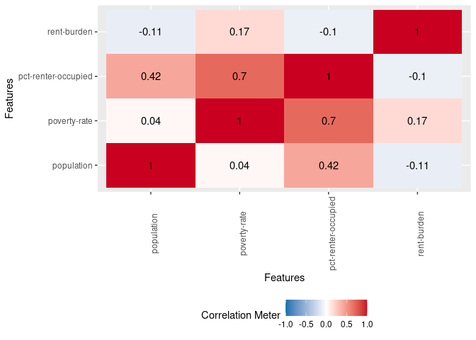
The heatmap shades things dark red the closer we get to a perfect positive correlation (r=1) and dark blue the closer we get to a perfect negative correlation (r=-1). It also includes the Pearson linear correlation coefficient between a variable pair in the respective box.
In our heatmap, for example, the correlation coefficient between rent burden and poverty rate is 0.17 (top row, second column). This is a weak correlation that suggests that as the rent burden goes up, so does poverty rate (and vice versa). You’ll notice that the diagonal is all red; that’s because it represents a variable’s correlation with itself (which is always 1). The values above the diagonal will mirror those below it, so you need only look at one half of the heatmap.
However, a quick glance shows me one potentially interesting relationship: A strong correlation between poverty rate (poverty-rate) and the percentage of occupied housing units that are renter-occupied (pct-renter-occupied).
This tells us that counties with a higher poverty rate tend to have a greater proportion of renters. Thus, they may be more impacted by the issue/prospect of evictions. (There is also a moderate correlation between population size and the percentage of occupied housing units that are renter-occupied.)
Generating Scatter Plots
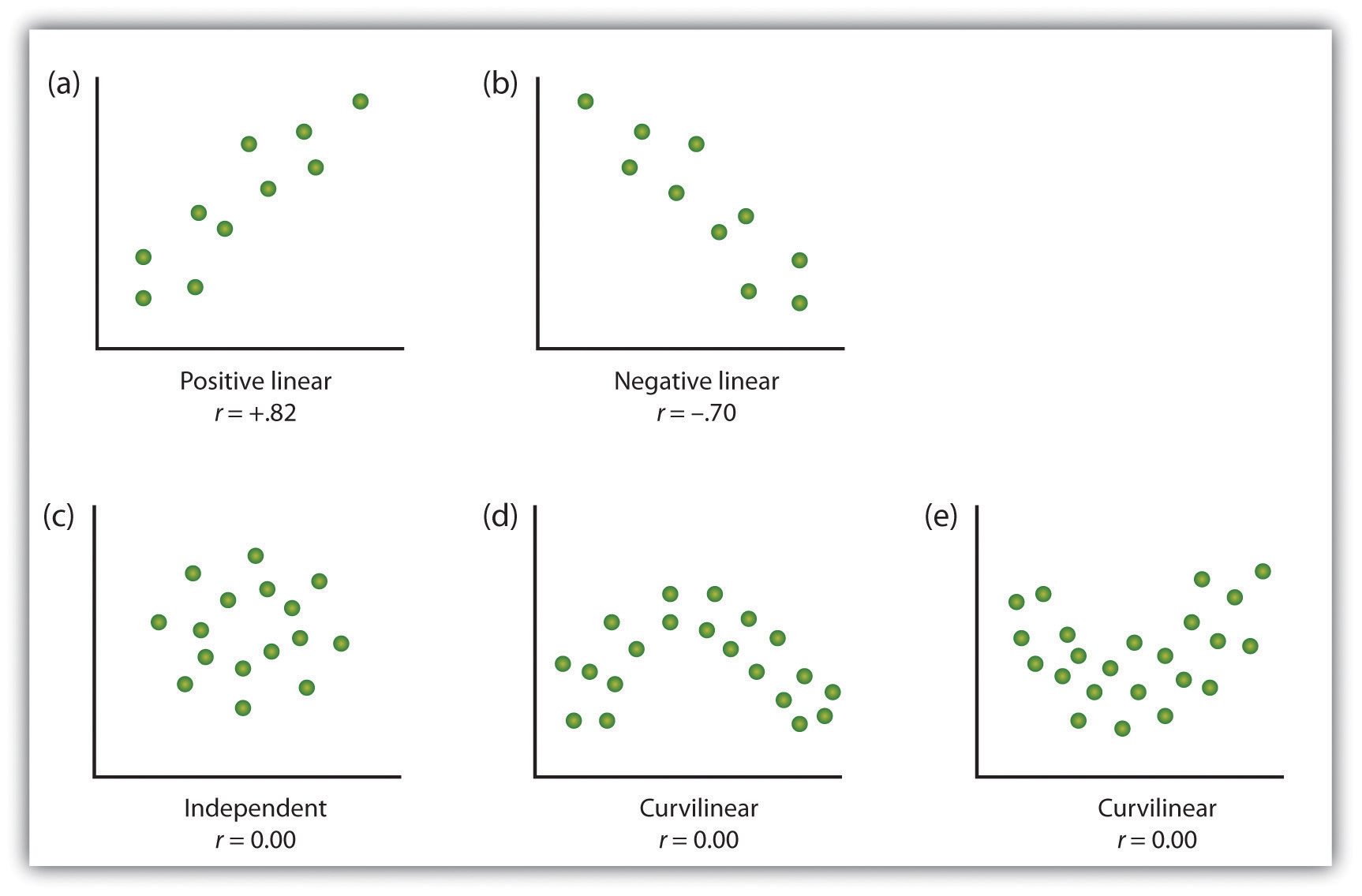
While the correlation heatmap can be very useful, do recall that it only calculates linear correlations.
DataExplorer also helps us visualize scatter plots, which are good for showing the relationship between two continuous variables (e.g., ratio or interval data)—and allow us to spot non-linear relationships (for example, see this diagram where a clear relationship exists (d and e) yet the coefficient is 0).
To do that, you can use the plot_scatterplot() function to produce multiple scatterplots showing the relationship between one variable and several others.
Like DataExplorer::plot_histogram(), you must supply a data frame as an argument—which we can leave blank if we’re piping the information. However, you also need to supply a variable for the Y (vertical) axis, against which all the other variables are fixed (plotted), using the by= argument. (Do note that DataExplorer expects the by variable to be introduced as a string rather than an object/vector. That’s just one of its conventions, which is different from the conventions in the tidyverse packages we’ve been using.)
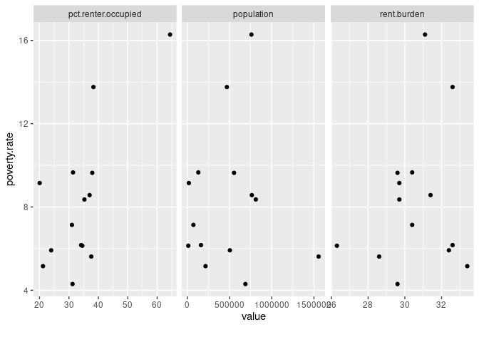
For example, let’s say we want to see the relationship between population and three other variables (poverty-rate, pct-renter-occupied, and rent-burden) across all our states in the year 2016.
Here’s what I’d need to do:
-
Call the data from my data frame.
-
Apply a filter to cover just the desired year.
-
Select only the four variables we’re interested in examining.
-
Use the
plot_scatterplot()function and fix it to thepopulationvariable.
Here’s how we might translate that logic into code:
ma_counties %>%
  filter(year==2016) %>%
  select(population, `poverty-rate`, `pct-renter-occupied`, `rent-burden`) %>%
  plot_scatterplot(by="population")
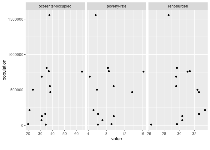
The resulting scatter plot offers no evidence of a curvilinear relationship for any of the variables. Like our correlation heatmap showed, we do see some evidence that bigger population sizes tend to have higher percentages of occupied housing units that are renter-occupied.
However, this scatter plot also tells me is that there’s a big outlier in our dataset at the far end of that variable pairing (population and pct-renter-occupied). That outlier would be worth exploring. It could become the basis for a news story.
Issues with special characters
There is one big issue with the conventions used by DataExplorer vis-a-vis our dataset: it can’t handle special characters in the variable name (like a dash, which can interpreted as a minus sign).
For example, here’s what happens when we set poverty-rate as our Y variable:
ma_counties %>%
  filter(year==2016) %>%
  select(population, `poverty-rate`, `pct-renter-occupied`, `rent-burden`) %>%
  plot_scatterplot(by="poverty-rate")
## Error in FUN(X[[i]], ...): object 'poverty' not found
What’s happening is that the function is trying to do math when it shouldn’t. If we try to use the grave accent (`) mark, we get a similar problem:
ma_counties %>%
  filter(year==2016) %>%
  select(population, `poverty-rate`, `pct-renter-occupied`, `rent-burden`) %>%
  plot_scatterplot(by="`poverty-rate`")
## Error in melt.data.table(data, id.vars = by, variable.factor = FALSE): One or more values in 'id.vars' is invalid.
The as_tibble() function
What we need to do to overcome this problem is replace the special symbols in our variable names with something simpler—like a period. Thankfully, there’s a simple way to do that.
All we have to do is recreate the data frame resulting from our select() operation by using the tible::as_tibble() function, and add the argument .name_repair="universal" to that latter function. Here’s how we would put that into action:
ma_counties %>%
  filter(year==2016) %>%
  select(population, `poverty-rate`, `pct-renter-occupied`, `rent-burden`) %>%
  as_tibble(.name_repair="universal")
## New names:
## * `poverty-rate` -> poverty.rate
## * `pct-renter-occupied` -> pct.renter.occupied
## * `rent-burden` -> rent.burden
| population | poverty.rate | pct.renter.occupied | rent.burden |
|---|---|---|---|
| 214766 | 5.16 | 21.19 | 33.4 |
| 129288 | 9.66 | 31.39 | 30.4 |
| 552763 | 9.64 | 37.93 | 29.6 |
| 17048 | 9.15 | 20.06 | 29.7 |
| 763849 | 8.57 | 37.03 | 31.4 |
| 71144 | 7.14 | 31.02 | 30.4 |
| 468041 | 13.76 | 38.33 | 32.6 |
| 160759 | 6.17 | 34.16 | 32.6 |
| 1556116 | 5.62 | 37.59 | 28.6 |
| 10556 | 6.14 | 34.54 | 26.3 |
| 687721 | 4.30 | 31.23 | 29.6 |
| 503681 | 5.92 | 23.97 | 32.4 |
| 758919 | 16.28 | 64.38 | 31.1 |
| 810935 | 8.36 | 35.27 | 29.7 |
You can see from the output and the new column names that the transformation worked.
This is an example of why you’ll want to avoid using special characters like mathematical operators in your own variable names. However, when you’re working with data from the wild, you have to deal with other peoples’ preferences and make corrections accordingly.
Do note that the transformation we applied is not persistent as we never reassigned it to an object using the <- assignment operator. That is, whenever we reference our ma_counties data frame going forward, we’ll need to reapply the transformation. (You can, of course, assign the transformation to a new object or reassign it into the existing one.)
We can now generate our scatter plots for poverty.rate thusly:
ma_counties %>%
  filter(year==2016) %>%
  select(population, `poverty-rate`, `pct-renter-occupied`, `rent-burden`) %>%
  as_tibble(.name_repair="universal") %>%
  plot_scatterplot(by="poverty.rate")
## New names:
## * `poverty-rate` -> poverty.rate
## * `pct-renter-occupied` -> pct.renter.occupied
## * `rent-burden` -> rent.burden
Generating box plots
You can similarly produce a series of box plots using the DataExplorer::plot_boxplot() function.
As with plot_scatterplot(), it accepts as arguments (1) a data frame and (2) a Y axis variable that is fixed. Box plots are particularly useful for showing distributions by identifying the upper, middle, and lower quartiles, and highlighting the outliers.
Following our earlier model for plot_scatterplot(), here’s how we might create a series of box plots fixed to the year variable that includes the following three variables: poverty-rate, pct-renter-occupied, and rent-burden:
ma_counties %>%
  select(year, `poverty-rate`, `pct-renter-occupied`, `rent-burden`) %>%
  plot_boxplot(by="year")
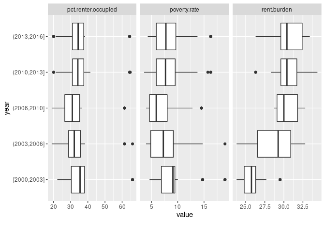
If you aren’t sure how to read a box plot, here is a handy guide.
Looking at this chart, we see that rent burdens seem to be increasing over time. In fact, the most extreme case in the first grouping (between 2000 and 2003) is below the median (thick black vertical line inside the box) in the most recent year grouping.
However, recall that we are missing a good chunk of data in this dataset, especially in earlier years (there are more missing values in our earlier years than the later ones). Thus, we’d want to probe deeper if we were to include that insight in our reporting. We’d probably want to drill down into specific years (rather than year groupings) and be more selective about which counties to include.
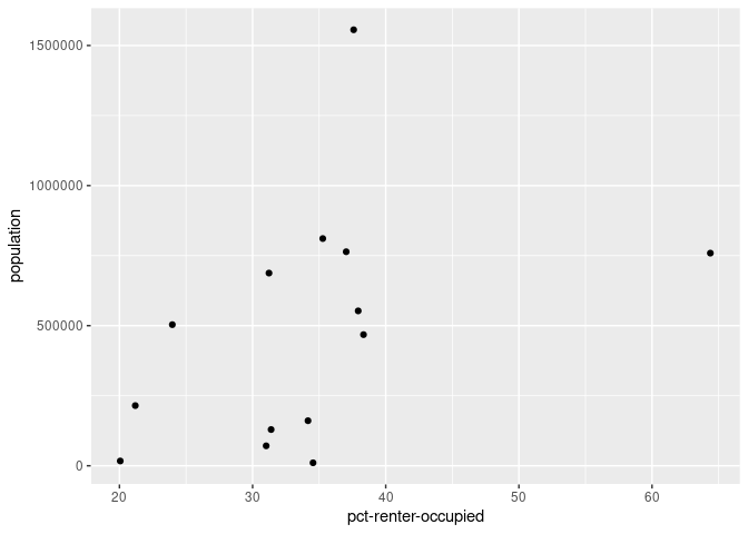
Creating Your Own Scatter Plot
We can also use ggplot2::ggplot() to create our own scatter plot, which we can customize a bit more.
The key function for creating a scatter plot with ggplot() is geom_point(). This will add a layer with points at the intersection of the x and y axes.
For example, here’s how we might recreate one of our earlier scatter plots, which placed population on the Y axis and pct-renter-occupied on the X axis for observations from the year 2016:
ma_counties %>%
  filter(year==2016) %>%
  ggplot(aes(x=`pct-renter-occupied`, y=population)) +
    geom_point()
Adding Interactivity
That outlier on the X axis (pct-renter-occupied) is still bugging me, and I’d love to quickly see what it is.
Well, we can always add interactivity to our plots by using the plotly::ggplotly() function:
library(plotly)
##
## Attaching package: 'plotly'

## The following object is masked from 'package:ggplot2':
##
##     last_plot

## The following object is masked from 'package:stats':
##
##     filter

## The following object is masked from 'package:graphics':
##
##     layout
g <- ma_counties %>%
  filter(year==2016) %>%
  ggplot(aes(x=`pct-renter-occupied`, y=population, county=name)) +
  geom_point()
ggplotly(g)
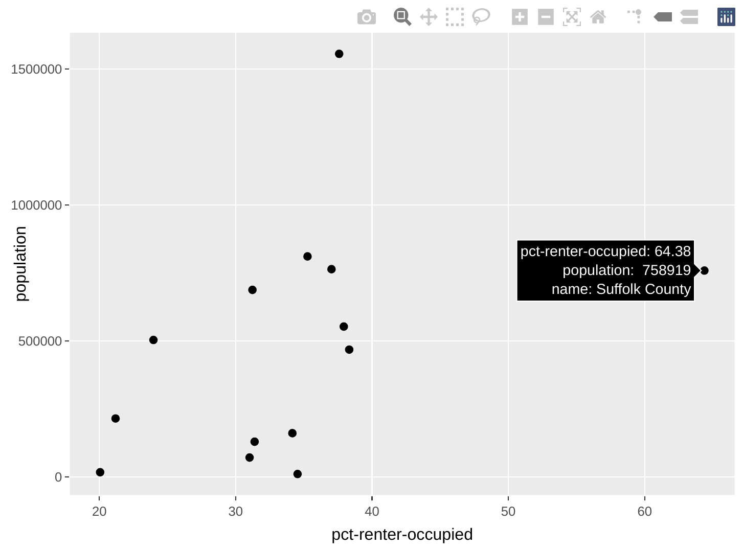
I created that custom county aesthetic that maps to the name variable in order to give us additional tooltip information. That’s what allows me to see the county’s name when I hover over the points.
Now we can quickly see that Suffolk County—which includes much of Boston—is that outlier with an exceptionally high percentage of occupied housing units that are renter-occupied.
Adding More Aesthetics
ggplot2 is a powerful package that allows us to create some highly sophisticated charts. We will be covering more of its aesthetic features later on in the book, but you can already start practicing with some of its many functions. RStudio also offers a helpful cheatsheet for some of them.
Below are just some examples of how you could take ggplot2 and plotly a little further to help make comparisons across your data. These charts are designed to show us information and are not yet of production-level quality (i.e., for publishing to a general audience). Additionally, I won’t detail the code just yet but they’re examples of what you could be doing (and will be able to do by the end of the book).
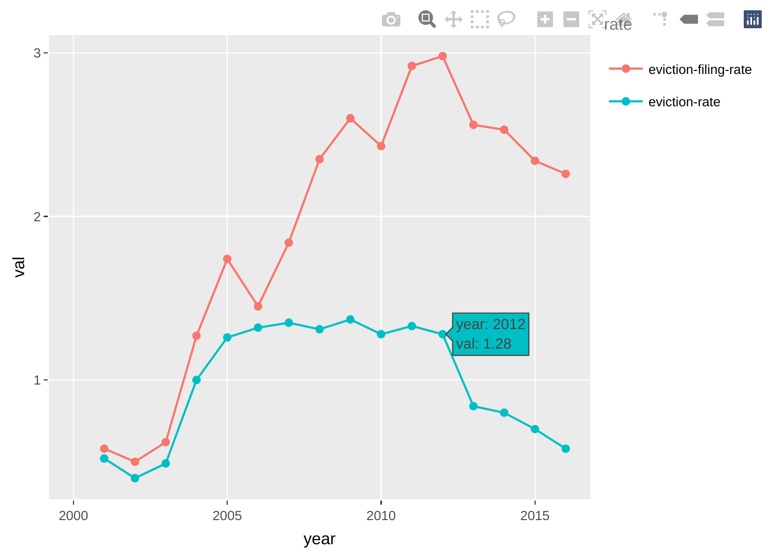
Comparing two different rates
The chart below helps compare eviction filing rates with eviction rates over time in Hampshire County.
g <- ma_counties %>%
  filter(name=="Hampshire County") %>%
  select(year, name, `eviction-filing-rate`, `eviction-rate`) %>%
  gather(key=rate, value=val, `eviction-filing-rate`, `eviction-rate`) %>%
  ggplot(aes(x=year, y=val, group=rate, color=rate)) +
    geom_point() +
    geom_line()
ggplotly(g, tooltip=c("x", "y"))
Comparing eviction rates across counties
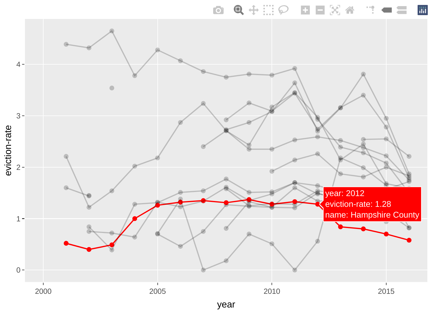
The chart below helps compare Hampshire County’s eviction rate trajectory with other counties'.
g <- ma_counties %>%
  mutate(IsHamp=factor(ifelse(name=="Hampshire County", 1, 0))) %>%
  ggplot(aes(x=year, y=`eviction-rate`, group=name, color=IsHamp, alpha=IsHamp)) +
    geom_point() +
    geom_line() +
    scale_color_manual(values=c("black", "red")) +
    scale_alpha_manual(values=c(0.2, 1)) +
    theme(legend.position = "none")
ggplotly(g, tooltip=c("group", "x", "y"))