Correlation, Causation, and Change
Introduction
Data journalists often have to assess shifts in quantities and the relationship between variables in the course of their analysis. Understanding how to represent those shifts and what the correct terminology for describing relationships are is therefore important for doing good reporting.
Understanding Correlations
The term “correlation” is often used colloquially to refer to the idea that two variables are related to each other in some fashion. However, “correlation” also has a statistical meaning and it can be measured statistically.
In a statistical sense, the term “correlation” refers to the extent to which two variables are dependent on each other. So, when we talk about two variables being correlated, what we are saying is that a change in X coincides with a change in Y because of that dependence.
Much of the time, correlations are measured through the linear relationship between variables and are described by Pearson’s Product-Moment Correlation Coefficient, which is typically denoted by an italicized, lowercase r. This statistic is calculated by using data from continuous variables (e.g., interval or ratio values), such as the relationship among basketball players between the variable for height (i.e., number of inches) and the variable for number of blocks.
However, it is possible to assess nonlinear relationships or a rank-order relationship that assesses ordinal data using other statistical tests. (For example, I could measure the correlation between that same height variable and a yes/no variable for whether the player made All-NBA team.)
As such, it is important to understand that “correlation” actually refers to a fairly complex statistic.
Features of Correlations
There are two key features of correlations that data journalists should be aware of: the strength of the correlation and the type of correlation.
You can get a sense of these two features by looking at a scatter plot, where the X axis represents one variable and the Y axis represents a second variable. The data points on that scatter plot represent the respective values of the two variables for each observation in the dataset.
Strength of Correlation
The strength of the correlation refers to how closely dependent two variables are.
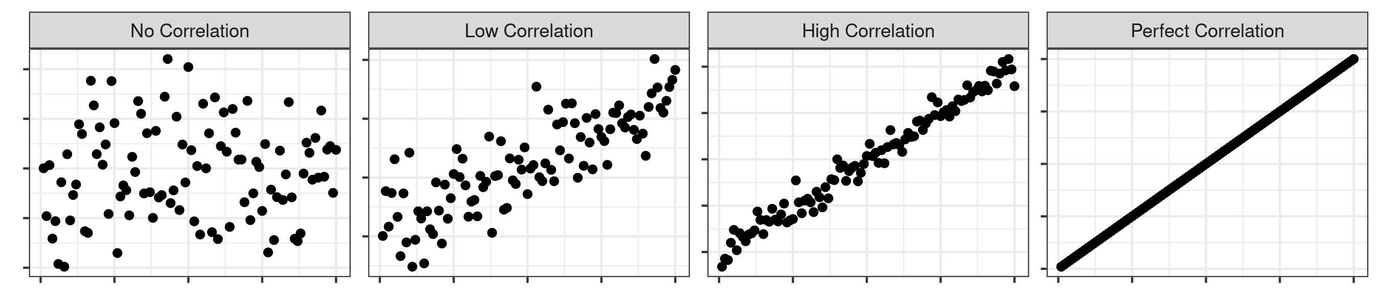
You can have no correlation when there is no dependence between two variables. This means that a change in X does not result in a corresponding change in Y. In this example, the Pearson r would be 0.
On the other end, you can have perfect correlation when a linear equation perfectly describes the relationship between X and Y, such that all the data points would appear on a line for which Y changes as X changes. For example, a one-unit change in X (the basketball player grows by an inch) might always result in a three-unit change in Y (the basketball player has three more blocks). A perfect correlation would be represented by a Pearson r of 1 (or -1, for anticorrelation, or a perfectly negative correlation).
You can also have low correlation, medium correlation, and high correlation. The parameters for what constitutes low, medium, and high are arbitrary and dependent on the phenomenon being studied. However, a Pearson r above 0.7 is usually viewed as indicating high correlation, above 0.5 as moderate correlation, above 0.3 as having low correlation. A phenomenon with a Pearson r below 0.3 is generally seen as having no real correlation.
Type of Correlation
The type of correlation refers to whether the nature of the relationship between two variables.
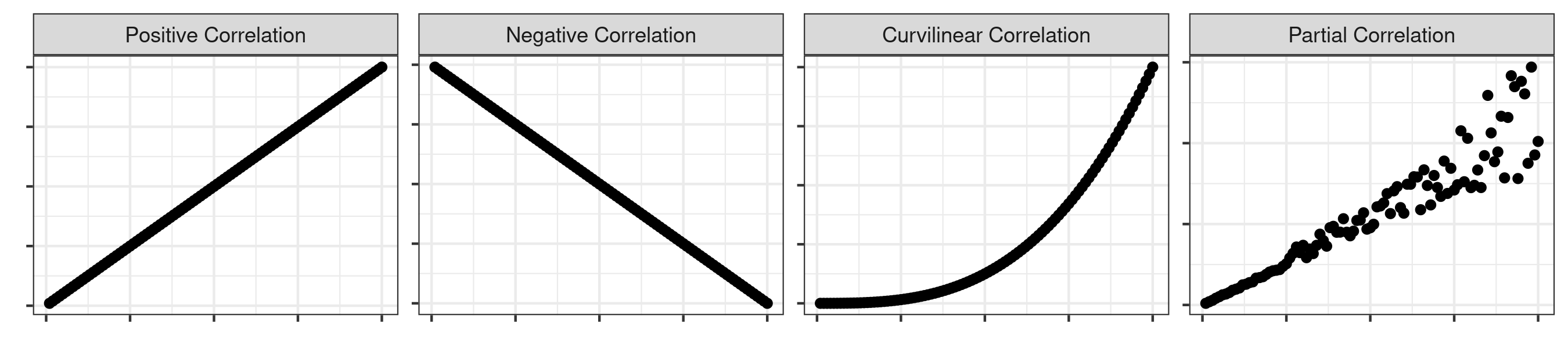
A positive correlation indicates that a positive change in X results in a positive change in Y, whereas a negative correlation indicates that a positive change in X results in a negative change in Y. Because of this, Pearson r values may range from -1 to a positive 1.
You can also have a curvilinear correlation, where the relationship is not defined by a straight line but rather through some sort of curve (e.g., an exponential relationship). Similarly, the curvilinear relationship may even oscillate between positive and negative (i.e,, positive until a certain point and then becomes negative, like a semi-circle). A Pearson correlation coefficient would not be appropriate for this sort of relationship, which is an important thing to keep in mind if you are trying to quantify the strength of the relationship.
Finally, you can have a partial correlation where there is a strong (or moderate) correlation until a certain point. Past that point, however, the relationship weakens or becomes non-existent.
Reporting Correlation Coefficients
Data journalists will rarely include a correlation statistic in their news story. That’s because the statistic will be largely meaningless for the general public, which lacks a general sense of how to interpret it.
Instead, the journalist will usually use the language of “strong” or “clear” “relationship” between variables, or perhaps even a “modest” one. They may even note that “there is no clear relationship” between two variables, even if there is a small statistical relationship. (Note the use of “relationship” instead of “correlation” to not raise any formal statistical expectations.) Thus, when it comes to ascertaining the strength and type of relationships between variables, the journalist will often put on their sense-making hat and simply describe the take-away message.
Because of this, it is often more helpful to turn to a scatter plot (like the ones above) in order to get a visual sense of the relationship between the variables. Not only can that help you get a better sense of the data but it will allow you to spot potential relationships that might be missed by simple, linear correlation tests.
Correlation and Causation
It is also crucial that data journalists remember to popular idiom that “correlation does not imply causation.”
A causal inference would suggest that a change in X is responsible for a change in Y. However, it is not possible to make that statement from a simple correlation test or visual examination of a scatter plot.
For example, there is a very strong correlation between U.S. spending on Science, Space and Technology and the number of suicides by hanging, strangulation and suffocation.
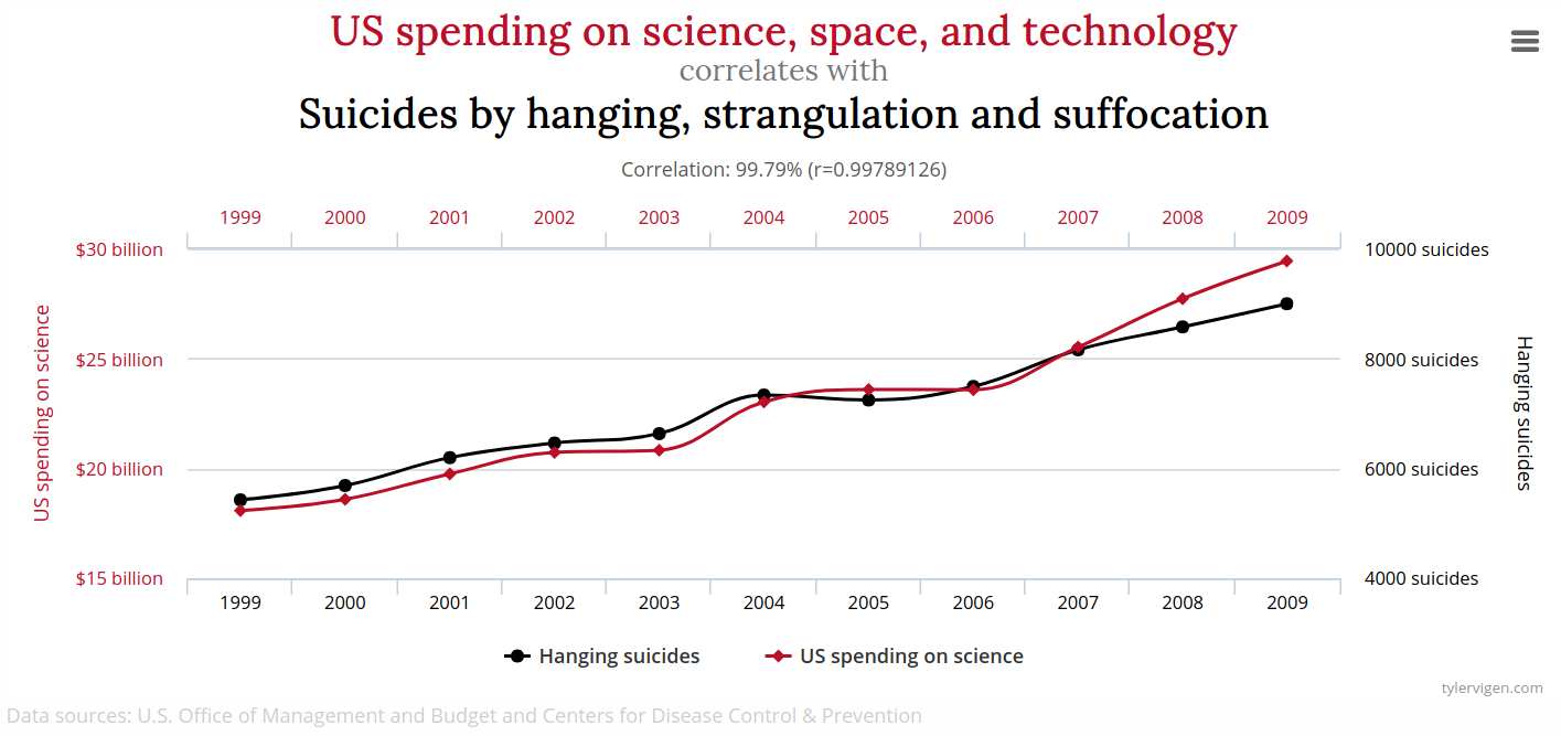
A causal interpretation might be that spending on STEM is responsible for suicides — so we should stop investing in STEM! However, there is no reason to believe that is the case. Instead, this is most likely a spurious correlation, meaning that while there is a strong mathematical association between the variables, the reason for the relationship is either random or due to a confounding factor (a third, unseen variable that is actually responsible for the causal change).
Additionally, even if there is a causal relationship, a correlation does not tell us which variable is the causal variable (the one driving the change). For that, we need to pair statistics with reasoning. For example, in our earlier example, it is highly unlikely that the number of blocks a player has is driving the change in height. Instead, it is more probable that it is the change in height that is driving the change in the number of blocks they have.
You shouldn’t just dismiss correlations, though. Even though they don’t directly allow for causal inferences, they often give good reason to explore a relationship further. This is where good human sourcing can come in and fill in the gaps.
In general, researchers tend to use more advanced statistical modeling (such as regression analysis and structural equation modeling) to identify the causal variable(s) and isolate their impacts by statistically controlling for other potentially relevant variables. Outside of specialty data journalism outlets, few data journalists tend to adopt this level of sophistication in their analyses, though. Instead, they tend to use more limited original analyses and contextualize them with findings from research studies or interviews with subject experts.
So, remember, “correlation does not imply causation.”
Describing Change
Data journalists spend a lot of time assessing and describing changes in quantities. It is thus important to understand the difference between absolute change and relative change, and to know when to use each.
Absolute Change
Absolute change refers to the presentation of the change between two values by using the same scale.
For example, the statement that “there were 211 assaults in 2021, or 15 fewer than in 2020,” would refer to change in an absolute sense.
The same is true for the statements, “in-state tuition and fees at UMass increased from $16,389 in 2019-2020 to $16,439 in 2020-2021” and “alpaca attacks increased from one in 2020 to three in 2021.”
Relative Change
Relative change refers to the presentation of the change between two values by making it relative to the original size, often through the use of a percentage.
For example, the statement that “there were 211 assaults in 2021, a 7.1 percent decrease from 2020,” would refer to change in a relative sense.
The same is true for the statements, “in-state tuition and fees at UMass increased by 1.3 percent from 2019-2020 to 2020-2021” and “alpaca attacks increased by 200 percent in 2015.”
How to Describe Change
Neither of these presentation modes is inherently better and so there is no “right” choice that covers all situations. Instead, it is important to recognize that the way numbers are presented can have a significant effect on how people react to and interpret information.
For example, if I report the absolute change in alpaca attacks (increased by 2 attacks per year), it might not seem like a big deal. However, if I choose to report the relative change (an increase of 200 percent), then it sounds like we might have an alpacalypse on your hands.
This is an example of how statistics can be used to “lie,” in this case by taking a small change to a low base value and making it seem like a HUGE relative change.
The choice of which presentation mode to use thus comes down to understanding the context. In this case, even a 200% increase still makes an alpaca attack quite rare, so it makes the most sense to focus on the absolute change. However, for huge figures (like change in federal government spending), a relative change is typically more informative.
It is not uncommon for journalists to blend the two by reporting the percent increase from (or to) an absolute value. For example, a data journalist may write that “tuition and fees at UMass totaled $16,439 this academic year, marking a 1.3 percent increase from the previous year.”
In short, keep in mind as you analyze relationships and change that there are particular terms that have statistical meaning (that may come with expectations of formal statistical tests) and that the way in which you choose to present information can have an important impact on how people come to interpret it.