One Dataset, Many Charts
Introduction
There are many ways to visualize a single dataset.
To illustrate this, we will be using a simple dataset covering the total value of player transfers for the Arsenal football (soccer) team between the 2000-01 season and the 2020-21 season. The dataset contains three variables: season (the year the season began), transfers_in (the total value, in millions of British Pounds, of the players purchased by the club), and transfers_out (the total value of the players sold, also in millions). These data were compiled from the Arsenal page on TransferMarkt.
This is what the dataset looks like:
| season | transfers_in | transfers_out |
|---|---|---|
| 2000 | 56.3 | 60.73 |
| 2001 | 32.69 | 12 |
| 2002 | 12.83 | 8.22 |
| 2003 | 30.62 | 1.05 |
| 2004 | 12.48 | 3.9 |
| 2005 | 46 | 25 |
| 2006 | 15 | 12.93 |
| 2007 | 30.95 | 56.73 |
| 2008 | 40.15 | 25.8 |
| 2009 | 12 | 47.7 |
| 2010 | 23 | 8.1 |
| 2011 | 65.48 | 78.29 |
| 2012 | 56 | 65.85 |
| 2013 | 49.25 | 12.15 |
| 2014 | 118.98 | 27.8 |
| 2015 | 26.5 | 2.5 |
| 2016 | 113.04 | 10.35 |
| 2017 | 152.85 | 158 |
| 2018 | 80.15 | 7.9 |
| 2019 | 160.4 | 53.65 |
| 2020 | 85 | 18.65 |
Our goal for this dataset is to show our audience whether Arsenal have generally made a profit or a loss on their transfers in recent years.
While a table like this (with more descriptive headings) might be a helpful way of showing the data — especially if the audience cares deeply about precision — a data visualization would likely do a better job of conveying all of this information in a simple way.
Using a Bar Chart
We can start with a basic bar chart that allows us to show both the player purchases and the player sales in a side-by-side manner.
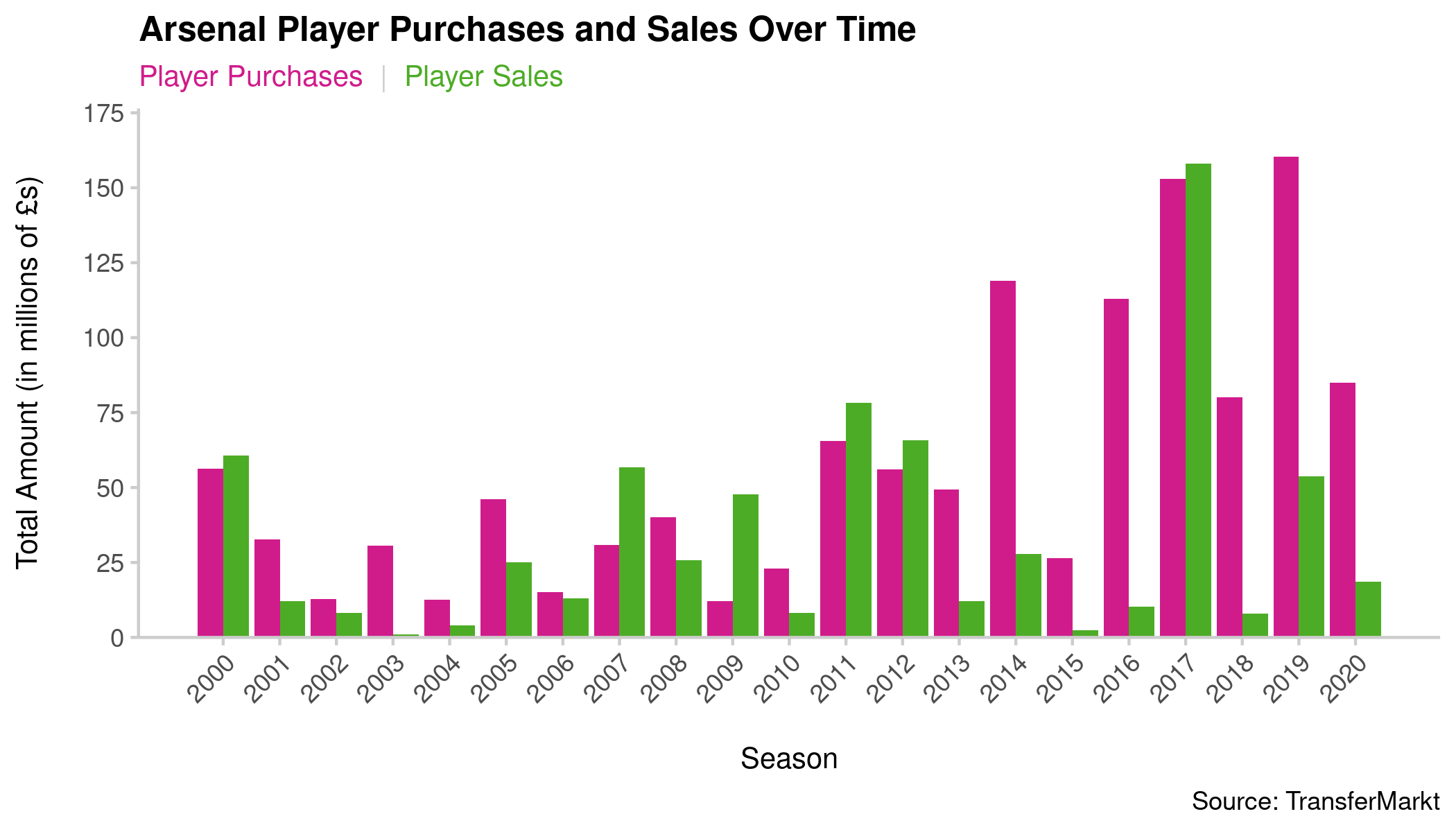
This chart allows me to quickly see the information from both variables for each season. I can use the color red to convey player purchases (since it costs money) and the color green to convey player sales (since it generates money) — though I will want variations of those colors that are accessible to individuals who have red-green color blindness. I can also link the colors in the subheading in order to avoid a clunky (and space-consuming) guide. I have clearly labeled axes — I probably don’t need one for that X axis, though — and a title that describes the information in the chart.
However, I don’t particularly like this chart because it has too much information. I expect my viewer would feel overwhelmed by all of the bars and really lose the forest for the trees. Thus, I think I need a variation of the chart that helps me simplify things.
Cleveland Dot Plot
Next, I want to try a Cleveland dot plot. This way, I can still show both the player purchases and the player sales in a side-by-side manner, and use the distance between dots to illustrate the magnitude difference.
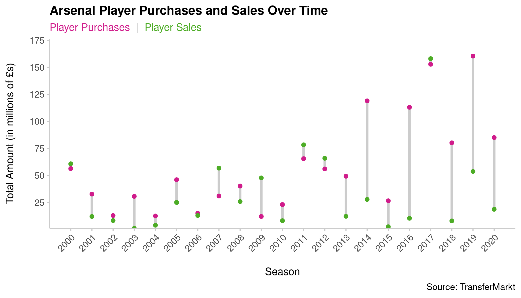
I kept many of the good things about the previous chart: There is a clear and descriptive title, a link between the color of the text in the subheading and the dots, and clear labeling.
However, the main draw for me is that it also reduces the visual clutter coming from all those tall bars in the previous chart. Now, I can more clearly see the transfer activity (and broader changes in spending patterns) over time.
It still seems like I can improve things, though. In particular, it’s a bit hard for me to match up the points from one season to the next to get a clear sense of trends in purchases and expenditures. I can do it, but it requires a bit more cognitive work on my part.
Line Chart
Next, I want to try a typical line chart. These are quite common for showing change over time, and for good reason: The lines help guide us from one point to the next, making it easier to see trajectories. Additionally, the popularity of this chart type makes it such that general audiences can be expected to be familiar with them.
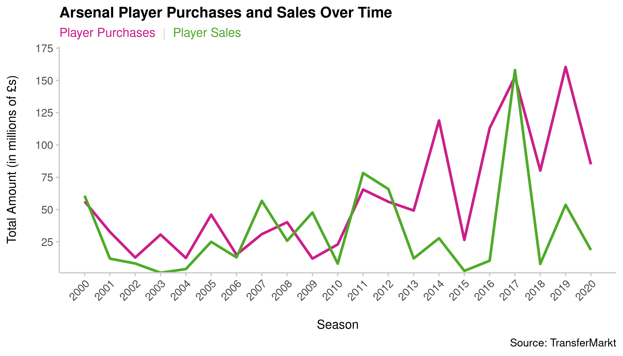
This side-by-side approach makes it easier for me to see those general trends I was talking about. Overall, the expenditures associated with player transfers have increased considerably over time, and the player sales have generally failed to keep up (with the exception of the 2017-18 season).
So far, this is the chart I like best. I can envision myself making a few more tweaks to it by adding some annotations.
However, before I start thinking any more about that, I want to recall the original purpose of this visualization: to show whether Arsenal have made a profit or a loss on player transfers over time. While I think I have the right chart type here and am certainly providing all of the information necessary to determine that, I think I can still reduce the cognitive work my viewer has to perform to answer that question.
Same Chart, Different Information
I can keep my chart type (a line graph) but modify what I am showing with it. Specifically, I can calculate the difference between player purchases and sales to determine whether Arsenal made a profit or a loss on any given year.
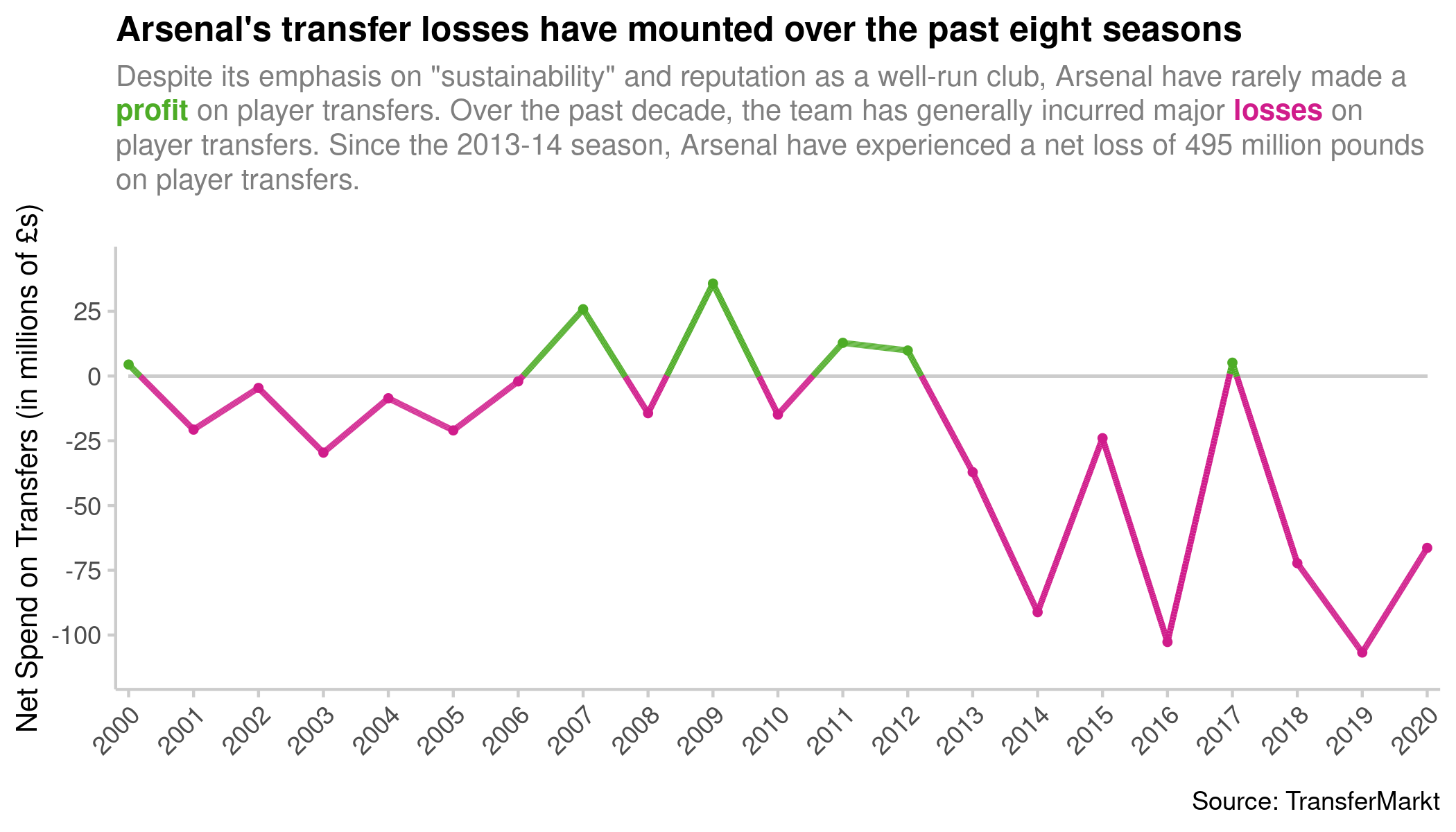
This helps me drive home the point by showing exactly in which years Arsenal made a profit, and in which years they made a loss — while also illustrating the magnitude of the profit or loss.
Given that I am telling a story here — not just providing data for the viewer to explore — I’ve changed my title to emphasize the take-home point: Arsenal’s losses on player transfers are mounting up. I’ve also added a descriptive subheading that tells a story: Arsenal have a particular image that isn’t corroborated by the data. I again use color-coding to illustrate that green means a profit was made and red means the team incurred losses. However, I now add a straight line through the break-even (0) point to illustrate that anything above that point is a profit and anything below it is a loss.
I also added a data point to my subheading that is not easily discerned from the data: Arsenal had losses totaling almost half a billion pounds over the most recent eight-year stretch. This adds even more value to my visualization by helping drive home the point.
There are still a few more things I can do with this chart. First, I could add some annotations to identify seasons where a particularly expensive player was bought or sold. Second, I could layer similar net spends by Arsenal’s chief rivals to offer more context. Given that my focus is on Arsenal, I would probably introduce those other teams as semi-transparent gray lines.
Nevertheless, I think this chart does a good job of communicating my main point clearly, compellingly, and in a simple way.
The R code for creating all of the charts above is available here.