Creating Interactive Charts with Flourish
Introduction
For this tutorial, we will be looking at the cumulative amount of COVID-19 cases for different countries over time. These data come from the European Centre for Disease Prevention and Control, which aggregates data from other national sources. (They even include some R code for how to pull those data automatically so your charts can automatically update. Do note that I appended some new variables to their dataset for this tutorial, so you should use my dataset below.)
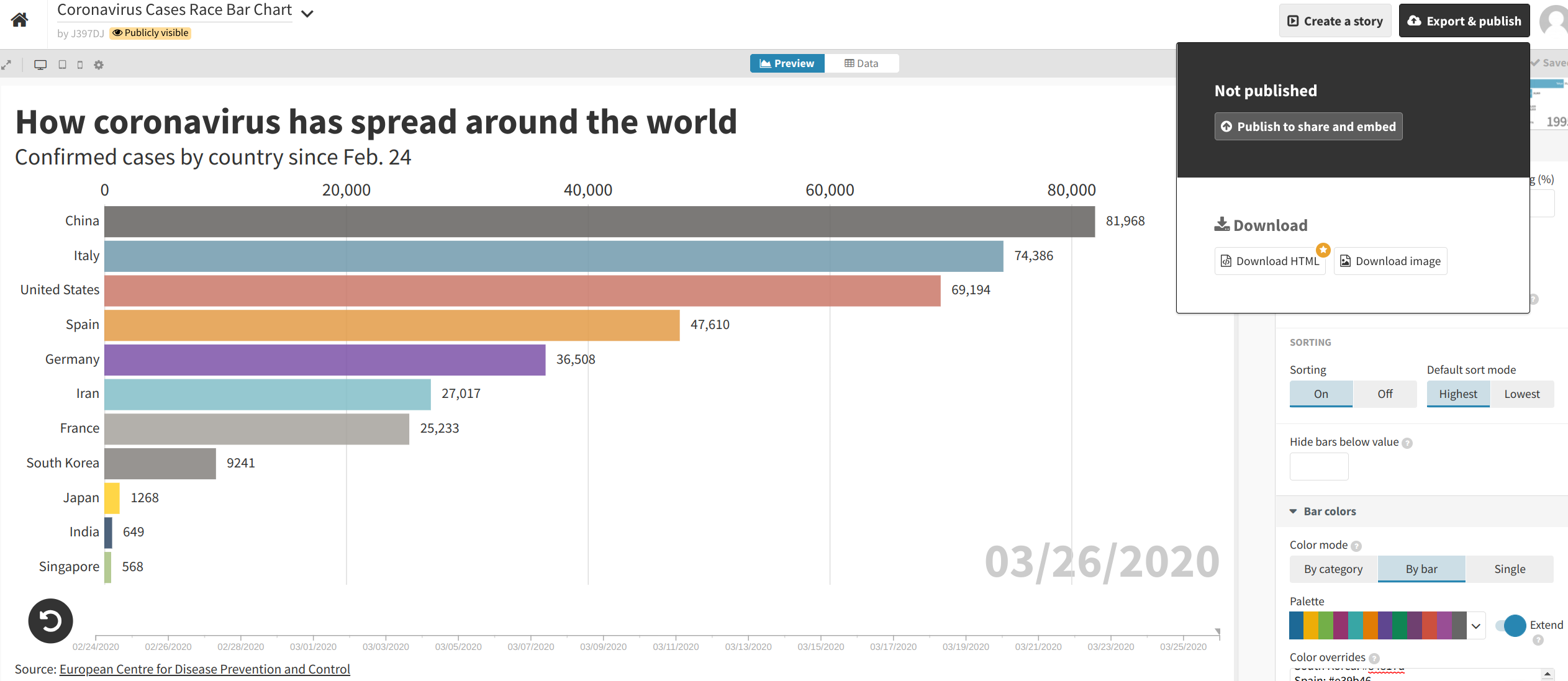
By the end of the tutorial, we will have produced an animated bar chart of COVID-19 cases for 11 countries, just like the one found on this Boston Globe story. This is what that chart looks like this:
Your browser does not support this video.
For those who cannot wait, here’s what our final product will look like.
Data Processing
To create a data visualization, we need to provide tools like Flourish with data. CSV files are universally accepted by data visualization tools. We can use R to help us create such a file.
Loading the Data
The first step, as usual, is to read in the source data. Like before, we’ll use the readr::read_csv() function to read data from this CSV file.
library(tidyverse)
## ── Attaching packages ─────────────────────────────────────── tidyverse 1.3.1 ──

## ✓ ggplot2 3.3.5     ✓ purrr   0.3.4
## ✓ tibble  3.1.3     ✓ dplyr   1.0.7
## ✓ tidyr   1.1.3     ✓ stringr 1.4.0
## ✓ readr   2.0.1     ✓ forcats 0.5.1

## ── Conflicts ────────────────────────────────────────── tidyverse_conflicts() ──
## x dplyr::filter()     masks stats::filter()
## x dplyr::group_rows() masks kableExtra::group_rows()
## x dplyr::lag()        masks stats::lag()
corona_cases <- read_csv("https://dds.rodrigozamith.com/files/covid19_cases_by_country_20200326.csv")
## Rows: 6931 Columns: 13

## ── Column specification ────────────────────────────────────────────────────────
## Delimiter: ","
## chr  (3): countriesAndTerritories, geoId, countryCode
## dbl  (9): day, month, year, cases, deaths, popData2018, cumulativeCases, cum...
## date (1): dateRep

##
## ℹ Use `spec()` to retrieve the full column specification for this data.
## ℹ Specify the column types or set `show_col_types = FALSE` to quiet this message.
Here’s a sample of the data:
corona_cases %>%
  head(10)
| dateRep | day | month | year | cases | deaths | countriesAndTerritories | geoId | countryCode | popData2018 | cumulativeCases | cumulativeDeaths | daysSince100 |
|---|---|---|---|---|---|---|---|---|---|---|---|---|
| 2019-12-31 | 31 | 12 | 2019 | 0 | 0 | Afghanistan | AF | AFG | 37172386 | 0 | 0 | -1 |
| 2020-01-01 | 1 | 1 | 2020 | 0 | 0 | Afghanistan | AF | AFG | 37172386 | 0 | 0 | -1 |
| 2020-01-02 | 2 | 1 | 2020 | 0 | 0 | Afghanistan | AF | AFG | 37172386 | 0 | 0 | -1 |
| 2020-01-03 | 3 | 1 | 2020 | 0 | 0 | Afghanistan | AF | AFG | 37172386 | 0 | 0 | -1 |
| 2020-01-04 | 4 | 1 | 2020 | 0 | 0 | Afghanistan | AF | AFG | 37172386 | 0 | 0 | -1 |
| 2020-01-05 | 5 | 1 | 2020 | 0 | 0 | Afghanistan | AF | AFG | 37172386 | 0 | 0 | -1 |
| 2020-01-06 | 6 | 1 | 2020 | 0 | 0 | Afghanistan | AF | AFG | 37172386 | 0 | 0 | -1 |
| 2020-01-07 | 7 | 1 | 2020 | 0 | 0 | Afghanistan | AF | AFG | 37172386 | 0 | 0 | -1 |
| 2020-01-08 | 8 | 1 | 2020 | 0 | 0 | Afghanistan | AF | AFG | 37172386 | 0 | 0 | -1 |
| 2020-01-09 | 9 | 1 | 2020 | 0 | 0 | Afghanistan | AF | AFG | 37172386 | 0 | 0 | -1 |
Getting the Data We Need
The next thing we’ll want to do is extract only the information we need for creating the chart. While it can be harmless to include additional data, it can sometimes (a) confuse the software being used to create the chart; (b) make it unwieldy to select options using those software; and (c) exceed the dataset size limitations of the software, especially if you’re on a free tier.
In our case, we only need data from the following eleven countries: China, France, Germany, India, Iran, Italy, Japan, Singapore, South Korea, Spain and the United States. We also only want data after February 24, 2020.
We can thus use a combination of the dplyr::filter() and dplyr::select() functions.
corona_cases %>%
  filter(dateRep >= "2020-02-24" & countriesAndTerritories %in% c("China", "France", "Germany", "India", "Iran", "Italy", "Japan", "Singapore", "South Korea", "Spain", "United States of America")) %>%
  select(dateRep, countriesAndTerritories, cumulativeCases)
The %in% operator allows us to search for multiple strings within a single, simple filter() statement. It basically notes that the value for the variable name must appear in the vector we specify with the c() function. If there is a match with any element on that vector, the observation is included (filtered in). If there is no match, it is excluded (filtered out).
Here’s a sampling of the result:
| dateRep | countriesAndTerritories | cumulativeCases |
|---|---|---|
| 2020-02-24 | China | 77234 |
| 2020-02-25 | China | 77749 |
| 2020-02-26 | China | 78159 |
| 2020-02-27 | China | 78598 |
| 2020-02-28 | China | 78927 |
| 2020-02-29 | China | 79355 |
Cleaning Up the Data
A lot of the web-based tools have very limited functionality for cleaning up the data, so it is best to do that within R.
Here, I see two changes we need to make. First, we’ll want to abbreviate “United States of America” and then change our date format (using the lubridate package) to something that is easier for others to read. In both cases, we’ll use the mutate() function to change our variables.
First, let’s load the lubridate package.
library(lubridate)
##
## Attaching package: 'lubridate'

## The following objects are masked from 'package:base':
##
##     date, intersect, setdiff, union
Make sure you have installed the lubridate package before loading it, or R will give you an error.
Then, let’s add the two mutate statements to our piped operation. (I am performing this as two separate operations for demonstrative purposes.)
corona_cases %>%
  filter(dateRep >= "2020-02-24" & countriesAndTerritories %in% c("China", "France", "Germany", "India", "Iran", "Italy", "Japan", "Singapore", "South Korea", "Spain", "United States of America")) %>%
  select(dateRep, countriesAndTerritories, cumulativeCases) %>%
  mutate(countriesAndTerritories=recode(countriesAndTerritories, "United States of America"="United States")) %>%
  mutate(dateRep=format(dateRep, format="%m/%d/%Y")) %>%
We are using the recode() function to shorten the country name for the United States, which will make our visualization look nicer. We use the format() function to change the way the date is presented to fit our cultural context, with %m being month, %d being day, and %Y being the year.
Here’s what our dataset now looks like. Notice the change in the date. (We would only see the change in the "United States" label by looking further down in the dataset.)
| dateRep | countriesAndTerritories | cumulativeCases |
|---|---|---|
| 02/24/2020 | China | 77234 |
| 02/25/2020 | China | 77749 |
| 02/26/2020 | China | 78159 |
| 02/27/2020 | China | 78598 |
| 02/28/2020 | China | 78927 |
| 02/29/2020 | China | 79355 |
Going from Long to Wide
Unlike ggplot, Flourish likes the data to be uploaded in wide format.
That is, each bar should be a separate row in the data, and each column represents a different data point for that bar. You’ll find that different tools have different expectations, which may require you to reshape your data to fit those expectations. It’s frustrating but, thankfully, easily solved with R.
We can quickly reshape our data with the dplyr::pivot_wider() function like so:
corona_cases %>%
  filter(dateRep >= "2020-02-24" & countriesAndTerritories %in% c("China", "France", "Germany", "India", "Iran", "Italy", "Japan", "Singapore", "South Korea", "Spain", "United States of America")) %>%
  select(dateRep, countriesAndTerritories, cumulativeCases) %>%
  mutate(countriesAndTerritories=recode(countriesAndTerritories, "United States of America"="United States")) %>%
  mutate(dateRep=format(dateRep, format="%m/%d/%Y")) %>%
  pivot_wider(id_col=countriesAndTerritories, names_from=dateRep, values_from=cumulativeCases)
What we’re doing with the pivot_wider() function is telling R to use the countriesAndTerritories variable to identify unique observations in our dataset (each year becomes a separate row), create variables (columns) based on the unique values in the dateRep variable, and populate the new cell values with the associated values stored in the cumulativeCases variable. Contrast this table with the one you saw above.
Here’s a sampling of our new data frame:
| countriesAndTerritories | 02/24/2020 | 02/25/2020 | 02/26/2020 | 02/27/2020 | 02/28/2020 | 02/29/2020 | 03/01/2020 | 03/02/2020 | 03/03/2020 | 03/04/2020 | 03/05/2020 | 03/06/2020 | 03/07/2020 | 03/08/2020 | 03/09/2020 | 03/10/2020 | 03/11/2020 | 03/12/2020 | 03/13/2020 | 03/14/2020 | 03/15/2020 | 03/16/2020 | 03/17/2020 | 03/18/2020 | 03/19/2020 | 03/20/2020 | 03/21/2020 | 03/22/2020 | 03/23/2020 | 03/24/2020 | 03/25/2020 | 03/26/2020 |
|---|---|---|---|---|---|---|---|---|---|---|---|---|---|---|---|---|---|---|---|---|---|---|---|---|---|---|---|---|---|---|---|---|
| China | 77234 | 77749 | 78159 | 78598 | 78927 | 79355 | 79929 | 80134 | 80261 | 80380 | 80497 | 80667 | 80768 | 80814 | 80859 | 80879 | 80908 | 80932 | 80954 | 80973 | 80995 | 81020 | 81130 | 81163 | 81238 | 81337 | 81416 | 81499 | 81649 | 81748 | 81847 | 81968 |
| France | 12 | 12 | 14 | 17 | 38 | 57 | 100 | 130 | 178 | 212 | 285 | 423 | 613 | 716 | 1126 | 1412 | 1784 | 2281 | 2876 | 3661 | 4499 | 5423 | 6633 | 7730 | 9134 | 10995 | 12612 | 14459 | 16018 | 19856 | 22302 | 25233 |
| Germany | 15 | 15 | 17 | 21 | 47 | 57 | 111 | 129 | 157 | 196 | 262 | 400 | 684 | 847 | 902 | 1139 | 1296 | 1567 | 2369 | 3062 | 3795 | 4838 | 6012 | 7156 | 8198 | 14138 | 18187 | 21463 | 24774 | 29212 | 31554 | 36508 |
| India | 3 | 3 | 3 | 3 | 3 | 3 | 3 | 3 | 5 | 6 | 28 | 29 | 31 | 34 | NA | 44 | 50 | 73 | 75 | 83 | 90 | 93 | 125 | 137 | 165 | 191 | 231 | 320 | 439 | 492 | 562 | 649 |
| Iran | 43 | 61 | 95 | 139 | 245 | 388 | 593 | 978 | 1501 | 2336 | 2922 | 3513 | 4747 | 5823 | 6566 | 7161 | 8042 | 9000 | 10075 | 11364 | 12729 | 13938 | 14991 | 16169 | 17361 | 18407 | 19644 | 20610 | 21638 | 23049 | 24811 | 27017 |
| Italy | 132 | 229 | 322 | 400 | 650 | 888 | 1128 | 1689 | 1835 | 2502 | 3089 | 3858 | 4636 | 5883 | 7375 | 9172 | 10149 | 12462 | 15113 | 17660 | 17750 | 23980 | 27980 | 31506 | 35713 | 41035 | 47021 | 53578 | 59138 | 63927 | 69176 | 74386 |
| Japan | 144 | 144 | 164 | 186 | 210 | 230 | 239 | 254 | 254 | 268 | 317 | 349 | 408 | 455 | 488 | 514 | 568 | 619 | 675 | 737 | 780 | 814 | 824 | 829 | 873 | 950 | 1007 | 1046 | 1089 | 1128 | 1193 | 1268 |
| Singapore | 89 | 90 | 91 | 93 | 96 | 98 | 102 | 106 | 108 | 110 | 112 | 117 | 130 | 138 | 150 | 160 | 166 | 178 | 187 | 200 | 214 | 226 | 243 | 266 | 313 | 345 | 385 | 432 | 455 | 509 | 558 | 568 |
| South Korea | 762 | 892 | 1146 | 1595 | 2022 | 2931 | 3526 | 4212 | 4812 | 5328 | 5766 | 6284 | 6767 | 7134 | 7382 | 7513 | 7755 | 7869 | 7979 | 8086 | 8162 | 8236 | 8320 | 8413 | 8565 | 8652 | 8799 | 8897 | 8961 | 9037 | 9137 | 9241 |
| Spain | 2 | 3 | 7 | 12 | 25 | 34 | 66 | 83 | 114 | 151 | 200 | 261 | 374 | 430 | 589 | 1204 | 1639 | 2140 | 3004 | 4231 | 5753 | 7753 | 9191 | 11178 | 13716 | 17147 | 19980 | 24926 | 28572 | 33089 | 39673 | 47610 |
| United States | 35 | 53 | 53 | 59 | 60 | 66 | 69 | 89 | 103 | 125 | 159 | 233 | 338 | 433 | 554 | 754 | 1025 | 1312 | 1663 | 2174 | 2951 | 3774 | 4661 | 6427 | 9415 | 14250 | 19624 | 26747 | 35206 | 46442 | 55231 | 69194 |
Producing a CSV File
If we want to get our data out of R, we’ll need to export it. The readr package (part of tidyverse) makes it easy for us to produce a properly formatted CSV file with its write_csv() function.
That function requires us to provide it just two arguments: the object (data frame) we’d like to export and the filename of the CSV file.
The CSV file will be saved in your working directory, unless you specify a different path.
corona_cases %>%
  filter(dateRep >= "2020-02-24" & countriesAndTerritories %in% c("China", "France", "Germany", "India", "Iran", "Italy", "Japan", "Singapore", "South Korea", "Spain", "United States of America")) %>%
  select(dateRep, countriesAndTerritories, cumulativeCases) %>%
  mutate(countriesAndTerritories=recode(countriesAndTerritories, "United States of America"="United States")) %>%
  mutate(dateRep=format(dateRep, format="%m/%d/%Y")) %>%
  pivot_wider(id_col=countriesAndTerritories, names_from=dateRep, values_from=cumulativeCases) %>%
  write_csv("covid_19_plot_data.csv")
Because we’re piping the information, the first argument (the data frame) is already filled in for us. Thus, we only need to specify the filename for where to save the data.
Our Final CSV File
You can download a copy of the CSV file we will be using below by clicking here.
Creating an Interactive Plot Online
A powerful tool for creating interactive data visualizations is Flourish. Flourish allows you to create a range of different charts and specify a lot of options—more than many of its competitors. Large newsrooms like The Boston Globe routinely make use of Flourish when creating data visualizations.
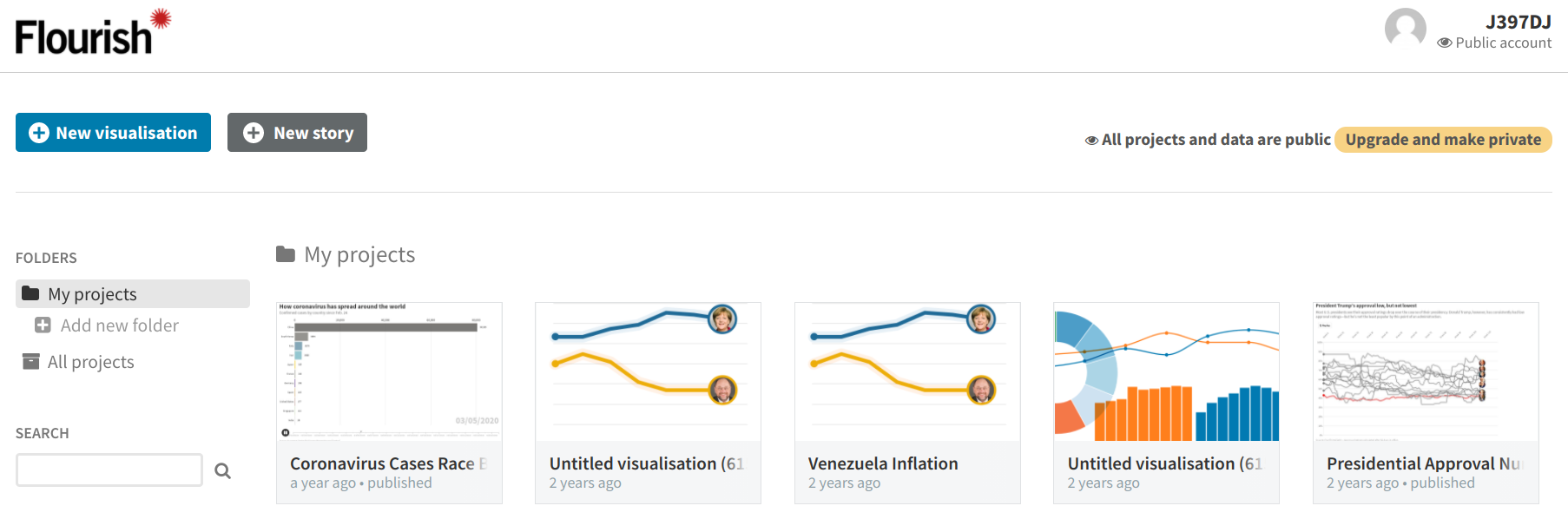
The first step is to create an account with Flourish. As is the case with many online visualization tools, Flourish provides you with a limited free tier and more feature-loaded paid tiers. The free tier will be good enough for our purposes.
After you create your account, you should be presented with a dashboard that looks like this:
Click on the “New visualization” button to create a new chart. Then, since we want to create an animated line chart, select the “Simple” chart under the “Bar chart race” section.
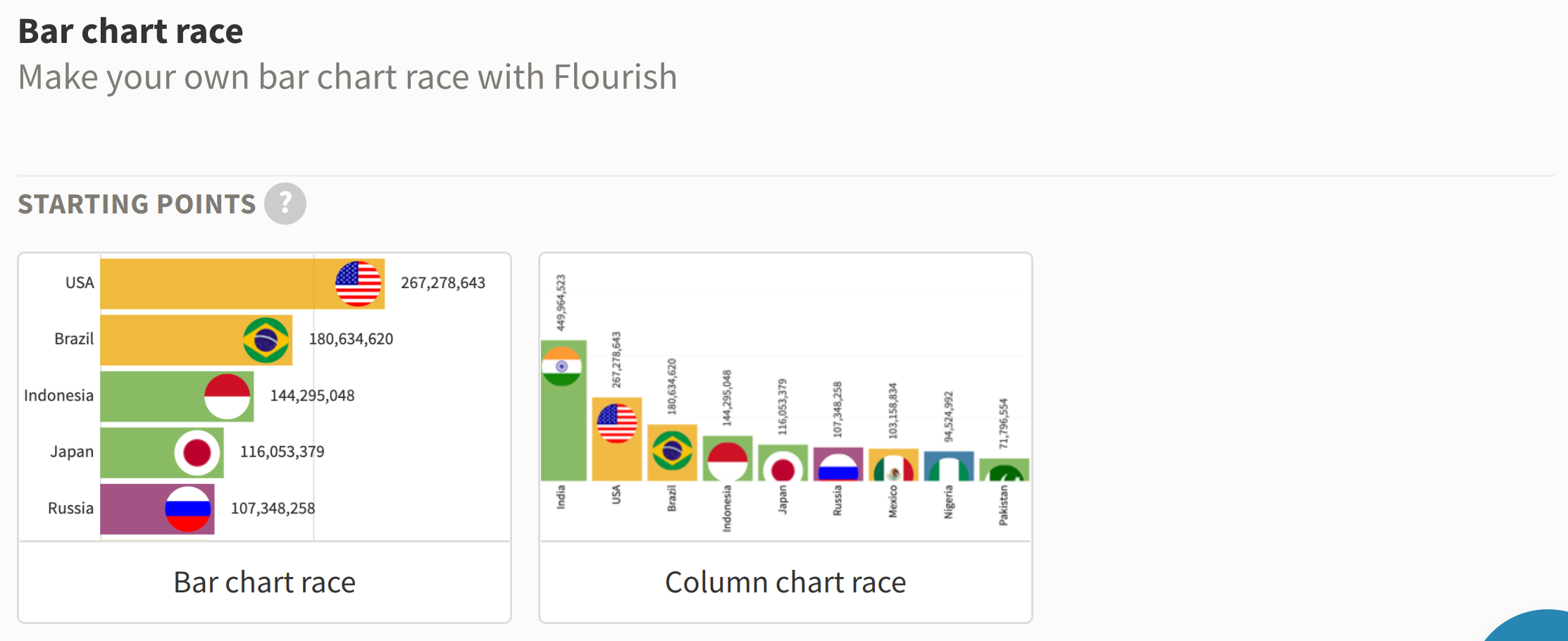
A sample chart will appear, which should look similar to this:
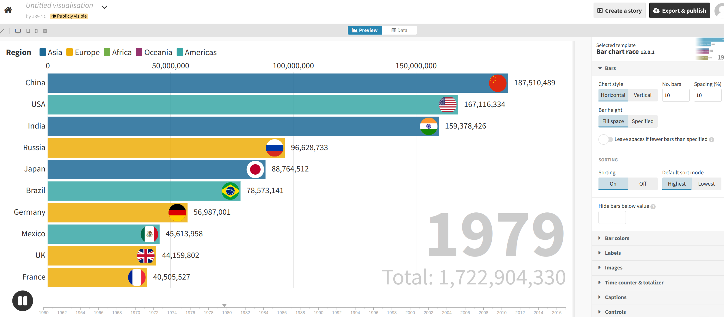
First, let’s title our visualization by entering some text at the box near the top of the page (e.g., “Coronavirus Cases Race Bar Chart”).
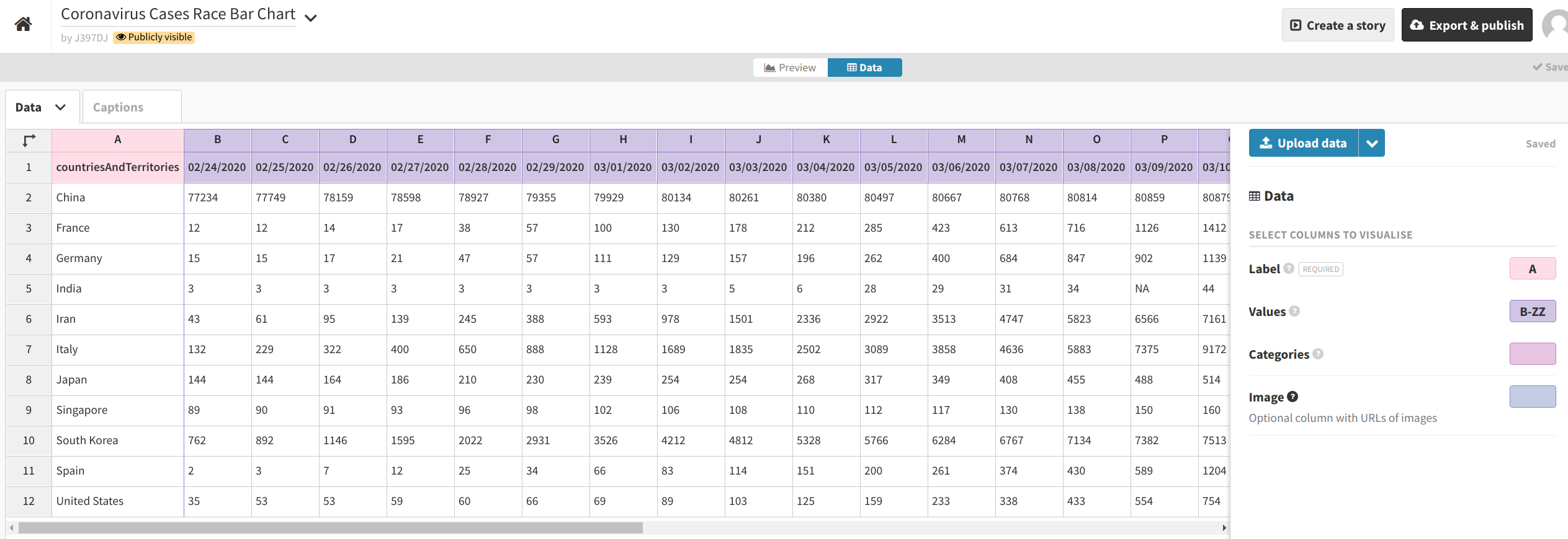
Then, click the “Data” button in the middle of the gray row near the top of the screen to upload your dataset. Click the blue “Upload data” button and select the CSV file we just created (covid_19_plot_data.csv).
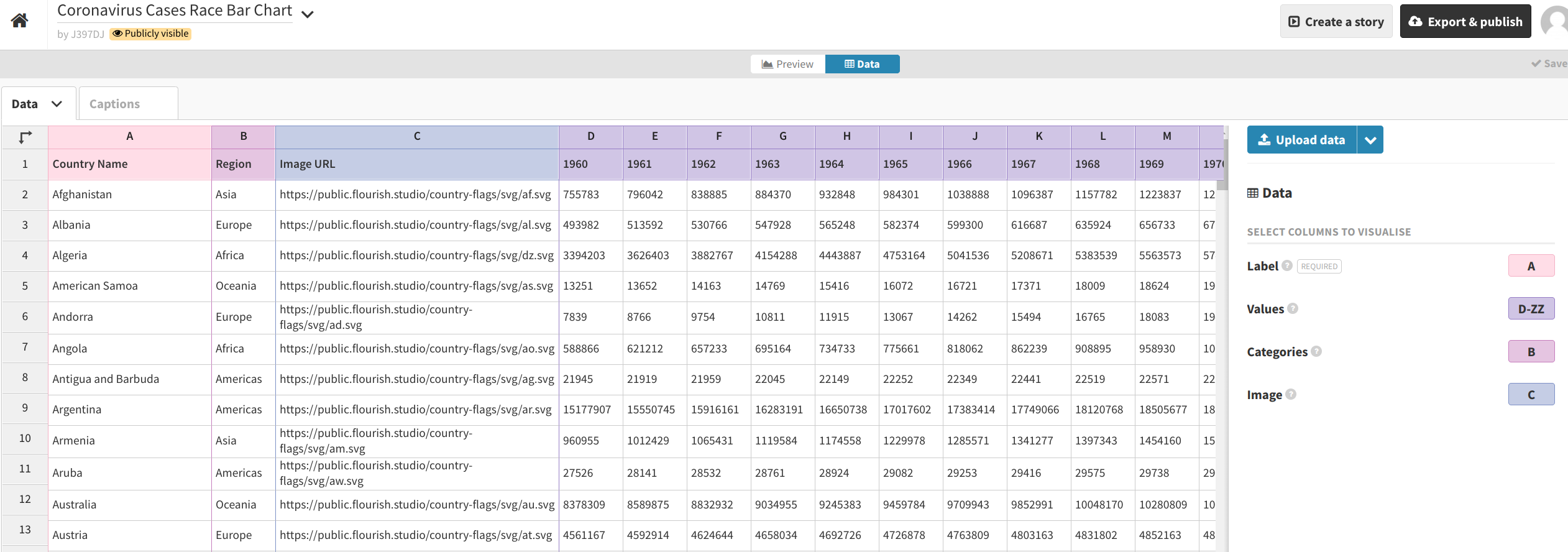
Import it publicly. Set the Label column to A and the Values columns to cover the rest of the columns (or all possible remaining columns, like B-ZZ). Set the Categories and Image columns to blank ( ).
When your interface looks similar to the above, hit “Preview.” Then, begin playing around with the different settings.
Boston Globe’s Settings
Here are the settings we can use to replicate the Boston Globe’s chart:
-
Bars
- No. bars:
11
- No. bars:
-
Bar Colors
-
Color mode:
By bar -
Color overrides:
-
China: #63615f -
France: #a5a29c -
Germany: #7c51a8 -
India: #2e4764 -
Iran: #82bec8 -
Italy: #7099ac -
Japan: #ffcf26 -
Singapore: #a6c180 -
South Korea: #84817d -
Spain: #e39b46 -
United States: #ca7768
-
-
-
Labels
- Max font size:
0.8
- Max font size:
-
Time counter & totalizer
-
Current time counter, size (% of screen):
4 -
Total: disable
-
-
Timeline & animation
- Loop timeline: disable
-
Header
-
Title
-
Label:
How coronavirus has spread around the world -
Styling (change title styles)
- Size: Bigger
-
-
Subtitle
-
Label:
Confirmed cases by country since Feb. 24 -
Styling (change subtitle styles)
-
Size:
1.3(Custom, or ‘…’) -
Line height:
1.3
-
-
-
-
Footer
-
Source name:
European Centre for Disease Prevention and Control(My modification, since that’s where I got the data from) -
Size:
0.75
-
Publishing your Data Visualization
When you are satisfied with your data visualization, you can click the “Export & publish” button at the top-right corner of the screen. Then, select “Publish to share and embed”.
Flourish will then provide you with a link as well as “embed code” that can be used to incorporate the visualization into your story on another platform.
If you used the options listed above, your visualization should look just like this one.