Context and Chart Types
Introduction
Data visualizations can be incredibly effective at quickly communicating complex quantitative information, and so it is unsurprising to see that the vast majority of data-driven stories include a visual component.
When thinking about a data visualization, it is good to start from the premise that the objective of a data visualization should be to communicate information. It is not just eye candy.
This is not to say that data visualizations can’t be pretty — after all, part of the reason people are drawn to data visualizations is because they often are aesthetically pleasing. Instead, it is to reiterate that beauty should not come at the expense of effectively conveying information.
It is also important to note that your chart should not just repeat information from your story. It is supposed to add something to it, either by illustrating the information in a different way or by including additional relevant information that may not have made it into the story.
Understanding the Context
In order to effectively convey information, you need to understand the context around your story and visualization.
Your Audience
Understanding the context begins with having a clear picture of the audiences for the story and visualization. Who are they? What do they care about? What do they already know?
For example, if your primary audience is comprised of subject experts, you may not need to explain the use of certain terminology. Similarly, if the audience is comprised of people with advanced statistical knowledge, you may be able to layer some additional information on a visualization (e.g., a confidence interval) that would confuse a general audience.
Your Purpose
Second, you’ll want to ask yourself: What is the purpose of this visualization?
Every data visualization should serve some purpose in order to add something to the story. That something might be to elaborate on (or help substantiate) a crucial point in the story. Alternatively, it might be to add an interesting tangent to the story without bogging down the main narrative.
There are three main purposes of a data visualization: to (1) explore data, (2) explain data, or (3) exemplify with data.
Exploratory data visualizations tend to emphasize the inclusion of several data points. The purpose is to give the viewer an opportunity to find story lines that may not be covered by the accompanying text. For example, a story may focus on crime in Amherst, but the accompanying visualization would include data points from Northampton, Easthampton, and Holyoke to allow the viewer to learn more about other areas they may be interested in (and perhaps find some patterns). Exploratory data visualizations tend to be especially interactive, as the goal is to help ‘open up’ a dataset and make it more accessible.
Explanatory data visualizations tend to emphasize storytelling. These tend to be a bit more selective in which data points are included, include annotations and different aesthetic options to highlight observations of interest, and include more contextual information (i.e., narrative) to prime the viewer. For example, an explanatory data visualization may be titled, “Violent Crime in Amherst Continues 10-Year Slide” (as opposed to a more exploratory, “Crime in Amherst, 2011-2021”). Similarly, while an exploratory line chart showing regional crime might opt to include 10 named lines (each a different Western Mass town), an explanatory visualization might opt to highlight Amherst using a particular color (e.g., a bold blue) and use more transparent gray lines for the other towns since the focus is on explaining how Amherst compares to those other towns.
Exemplification data visualizations are more commonly associated with graphic illustrations. These tend to be more creative in nature and depart from traditional chart types (e.g., bar graphs and line graphs). The emphasis is often not on showing the data but instead representing some aspect of it in a more creative and memorable way. For example, this might include a drawing of an airplane that uses color coding to illustrate the failure rates of different components.
Your Main Point
Finally, you will want to ask yourself the crucial question: What is the main point of this visualization?
Visual communication is no different from written communication in the sense that a clear and well-focused message is often far more compelling than an rambling one. Put another way, while you can communicate several different messages with a single visual, that does not mean you should do that.
A good way to determine the main point of the visualization is to write down what you want to convey using a single, short sentence. Using the aforementioned example, I might write: “Crime in Amherst has dropped over the past 10 years, making it safer than many nearby towns of similar size.”
The main point will help guide me in reducing the complexity of my visualization. Put another way, the goal should be to communicate the main point as simply and clearly as possible — and that usually requires us to exclude any information that doesn’t advance that main point.
Selecting a Chart Type
There are dozens of types of charts out there, and several ways of illustrating data beyond that. Choosing between them can be quite challenging.
A great way to narrow your options is to let function guide form. Think back to the context and purpose of your visualization: What are you trying to show, and what is the best way to convey that to your audience?
For example, do I want to show a comparison between two or more sports teams? Do I want to show the relationship between the variables of time and the starting pay of college faculty? Am I interested in showing the incidence of drug abuse across a geographical area?
After deciding on the function, it is much easier to select the types of charts best suited for the chosen function. A great resource for matching chart types and functions is The Data Visualisation Catalogue.
Comparisons
Data visualizations can be very effective at showing the differences or similarities between values and entities.
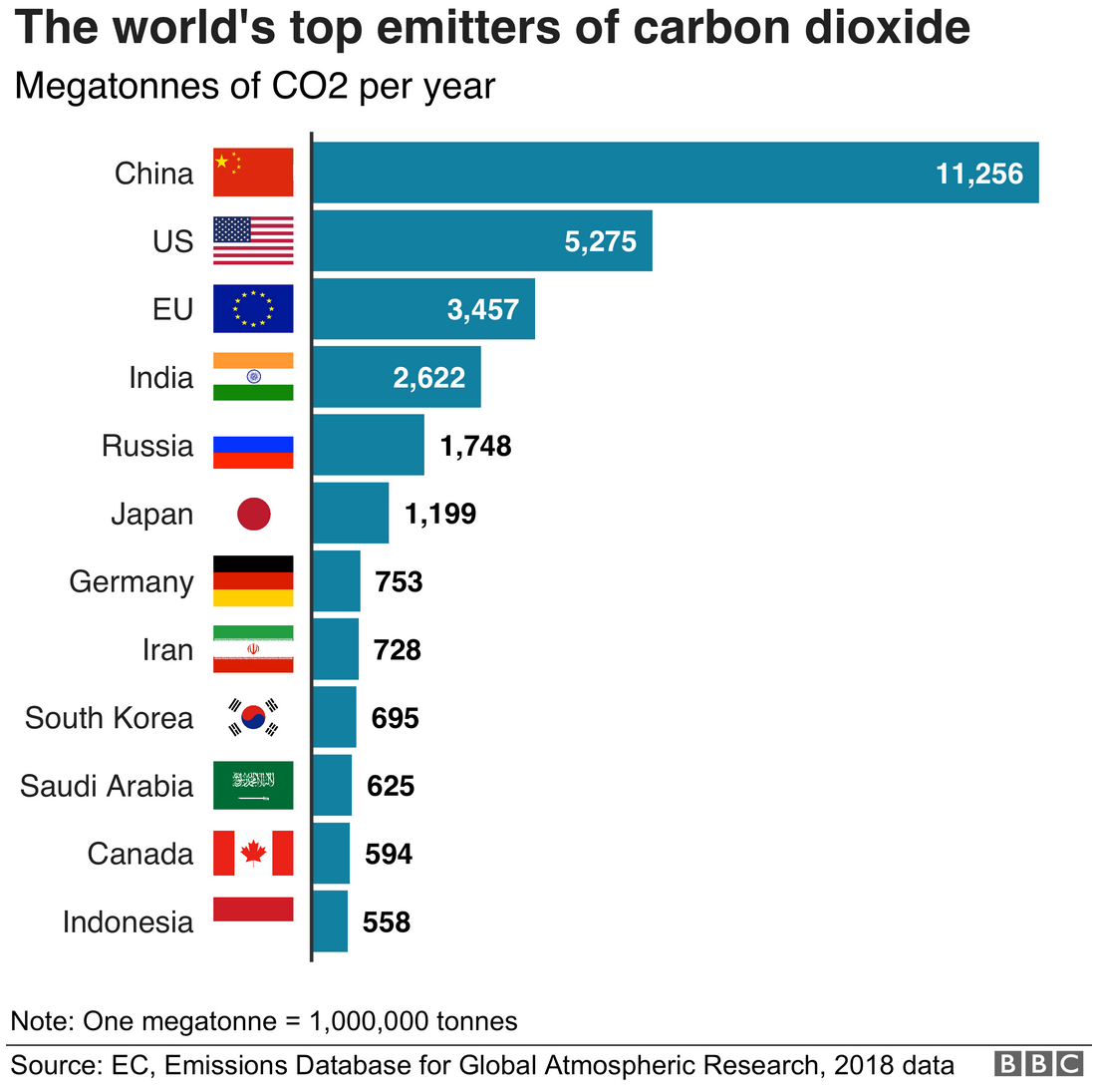
For example, a great way to compare categorical data (e.g., countries) is with a bar chart, as our eyes can quickly compare heights when bars are placed against a consistent baseline (e.g., the value 0). When your labels are long, as with country names, you may want to try a horizontal bar chart like this exploratory chart from the BBC.
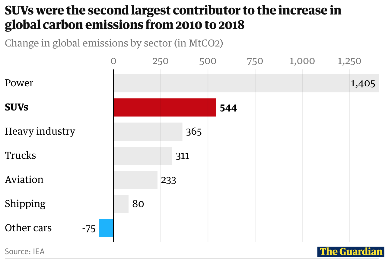
Alternatively, here’s the same type of chart, but designed to be more explanatory in nature. Notice how they title the graph differently (emphasizes a specific point) and use aesthetics to call attention to certain elements in the chart (i.e., those pertaining to the main point).
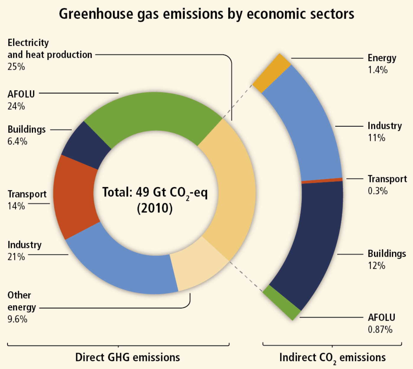
Similarly, donut charts can be terrific if you have a small set of categories that are all part of a larger whole. While pie charts are a similar alternative, donut charts are typically preferred because humans have a harder time distinguishing the size of items via area than via length. For example, consider the donut chart below:
Humans have a difficult time correctly perceiving sizes and proportions in three-dimensional charts. This is especially true for 3D pie charts, as the rotation of the chart can impact the sense of perspective (e.g., what is closest to the foreground can seem larger). Thus, 3D charts are generally discouraged.
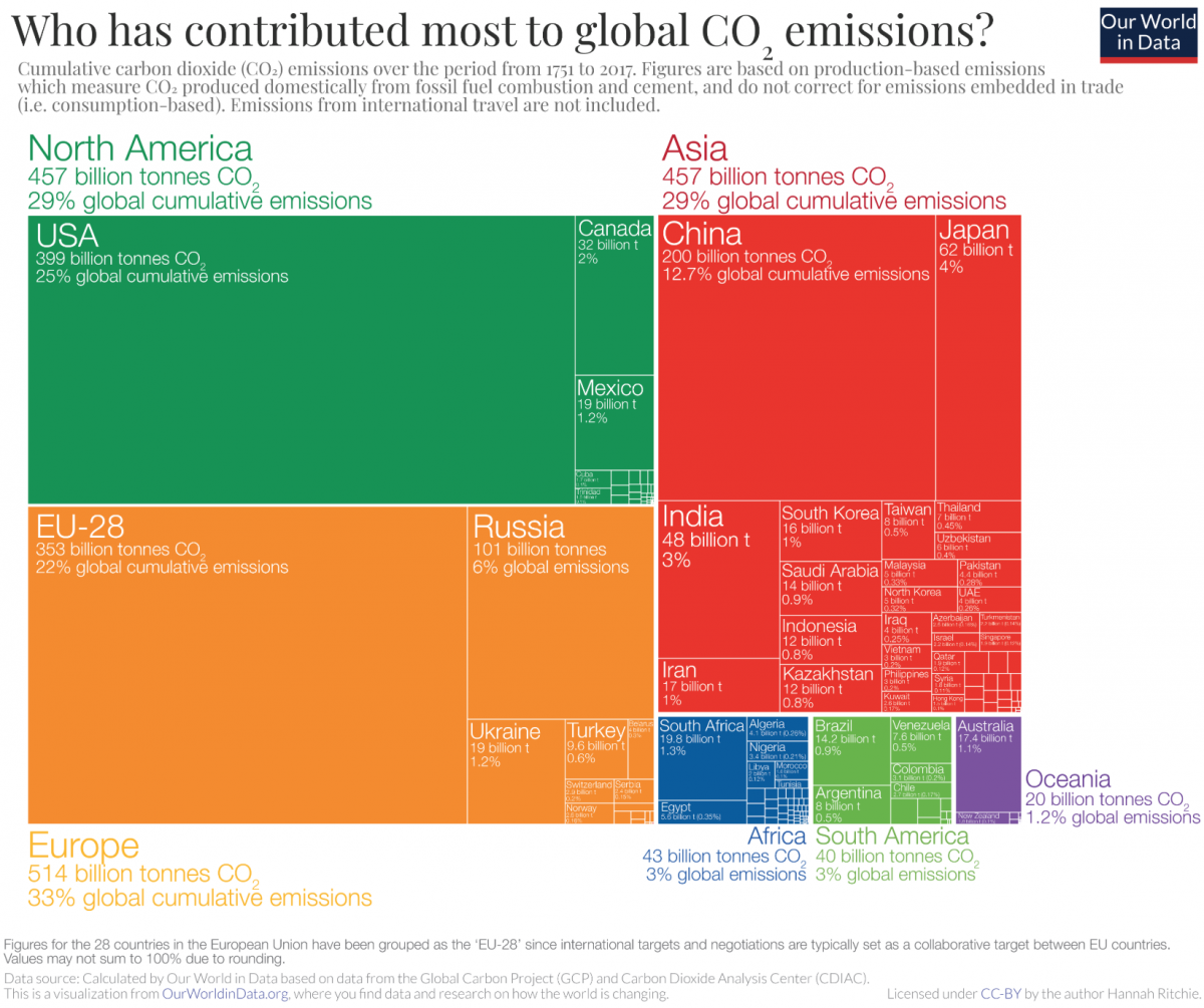
If you have a large set of categories, and especially if you have nested categories, a tree map can be a great choice. Here’s one example of that, with the color coding representing continents, each square representing a country, and the size of the square representing the amount of emissions.
Relationships Between Variables
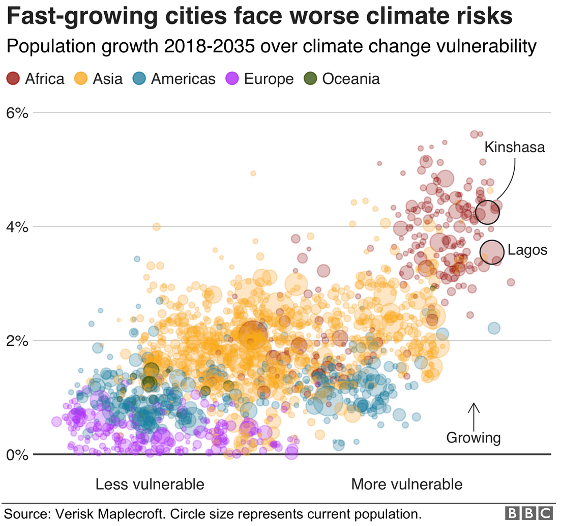
If you are interested in showing showing a relationship between two continuous variables, a scatterplot is often a great choice. They are especially useful if you are trying to illustrate the a potential correlation between variables.
Scatterplots can sometimes be a bit confusing for a general audience, and it is okay to simplify them (even if it comes at the expense of some precision). For example, consider this scatterplot from the BBC that shows how the fastest-growing cities are also among the most vulnerable to climate change.
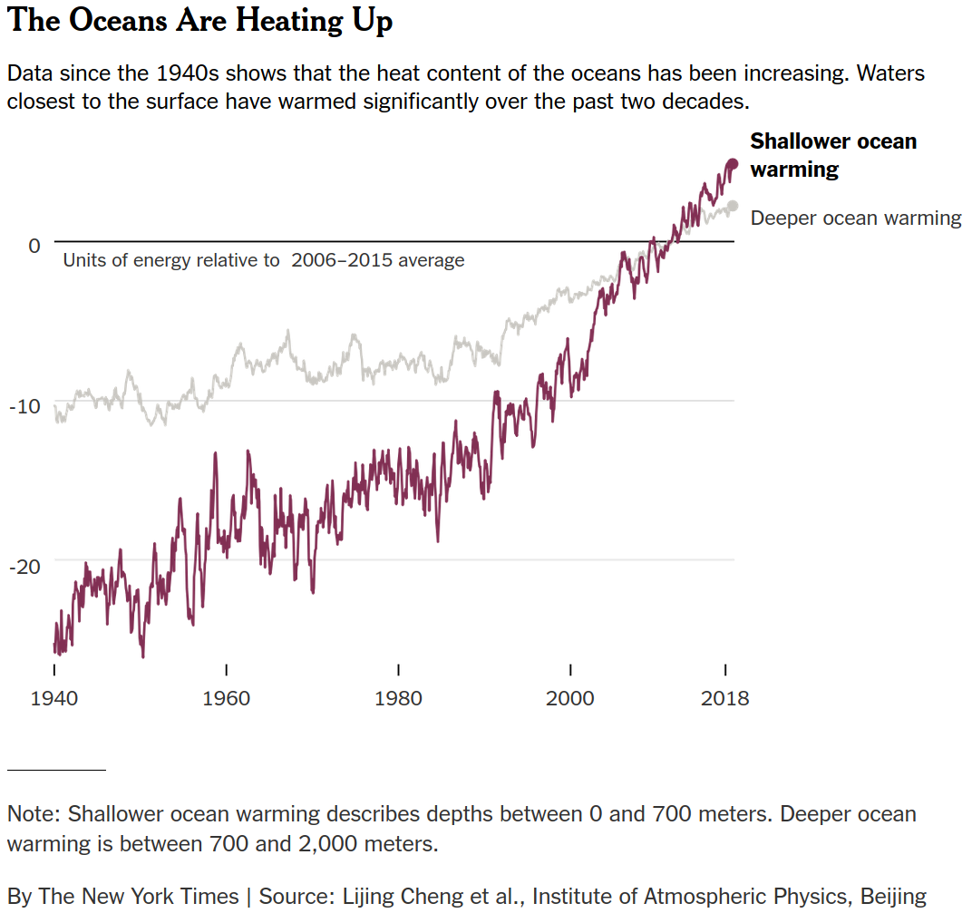
If one of your key variables pertains to time, then it often makes sense to use a line graph and to place time on the X axis to show change in the Y variable over time. Here’s an example of a line chart showing the warming of ocean waters since the 1940s.
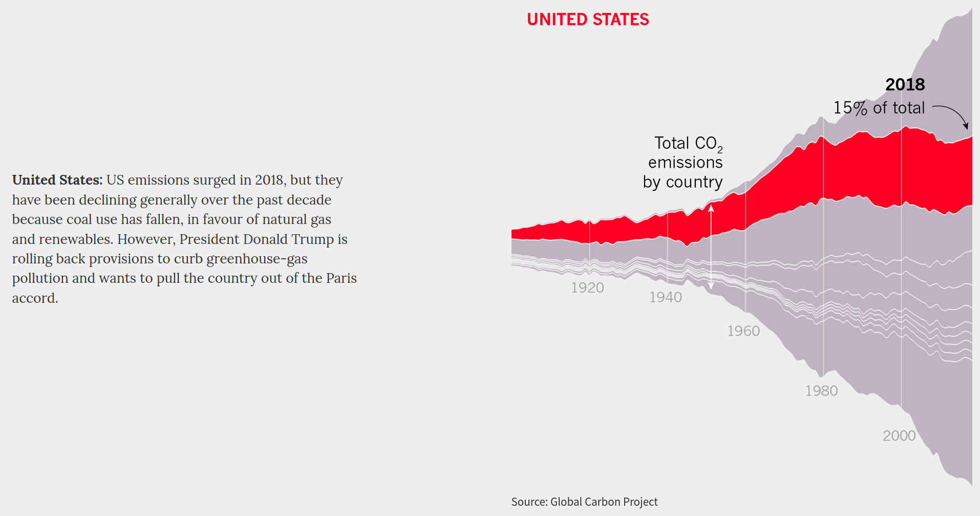
While we often see change over time represented through a single line, you can also pair it with area size to illustrate changing overall and per-category quantities. Here’s an example of total carbon dioxide emissions by country, highlighting one country (segment of the chart) at a time for countries of particular note.
Spatial Information
Maps are naturally well-suited for the task of visualizing information covering some geographical area. However, there are many ways to visualize information using maps.
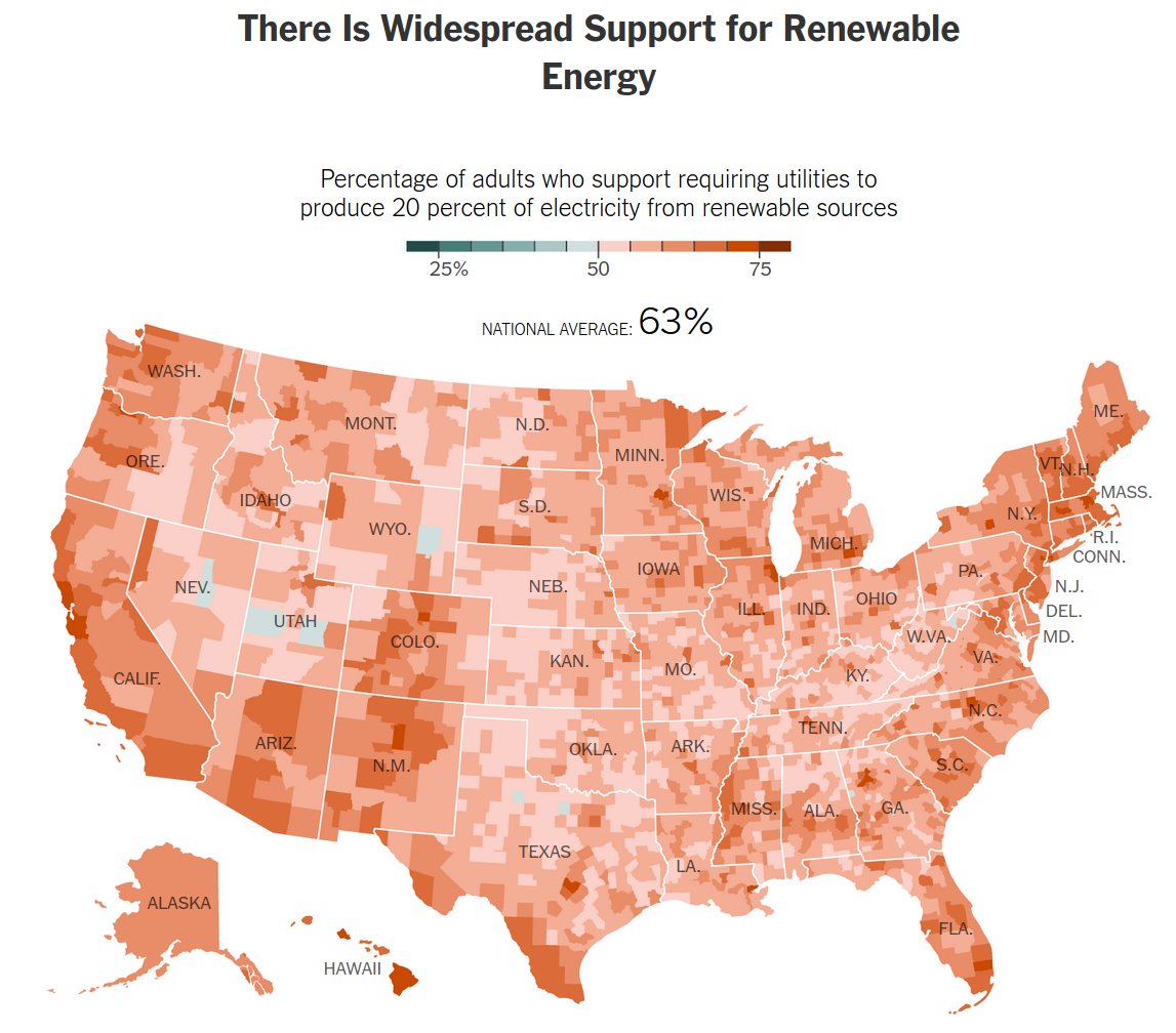
Dot maps are a great choice for showing where things happened. Here, dots are placed on top of every location where something happened. A variation of dot maps is the bubble map, where the size of each dot becomes proportional to some additional variable. (This allows you to visualize more information within a single chart.) Choropleth maps are also terrific choices for patterning geographical areas in relation to some data variable by shading that area in accordance to some variable.
For example, here is a choropleth map showing the amount of support for a green energy policy at the county level.
Balancing Beauty and Simplicity
There are some great charts out there that can show a lot of information and look really pretty, but still be extremely hard to decipher.
Here’s an example from The Guardian that shows the purchase and sale of football players in the top flight of English football (soccer) in 2013.
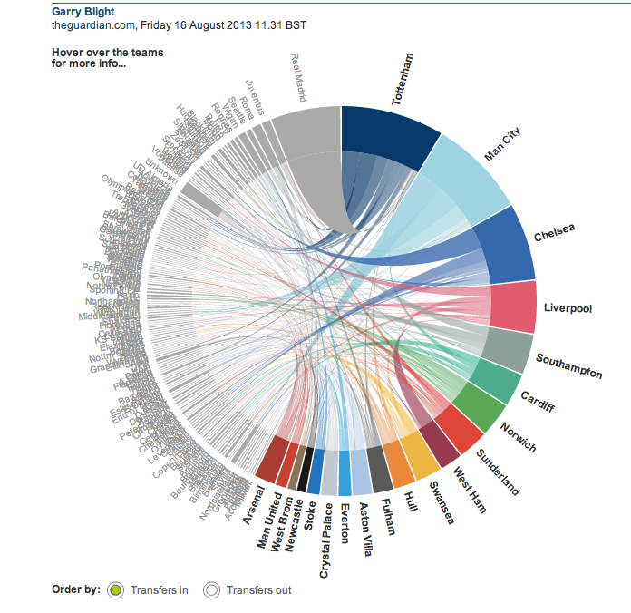
The chart looks pretty and is driven by a large number of data points, but it is difficult to read — especially as a flat image. (Thankfully, it is interactive on The Guardian’s site.) What I can tell is that Tottenham spent more money than any other English team in 2013 because it has the largest segment on the donut portion of the chart. I can also see that it had dealings with a number of different teams because it has a bunch of lines going to different places.
However, many people will look at a chart like this and be at a loss. First, it uses a chord diagram, a chart type that is unfamiliar to most people. While that is a perfectly fine chart type to use, the likely lack of familiarity warrants the inclusion of some annotations that walk the viewer through key aspects of the visualization. Second, there’s just too much going on with it — evidenced by all of the overlapping labels on the left half of the chart. It thus might make more sense to collapse the non-English teams into leagues, and use interactivity to allow the viewer to click on each league to show the teams within in.
This serves to highlight the value of picking charts that people are likely to be familiar with and to start with a simple layout. While I was able to read the chart reasonably quickly, that is only because I have seen this type of chart before and understand the context well as an avid football fan. That would not be the case for a general audience.
Going Beyond Singular Charts
You also have options that go beyond charts. Many designers like to create infographics, which use a variety of different visual tools to communicate a range of related information.
For example, here’s a Washington Post infographic showing 30 years of space shuttle missions, and potential next steps following a presumed final mission for the U.S. space program in 2011.
This infographic integrates a line chart, a radial dot chart, a tally (person) chart, and an area (volume) chart — though this last piece was in 3D, a practice the Post does not engage in very often anymore. The infographic tells a self-contained story about the past and possible directions for the future, helping the viewer get a sense of how the space program (and specific shuttles) fared under different administrations, the proportion of the budget it accounted for over time, and the carrying capacity for different shuttle alternatives.
Tools for Creating Data Visualizations
There are a number of different tools you can use to create both static and interactive data visualizations. Some popular tools used by newsrooms to create static charts are Adobe Illustrator and R. (In fact, many newsrooms today use R to generate the foundation for a visualization and Illustrator to fine-tune it.) Some popular tools used by newsrooms to create interactive charts are Datawrapper and Flourish. For more advanced and heavily customized visualizations, some newsrooms will use JavaScript libraries like D3.js and Highcharts.
While newsrooms like The New York Times and The Washington Post have large data visualization teams and use a lot of custom tools (built using technologies like D3.js), many newsrooms make do with technology that you can easily access and eventually master.
For example, The Boston Globe regularly uses Flourish for many of its data visualizations. Additionally, FiveThirtyEight regularly uses R’s ggplot2 library for its visualizations (with heavily customized themes).
While most of those tools include presets and functionality for creating basic charts like bar graphs and line graphs, more esoteric chart types (such as the Nightingale rose chart) require more specialized software. Additionally, if you really want to customize every aspect of your chart, you may need to use advanced tools or even do some of your own programming.
However you choose to create the visualization, just remember to match the form to the intended function and to keep your context in mind.