Making Sense of What's in a Dataset
Introduction
Once you have a dataset in your preferred file format, you will want to get a sense of what data are included in it.
If you found that dataset online, you will usually find a written summary of what is in the dataset alongside the download link. However, the summary is just that: a brief description of what the dataset is about. The dataset is likely going to include a lot of additional information, and will just as likely not include some important variables that you might have expected to find.
Additionally, the dataset will be self-explanatory some of the time: the variable names will be clear, and all the data points will be unambiguous. That is the ideal scenario, and it does occur a decent amount of the time. However, there are other times when it is tough to understand what a variable is measuring because the names of the variables don’t offer much information, or the data points might involve codes that don’t make much sense right away. Just as importantly, a glimpse at the data may raise questions about how they were collected or aggregated, or cut up in particular ways.
Example: The College Scorecard
To illustrate a potential complication, let’s take a look at a dataset from the U.S. Department of Education’s College Scorecard website. The purpose of this dataset is offer measures of different dimensions pertaining to student enrollment and success at public and private colleges around the country. For this example, we will be looking at an extract of the full dataset that includes a smaller set of variables at the institutional (school) level.
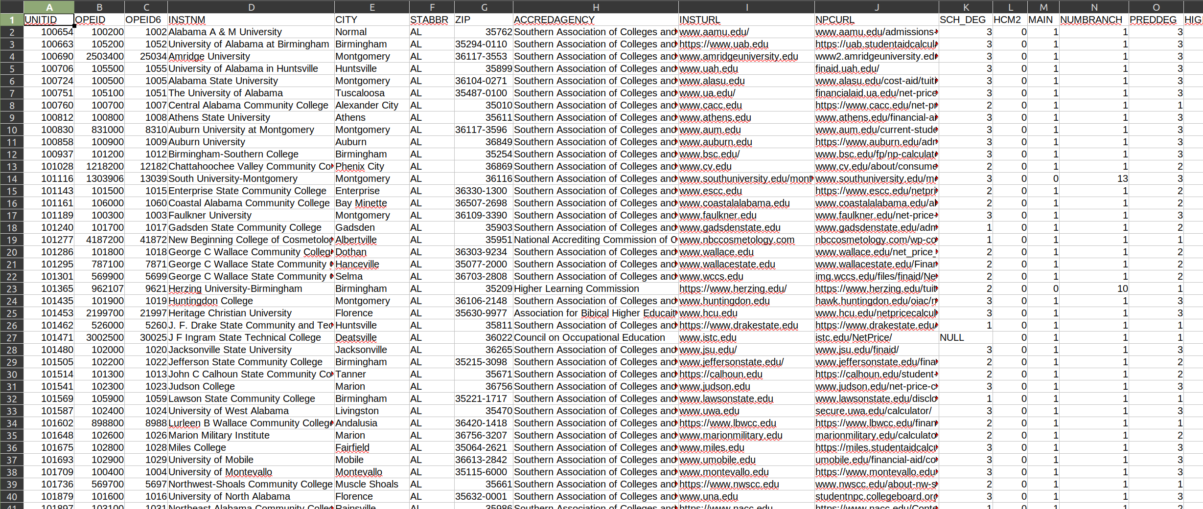
Right away, we see that the first row contains the variable names for this dataset. However, some of the variable names can be a bit confusing. While the first few variables (columns) are not labeled clearly, we can guess at what they are: the first three (UNITID, OPEID, and OPEID6) are identifiers to make record retrieval easier. Then, we have the name of the institution (INSTNM), the city (CITY), state (STABBR), and zip code (ZIP) it is based in, and so on.
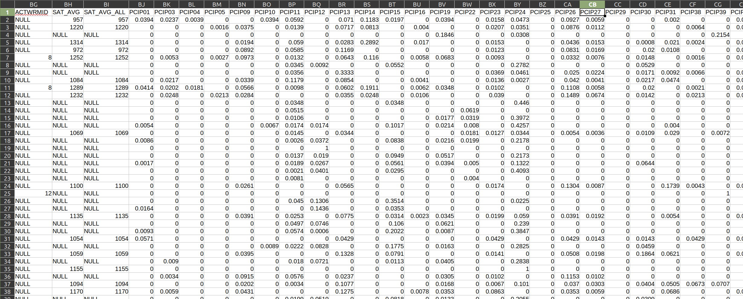
From there, it starts to get a little bit more complicated. I have no idea what SCH_DEG, HCM2, or PREDDEG represent. (Even worse, if we look at some of the subsequent columns, we get a bunch of PCIP variables that give me absolutely no indication of what they represent. What the heck is PCIP27?
Example: Workforce Indicators
Similarly, let’s take a look at a dataset from the U.S. Census Bureau’s Quarterly Workforce Indicators System. This system offers a set of economic measures at the national and state levels, including employment, job creation, earnings, and other measures of employment flows.
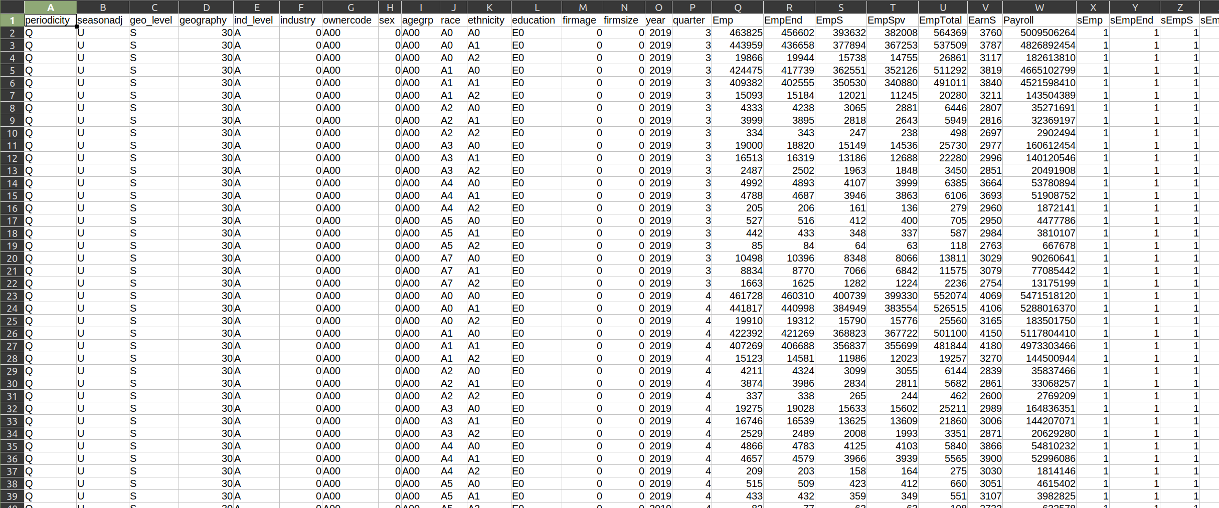
The variable names are, for the most part, a bit more clear with this dataset. For example, year almost certainly covers the year represented by that observation (row), agegrp probably refers to the age group being measured, Emp likely refers to the total number of people who are employed, and so on. We do still have a few unclear variables, like EarnS and sEmp. I have no idea what those stand for!
Even though I can guess what some of the variables are measuring, I have no idea what the values themselves refer to. For example, what does A0 under race refer to? How is it different from A3? What about ethnicity? It also has A0 values. Do they refer to the same thing? And what is that thing?
Put simply, you will regularly encounter datasets that have cryptic variable names and values. This requires us to look outside of the dataset for information needed to understand it.
Data and Documentation
The Internet has given us a acronym for when we encounter problems like this: RTFM. It stands for Read The Fucking Manual. And it is good advice.
The idea here is that most datasets that have such ambiguity usually come with supporting documentation. This is sometimes called the “codebook,” “manual,” “dictionary,” “schema,” or “appendix,” and will clarify all the abbreviations, codes, and other shorthand used to store the data.
The College Scorecard dataset, for example, has a whole section of the website that describes the dataset, including a data dictionary that will spell out all those variables.
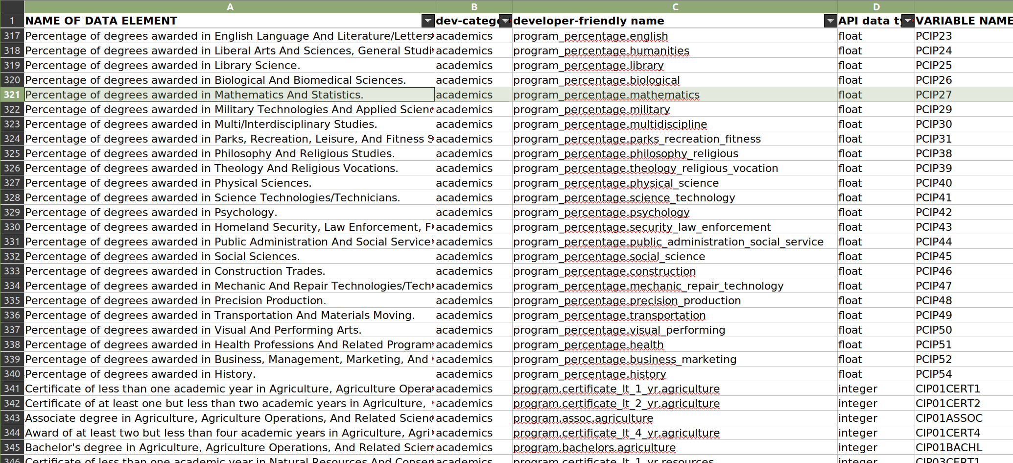
While their data dictionary is not the prettiest thing in the world, it does have the information I need. Remember that PCIP27 variable that puzzled me? We can quickly look it up, and find that it refers to the “Percentage of degrees awarded in Mathematics And Statistics.” That is very helpful!
How about that race variable from the Quarterly Workforce Indicators System that had the totally unclear value of A0? The U.S. Census Bureau also clearly documents their data online.
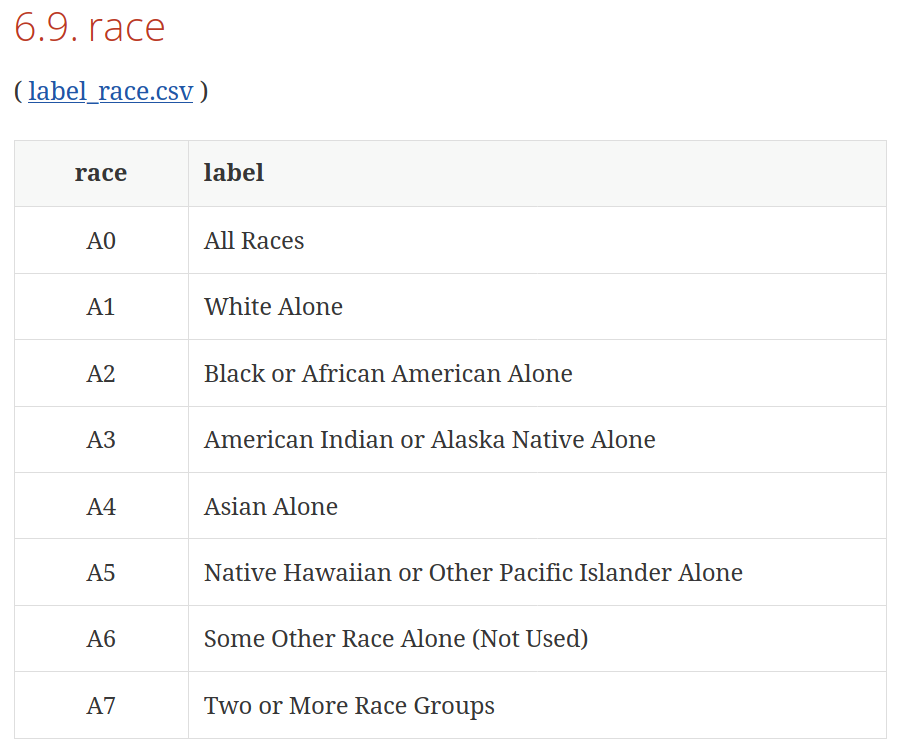
We can thus look up the variable race and see the codes for the different categories. It appears A0 refers to All Races, which is just a summary statistic covering all the races below. A1 would refer to White Alone, A2 would refer to Black or African American alone, and so on.
If we look up the variable of ethnicity, we see that A0 refers to All Ethnicities and A1 refers to Not Hispanic or Latino. Thus, even though the codes are the same, they mean different things depending on the variable. That is pretty common, and it highlights the value of a well-documented data dictionary.
You might ask yourself, “why don’t they just use the complete labels in the dataset?” The answer is twofold.
First, using simple codes helps make datasets much smaller, especially when you are talking about big sets of data involving millions of data points. For example, it takes less space (and processing power) to store and parse the value Bachelor's degree or advanced degree when it is stored as a simple code, like E3 — and while those efficiencies are insignificant at a small scale, they do become more significant as datasets grow.
Second, many systems (and certainly those from governmental agencies) were developed many years ago when resource constraints were far more limiting, and other systems grew from them. Consequently, the modern information system used by those agencies (and institutions that rely on them) depend on those legacy ways of storing and coding information. Inertia therefore helps to explain some of the seemingly archaic things we see today.
The U.S. Census Bureau also offers a detailed description of how they measure a lot of those variables, which can be helpful for fully understanding the information and then contextualizing it when it is time to produce a news story.
Keep Copies of the Documentation
Every time you download a dataset, see if there is any accompanying documentation. If there is, be sure to save it alongside the data. (It can be easy to lose track of the documentation, and it can be tricky to find them again, especially on some government websites.) A lot of the questions you have about the variables and values in the dataset will be covered in that documentation.
If you can’t find any documentation, or if there are variables in the dataset that you can’t find in the documentation, call or e-mail the party that collected it. They will usually be willing to help out. Don’t just assume things about those data, though, because you could turn out to be wrong — and that could have serious implications for your analysis, and your ability to inform (rather than misinform) your audiences.