The Mechanics of Maps
Introduction
Storytelling with maps always imposes an imaginary order, privileging one set of features or details over others. Put another way, it is often impossible—or at least unwise—to fill a map with all possible information about that geographical area or the data you wish to attach to it. Making a map thus involves choices about what to include and exclude, or which spatial features to call attention to.
When creating a map, there are at least three things you should be attune to: (1) the projection you will be using for your map, (2) the spatial data you will be using for that map, and (3) the features you intend to layer onto that map.
Map Projections
Contrary to unfounded conspiracy theories, the earth is not flat. It is spherical, and is therefore a three-dimensional object. However, we often show it—or portions of it– on a flag, two-dimensional plane (like your laptop’s or phone’s screen).
The translation to a two-dimensional plane invariably distorts things, and mapmakers must thus make decisions about how to distort the earth to best illustrate it.
This is where the map projection comes in, or the system through which the mapmaker translates geographical coordinates onto a plane. Mapmakers have developed dozens of different projections over centuries, and there isn’t a single “best” projection. However, some projections are more familiar to general audiences, and some are generally regarded as offering a more accurate representation by geographical experts.
Mercator Projections
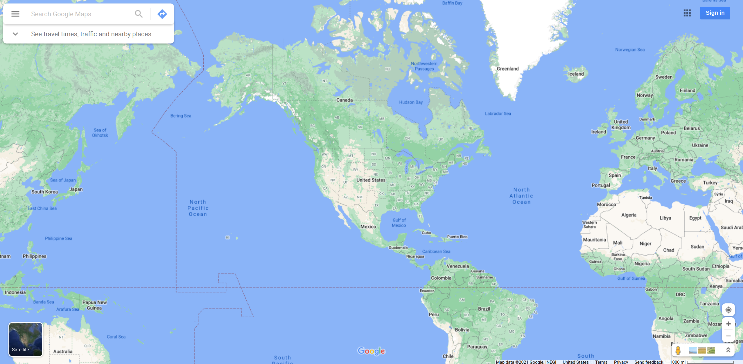
The most common projection today is the Mercator. Whenever you are using Google Maps or OpenStreetMap, there is a good chance you are looking at a variant of the Mercator projection known as Web Mercator. (This has become the de facto standard for Web mapping applications.)
The Mercator projection was introduced in 1569 and tried to flatten the map such that both the vertical and horizontal lines (longitude and latitude) are straight. It distorts the size of objects as the latitude increases from the Equator to the poles, resulting in landmasses like Greenland appearing much larger than they actually are (relative to landmasses like Central Africa). Indeed, although Alaska appears to be roughly the same size as Australia under this projection, Australia is actually 4.5 times as large as Alaska.
Despite the glaring distortions, the Mercator is remains commonly used because it is easily recognized by most people around the world. The Web Mercator variant in particular is well-suited to zooming in, which has aided its popularity in interactive applications.
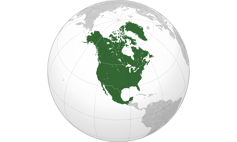
Orthographic Projections
Orthographic projections offers an alternative approach that places the Earth (a sphere) on a tangent or secant plane. Put another way, it depicts space as it might look from outer space, where the horizon is a great circle. This gives the illusion of a three-dimensional globe, so it is often used as inset map or for pictorial views of the Earth from space.
This projection often distorts the shapes and areas near the edges, and isn’t used as often as the Mercator—though some applications begin with an Ortographic projection at high levels (zoomed out) and transition to a flatter Mercator projection at lower levels (zoomed in).
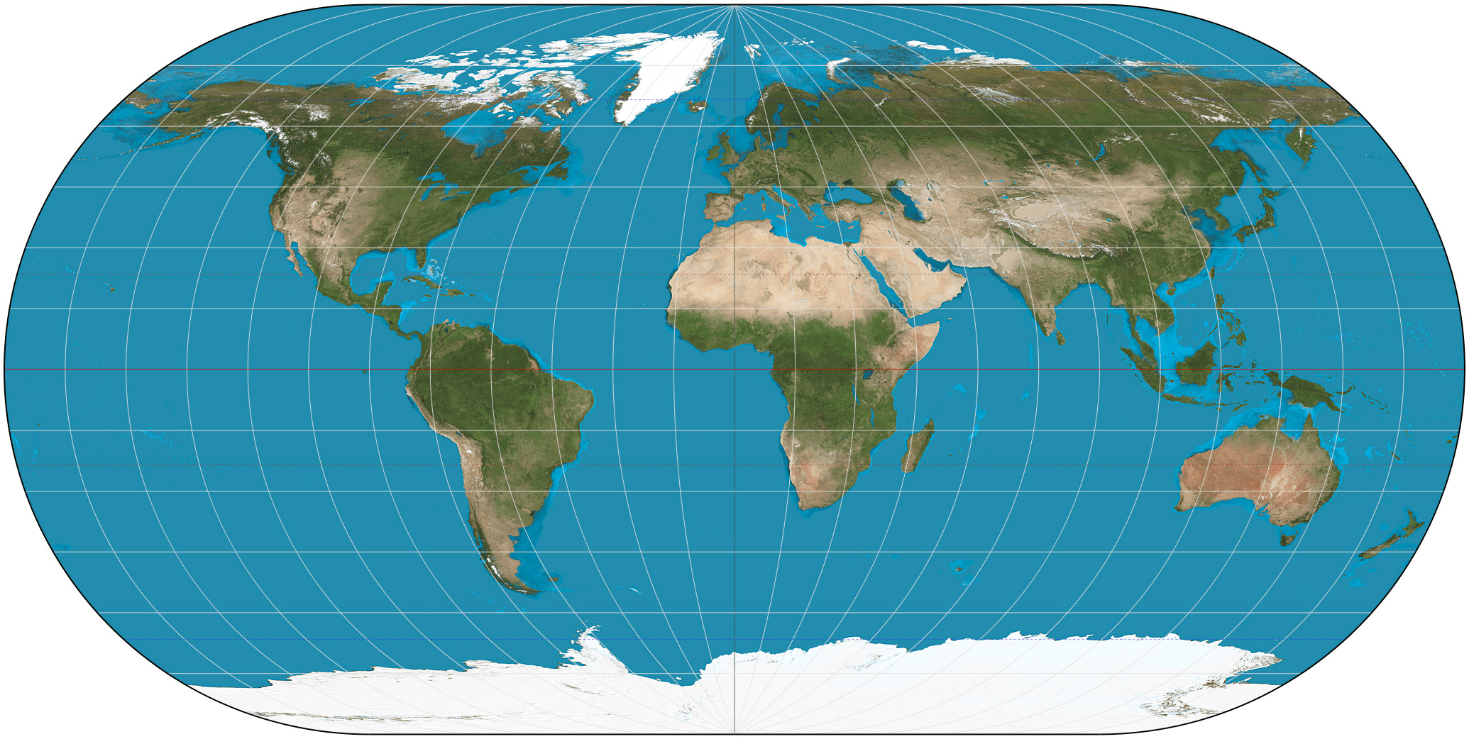
Ortelius Projection
The Ortelius oval projection is a pseudo-cylindrical projection that is neither conformal nor equal-area. Instead, it offers a compromise presentation by curving the longitudinal lines. As you can see below, the distortion is quite different, and Greenland looks far smaller than it does in a Mercator projection.
You’ll most often see this projection used to illustrate world maps, and it was especially popular in the late 16th and early 17th centuries. Today, it is far less popular, but is still useful for illustrating different ways of distorting the Earth.
Layering Spatial Data
Once you have selected your projection, you will want to place information on top of the resulting map. There are two main ways of doing that: points and shapes.
Points
Points are specific locations on a map that are denoted by a latitude and longitude coordinate pairing. These are decimal numbers that often have a degree symbol attached at the end.
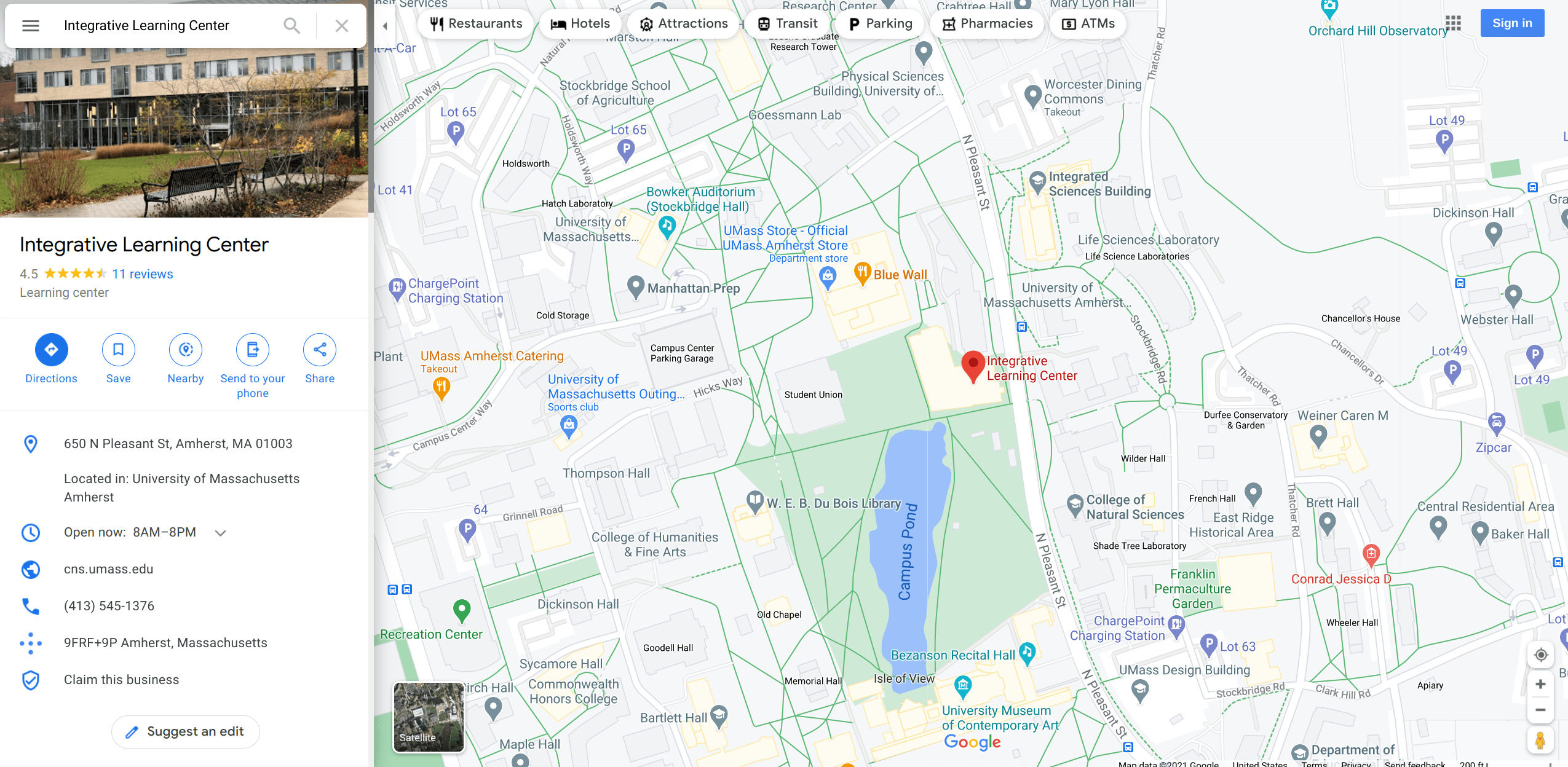
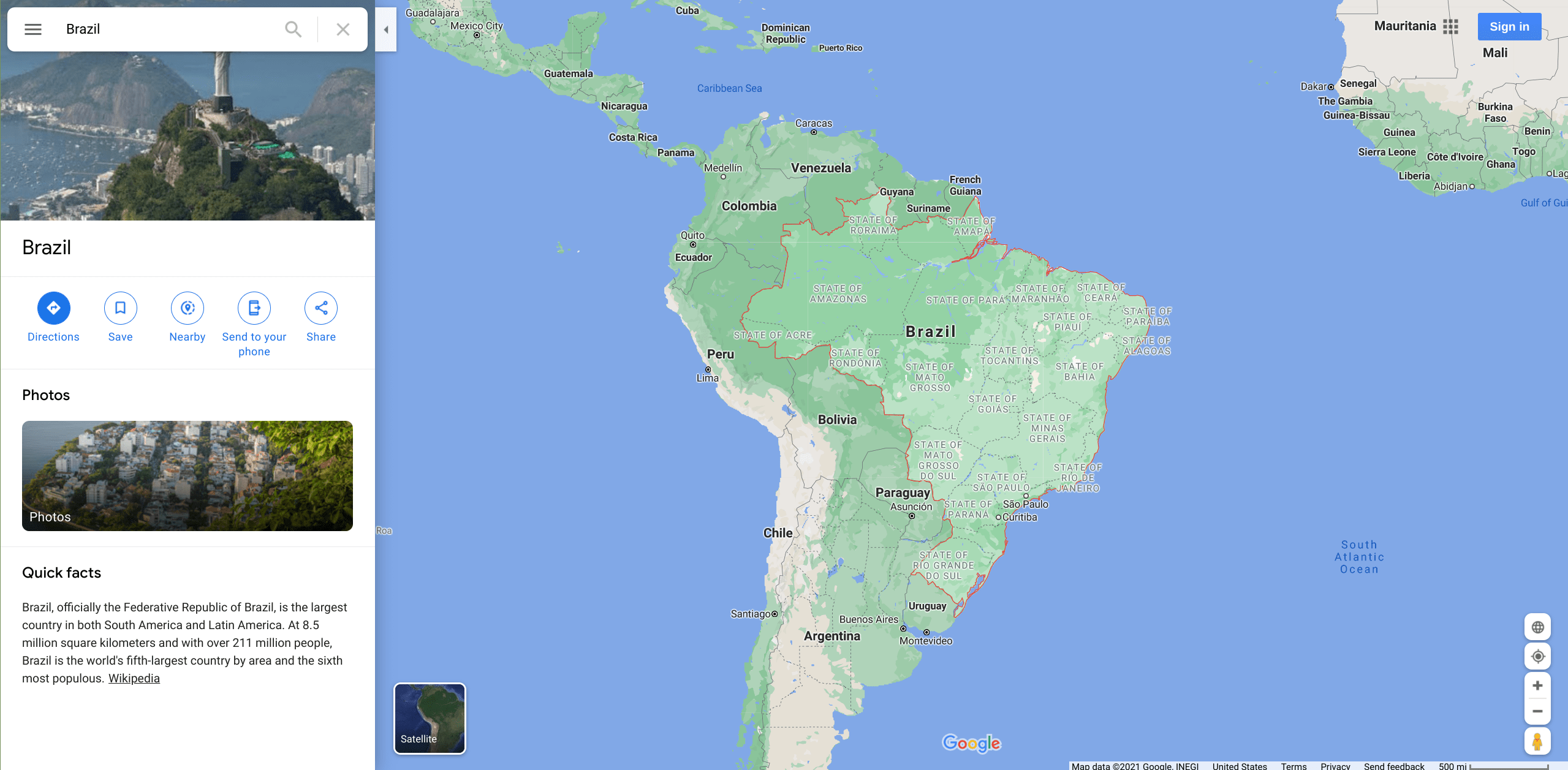
For example, the Integrative Learning Center at the University of Massachusetts Amherst is located at 42.3910750, -72.5259090.
The first of those numbers, per convention, is the latitude. Latitude refers to the horizontal lines on a map that run east to west, parallel to the Equator. Latitude values range from positive 90 degrees, which marks the tip of the northern hemisphere, to negative 90 degrees, which marks the tip of the southern hemisphere.
The second of those numbers is the longitude. Longitude refers to the vertical lines that run north to south, parallel to the Prime Meridian. Longitudinal values range from positive 180 degrees, which denotes east of the Meridian, to negative 180 degrees, which denotes west of the Meridian.
Geocoding Information
How do you translate a location, like the Integrative Learning Center, to a set of coordinates? By geocoding it.
Geocoding refers to the process of assigning longitude and latitude coordinates to some place of reference, like a country, state, county, city, or address. Whenever you type in some information into Google Maps and it shows you a location, what it has done is geocoded the string you provided (e.g., Integrative Learning Center) based on its best guess of the place you were looking for.
There are several online tools you can use to automatically geocode place names or addresses. Google Maps and OpenStreetMap offer Application Programming Interfaces (APIs) that allow you to batch geocode several different locations using its massive databases. Several mapping tools, like ArcGIS, have built-in geocoding functionality. Additionally, there are third-party data providers (such as Texas A&M’s Geocoder and Geocodio) that allow you to upload a simple CSV file with location labels, and it will geocode those locations in large batches and provide you with a new CSV file that contains the latitude-longitude pairing for each location.
There are also a number of R packages that allow you to use services like Google Maps to handle all of the geocoding within R itself. Useful packages to complete geocoding include: ggmap (and its ggmap::mutate_geocode() function), mapsapi (and its mapsapi::mp_geocode() function), and tmaptools (and its tmaptools::geocode_OSM() function).
Do note that whenever you use a system to geocode information, its algorithms will make guesses about the location you want. A helpful rule of thumb to keep in mind then is: The less ambiguous the information, the more likely the system will geocode the information correctly.
For example, if you have a complete address, like “650 North Pleasant Street, Amherst, Massachusetts, 01002, United States,” then you will almost certainly get the right coordinates. In contrast, if you simply type in “Athens,” the system may not know if you want Athens, Georgia, Athens, Ohio, or Athens, Greece.
Whenever you go to geocode, always provide it with the most complete information you have, which may involve combining information from different variables in your dataset, like the city and state name variables that may be present in a dataset.
Shapes
There are times when you will be more interested in areas than points. For example, perhaps you want to illustrate disparities across counties or states.
In order to do that, you will need to create shapes that represent those areas. Shapes are usually defined by connecting a series of points, each denoted by latitude and longitude, to create the boundaries of that shape. When all the points have been connected, the shape will usually be assigned a name, like “Brazil.”
It is possible to create your own shapes, and that is sometimes necessary if you are interested in a non-standard area, like an arbitrary portion of a county. However, most of the time, you can find files that professional mapmakers have created to represent commonly used areas, such as countries, states, counties, cities, and even school districts.
As with the data files you’ve encountered, there are several different file formats used to represent geospatial shapes. Thus, you will want to see what file types your preferred data visualization program supports. Three common file formats for this kind of information are shapefile (.shp), GeoJSON (.json), and Keyhole Markup Language (.kml) files. Additionally, some data visualization programs have built-in shapes for popular areas, like U.S. states or countries on a world map. R, for example, has a maps package that allows you to reference a state shape simply by linking to its FIPS code (via the maps::state.fips data frame).
Visual Cues in Maps
As with other data visualizations, there are several visual cues that mapmakers can use in order to convey information. These include:
-
Location: Data can be oriented based on its central position.
-
Symbol: Shapes can be adjusted to reflect the category of data being illustrated.
-
Size: Proportions can be manipulated in order to illustrate an amount for each area.
-
Color: The hue and saturation of the color covering an area can be adjusted depending on the value shown.
-
Crispness: The clarity (or fuzziness) of boundaries can be used to depict uncertainty or groupings.
-
Transparency: The opacity of a map symbol or shape can be manipulated to convey information about a value.
Like any other data visualization, maps capture, construct, and communicate meaning. This raises questions about how to use visual cues to “best” represent some phenomenon, such as how to color quantities, what the default zoom level and central point should be, and so on. Again, there is no single “best” way to do things, but an ethical visualizer will be responsive to criticism and learn, over time, how to avoid common pitfalls.
Common Examples of Maps
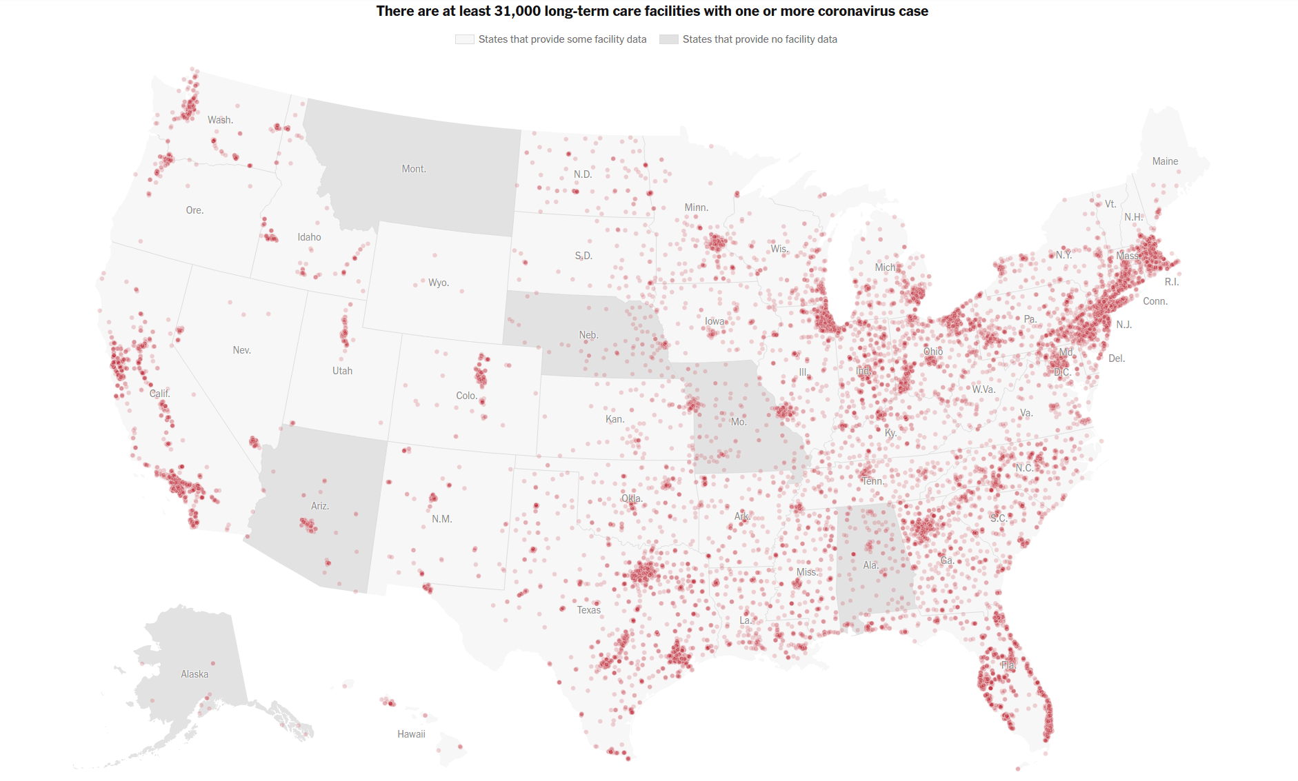
Pinpoint maps, for example, show the exact location of particular things, such as the nursing home locations with one COVID-19 case or more.
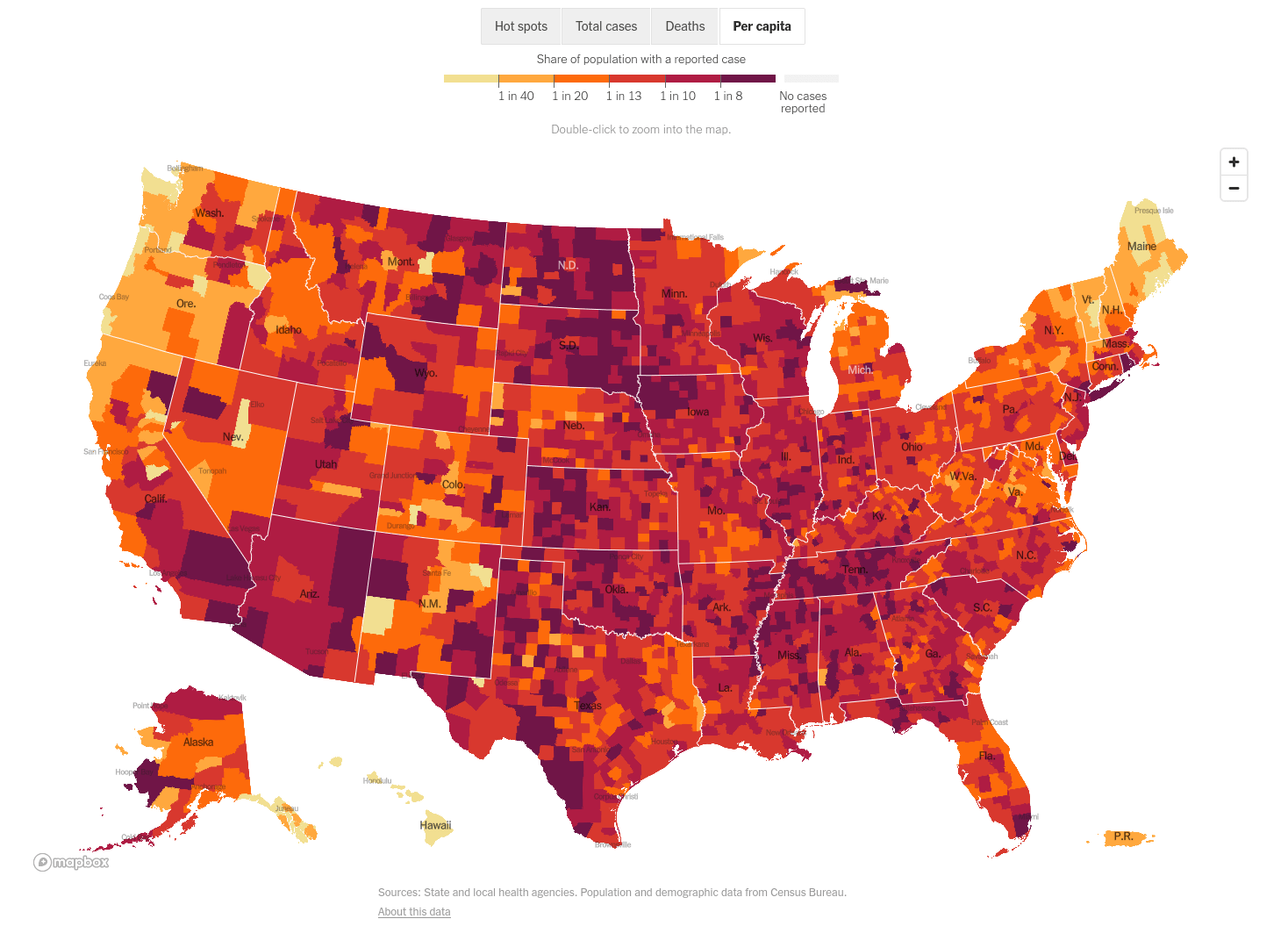
With choropleth maps, you assign colors to different categories and paint regions of the map accordingly. This map, for example, shows the share of the population with a reported COVID-19 case, coloring each county according to the per-capita rate.
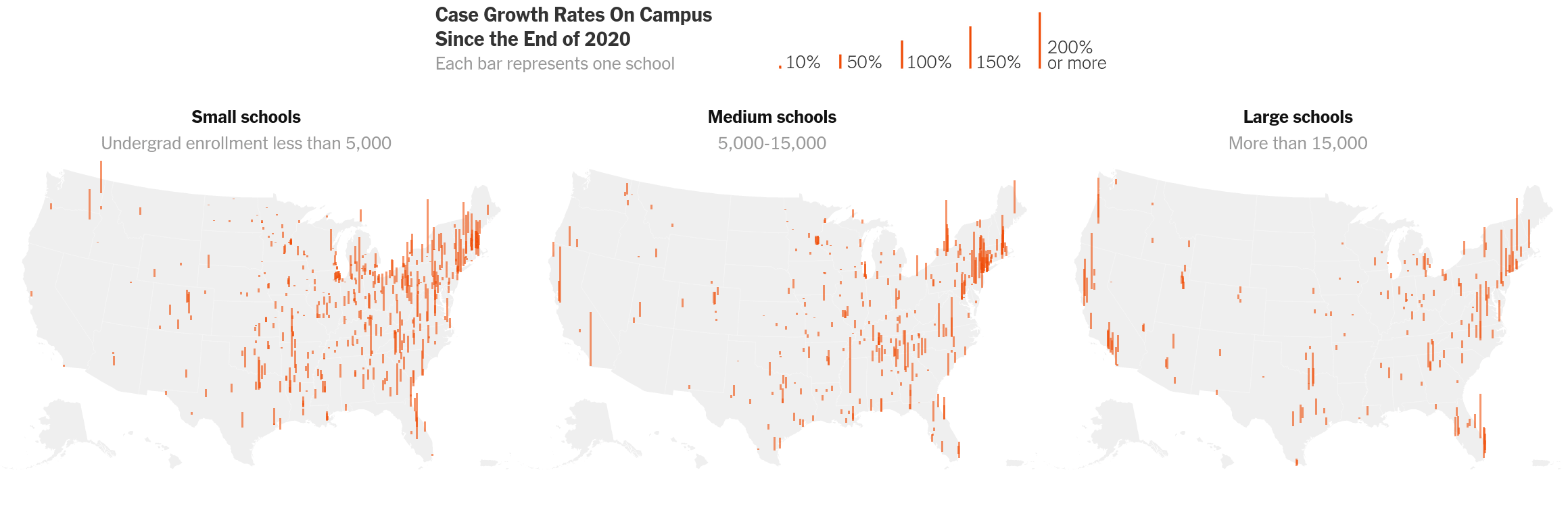
Proportional symbol maps are those that use some sort of symbol, like a circle or a bar, to communicate information in a proportional sense. In this example, the locations of colleges and universities are mapped with bars, which are sized to the case growth rates on those campuses relative to the end of 2020.
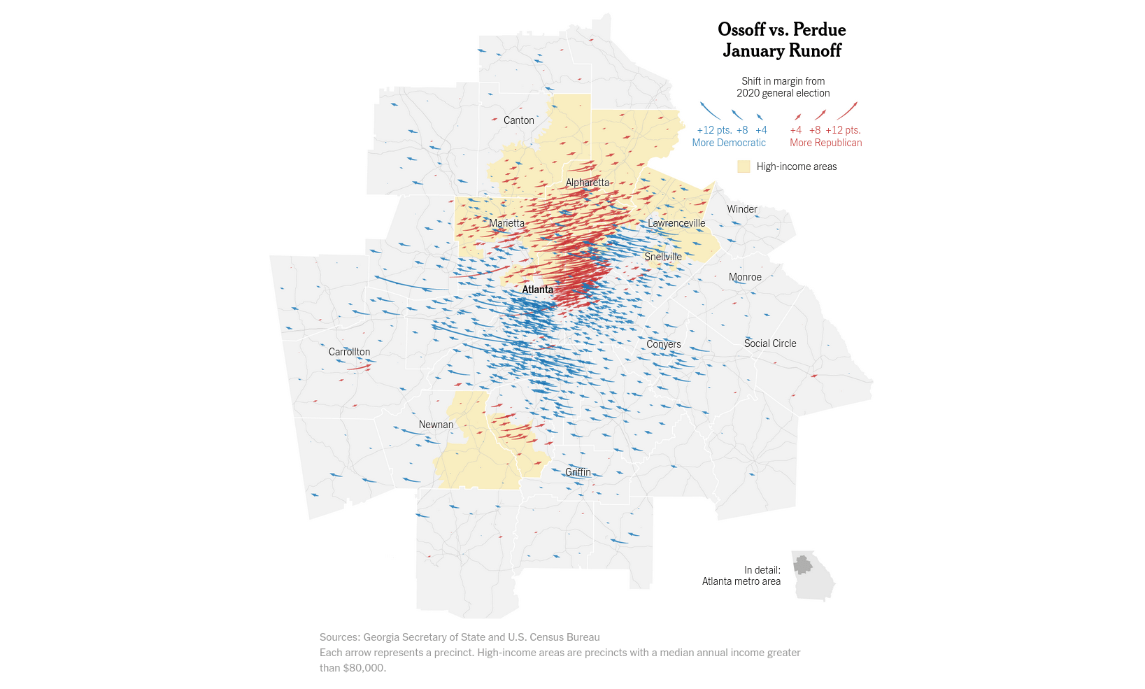
Stream maps are those that try to show connections between things or the directionality of some phenomenon. In the example below, the change in voting patterns between the 2020 General Election and the special runoff election held in January 2021 is shown via moving arrows.
Pinpoint and choropleth maps are especially common types of maps, and there are several tools you can use to help create them. Other map types are less common, and they may require you to code some of the map features yourself.
Regardless of the map type you choose, just remember the basic mechanics for creating maps and use your visual cues thoughtfully in order to create an informative visualization.