Maps as Storytelling Devices
Introduction
A map is an exceptionally popular and effective way of communicating spatial data, or information about elements that can be represented on a geographic coordinate system.
Maps do not just represent a series of data points, though. They reflect a particular geographical imagination of the world. That imagination can be leveraged to quickly convey a large amount of information and even to help tell stories. However, it is also a vector through which power and cultural understandings are communicated and reified.
The use of mapping as a journalistic device has seen rapid development over the past two decades. This is due in large part to the rise in the availability of easy-to-use digital mapping technologies, such as Google Maps and OpenStreetMap, which now serve as the backbone for many digital journalistic maps. (Software like ArcGIS helped make it easier for journalists in print and broadcast newsrooms to produce maps.) Additionally, new, open-source technologies (such as Leaflet and Mapbox) have been developed atop those mapping back-ends to give storytellers even more power.
While there have been notable map-making developments within journalism in recent years, it should be noted that cartography has long been a professional practice, though. In fact, early topographical maps have been dated as far back as 1150 BCE. Moreover, journalists have used maps in their reporting for hundreds of years, too. What is different about recent decades is the ease through which maps can be created by non-specialists, the levels of interactivity those maps can offer, and the kinds of devices maps are viewed on.
Different Purposes for Maps
Much like a chart, maps can be used to explore, explain, or exemplify.
For example, you may come across a map in a feature story about wine-making that pinpoints the best wineries in California. That map is simply intended to convey to the viewer the location of different points of interest, and allow them to identify what might be of greatest interest to them (e.g., the nearest quality winery to them, or a cluster of wineries they may want to visit on a day trip). Additionally, each of those points may show additional information when the user hovers over their marker—these are generally called ’tooltips’ or ‘infoboxes’ in interactive mapmaking software—which enables the viewer to explore the specific points they’re interested in, and learn more about them.
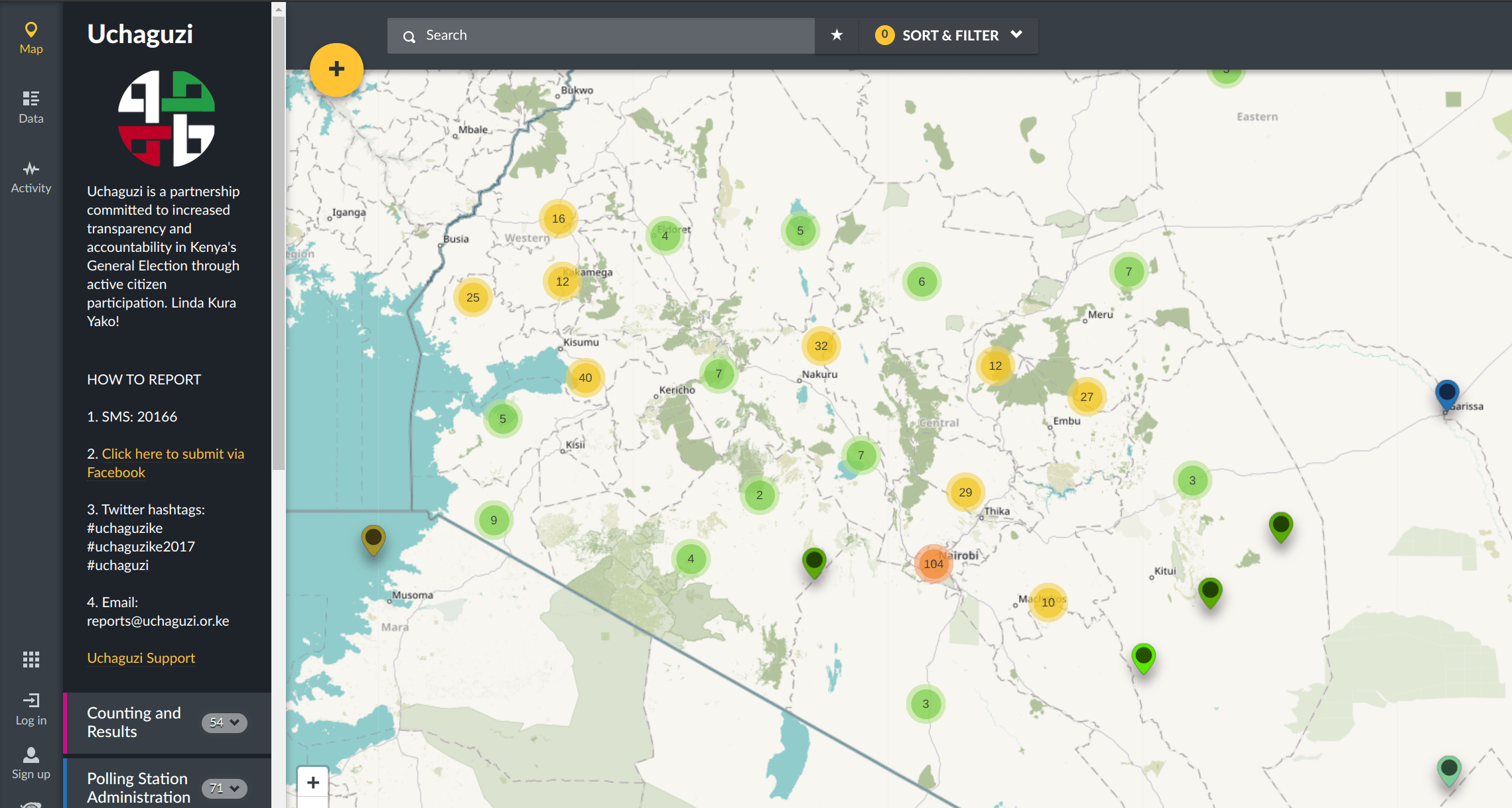
In recent years, both journalistic outlets and non-governmental organizations have experimented with the idea of crowd-mapping. This approach typically either takes crowd-sourced information, curates it, and produces a map (e.g., tweets about the best wineries) or creates a simple interface that allows individuals to add information to an existing map (e.g., report the location of an act of violence during a protest). Put another way, such maps are designed to leverage the collective intelligence of citizens, officials, and experts. One platform that helped popularize this approach is Ushahidi, which has been deployed more than 100,000 times to crowd-map things as simple as traffic management to election-day incidents.
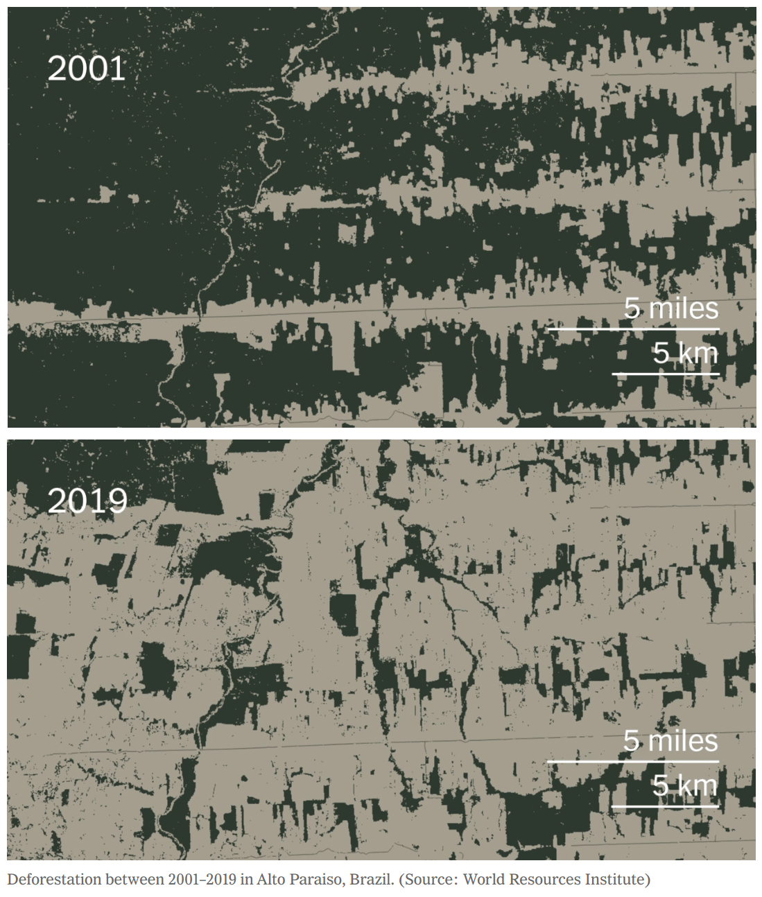
Maps may also be used to exemplify things. For example, in a story about deforestation in the Amazon, a journalist may use two maps of the same area, which are set a few years apart, to show how a section of the Amazon previously covered by trees is now largely cleared of them. Alternatively, a journalist may use satellite imagery to show a neighborhood before and after a military bombing. Such maps are generally intended to show how spaces have changed over time or in response to some incident.
Story Mapping
One increasingly common explanatory use of maps is called story mapping, which captures the practice of integrating narratives into cartographic practice.
In contrast to typical maps, which are designed to be primarily functional by showing a range of data points to the viewer, a story map is designed to move the viewer through the map in order to convey a narrative. Put another way, a story map aims to convey a particular journey through space. This journey is necessarily subjective—it is one of many potential paths chosen by the storyteller—but it enables a more detailed accounting of space and its most notable features.
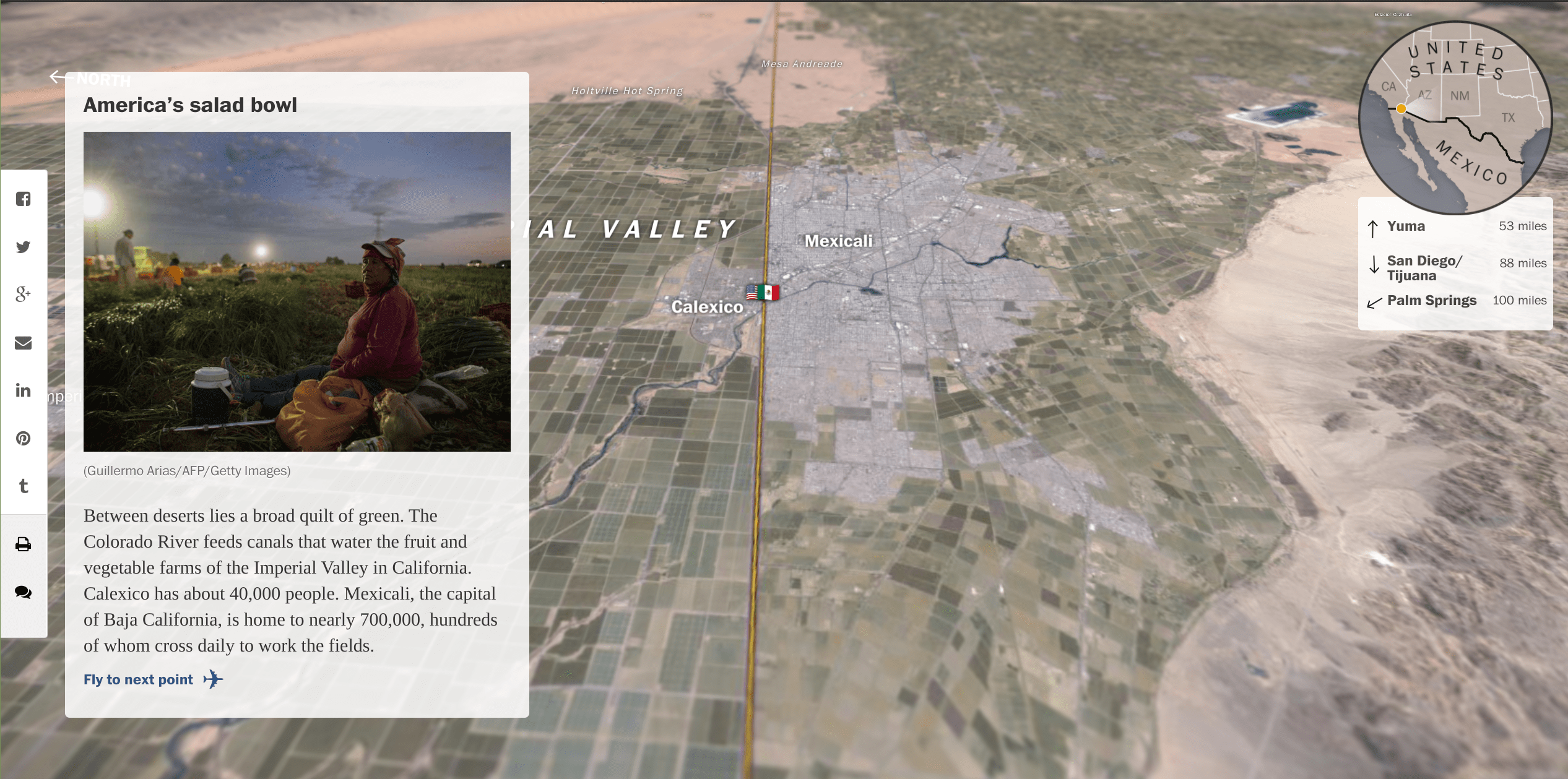
One example of this is The Washington Post’s Borderline project, which walks the viewer through the U.S. border with Mexico, pinpointing different border crossing areas of note and illustrating the topography of those places via satellite-aided 3D renderings. Here, the story is told through bite-site pieces of prose that call attention to the most interesting features of the geography that the viewer is being exposed to as they fly from one end of the border to the next.
In similar vein, one could imagine a journalist working with a group of migrants or refugees to tell their stories by illustrating their migration paths on a map and supplementing it first-hand, personal experiences at different points in the journey. This effectively centers the story around a small group of sources, with the mapping serving as a tool to add context and immersion.
Maps as Cultural Reproduction
When using maps as a visual aide, it is also important to note that their authority is embedded in long-standing histories that reflect power and colonization. That power and those histories are themselves embedded in mapping software via the ‘default’ options they offer, and become even further reified through their dissemination to broad audiences—which has epistemological and ontological consequences.
Maps are generally characterized by boundaries, but those boundaries are not often clear—and it is similarly unclear who should have the power to set the boundaries. To illustrate this, consider the issue of disputed lands. If one is to query the coordinates of the Himalayas across mapping products, they may encounter different borders as geopolitical landscapes change things. Similarly, Bir Tawil is an uninhabited piece of land on the border of Egypt and Sudan, yet it is not claimed by either nation (despite often showing up within Sudan on many maps).
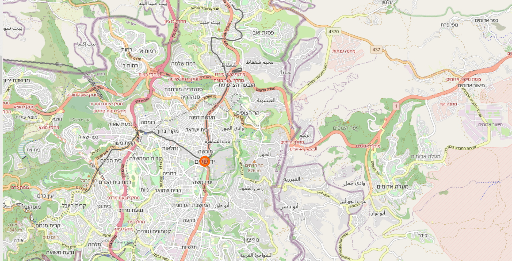
Perhaps more notable and controversial is the naming of disputed lands on maps. For example, if you were to zoom in on the disputed areas between Israel and Palestine on OpenStreetMap, you would come across Jerusalem, which is conveyed on the map through its Hebrew name. In the past, the area would be conveyed via either its Arabic or Hebrew name, depending on who had most recently edited its wiki-style database. In order to end the inconsistency (and combat infighting on the site), OpenStreetMap adopted a policy where they would use the names of geographical features as asserted by the “dominant controlling power” in that region. While this has led to greater consistency on the platform, it has raised questions about the reification of the status quo.
In short, by using maps, journalists are not just illustrating features of their chosen data. They are offering a particular imagination of the world based on their selected platforms and mapping engines, which can either challenge existing spatial notions or reinforce geographic epistemologies.