Chart Design Principles
Introduction
Creating a beautiful and informational data visualization can be a challenge, especially if you don’t have a strong background in design.
However, you can make some highly intelligent design decisions by simply understanding the Gestalt principles. These principles are rooted in a theory of human perception that was developed by Austrian and German psychologists in the 20th century. The key point from this theoretical perspective is that individuals perceive entire patterns or configurations, and not just individual components, when they encounter a visual object.
The Gestalt Principles
In this lesson, we’ll cover six of those principles that are most relevant to modern-day data visualizations: proximity, similarity, enclosure, closure, continuity, and connection.
These principles can be used to produce visual communications that are more easily processed by general audiences. Specifically, the principles can be used to make the connections between the different visual elements more obvious. The goal here is to reduce the cognitive work a viewer has to perform to see the central point of the visualization.
The principles are also useful for a secondary reason: they help us identify and remove clutter — information that does little to advance our visualization.
Proximity
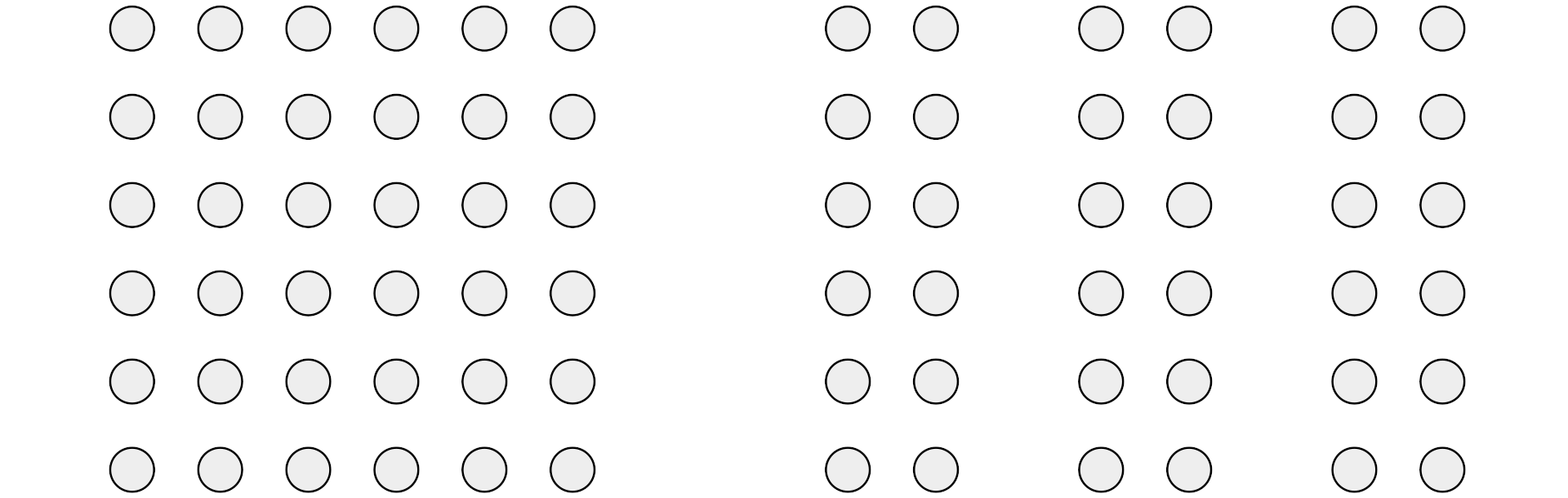
The principle of proximity states that when an individual encounters an assortment of objects, they perceive the objects that are close to one another as being part of the same group. Proximity may be conveyed by clustering like information together — and using space to separate different groups of information. For example, in the image below, we see those 72 circles as one group of 36 circles and three different groups of 12 circles.
Similarity
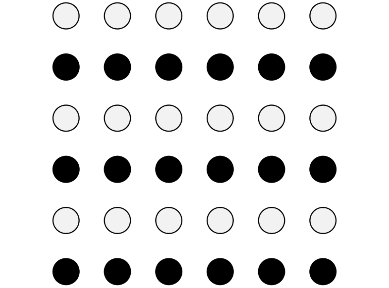
The principle of similarity states individuals tend to group together the things that they perceive as being similar. Our minds then go on to make similar assumptions about the elements within that group. Similarity may be conveyed through the selection of shape, color, size, and so on. For example, in the image below, we perceive the dark circles as being part of the same group — even though they are set apart.
Enclosure
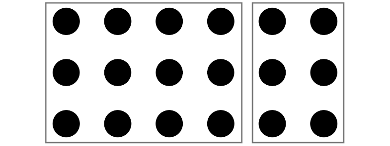
The principle of enclosure states that individuals tend to group items that are surrounded by an object, such as a rectangle or circle. For example, in the image below, we perceive the dots as being part of one of two groups, even though they look exactly the same and are spread evenly apart.
Closure
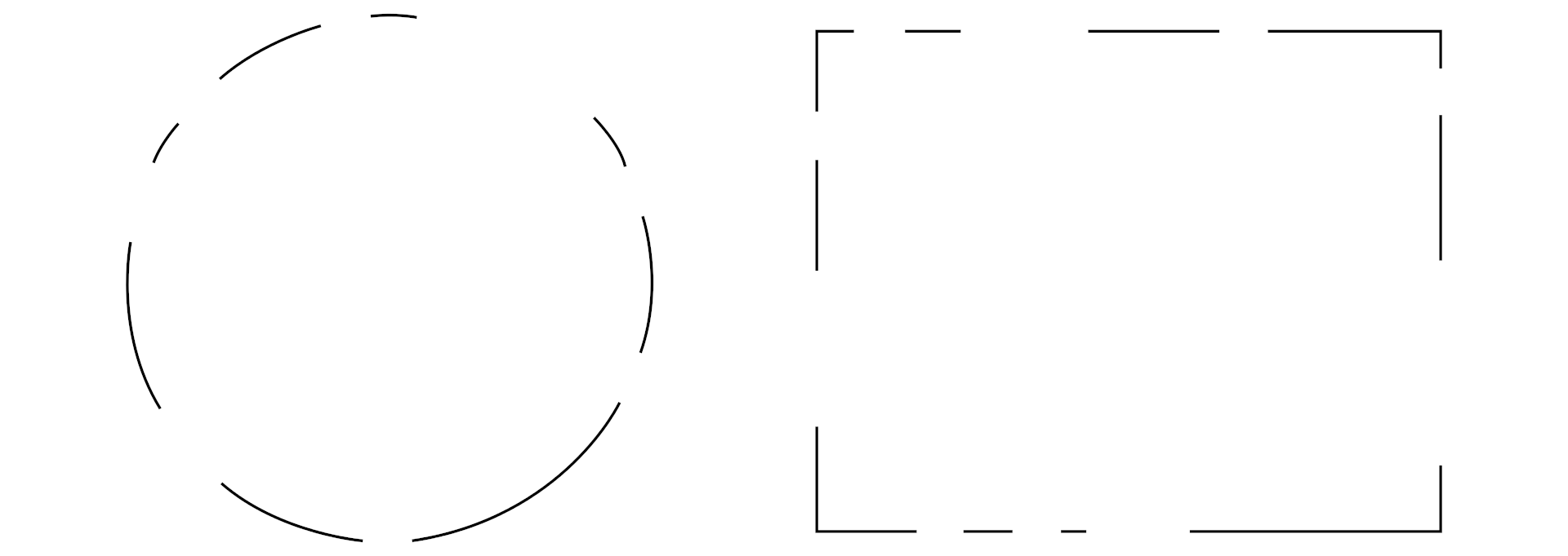
The principle of closure states that the human mind seeks to perceive a whole image, rather than the sum of its parts. Consequently, when presented with an incomplete object, our minds will fill in the gaps. For example, as shown in the image below, we will complete a circle or a rectangle so long as we are (a) familiar with what those shapes look like and (b) have sufficient information to complete the shape.
Symmetry
The principle of symmetry states that the mind perceives objects as being symmetrical and forming around a center point. This has two implications. First, the mind will often group symmetrical items as a single, coherent shape or image. Second, humans are generally drawn to symmetrical objects — which is why we tend to notice (and be disturbed) by misaligned objects in an image. For example, the image below helps show that we see three pairs of symmetric brackets (and not six individual brackets) due to our predisposition toward symmetry.

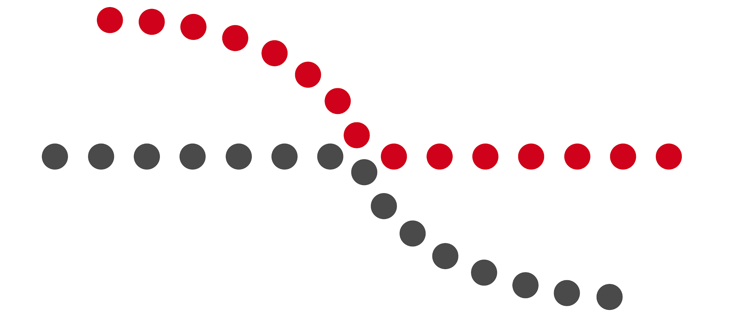
Continuity
The principle of continuity states that individuals tend to look for continuous lines or smooth curves rather than sharp or broken segments, and will thus integrate them into perceptual wholes even when there is some kind of discontinuation. For example, in the image below, your mind will probably track one straight line and a second curved line (based on their trajectory), even though the coloring might suggest two lines that shift suddenly.
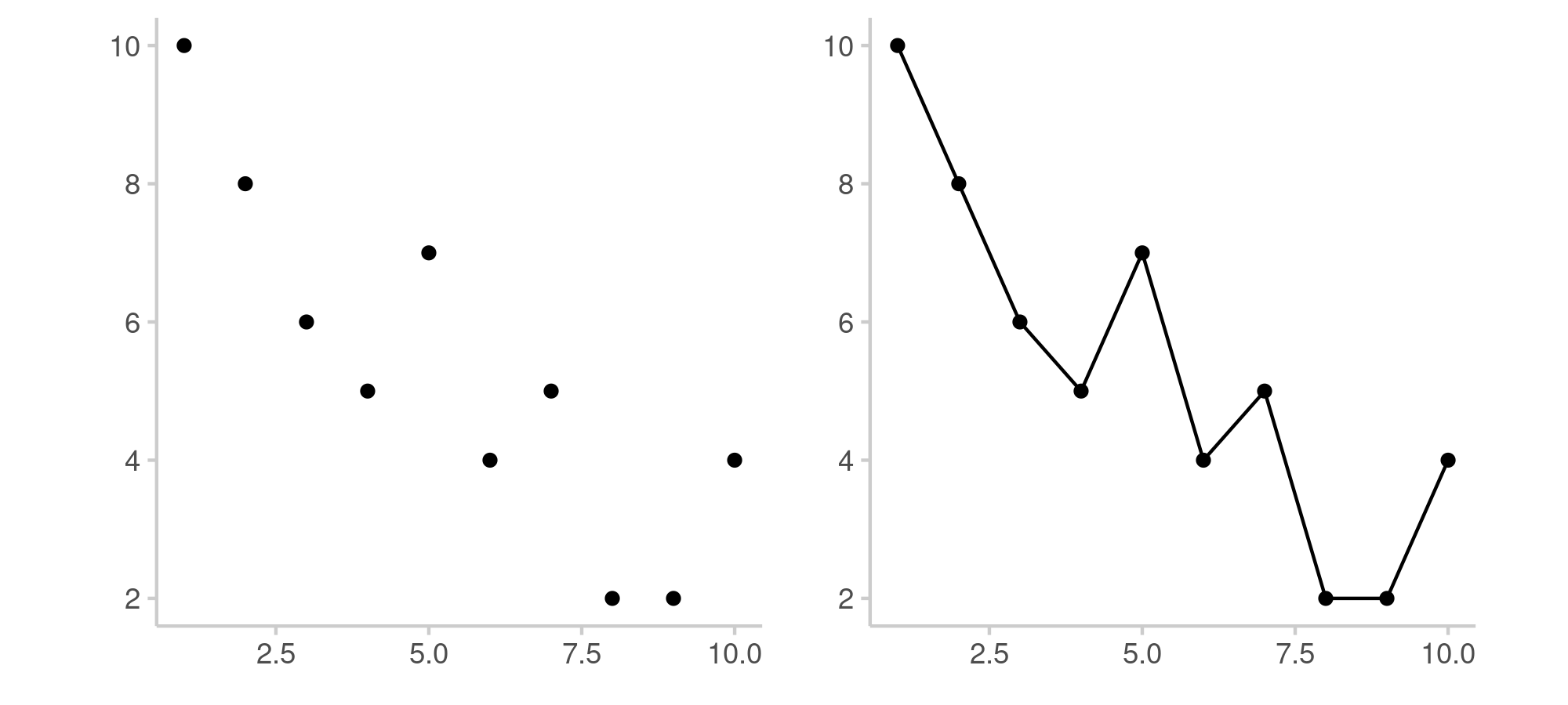
Connection
The principle of connection states that individuals will more easily group points together if they are connected in some fashion, such as by a line. This is why line graphs tend to be easier to read than just plotting individual points on a chart, as shown in the image below.
Hierarchy
Within Gestalt psychology, there is also the important concept of visual hierarchy. This refers to the patterns employed within some visual that enables some elements to attract more attention than other elements (i.e., stand out), thereby suggesting a hierarchy of importance within the visual as a whole. Put another way, designers can use certain aesthetics to highlight certain pieces of information by drawing on psychological predispositions.
There are three main aesthetics that data visualization designers often draw upon: color, size, and alignment.
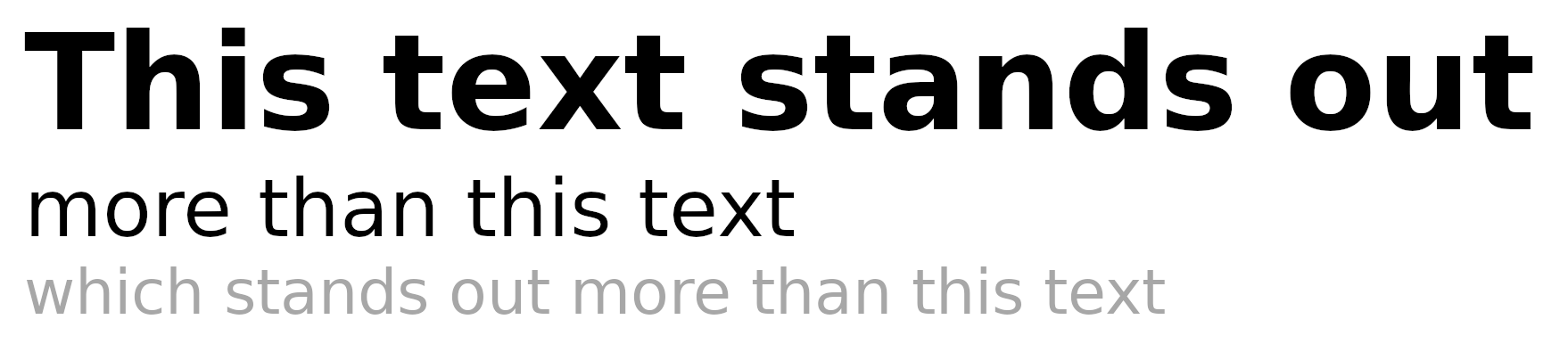
Color
Color encompasses the hue, saturation, value, and perceived texture of an element. For example, dark figures will stand out on a light background, light figures will stand out on a dark background, and brightly-colored figures will stand out on a muted background. Within the context of data visualizations, designers will often use a bold font face to draw attention to a heading and a more muted gray for a subheading that simply offers general information. They may also use different colors to highlight particular elements of interest in the visualization.
Size
Larger elements tend to be the ones that receive the most attention. For example, a chart title tends to employ a larger font size because it generally contains more important information than the subheading, which typically uses a smaller font size. Similarly, an infographic may use a larger enclosure (and even larger sub-elements within it) in order to draw the viewer’s attention to that grouping of information first.
Alignment
Alignment refers to the arrangement of forms, in relation to one another. In cultures that employ a left-to-right reading pattern (i.e., most cultures in the West), items in the upper left corner of a page are often seen first (as people read in a Z-shaped pattern). Additionally, the center of the image is often given particular prominence. Negative space can also be employed to convey importance as an isolated figure (i.e., surrounded by large amounts of white space) will stand out more than one surrounded by many other elements.
Putting It All Together
Gestalt principles are not meant to be thought about in isolation. They’re intended to be executed in a complementary fashion through the application of different tactics. For example, you can contrast data — that is, apply the opposite of the similarity principle — by using different colors. You can connect a component of your subtitle to a series of data (e.g., a specific line) by using the same color for both that segment of text and the line on the chart. And, you can highlight a period of interest by enclosing that portion of the line chart and adding an annotation with a key bit of information having its text bolded.
It is important to keep in mind, however, that these principles should be applied thoughtfully in order to have a cohesive whole. For example, using several different font faces may indeed create contrast but it will also likely create a visual mess. Similarly, having too many contrasting elements (e.g., many different colors) will likely make it hard for the viewer to pick out what matters the most. In general, it is helpful to repeat many of your elements (e.g., use a small color palette) and contrast only the most important pieces of information.
Ultimately, the goal of good design is to make your viewer have to “work” the least amount in order to get the main point of the visualization. There are entire undergraduate and graduate programs dedicated to design, and you can take entire courses on things like typography alone. However, keeping these Gestalt principles in mind will go a long way to ensuring you are creating visualizations that are not only appealing to the human eye but also communicate information effectively.