Creating Animated Maps with R
Introduction
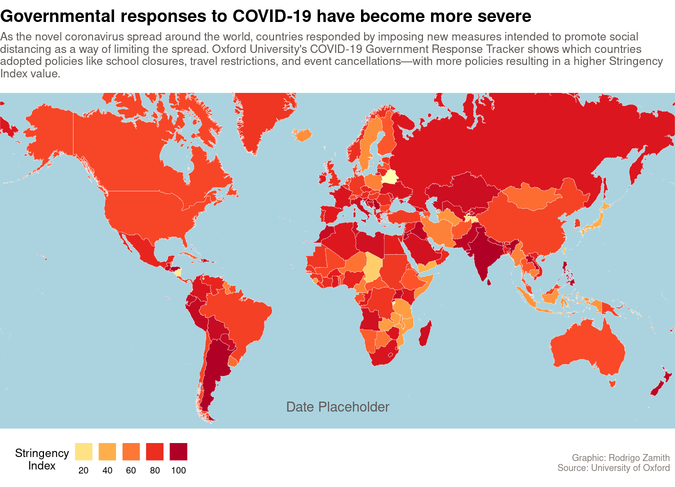
For this tutorial, we will be using R create an animated map using the ggplot2 and gganimate packages. This map will shows how different governments around the world responded to the spread of COVID-19 during its early phases. Here’s what that map will look like:
The foundation for this chart, including how to download a shapefile and set up the foundational pieces of our map using ggplot2 are covered in the “Creating Static Maps with R” tutorial. For brevity, I will not explain code used in this tutorial that was covered in that one. Put another way, I encourage you to read the “Creating Static Maps with R” tutorial first.
Loading the Data
Our data are derived from The Oxford COVID-19 Government Response Tracker, which provides regularly updated data files about different policy responses governments have adopted.
In particular, we are going to focus on their overall “Stringency Index,” which is a number from 0 to 100 that describes the number and strength of 20 different policy indicators, such as school closures, travel restrictions, events cancellations. More detail about those indicators is available here.
We will be working with a subset of their dataset that includes the country’s name (CountryName) and code (CountryCode), the date (Date) of measurement, the number of confirmed COVID-19 cases (ConfirmedCases) and deaths (ConfirmedDeaths), and the Stringency Index (StringencyIndex).
You can load the dataset into an object called covid19_stringency by using the readr::read_csv() function to read data from this CSV file.
library(tidyverse)
covid19_stringency <- read_csv("https://dds.rodrigozamith.com/files/covid19_stringency_20210402.csv")
## Rows: 85374 Columns: 6

## ── Column specification ────────────────────────────────────────────────────────
## Delimiter: ","
## chr (2): CountryName, CountryCode
## dbl (4): Date, ConfirmedCases, ConfirmedDeaths, StringencyIndex

##
## ℹ Use `spec()` to retrieve the full column specification for this data.
## ℹ Specify the column types or set `show_col_types = FALSE` to quiet this message.
This is what our dataset looks like:
head(covid19_stringency)
| CountryName | CountryCode | Date | ConfirmedCases | ConfirmedDeaths | StringencyIndex |
|---|---|---|---|---|---|
| Aruba | ABW | 20200101 | NA | NA | 0 |
| Aruba | ABW | 20200102 | NA | NA | 0 |
| Aruba | ABW | 20200103 | NA | NA | 0 |
| Aruba | ABW | 20200104 | NA | NA | 0 |
| Aruba | ABW | 20200105 | NA | NA | 0 |
| Aruba | ABW | 20200106 | NA | NA | 0 |
Each observation refers to a country’s index and case/death count on a particular date. For example, the first observation tells us that on January 1, 2020, Aruba had a Stringency Index of 0, and we did not have information about its confirmed case and death counts.
Filtering and Joining the Data
Our dataset contains more information than we need. In particular, we only need the observations covering the first three full months of the COVID-19 pandemic, and for just three of our variables (CountryName, CountryCode, and StringencyIndex).
It is helpful to get your dataset to the smallest possible size before you start adding shape information to it. Since we are now effectively creating 90 different maps (one per day), it will take a little longer to render the map, and it is possible that your system’s memory capacity will be exhausted. This becomes an even bigger challenge as your dataset grows in size as new dates are added to it.
Here’s how we could get our desired data (and store it in an object called covid19_stringency_mini):
covid19_stringency_mini <- covid19_stringency %>%
  filter(between(Date, 20200101, 20200401))
Then, we’ll need to join the data with our shapefile information. We’ll start by downloading this shapefile and saving it to our project directory. Then, we can load the shapefile data into an object called world_map by using the following code:
library(sf)
unzip("TM_WORLD_BORDERS-0.3.zip", exdir=tempdir())
world_map <- st_read(paste0(tempdir(), "/", "TM_WORLD_BORDERS-0.3.shp"))
You will need to install the sf package before you can run it for the first time. This may require you to install some additional software on your system.
Finally, we can join the two datasets into an object called map_data_animated with the following code:
map_data_animated <- left_join(x=world_map, y=covid19_stringency_mini, by=c("iso3"="CountryCode"))
Designing our Map
Before we start animating our map, we’ll want to make sure it looks how we want it to. After all, the scaffolding and aesthetics of the map will largely remain the same across frames—only the shading of the countries and the date label will be changing.
Again, it will be helpful here to refer to the Creating Static Maps with R tutorial, as much of that code will be reused and not explained here.
During the design phase, I’m going to fix on a particular date (using filter()) so I can see how my map looks. I’ll be tweaking all of my ggplot2 functions as needed to get my map to look just how I want it:
map_data_animated %>%
  filter(Date==20200330) %>%
  ggplot(aes(fill=StringencyIndex)) +
    geom_sf(color="white", size=.1) +
    coord_sf(crs=st_crs(3857), ylim = c(-7842319, 12123480), expand = FALSE) +
    theme_void() +
    scale_fill_distiller(breaks=c(0,20,40,60,80,100), palette="YlOrRd", direction=1, guide=guide_legend(label.position="bottom", title.position="left", nrow=1), name="Stringency\nIndex") +
    theme(legend.position="bottom") +
    labs(title="Governmental responses to COVID-19 have become more severe", subtitle="As the novel coronavirus spread around the world, countries responded by imposing new measures intended to promote social \ndistancing as a way of limiting the spread. Oxford University's COVID-19 Government Response Tracker shows which countries \nadopted policies like school closures, travel restrictions, and event cancellations\u2015with more policies resulting in a higher Stringency \nIndex value.\n", caption="\n\nGraphic: Rodrigo Zamith  \nSource: University of Oxford  \n", tag="Date Placeholder") +
    theme(legend.position=c(.15,-.09), legend.title=element_text(hjust=.5), plot.title=element_text(size=rel(1.5), family="sans", face="bold"), plot.subtitle=element_text(color="#5e5855"), plot.caption=element_text(color="#867e7a"), plot.tag=element_text(hjust=0.5, color="#5e5855"), plot.tag.position=c(0.5, 0.16), panel.background=element_rect(fill="#aad3df", color=NA))
Here’s what the map looks like, when it is keyed to March 30, 2020:
Animating the Map
To animate our map, we’ll use the gganimate package, which allows us to create animated .gif files and even video files (e.g., .mp4) that can be embedded onto a page.
Prior to loading the gganimate package, it is recommended that you install the av package (to create .mp4 files) or the gifski package (to create .gif files). This may require you to install some additional software on your system (read through the output when you try to install the gganimate package in R, or load it later on.)
library(gganimate)
You will need to install the gganimate package before you can run it for the first time.
Then, we just need to make a few modifications to the map we created above:
-
First, we’ll get rid of our
filter(), so we can look at all the dates. -
Second, we’ll make sure to use
arrange()to sort our dates in a sequential manner (earliest to latest), and then usemutate()to make our dates easier to read. (Theformat()function allows us to translate our date to Month (%B), Day (%d), and Year (%Y). We also include thelevelsargument to keep our sequential ordering, as this tells R to keep our original order (sorted by date) and not re-order alphabetically.) To help with the date conversion, we will also load thelubridatepackage. -
Third, we’ll tweak our
tagargument inlabs()to be{current_frame}, which is an indicator togganimateto paste the name of the currentDatethere when it generates a new frame. (We tell it to use theDatevariable in the next step.)
Once we have done that, we will use the gganimate::transition_manual() function to tell it to create a new image/frame with every unique value of Date.
We will assign the result of all of that to an object called p by modifying the first line of our code.
library(gganimate)
library(lubridate)
p <- map_data_animated %>%
  #filter(Date=="2020-03-30") %>% # Commented it out so it won't run
  arrange(Date) %>%
  mutate(Date=factor(format(ymd(Date), format="%B %d, %Y"), levels=unique(format(ymd(Date), format="%B %d, %Y")))) %>%
  ggplot(aes(fill=StringencyIndex)) +
    geom_sf(color="white", size=.1) +
    coord_sf(crs=st_crs(3857), ylim = c(-7842319, 12123480), expand = FALSE) +
    theme_void() +
    scale_fill_distiller(breaks=c(0,20,40,60,80,100), palette="YlOrRd", direction=1, guide=guide_legend(label.position="bottom", title.position="left", nrow=1), name="Stringency\nIndex") +
    theme(legend.position="bottom") +
    labs(title="Governmental responses to COVID-19 have become more severe", subtitle="As the novel coronavirus spread around the world, countries responded by imposing new measures intended to promote social \ndistancing as a way of limiting the spread. Oxford University's COVID-19 Government Response Tracker shows which countries \nadopted policies like school closures, travel bans, and event cancellations\u2015with more policies resulting in a higher Stringency Index \nvalue.\n", caption="\n\nGraphic: Rodrigo Zamith  \nSource: University of Oxford  \n", tag="{current_frame}") +
    theme(legend.position=c(.15,-.09), legend.title=element_text(hjust=.5), plot.title=element_text(size=rel(1.5), family="sans", face="bold"), plot.subtitle=element_text(color="#5e5855"), plot.caption=element_text(color="#867e7a"), plot.tag=element_text(hjust=0.5, color="#5e5855"), plot.tag.position=c(0.5, 0.16), panel.background=element_rect(fill="#aad3df", color=NA)) +
    transition_manual(Date)
Exporting the Animation
To actually view our animated map, we will want to export it into a file that we can open on our computer. (Simply calling the object p will typically produce undesirable results.)
We can handle that exporting process by using the gganimate::animate() function. With that function, we just specify the object containing our animation (p) and the renderer that we’d like to use. We can also add sizing parameters (in pixels) with width and height.
The File Renderer
The first renderer, which will work on most computers, is the file_renderer(). This renderer will create a series of .png files that you can then combine into an animated .gif by using a website like this. (Then, it’d be wise to run it through an image compressor to reduce the file size.)
animate(p, width=1080, height=755, renderer=file_renderer(dir="anim_img/"))
This will save the images into a subfolder called anim_img/ of your working directory. If you are using an RStudio project, that will typically be your project folder.
You may find, though, that your text looks really small after the animate() function resizes the ggplot. To rectify that, you can just tweak a few of the theme() parameters and run the function again. For example:
unlink("anim_img/", recursive=TRUE) # Use this to delete your `anim_img/` directory, otherwise your images will not be changed.
p2 <- p +
  theme(text=element_text(size=18), legend.position=c(.12,-.06), plot.tag.position=c(0.5, 0.12))
animate(p2, width=1080, height=755, renderer=file_renderer(dir="anim_img/"))
Advanced Renderers
You could also create a .gif file automatically by using the gifski_renderer() or magick_renderer() functions, or create a video file using av_renderer() or ffmpeg_renderer() functions. Again, these will produce good-quality results and automate the animation process, but they may require you to install additional packages (and supporting software, in some cases) on your computer.
Here is an example of how we can create an .mp4 video file—like the one at the top of this tutorial—that can be embedded in a news story with play/pause/replay controls. (Those files are also better optimized, and thus much smaller, than .gif files.)
p2 <- p +
  theme(text=element_text(size=18), legend.position=c(.12,-.06), plot.tag.position=c(0.5, 0.12))
animate(p2, width=1050, height=750, duration=20, end_pause=10, renderer=av_renderer(file="covid19-stringency-map.mp4"))
This will save the video file in your working directory. If you are using an RStudio project, that will typically be your project folder.
And there you’d have it, the animated map atop this tutorial!
If you like, you can continue playing around with the sizing to get a higher-resolution graphic, or tweak more of the theming options to get it to look just as you want it.