Exploratory Data Visualization in R
Introduction
In this tutorial, we will be using some functions from the DataExplorer and plotly packages to help us perform an initial exploratory visual analysis of county-level data from the Eviction Lab. We’ll also do some basic plotting of our own with the ggplot2 package. Specifically, we’ll be learning how to:
-
Visualize missing values in the data.
-
Generate histograms for all your numerical variables.
-
Generate bar plots for all your nominal variables.
-
Create a line graph using ggplot.
-
Add some basic interactivity to your ggplots.
The Dataset
The Eviction Lab has collected data from 80 million records around the country and you can read about the methodology here. Desmond’s team also makes data available at more micro levels ([U.S. Census tracts]((https://www.census.gov/geo/reference/webatlas/tracts.html) and block groups), as well as more macro levels (county, statewide).
As always, it is helpful to review the data dictionary to understand the meaning of the different variables (what each variable name corresponds to). If you want more detail about any of the variables, I encourage you to review the full Methodology Report.
Pre-Analysis Steps
Load the data
The first step, of course, is to read in the data. We’ll use the readr::read_csv() function (readr can be loaded by the tidyverse metapackage) and store the data in an object called ma_counties.
library(tidyverse)
## ── Attaching packages ─────────────────────────────────────── tidyverse 1.3.1 ──

## ✓ ggplot2 3.3.5     ✓ purrr   0.3.4
## ✓ tibble  3.1.3     ✓ dplyr   1.0.7
## ✓ tidyr   1.1.3     ✓ stringr 1.4.0
## ✓ readr   2.0.1     ✓ forcats 0.5.1

## ── Conflicts ────────────────────────────────────────── tidyverse_conflicts() ──
## x dplyr::filter()     masks stats::filter()
## x dplyr::group_rows() masks kableExtra::group_rows()
## x dplyr::lag()        masks stats::lag()
ma_counties <- read_csv("https://dds.rodrigozamith.com/files/evictions_ma_counties.csv")
## Rows: 238 Columns: 27

## ── Column specification ────────────────────────────────────────────────────────
## Delimiter: ","
## chr  (2): name, parent-location
## dbl (25): GEOID, year, population, poverty-rate, renter-occupied-households,...

##
## ℹ Use `spec()` to retrieve the full column specification for this data.
## ℹ Specify the column types or set `show_col_types = FALSE` to quiet this message.
Confirm it imported correctly
The next step is to confirm the data were imported the way we wanted it to. Here, I would recommend that you follow three steps.
Step 1: Check the first few observations
Start by checking the first few observations (rows) of the object to check if there’s anything odd using the head() function:
head(ma_counties)
| GEOID | year | name | parent-location | population | poverty-rate | renter-occupied-households | pct-renter-occupied | median-gross-rent | median-household-income | median-property-value | rent-burden | pct-white | pct-af-am | pct-hispanic | pct-am-ind | pct-asian | pct-nh-pi | pct-multiple | pct-other | eviction-filings | evictions | eviction-rate | eviction-filing-rate | low-flag | imputed | subbed |
|---|---|---|---|---|---|---|---|---|---|---|---|---|---|---|---|---|---|---|---|---|---|---|---|---|---|---|
| 25001 | 2000 | Barnstable County | Massachusetts | 222230 | 6.89 | 21035 | 22.18 | 723 | 45933 | 178800 | 27.7 | 93.38 | 1.73 | 1.35 | 0.52 | 0.61 | 0.02 | 1.56 | 0.83 | NA | NA | NA | NA | 0 | 0 | 0 |
| 25001 | 2001 | Barnstable County | Massachusetts | 222230 | 6.89 | 21096 | 22.18 | 723 | 45933 | 178800 | 27.7 | 93.38 | 1.73 | 1.35 | 0.52 | 0.61 | 0.02 | 1.56 | 0.83 | NA | NA | NA | NA | 0 | 0 | 0 |
| 25001 | 2002 | Barnstable County | Massachusetts | 222230 | 6.89 | 21157 | 22.18 | 723 | 45933 | 178800 | 27.7 | 93.38 | 1.73 | 1.35 | 0.52 | 0.61 | 0.02 | 1.56 | 0.83 | NA | NA | NA | NA | 0 | 0 | 0 |
| 25001 | 2003 | Barnstable County | Massachusetts | 222230 | 6.89 | 21218 | 22.18 | 723 | 45933 | 178800 | 27.7 | 93.38 | 1.73 | 1.35 | 0.52 | 0.61 | 0.02 | 1.56 | 0.83 | 767 | 751 | 3.54 | 3.61 | 0 | 0 | 0 |
| 25001 | 2004 | Barnstable County | Massachusetts | 222230 | 6.89 | 21279 | 22.18 | 723 | 45933 | 178800 | 27.7 | 93.38 | 1.73 | 1.35 | 0.52 | 0.61 | 0.02 | 1.56 | 0.83 | NA | NA | NA | NA | 0 | 0 | 0 |
| 25001 | 2005 | Barnstable County | Massachusetts | 222629 | 4.31 | 21340 | 18.91 | 1045 | 60096 | 399900 | 32.8 | 93.05 | 1.90 | 1.76 | 0.37 | 0.93 | 0.01 | 1.58 | 0.40 | NA | NA | NA | NA | 0 | 0 | 0 |
Just like before, it appears we imported the data correctly. Each observation represents a different county (name) at a different point in time (year).
Step 2: Check the structure
Next, we’ll use the glimpse() function to check all the column names and make sure they’re associated with the right data type:
glimpse(ma_counties)
## Rows: 238
## Columns: 27
## $ GEOID                        <dbl> 25001, 25001, 25001, 25001, 25001, 25001,...
## $ year                         <dbl> 2000, 2001, 2002, 2003, 2004, 2005, 2006,...
## $ name                         <chr> "Barnstable County", "Barnstable County",...
## $ `parent-location`            <chr> "Massachusetts", "Massachusetts", "Massac...
## $ population                   <dbl> 222230, 222230, 222230, 222230, 222230, 2...
## $ `poverty-rate`               <dbl> 6.89, 6.89, 6.89, 6.89, 6.89, 4.31, 4.31,...
## $ `renter-occupied-households` <dbl> 21035, 21096, 21157, 21218, 21279, 21340,...
## $ `pct-renter-occupied`        <dbl> 22.18, 22.18, 22.18, 22.18, 22.18, 18.91,...
## $ `median-gross-rent`          <dbl> 723, 723, 723, 723, 723, 1045, 1045, 1045...
## $ `median-household-income`    <dbl> 45933, 45933, 45933, 45933, 45933, 60096,...
## $ `median-property-value`      <dbl> 178800, 178800, 178800, 178800, 178800, 3...
## $ `rent-burden`                <dbl> 27.7, 27.7, 27.7, 27.7, 27.7, 32.8, 32.8,...
## $ `pct-white`                  <dbl> 93.38, 93.38, 93.38, 93.38, 93.38, 93.05,...
## $ `pct-af-am`                  <dbl> 1.73, 1.73, 1.73, 1.73, 1.73, 1.90, 1.90,...
## $ `pct-hispanic`               <dbl> 1.35, 1.35, 1.35, 1.35, 1.35, 1.76, 1.76,...
## $ `pct-am-ind`                 <dbl> 0.52, 0.52, 0.52, 0.52, 0.52, 0.37, 0.37,...
## $ `pct-asian`                  <dbl> 0.61, 0.61, 0.61, 0.61, 0.61, 0.93, 0.93,...
## $ `pct-nh-pi`                  <dbl> 0.02, 0.02, 0.02, 0.02, 0.02, 0.01, 0.01,...
## $ `pct-multiple`               <dbl> 1.56, 1.56, 1.56, 1.56, 1.56, 1.58, 1.58,...
## $ `pct-other`                  <dbl> 0.83, 0.83, 0.83, 0.83, 0.83, 0.40, 0.40,...
## $ `eviction-filings`           <dbl> NA, NA, NA, 767, NA, NA, NA, NA, NA, NA, ...
## $ evictions                    <dbl> NA, NA, NA, 751, NA, NA, NA, NA, NA, NA, ...
## $ `eviction-rate`              <dbl> NA, NA, NA, 3.54, NA, NA, NA, NA, NA, NA,...
## $ `eviction-filing-rate`       <dbl> NA, NA, NA, 3.61, NA, NA, NA, NA, NA, NA,...
## $ `low-flag`                   <dbl> 0, 0, 0, 0, 0, 0, 0, 0, 0, 0, 0, 0, 0, 0,...
## $ imputed                      <dbl> 0, 0, 0, 0, 0, 0, 0, 0, 0, 0, 0, 0, 0, 0,...
## $ subbed                       <dbl> 0, 0, 0, 0, 0, 0, 0, 0, 0, 0, 0, 0, 0, 0,...
All of our variables appear to have the data types we’d expect for them (e.g., dbl for variables we would think would be numerical and chr for those we expect to be text).
Step 3: Check the range of values
We’ll also want to check to see if there are any extreme values in our dataset that may have been the result of information being entered incorrectly. To do that, we’ll use the summary() function:
summary(ma_counties)
##      GEOID            year          name           parent-location
##  Min.   :25001   Min.   :2000   Length:238         Length:238
##  1st Qu.:25007   1st Qu.:2004   Class :character   Class :character
##  Median :25014   Median :2008   Mode  :character   Mode  :character
##  Mean   :25014   Mean   :2008
##  3rd Qu.:25021   3rd Qu.:2012
##  Max.   :25027   Max.   :2016
##
##    population       poverty-rate   renter-occupied-households
##  Min.   :   9520   Min.   : 3.61   Min.   :  1365
##  1st Qu.: 130168   1st Qu.: 5.62   1st Qu.: 18481
##  Median : 470496   Median : 7.40   Median : 57391
##  Mean   : 466733   Mean   : 8.16   Mean   : 69080
##  3rd Qu.: 723419   3rd Qu.: 9.45   3rd Qu.:101985
##  Max.   :1556116   Max.   :18.99   Max.   :237937
##
##  pct-renter-occupied median-gross-rent median-household-income
##  Min.   :18.91       Min.   : 499.0    Min.   :39047
##  1st Qu.:29.20       1st Qu.: 743.2    1st Qu.:49956
##  Median :33.59       Median : 853.0    Median :56842
##  Mean   :33.88       Mean   : 946.7    Mean   :59647
##  3rd Qu.:37.00       3rd Qu.:1141.0    3rd Qu.:65313
##  Max.   :66.07       Max.   :1648.0    Max.   :88262
##
##  median-property-value  rent-burden      pct-white       pct-af-am
##  Min.   : 116800       Min.   :23.80   Min.   :46.47   Min.   : 0.83
##  1st Qu.: 202700       1st Qu.:26.30   1st Qu.:78.32   1st Qu.: 2.31
##  Median : 273100       Median :29.60   Median :84.93   Median : 3.15
##  Mean   : 331264       Mean   :29.16   Mean   :82.12   Mean   : 4.97
##  3rd Qu.: 392800       3rd Qu.:31.27   3rd Qu.:89.73   3rd Qu.: 6.04
##  Max.   :1000001       Max.   :34.40   Max.   :94.38   Max.   :20.85
##
##   pct-hispanic      pct-am-ind       pct-asian        pct-nh-pi
##  Min.   : 0.630   Min.   :0.0100   Min.   : 0.310   Min.   :0.0000
##  1st Qu.: 2.580   1st Qu.:0.1100   1st Qu.: 1.250   1st Qu.:0.0100
##  Median : 4.360   Median :0.1500   Median : 1.780   Median :0.0200
##  Mean   : 6.953   Mean   :0.2992   Mean   : 3.193   Mean   :0.0213
##  3rd Qu.:10.170   3rd Qu.:0.2200   3rd Qu.: 4.430   3rd Qu.:0.0300
##  Max.   :22.730   Max.   :2.4200   Max.   :10.460   Max.   :0.0700
##
##   pct-multiple     pct-other      eviction-filings   evictions
##  Min.   :0.900   Min.   :0.0000   Min.   :   0.0   Min.   :   0.0
##  1st Qu.:1.340   1st Qu.:0.2025   1st Qu.: 356.8   1st Qu.: 166.8
##  Median :1.630   Median :0.4000   Median :1667.0   Median :1257.5
##  Mean   :1.705   Mean   :0.7345   Mean   :2124.3   Mean   :1333.1
##  3rd Qu.:1.900   3rd Qu.:1.1600   3rd Qu.:3555.5   3rd Qu.:2448.5
##  Max.   :3.180   Max.   :4.9000   Max.   :7301.0   Max.   :3589.0
##                                   NA's   :76       NA's   :76
##  eviction-rate   eviction-filing-rate    low-flag         imputed
##  Min.   :0.000   Min.   :0.000        Min.   :0.0000   Min.   :0.00000
##  1st Qu.:1.252   1st Qu.:1.745        1st Qu.:0.0000   1st Qu.:0.00000
##  Median :1.555   Median :2.695        Median :0.0000   Median :0.00000
##  Mean   :1.865   Mean   :2.941        Mean   :0.3151   Mean   :0.04622
##  3rd Qu.:2.502   3rd Qu.:3.985        3rd Qu.:1.0000   3rd Qu.:0.00000
##  Max.   :4.650   Max.   :7.470        Max.   :1.0000   Max.   :1.00000
##  NA's   :76      NA's   :76
##      subbed
##  Min.   :0
##  1st Qu.:0
##  Median :0
##  Mean   :0
##  3rd Qu.:0
##  Max.   :0
##
As with some of the data we previously looked at, there is a fair amount of missing data here for some of the variables (e.g., eviction-rate). Given that the number of NAs is pretty consistent (76), I’m guessing that data simply are not available for some counties at given years. But, it may also mean that we’ll need to exclude some counties from the analysis altogether, which would merit a note to the reader.
Visual Data Exploration
To begin visually inspecting our data, we can turn to the DataExplorer package. (You may need to install DataExplorer by going to Tools, Install Packages, and entering in that package name.)
DataExplorer helps us do things like visualize missing values and automatically generate histograms, scatter plots, boxplots, and correlation matrices for all the variables in a given dataset.
The reason this is valuable is because humans have a much easier time processing large amounts of information when it is visualized in some way. Data tables are great for looking at individual trees but visuals help us see the forest.
Additionally, visually inspecting data is great for finding outliers (extreme observations). Sometimes the story is not in the general pattern but in the outlier. For example, you may wonder why a particular city has an exceptionally high crime rate. (However, outliers may also be data entry errors that we need to clean up.)
Let’s load DataExplorer first to get access to its functions.
library(DataExplorer)
You will need to install the DataExplorer package if you haven’t already. In RStudio, you can do that by going to Tools, Install Packages, and selecting it for installation.
Visualizing Missing Values
While we can use the base::summary() function to get the number of NA values for each variable, DataExplorer provides us with a plot_missing() function that visualizes that nicely for us. That function just takes a single argument: the name of the data frame you want to analyze.
In our case, we’re currently working with the ma_counties data frame, so we’ll supply that as the lone argument:
plot_missing(ma_counties)
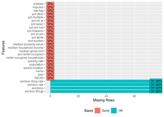
Behold, we get a simple graph that tells us that we have data for almost all of our variables. As we saw earlier, four of the variables have some missing data (actually, a fair amount of missing data!).
The fact that the values are equal (31.93%) for all four variables suggests some entries have missing data for all those variables—though it is possible that some entries have data for eviction-rate but not eviction-filing-rate.
Digging Deeper
We could, of course, quickly examine that assumption:
ma_counties %>%
  filter(is.na(`eviction-filing-rate`) == TRUE | is.na(`eviction-rate`) == TRUE | is.na(`evictions`) == TRUE | is.na(`eviction-filings`) == TRUE) %>%
  select(year, name, `eviction-filing-rate`, `eviction-rate`, evictions, `eviction-filings`)
| year | name | eviction-filing-rate | eviction-rate | evictions | eviction-filings |
|---|---|---|---|---|---|
| 2000 | Barnstable County | NA | NA | NA | NA |
| 2001 | Barnstable County | NA | NA | NA | NA |
| 2002 | Barnstable County | NA | NA | NA | NA |
| 2004 | Barnstable County | NA | NA | NA | NA |
| 2005 | Barnstable County | NA | NA | NA | NA |
| 2006 | Barnstable County | NA | NA | NA | NA |
| 2007 | Barnstable County | NA | NA | NA | NA |
| 2008 | Barnstable County | NA | NA | NA | NA |
| 2009 | Barnstable County | NA | NA | NA | NA |
| 2010 | Barnstable County | NA | NA | NA | NA |
| 2011 | Barnstable County | NA | NA | NA | NA |
| 2012 | Barnstable County | NA | NA | NA | NA |
| 2013 | Barnstable County | NA | NA | NA | NA |
| 2000 | Berkshire County | NA | NA | NA | NA |
| 2001 | Berkshire County | NA | NA | NA | NA |
| 2002 | Berkshire County | NA | NA | NA | NA |
| 2003 | Berkshire County | NA | NA | NA | NA |
| 2004 | Berkshire County | NA | NA | NA | NA |
| 2005 | Berkshire County | NA | NA | NA | NA |
| 2006 | Berkshire County | NA | NA | NA | NA |
| 2000 | Bristol County | NA | NA | NA | NA |
| 2001 | Bristol County | NA | NA | NA | NA |
| 2002 | Bristol County | NA | NA | NA | NA |
| 2003 | Bristol County | NA | NA | NA | NA |
| 2004 | Bristol County | NA | NA | NA | NA |
| 2005 | Bristol County | NA | NA | NA | NA |
| 2006 | Bristol County | NA | NA | NA | NA |
| 2007 | Bristol County | NA | NA | NA | NA |
| 2000 | Dukes County | NA | NA | NA | NA |
| 2001 | Dukes County | NA | NA | NA | NA |
| 2002 | Dukes County | NA | NA | NA | NA |
| 2003 | Dukes County | NA | NA | NA | NA |
| 2004 | Dukes County | NA | NA | NA | NA |
| 2005 | Dukes County | NA | NA | NA | NA |
| 2006 | Dukes County | NA | NA | NA | NA |
| 2007 | Dukes County | NA | NA | NA | NA |
| 2000 | Essex County | NA | NA | NA | NA |
| 2001 | Essex County | NA | NA | NA | NA |
| 2003 | Essex County | NA | NA | NA | NA |
| 2004 | Essex County | NA | NA | NA | NA |
| 2005 | Essex County | NA | NA | NA | NA |
| 2006 | Essex County | NA | NA | NA | NA |
| 2007 | Essex County | NA | NA | NA | NA |
| 2008 | Essex County | NA | NA | NA | NA |
| 2009 | Essex County | NA | NA | NA | NA |
| 2000 | Franklin County | NA | NA | NA | NA |
| 2001 | Franklin County | NA | NA | NA | NA |
| 2000 | Hampden County | NA | NA | NA | NA |
| 2000 | Hampshire County | NA | NA | NA | NA |
| 2000 | Middlesex County | NA | NA | NA | NA |
| 2001 | Middlesex County | NA | NA | NA | NA |
| 2002 | Middlesex County | NA | NA | NA | NA |
| 2003 | Middlesex County | NA | NA | NA | NA |
| 2004 | Middlesex County | NA | NA | NA | NA |
| 2000 | Nantucket County | NA | NA | NA | NA |
| 2001 | Nantucket County | NA | NA | NA | NA |
| 2002 | Nantucket County | NA | NA | NA | NA |
| 2003 | Nantucket County | NA | NA | NA | NA |
| 2004 | Nantucket County | NA | NA | NA | NA |
| 2000 | Norfolk County | NA | NA | NA | NA |
| 2001 | Norfolk County | NA | NA | NA | NA |
| 2000 | Plymouth County | NA | NA | NA | NA |
| 2001 | Plymouth County | NA | NA | NA | NA |
| 2002 | Plymouth County | NA | NA | NA | NA |
| 2003 | Plymouth County | NA | NA | NA | NA |
| 2004 | Plymouth County | NA | NA | NA | NA |
| 2005 | Plymouth County | NA | NA | NA | NA |
| 2006 | Plymouth County | NA | NA | NA | NA |
| 2007 | Plymouth County | NA | NA | NA | NA |
| 2000 | Suffolk County | NA | NA | NA | NA |
| 2003 | Suffolk County | NA | NA | NA | NA |
| 2004 | Suffolk County | NA | NA | NA | NA |
| 2005 | Suffolk County | NA | NA | NA | NA |
| 2006 | Suffolk County | NA | NA | NA | NA |
| 2007 | Suffolk County | NA | NA | NA | NA |
| 2000 | Worcester County | NA | NA | NA | NA |
We use the pipe | character in our filter to convey an “OR” logical statement. That is, we’re saying, if eviction-filing-rate is an NA value or if eviction-rate is an NA value, and so on, then include the value in our filtered data frame.
Our assumption is correct: the missing data align across those four variables. But that’s a whole lot of data that’s missing. We can quickly examine which counties are even usable:
ma_counties %>%
  select(year, name, `eviction-filing-rate`, `eviction-rate`, evictions, `eviction-filings`) %>%
  filter(complete.cases(.) == FALSE) %>%
  count(name) %>%
  arrange(desc(n))
| name | n |
|---|---|
| Barnstable County | 13 |
| Essex County | 9 |
| Bristol County | 8 |
| Dukes County | 8 |
| Plymouth County | 8 |
| Berkshire County | 7 |
| Suffolk County | 6 |
| Middlesex County | 5 |
| Nantucket County | 5 |
| Franklin County | 2 |
| Norfolk County | 2 |
| Hampden County | 1 |
| Hampshire County | 1 |
| Worcester County | 1 |
filter(complete.cases(.) == FALSE) accomplishes the equivalent of the longer filter() line in the previous code chunk. Specifically, base::complete.cases() tests if the observation has any missing data, outputing TRUE if there are no missing values and FALSE if there is one or more. That function expects you to specify a data frame as the argument; we use . to signal that it should use the piped output from the previous step (the select() statement). Additionally, because we dropped several variables (e.g., population) by not selecting them, the complete.cases() function will only test for the few variables we selected.
It seems that some counties (like Barnstable County and Essex County) have a lot of missing data. Thus, we may not be able to make comparisons for some of the years across all counties.
This doesn’t mean these data are bad but it does mean that we’ll need to be careful about what we can say from our analysis of these data.
Generating Histograms
We may also want to check the frequency of values for the many variables in our dataset. This can be really handy for identifying those outliers and better understanding the distribution of values. For that, a histogram is very handy.
Here, we can use DataExplorer’s plot_histogram() function. That function requires a single argument (although there are some additional optional ones): the data frame from which to plot. The function will then go through that data frame and figure out which variables are sensible to plot on a histogram.
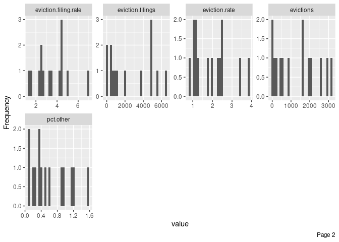
plot_histogram(ma_counties)
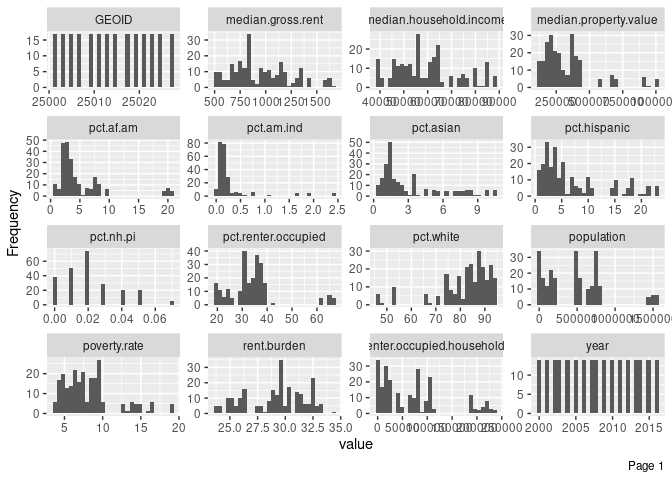
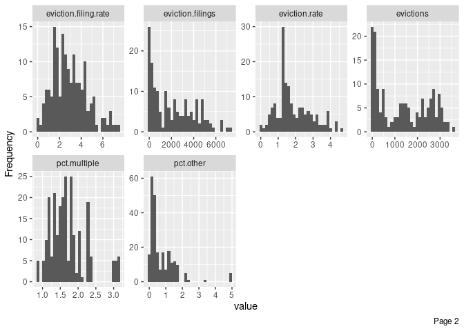
Notice that the plot_histogram() function automatically renamed our variables. For example, eviction-filings now shows up as eviction.filings. Our original data were not modified, but if we wanted to pipe that data further, we would need to use the new variable names.
The function produced a histogram for almost all of our variables. Some of those variables are kind of pointless (like GEOID) but we’re just exploring and can quickly ignore them. For some variables, like pct.nh.pi, the X axis isn’t very helpful—but we do see that those values tend to be very small across entries.
We’re generating those data for all the observations in our dataset, though, which includes a lot of semi-repetition (we wouldn’t expect the percentage of Hispanics to change tremendously from year to year for each county).
What if we wanted to generate these histograms, but only for a single year (2014)?
We would just have to use our filter() function once again, and pipe that output (a data frame) to plot_histogram(). Here’s how we could do that:
ma_counties %>%
  filter(year==2014) %>%
  plot_histogram()
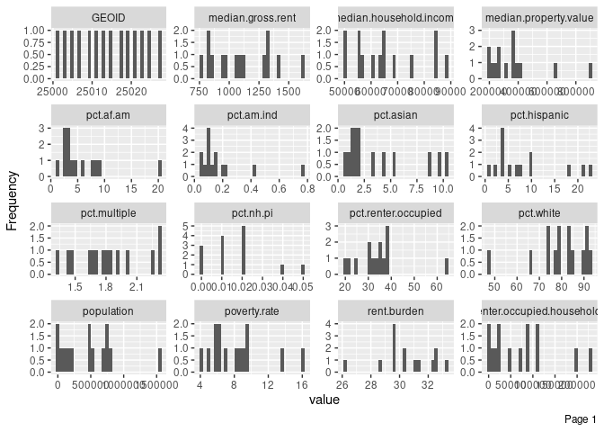
Immediately, we see, for example, that almost all counties have fewer than 40% of their households living in rental units (pct.renter.occupied). One county, however, has more than 60%. Maybe there’s something interesting about that county, and we can start digging into it through our exploratory data analysis.
Generating Bar Plots
DataExplorer also provides a function, plot_bar() that will generate frequencies for discrete variables (those identified as strings (chr or factor types)).
It works in a similar fashion to plot_histogram(). However, if we only have one chr-type variable of interest (name), we can just call it using our regular object$variable nomenclature:
plot_bar(ma_counties$name)
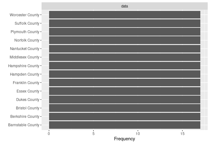
This doesn’t tell us anything too useful in this case, except that each county name comes up an equal number of times in our dataset.
However, if you were interested in which names (string-type) came up most often in a dataset about campaign contributions, for example, this would be a very useful tool for visually exploring things.
Generating Your Own Plots
The DataExplorer functions we’ve looked at so far can be called “wrapper” functions because they’re primarily geared toward expediting common uses of other functions. Specifically, DataExplorer makes extensive use of the ggplot2 visualization package, wrapping a bunch of ggplot2’s functions into a single one like plot_histogram().
ggplot2 is quite powerful and can get pretty complicated, and we’ll cover some of its more advanced later in the book. For now, we just care about producing some basic plots with little care for visual appeal—it’s just for exploration after all—so we’ll keep things simple.
First, load the ggplot2 package (if you loaded tidyverse previously, you don’t need to load ggplot2 as it is part of the tidyverse metapackage):
library(ggplot2)
ggplot2 works by layering information. For example, we might first set up a basic plot layer that defines the aesthetics; then add a layer with points; then add a layer with lines connecting the points; and finally add a text layer with a title. Those four layers, together, would comprise a line graph.
Creating a Line Graph
Let’s illustrate that by producing a graphic that addresses the following question: What is the trajectory of eviction filing rates in Hampshire County across the years in our dataset?
As a reminder, here are the variables in our data frame:
glimpse(ma_counties)
## Rows: 238
## Columns: 27
## $ GEOID                        <dbl> 25001, 25001, 25001, 25001, 25001, 25001,...
## $ year                         <dbl> 2000, 2001, 2002, 2003, 2004, 2005, 2006,...
## $ name                         <chr> "Barnstable County", "Barnstable County",...
## $ `parent-location`            <chr> "Massachusetts", "Massachusetts", "Massac...
## $ population                   <dbl> 222230, 222230, 222230, 222230, 222230, 2...
## $ `poverty-rate`               <dbl> 6.89, 6.89, 6.89, 6.89, 6.89, 4.31, 4.31,...
## $ `renter-occupied-households` <dbl> 21035, 21096, 21157, 21218, 21279, 21340,...
## $ `pct-renter-occupied`        <dbl> 22.18, 22.18, 22.18, 22.18, 22.18, 18.91,...
## $ `median-gross-rent`          <dbl> 723, 723, 723, 723, 723, 1045, 1045, 1045...
## $ `median-household-income`    <dbl> 45933, 45933, 45933, 45933, 45933, 60096,...
## $ `median-property-value`      <dbl> 178800, 178800, 178800, 178800, 178800, 3...
## $ `rent-burden`                <dbl> 27.7, 27.7, 27.7, 27.7, 27.7, 32.8, 32.8,...
## $ `pct-white`                  <dbl> 93.38, 93.38, 93.38, 93.38, 93.38, 93.05,...
## $ `pct-af-am`                  <dbl> 1.73, 1.73, 1.73, 1.73, 1.73, 1.90, 1.90,...
## $ `pct-hispanic`               <dbl> 1.35, 1.35, 1.35, 1.35, 1.35, 1.76, 1.76,...
## $ `pct-am-ind`                 <dbl> 0.52, 0.52, 0.52, 0.52, 0.52, 0.37, 0.37,...
## $ `pct-asian`                  <dbl> 0.61, 0.61, 0.61, 0.61, 0.61, 0.93, 0.93,...
## $ `pct-nh-pi`                  <dbl> 0.02, 0.02, 0.02, 0.02, 0.02, 0.01, 0.01,...
## $ `pct-multiple`               <dbl> 1.56, 1.56, 1.56, 1.56, 1.56, 1.58, 1.58,...
## $ `pct-other`                  <dbl> 0.83, 0.83, 0.83, 0.83, 0.83, 0.40, 0.40,...
## $ `eviction-filings`           <dbl> NA, NA, NA, 767, NA, NA, NA, NA, NA, NA, ...
## $ evictions                    <dbl> NA, NA, NA, 751, NA, NA, NA, NA, NA, NA, ...
## $ `eviction-rate`              <dbl> NA, NA, NA, 3.54, NA, NA, NA, NA, NA, NA,...
## $ `eviction-filing-rate`       <dbl> NA, NA, NA, 3.61, NA, NA, NA, NA, NA, NA,...
## $ `low-flag`                   <dbl> 0, 0, 0, 0, 0, 0, 0, 0, 0, 0, 0, 0, 0, 0,...
## $ imputed                      <dbl> 0, 0, 0, 0, 0, 0, 0, 0, 0, 0, 0, 0, 0, 0,...
## $ subbed                       <dbl> 0, 0, 0, 0, 0, 0, 0, 0, 0, 0, 0, 0, 0, 0,...
Selecting the data
Let’s start by producing a data frame that only includes information from Hampshire County. We can do that by piping our data to a filter() statement that only includes the desired data:
ma_counties %>%
  filter(name=="Hampshire County")
| GEOID | year | name | parent-location | population | poverty-rate | renter-occupied-households | pct-renter-occupied | median-gross-rent | median-household-income | median-property-value | rent-burden | pct-white | pct-af-am | pct-hispanic | pct-am-ind | pct-asian | pct-nh-pi | pct-multiple | pct-other | eviction-filings | evictions | eviction-rate | eviction-filing-rate | low-flag | imputed | subbed |
|---|---|---|---|---|---|---|---|---|---|---|---|---|---|---|---|---|---|---|---|---|---|---|---|---|---|---|
| 25015 | 2000 | Hampshire County | Massachusetts | 152251 | 9.40 | 19621 | 35.05 | 631 | 46098 | 142400 | 26.3 | 89.54 | 1.80 | 3.42 | 0.16 | 3.39 | 0.04 | 1.46 | 0.19 | NA | NA | NA | NA | 0 | 0 | 0 |
| 25015 | 2001 | Hampshire County | Massachusetts | 152251 | 9.40 | 19629 | 35.05 | 631 | 46098 | 142400 | 26.3 | 89.54 | 1.80 | 3.42 | 0.16 | 3.39 | 0.04 | 1.46 | 0.19 | 113 | 102 | 0.52 | 0.58 | 1 | 0 | 0 |
| 25015 | 2002 | Hampshire County | Massachusetts | 152251 | 9.40 | 19637 | 35.05 | 631 | 46098 | 142400 | 26.3 | 89.54 | 1.80 | 3.42 | 0.16 | 3.39 | 0.04 | 1.46 | 0.19 | 98 | 79 | 0.40 | 0.50 | 1 | 0 | 0 |
| 25015 | 2003 | Hampshire County | Massachusetts | 152251 | 9.40 | 19645 | 35.05 | 631 | 46098 | 142400 | 26.3 | 89.54 | 1.80 | 3.42 | 0.16 | 3.39 | 0.04 | 1.46 | 0.19 | 121 | 97 | 0.49 | 0.62 | 1 | 1 | 0 |
| 25015 | 2004 | Hampshire County | Massachusetts | 152251 | 9.40 | 19653 | 35.05 | 631 | 46098 | 142400 | 26.3 | 89.54 | 1.80 | 3.42 | 0.16 | 3.39 | 0.04 | 1.46 | 0.19 | 249 | 197 | 1.00 | 1.27 | 0 | 1 | 0 |
| 25015 | 2005 | Hampshire County | Massachusetts | 155160 | 5.28 | 19661 | 32.08 | 847 | 57293 | 252500 | 32.3 | 87.92 | 2.08 | 4.36 | 0.15 | 3.67 | 0.01 | 1.58 | 0.24 | 343 | 247 | 1.26 | 1.74 | 0 | 0 | 0 |
| 25015 | 2006 | Hampshire County | Massachusetts | 155160 | 5.28 | 19669 | 32.08 | 847 | 57293 | 252500 | 32.3 | 87.92 | 2.08 | 4.36 | 0.15 | 3.67 | 0.01 | 1.58 | 0.24 | 285 | 259 | 1.32 | 1.45 | 0 | 0 | 0 |
| 25015 | 2007 | Hampshire County | Massachusetts | 155160 | 5.28 | 19677 | 32.08 | 847 | 57293 | 252500 | 32.3 | 87.92 | 2.08 | 4.36 | 0.15 | 3.67 | 0.01 | 1.58 | 0.24 | 362 | 266 | 1.35 | 1.84 | 0 | 0 | 0 |
| 25015 | 2008 | Hampshire County | Massachusetts | 155160 | 5.28 | 19685 | 32.08 | 847 | 57293 | 252500 | 32.3 | 87.92 | 2.08 | 4.36 | 0.15 | 3.67 | 0.01 | 1.58 | 0.24 | 462 | 258 | 1.31 | 2.35 | 0 | 0 | 0 |
| 25015 | 2009 | Hampshire County | Massachusetts | 155160 | 5.28 | 19693 | 32.08 | 847 | 57293 | 252500 | 32.3 | 87.92 | 2.08 | 4.36 | 0.15 | 3.67 | 0.01 | 1.58 | 0.24 | 513 | 270 | 1.37 | 2.60 | 0 | 0 | 0 |
| 25015 | 2010 | Hampshire County | Massachusetts | 158080 | 5.99 | 19701 | 33.56 | 906 | 61264 | 263500 | 31.1 | 86.19 | 2.24 | 4.72 | 0.15 | 4.51 | 0.03 | 1.95 | 0.22 | 478 | 252 | 1.28 | 2.43 | 0 | 0 | 0 |
| 25015 | 2011 | Hampshire County | Massachusetts | 160759 | 6.17 | 19951 | 34.16 | 965 | 61368 | 265400 | 32.6 | 84.93 | 2.60 | 5.15 | 0.12 | 5.27 | 0.04 | 1.82 | 0.08 | 583 | 266 | 1.33 | 2.92 | 0 | 0 | 0 |
| 25015 | 2012 | Hampshire County | Massachusetts | 160759 | 6.17 | 20202 | 34.16 | 965 | 61368 | 265400 | 32.6 | 84.93 | 2.60 | 5.15 | 0.12 | 5.27 | 0.04 | 1.82 | 0.08 | 601 | 259 | 1.28 | 2.98 | 0 | 0 | 0 |
| 25015 | 2013 | Hampshire County | Massachusetts | 160759 | 6.17 | 20452 | 34.16 | 965 | 61368 | 265400 | 32.6 | 84.93 | 2.60 | 5.15 | 0.12 | 5.27 | 0.04 | 1.82 | 0.08 | 524 | 171 | 0.84 | 2.56 | 0 | 0 | 0 |
| 25015 | 2014 | Hampshire County | Massachusetts | 160759 | 6.17 | 20702 | 34.16 | 965 | 61368 | 265400 | 32.6 | 84.93 | 2.60 | 5.15 | 0.12 | 5.27 | 0.04 | 1.82 | 0.08 | 523 | 166 | 0.80 | 2.53 | 0 | 0 | 0 |
| 25015 | 2015 | Hampshire County | Massachusetts | 160759 | 6.17 | 20953 | 34.16 | 965 | 61368 | 265400 | 32.6 | 84.93 | 2.60 | 5.15 | 0.12 | 5.27 | 0.04 | 1.82 | 0.08 | 491 | 147 | 0.70 | 2.34 | 0 | 0 | 0 |
| 25015 | 2016 | Hampshire County | Massachusetts | 160759 | 6.17 | 21203 | 34.16 | 965 | 61368 | 265400 | 32.6 | 84.93 | 2.60 | 5.15 | 0.12 | 5.27 | 0.04 | 1.82 | 0.08 | 479 | 122 | 0.58 | 2.26 | 0 | 1 | 0 |
Adding the base layer
Once we have just the data we want to visualize, we’ll proceed to creating our visualization. With ggplot2, this begins by calling the ggplot() function and specifying dataset you want to use (first argument, which is data= by default) and the key aesthetic variables you’d like to use by default on subsequent layers (which we supply via the aes() function in the second argument, which is mapping= by default).
Common top-level aesthetic mappings that we can set within the aes() function include:
-
x: the variable that goes in the X axis -
y: the variable that goes in the Y axis (optional) -
group: any grouping variable to signal a connection between data points (optional) -
color: any variable for color-coding data points’ outside edges (optional) -
fill: any variable for color-coding data points’ inside fills (optional)
In this case, we’ll create a basic base layer that only maps the x and y variables (the years and the eviction filing rates). Let’s pipe our information to the ggplot() function (which will automatically fill in the information about the data frame object) and fill in the desired aesthetics:
ma_counties %>%
  filter(name=="Hampshire County") %>%
  ggplot(aes(x=year, y=`eviction-filing-rate`))
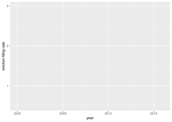
Our plot now has scaled values for the X axis and Y axis (look at the labels placed on both axes), but there’s no data plotted on it just yet.
Adding points
To add some points on that plot, we’ll add another layer by putting a + sign at the end of the previous layer. (Note that we’re no longer piping the information. We are adding layers to our ggplot.)
Then, we’ll add in points by simply applying the geom_point() function as our second layer.
ma_counties %>%
  filter(name=="Hampshire County") %>%
  ggplot(aes(x=year, y=`eviction-filing-rate`)) +
    geom_point()
## Warning: Removed 1 rows containing missing values (geom_point).
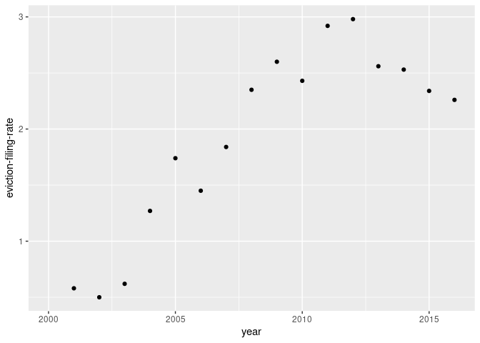
Note: R tells us that it removed a row because we don’t have data for eviction-filing-rate in the year 2000. If we had removed observations with NA values, that warning would not have been given.
Now we have points! Next up, we’ll add a line to connect our points.
Adding a line
We can place a line to connect our points by adding a third layer. Similar to our previous layer, we’ll just apply the geom_line() function to that new layer.
ma_counties %>%
  filter(name=="Hampshire County") %>%
  ggplot(aes(x=year, y=`eviction-filing-rate`)) +
    geom_point() +
    geom_line()
## Warning: Removed 1 rows containing missing values (geom_point).

## Warning: Removed 1 row(s) containing missing values (geom_path).
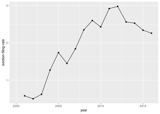
Note: We could do without the geom_point() layer in creating a line graph, but it’s often helpful to include some marker for each data point.
Creating other charts
We can replicate our earlier charts using ggplot2 functions like geom_histogram() and geom_bar().
We’ll cover ggplot2’s more advanced features later in the book, but here’s a cheatsheet if you already want to do more with it. For now, quick and dirty is all we need.
Adding interactivity
The nice thing about producing our own plots using ggplot2 is the fact that we can easily turn them into interactive plots by pairing them with the ggplotly() function from the plotly library, provided by the website Plot.ly. (You may need to install the library first.)
As usual, we begin by loading the package:
library(plotly)
##
## Attaching package: 'plotly'

## The following object is masked from 'package:ggplot2':
##
##     last_plot

## The following object is masked from 'package:stats':
##
##     filter

## The following object is masked from 'package:graphics':
##
##     layout
The plotly library has some more advanced features, but it can usually take a given ggplot2 object and automatically figure out which aspects of the plot could be enhanced through interactive elements.
The plotly library is a work in progress and authored by different people from ggplot2. Thus, some advanced ggplot2 aesthetics, like custom annotations, work poorly with plotly at the time of writing. For exploratory graphics, this isn’t usually an issue but it can be problematic if you want to produce production-level ggplot2 graphics.
Applying ggplotly()
Let’s recreate the line graph from above but make it so I can get precise values just by hovering over each point. First, we’ll store our ggplot in an object called g. Then, we will supply that object we just created as the lone argument for ggplotly():
g <- ma_counties %>%
  filter(name=="Hampshire County") %>%
  ggplot(aes(x=year, y=`eviction-filing-rate`)) +
    geom_point() +
    geom_line()

ggplotly(g)
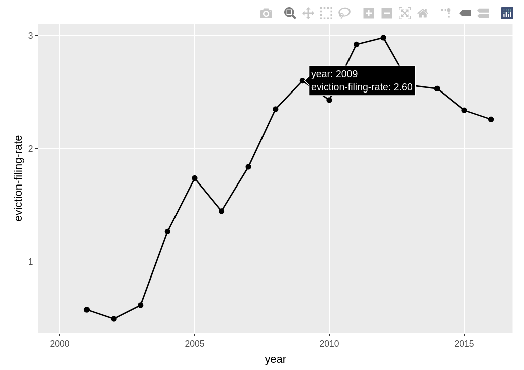
The above is just a screenshot of the interactive version that you should get when running the code.
By using these exploratory visualization tactics, you should be able to start identifying even more potential issues with your data, questions that you can explore in greater depth with follow-up analysis, and potential trends that you might have missed if you were just looking at a big table packed with numbers.