Creating Interactive Maps with Datawrapper
Introduction
For this tutorial, we will be looking at some eviction data aggregated at the county level for the state of Florida. These data come from the Eviction Lab, which is led by Matthew Desmond. As always, it is helpful to review the data dictionary. If you want more detail about any of the variables, I encourage you to review the full Methodology Report.
By the end of the tutorial, we’ll have produced an interactive map about eviction rates in Florida that looks like this:
Data Processing
To create a data visualization, we need to provide tools like Datawrapper with data. CSV files are universally accepted by data visualization tools. We can use R to help us create such a file.
Loading the Data
The first step, as usual, is to read in the source data. Like before, we’ll use the readr::read_csv() function to read data from this CSV file.
library(tidyverse)
us_counties <- read_csv("https://dds.rodrigozamith.com/files/evictions_us_counties.csv")
## Rows: 53436 Columns: 27

## ── Column specification ────────────────────────────────────────────────────────
## Delimiter: ","
## chr  (3): GEOID, name, parent-location
## dbl (24): year, population, poverty-rate, renter-occupied-households, pct-re...

##
## ℹ Use `spec()` to retrieve the full column specification for this data.
## ℹ Specify the column types or set `show_col_types = FALSE` to quiet this message.
Here’s a sample of the data:
us_counties %>%
  head(10)
| GEOID | year | name | parent-location | population | poverty-rate | renter-occupied-households | pct-renter-occupied | median-gross-rent | median-household-income | median-property-value | rent-burden | pct-white | pct-af-am | pct-hispanic | pct-am-ind | pct-asian | pct-nh-pi | pct-multiple | pct-other | eviction-filings | evictions | eviction-rate | eviction-filing-rate | low-flag | imputed | subbed |
|---|---|---|---|---|---|---|---|---|---|---|---|---|---|---|---|---|---|---|---|---|---|---|---|---|---|---|
| 01001 | 2000 | Autauga County | Alabama | 43671 | 10.92 | 3074 | 19.21 | 537 | 42013 | 94800 | 22.6 | 79.74 | 17.01 | 1.40 | 0.43 | 0.44 | 0.03 | 0.86 | 0.10 | 61 | 40 | 1.30 | 1.98 | 1 | 0 | 0 |
| 01001 | 2001 | Autauga County | Alabama | 43671 | 10.92 | 3264 | 19.21 | 537 | 42013 | 94800 | 22.6 | 79.74 | 17.01 | 1.40 | 0.43 | 0.44 | 0.03 | 0.86 | 0.10 | 89 | 37 | 1.13 | 2.73 | 0 | 0 | 0 |
| 01001 | 2002 | Autauga County | Alabama | 43671 | 10.92 | 3454 | 19.21 | 537 | 42013 | 94800 | 22.6 | 79.74 | 17.01 | 1.40 | 0.43 | 0.44 | 0.03 | 0.86 | 0.10 | 103 | 20 | 0.58 | 2.98 | 0 | 0 | 0 |
| 01001 | 2003 | Autauga County | Alabama | 43671 | 10.92 | 3644 | 19.21 | 537 | 42013 | 94800 | 22.6 | 79.74 | 17.01 | 1.40 | 0.43 | 0.44 | 0.03 | 0.86 | 0.10 | 107 | 12 | 0.33 | 2.94 | 0 | 0 | 0 |
| 01001 | 2004 | Autauga County | Alabama | 43671 | 10.92 | 3834 | 19.21 | 537 | 42013 | 94800 | 22.6 | 79.74 | 17.01 | 1.40 | 0.43 | 0.44 | 0.03 | 0.86 | 0.10 | 98 | 18 | 0.47 | 2.56 | 0 | 1 | 0 |
| 01001 | 2005 | Autauga County | Alabama | 49584 | 7.52 | 4024 | 22.45 | 779 | 51463 | 130700 | 27.2 | 77.92 | 17.80 | 2.04 | 0.37 | 0.62 | 0.00 | 1.13 | 0.11 | 89 | 42 | 1.04 | 2.21 | 0 | 1 | 0 |
| 01001 | 2006 | Autauga County | Alabama | 49584 | 7.52 | 4213 | 22.45 | 779 | 51463 | 130700 | 27.2 | 77.92 | 17.80 | 2.04 | 0.37 | 0.62 | 0.00 | 1.13 | 0.11 | 85 | 40 | 0.95 | 2.02 | 1 | 0 | 0 |
| 01001 | 2007 | Autauga County | Alabama | 49584 | 7.52 | 4403 | 22.45 | 779 | 51463 | 130700 | 27.2 | 77.92 | 17.80 | 2.04 | 0.37 | 0.62 | 0.00 | 1.13 | 0.11 | 87 | 47 | 1.07 | 1.98 | 1 | 0 | 0 |
| 01001 | 2008 | Autauga County | Alabama | 49584 | 7.52 | 4593 | 22.45 | 779 | 51463 | 130700 | 27.2 | 77.92 | 17.80 | 2.04 | 0.37 | 0.62 | 0.00 | 1.13 | 0.11 | 134 | 79 | 1.72 | 2.92 | 0 | 0 | 0 |
| 01001 | 2009 | Autauga County | Alabama | 49584 | 7.52 | 4783 | 22.45 | 779 | 51463 | 130700 | 27.2 | 77.92 | 17.80 | 2.04 | 0.37 | 0.62 | 0.00 | 1.13 | 0.11 | 111 | 56 | 1.17 | 2.32 | 0 | 0 | 0 |
Getting the data we need
The first thing we’ll want to do is extract only the information we need for creating the map. While it can be harmless to include additional data, it can sometimes (a) confuse the software being used to create the chart; (b) make it unwieldy to select options using those software; and (c) exceed the dataset size limitations of the software, especially if you’re on a free tier.
The first thing we’ll do is to filter out all the states (parent-location) besides Florida, since that’s the focus of our visualization. We also just want data for the year 2016.
We can use the dplyr::filter() function to include only the observations (rows) we’re interested in. Since we’ll continue to work with these data, we’ll assign them to an object called fl_data.
fl_data <- us_counties %>%
  filter(`parent-location` == "Florida" & year == 2016)
Here’s a sample of the data after applying that filter:
head(fl_data)
| GEOID | year | name | parent-location | population | poverty-rate | renter-occupied-households | pct-renter-occupied | median-gross-rent | median-household-income | median-property-value | rent-burden | pct-white | pct-af-am | pct-hispanic | pct-am-ind | pct-asian | pct-nh-pi | pct-multiple | pct-other | eviction-filings | evictions | eviction-rate | eviction-filing-rate | low-flag | imputed | subbed |
|---|---|---|---|---|---|---|---|---|---|---|---|---|---|---|---|---|---|---|---|---|---|---|---|---|---|---|
| 12001 | 2016 | Alachua County | Florida | 254218 | 13.00 | 52822 | 46.80 | 871 | 43073 | 164000 | 35.9 | 62.72 | 19.56 | 8.87 | 0.29 | 5.65 | 0.19 | 2.48 | 0.24 | 2090 | 733 | 1.39 | 3.96 | 0 | 0 | 0 |
| 12003 | 2016 | Baker County | Florida | 27135 | 12.50 | 2392 | 21.93 | 691 | 47121 | 114300 | 32.7 | 82.03 | 14.48 | 2.35 | 0.14 | 0.60 | 0.00 | 0.40 | 0.00 | 26 | 26 | 1.09 | 1.09 | 0 | 1 | 0 |
| 12005 | 2016 | Bay County | Florida | 175353 | 10.74 | 29262 | 38.55 | 922 | 47368 | 157800 | 31.4 | 77.94 | 10.54 | 5.49 | 0.54 | 2.03 | 0.05 | 3.29 | 0.11 | 1781 | 920 | 3.14 | 6.09 | 0 | 0 | 0 |
| 12007 | 2016 | Bradford County | Florida | 27223 | 16.66 | 2703 | 26.15 | 705 | 41606 | 89200 | 34.4 | 74.43 | 19.86 | 3.78 | 0.08 | 0.40 | 0.03 | 1.41 | 0.00 | NA | NA | NA | NA | 0 | 0 | 0 |
| 12009 | 2016 | Brevard County | Florida | 553591 | 9.91 | 73594 | 28.34 | 909 | 48925 | 142200 | 32.1 | 76.08 | 9.88 | 9.06 | 0.26 | 2.24 | 0.09 | 2.15 | 0.23 | 3033 | 1481 | 2.01 | 4.12 | 0 | 0 | 0 |
| 12011 | 2016 | Broward County | Florida | 1843152 | 11.21 | 276604 | 36.49 | 1191 | 51968 | 185900 | 36.1 | 40.38 | 26.89 | 26.96 | 0.17 | 3.43 | 0.04 | 1.67 | 0.45 | 18105 | 9594 | 3.47 | 6.55 | 0 | 0 | 0 |
The second thing we’ll want to do is think ahead to all the variables we will need to draw geographical information from and to fill in our captions with (e.g., when hovering over areas of the map). Again, in the interest of reducing the size of our dataset (and reducing the likelihood of a problem with the third-party tools), we want to select just the variables that we need.
The first variable is GEOID. If you look at the data dictionary, you’ll see that GEOID corresponds to the location’s FIPS code. Briefly, FIPS is a standardized code used by the U.S. government to link together locations across datasets. When referring to counties, you’ll see a five-digit code like 12001. The first two digits (12) refer to the state, in this case Florida. The following three digits (001) refer to the county, in this case Alachua County.
The second to fourth variables are name (the county’s name), eviction-rate (the eviction rate, which we will use for shading), and evictions (the total number of evictions, which we’ll include in the information box when the user hovers over a county).
We can use the dplyr::select() function to select those four columns.
map_data <- fl_data %>%
  select(GEOID, name, `eviction-rate`, evictions) %>%
  na.omit()
We use the na.omit() function to remove any rows that have an NA value in them—that is, if any one variable (e.g., eviction-rate) has a missing value. (This may happen in our dataset because there were insufficient data for the Eviction Lab team to confidently generalize to the county level.) This ensures that we only map counties for which we have data. Datawrapper in particular would be confused if it is presented with non-numeric values, like NA, for certain variables.
Here’s a sample of our modified data frame:
head(map_data)
| GEOID | name | eviction-rate | evictions |
|---|---|---|---|
| 12001 | Alachua County | 1.39 | 733 |
| 12003 | Baker County | 1.09 | 26 |
| 12005 | Bay County | 3.14 | 920 |
| 12009 | Brevard County | 2.01 | 1481 |
| 12011 | Broward County | 3.47 | 9594 |
| 12013 | Calhoun County | 0.00 | 0 |
Producing a CSV file
If we want to get our data out of R, we’ll need to export it. The readr package (part of tidyverse) makes it easy for us to produce a properly formatted CSV file with its write_csv() function.
That function requires us to provide it just two arguments: the object (data frame) we’d like to export and the filename of the CSV file.
The CSV file will be saved in your working directory, unless you specify a different path.
map_data %>%
  write_csv("evictions_map_data.csv")
Because we’re piping the information, the first argument (the data frame) is already filled in for us. Thus, we only need to specify the filename for where to save the data.
Our Preliminary CSV File
You can download a copy of the CSV file we will be using below by clicking here.
Creating an Map With Datawrapper
A simple tool for creating interactive maps is Datawrapper. Datawrapper is used by several (smaller) newsrooms for producing a range of different visualizations. It is a good alternative to either Infogram or Flourish–the latter of which supports mapping functionality of its own.
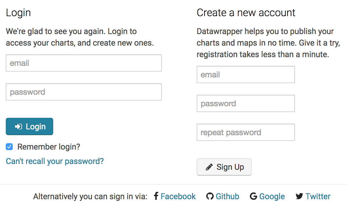
The first step is to create an account with Datawrapper. As is the case with many online visualization tools, Datawrapper provides you with a limited free tier and more feature-loaded paid tiers. The free tier will be good enough for our purposes.
You can click on the “Login” link on Datawrapper’s homepage and sign up with just a few details.
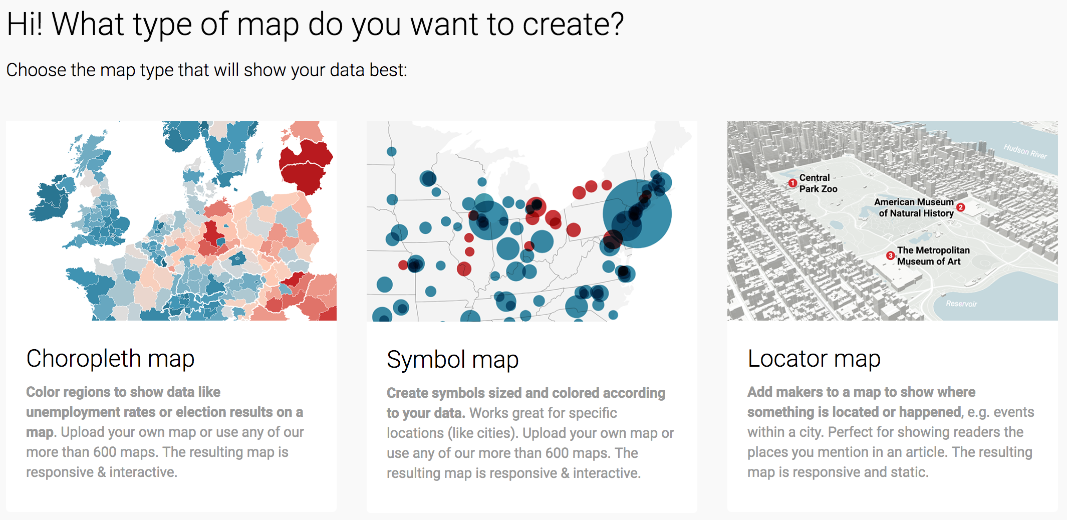
After you create and activate your account, you should be presented with a welcome page. Look for the “New Map” link at the top right part of the page.

You will then be presented with different options for maps. Today, we’ll be creating a choropleth map, where areas on the map are shaded according to some corresponding value (i.e., the eviction rate).
After selecting that option, you’ll be presented with different geographies for your map. In our case, we only have data for the state of Florida, so we’ll want to select that as our geography. You can either select it from the list or simply search for “Florida”. Because we have county-level data with county-level geographical identifiers (the FIPS code), we’ll select the USA >> Florida >> Counties option and then Next.
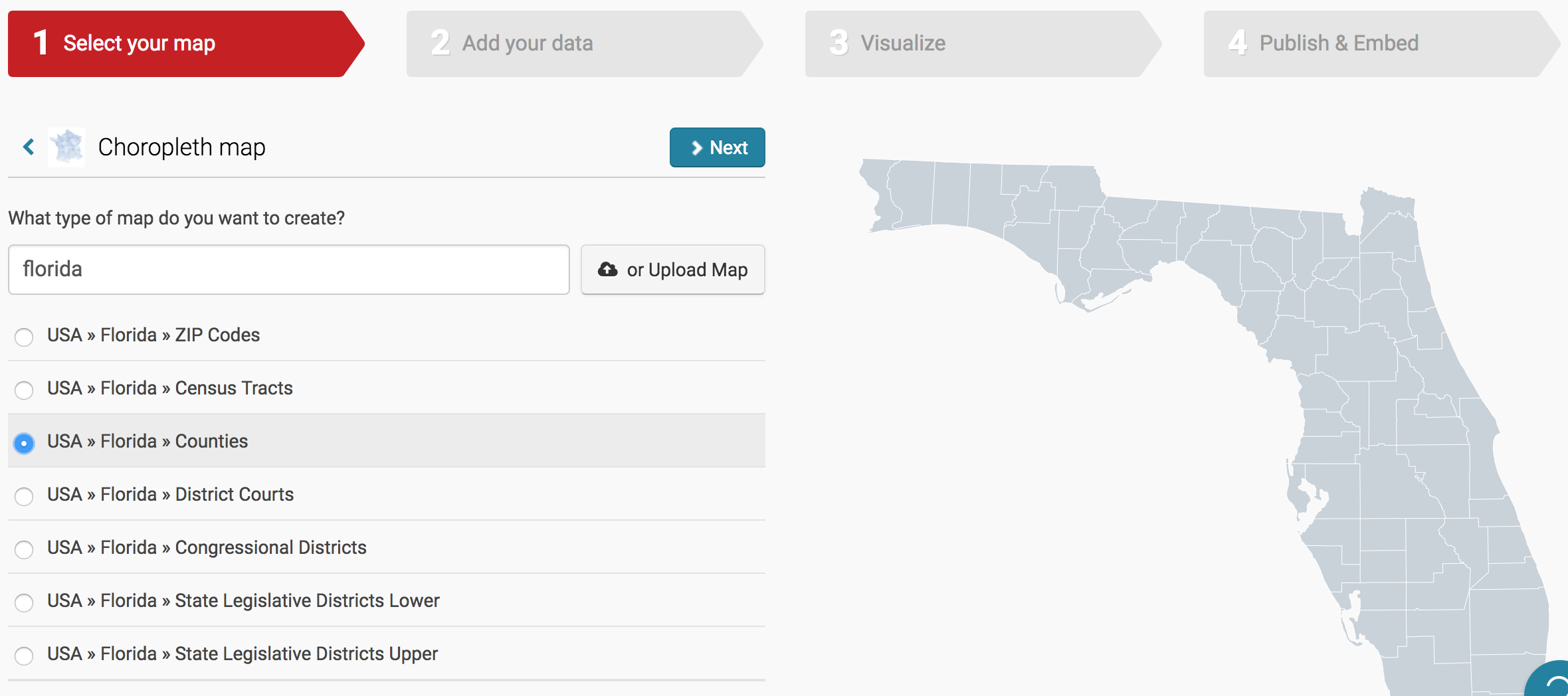
There is also an option to upload your own geography, which is necessary if you’re using less-used geographical markers like school district boundaries (or custom maps). This requires uploading a separate file with shape information and goes beyond the scope of this tutorial.
We now need to add in the data for our map. Datawrapper allows us to manually fill in values for each geographical marker associated with the selected geography (e.g., counties in the Florida Counties map). However, since we already have a clean data file with the values we need, we can just upload that file instead.
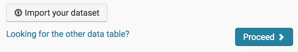
You can do that by scrolling to the bottom of the table and clicking on the Import your dataset button.
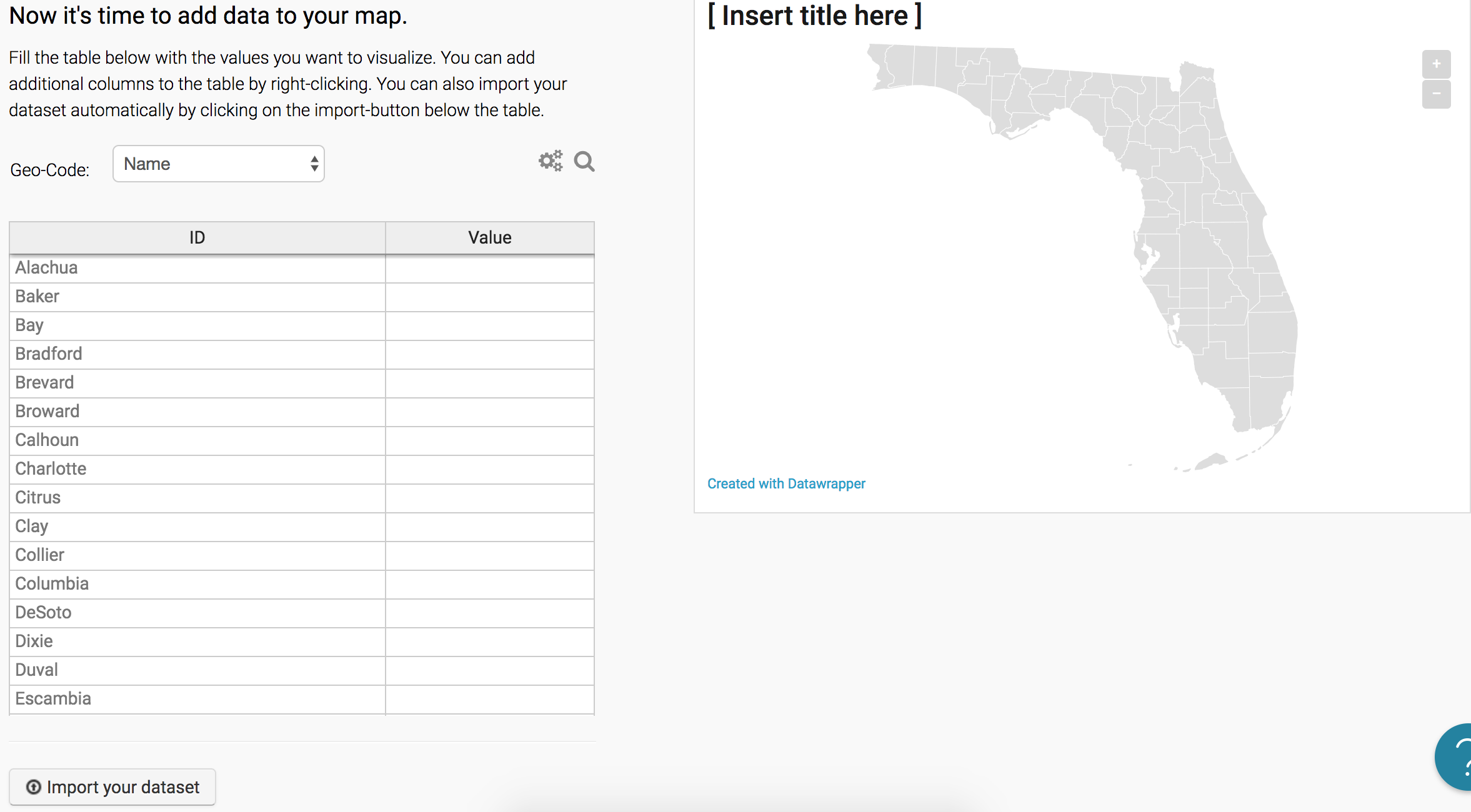
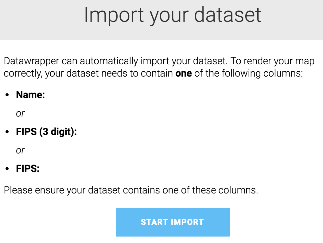
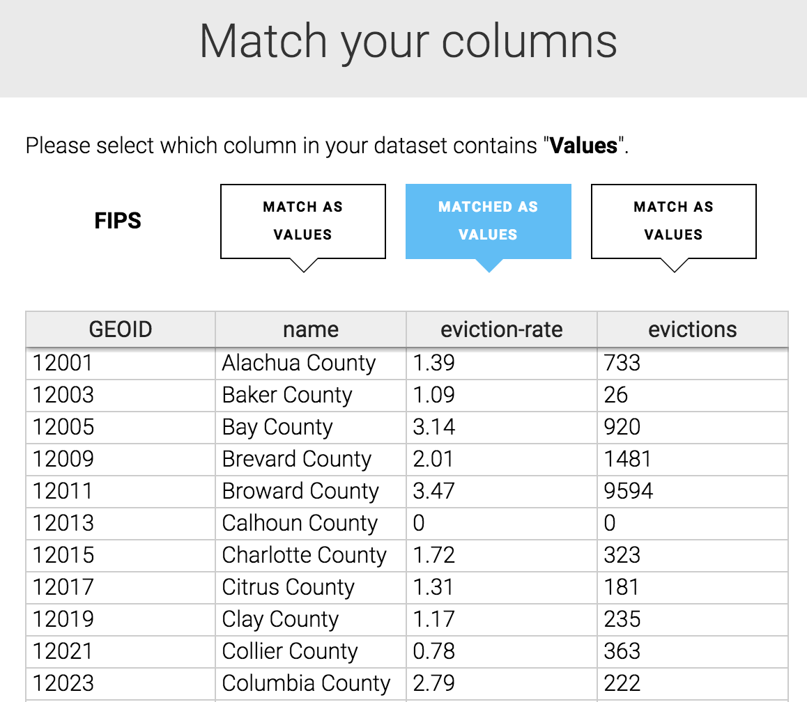
Datawrapper will tell us that we need a column in our dataset that specifies a corresponding geographical identifier. This can be either a “Name” column that matches Datawrapper’s expectations (e.g., “Alachua” for Alachua county) or a “FIPS” column that matches the U.S. government’s standard for counties. We have information for the latter, under the GEOID column, so we can just select Start Import.
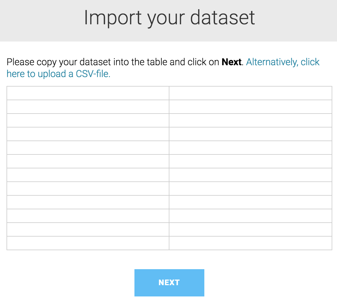
While Datawrapper gives us the option of copying and pasting the information into a table, we’re better off just uploading our clean CSV file. (It increases the likelihood of a clean import.) Click on the link to upload a CSV-file. Then, select the CSV file we just created (evictions_map_data.csv above).
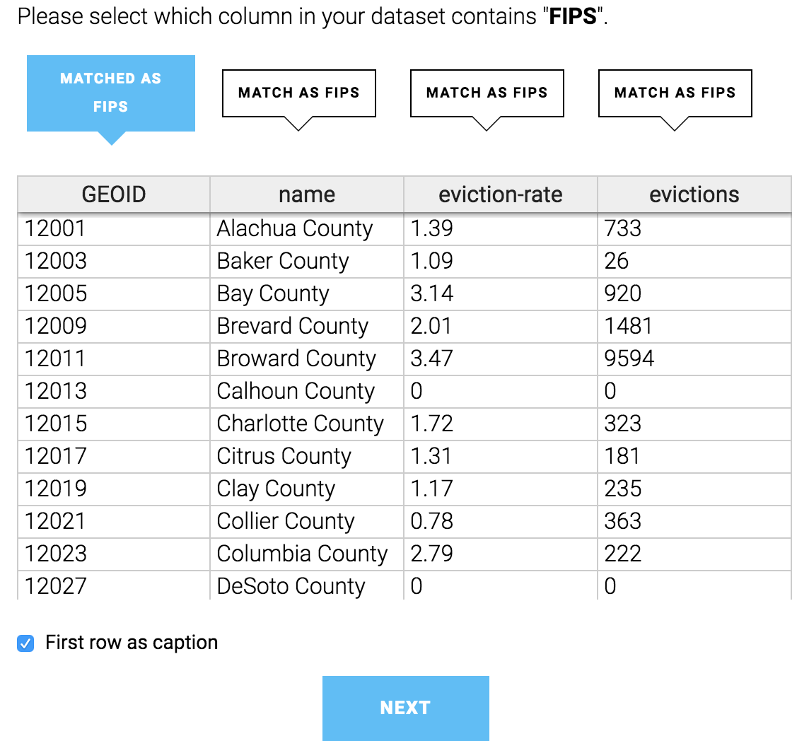
After selecting the file, the table will be updated to look like the one below. Datawrapper will also ask us to select the column that contains the FIPS codes. Make sure the first column (GEOID) is selected and click Next.
Once the data is imported, click Okay, Continue. You’ll then be asked to select the variable that will be used for shading the map. Select the eviction-rate variable, as that is the number that is most comparable across counties since it is proportional to the county’s population. (We can change this variable later.) Then, click Next.
With the data now added in, we can click Proceed at the bottom of our table.
You will then be presented with the design options for the map:
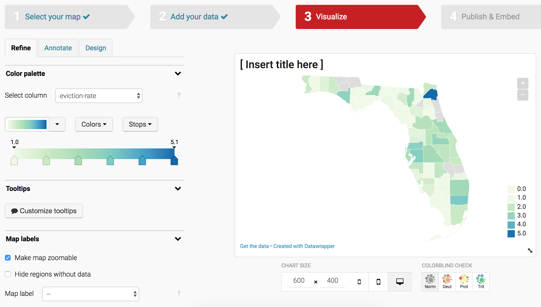
Play around with those options to find what suits you best. Note that there are tabs for Refine (select map options), Annotate (add in text), and Design (design options, which are limited for the free tier).
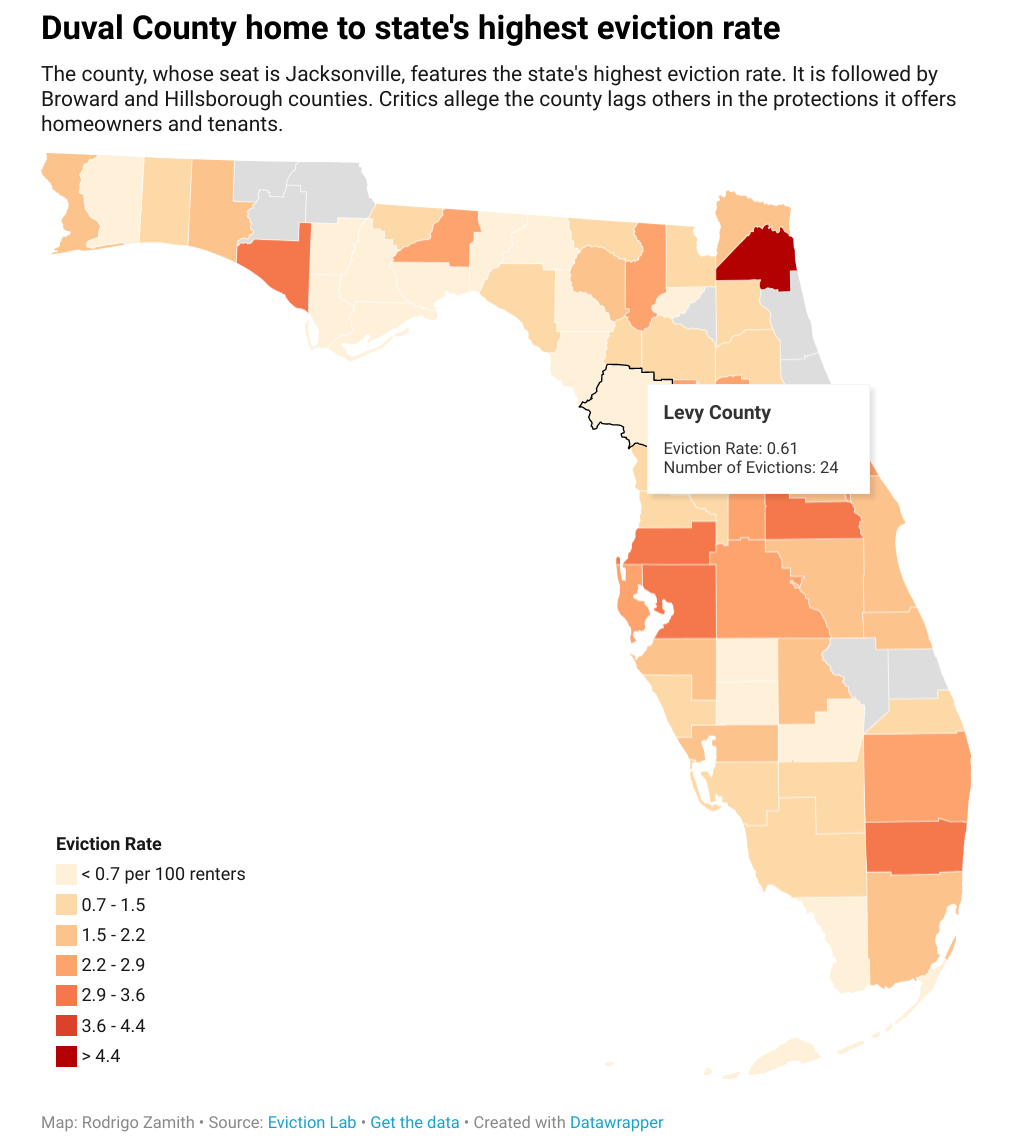
The map displayed at the start of this tutorial used the following options:
-
Refine
-
Color Palette:
#fef0d9,#fdd49e,#fdbb84,#fc8d59,#e34a33,#b30000(you can enter these into the box that appears when you select “Import Colors”) -
Type:
Steps -
Steps:
7(Custom)- Upper and Lower Limits:
min-0.7,0.7-1.5,1.5-2.2,2.2-2.9,2.9-3.6,3.6-4.4,4.4-max
- Upper and Lower Limits:
-
Legend Caption:
Eviction Rate -
Labels:
Custom- Edit Labels:
< 0.7 per 100 renters,0.7-1.5,1.5-2.2,2.2-2.9,2.9-3.6,3.6-4.4,> 4.4
- Edit Labels:
-
Label Position:
Bottom left -
Orientation:
Vertical -
Make Map Zoomable: Unchecked
-
Hide Regions Without Data: Unchecked
-
-
Annotate
-
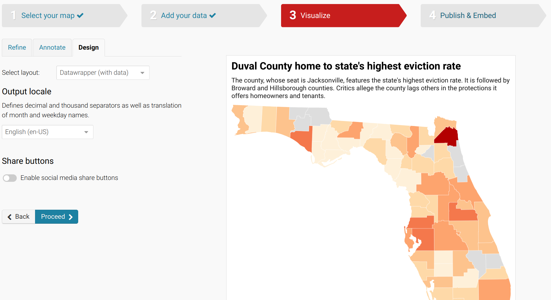
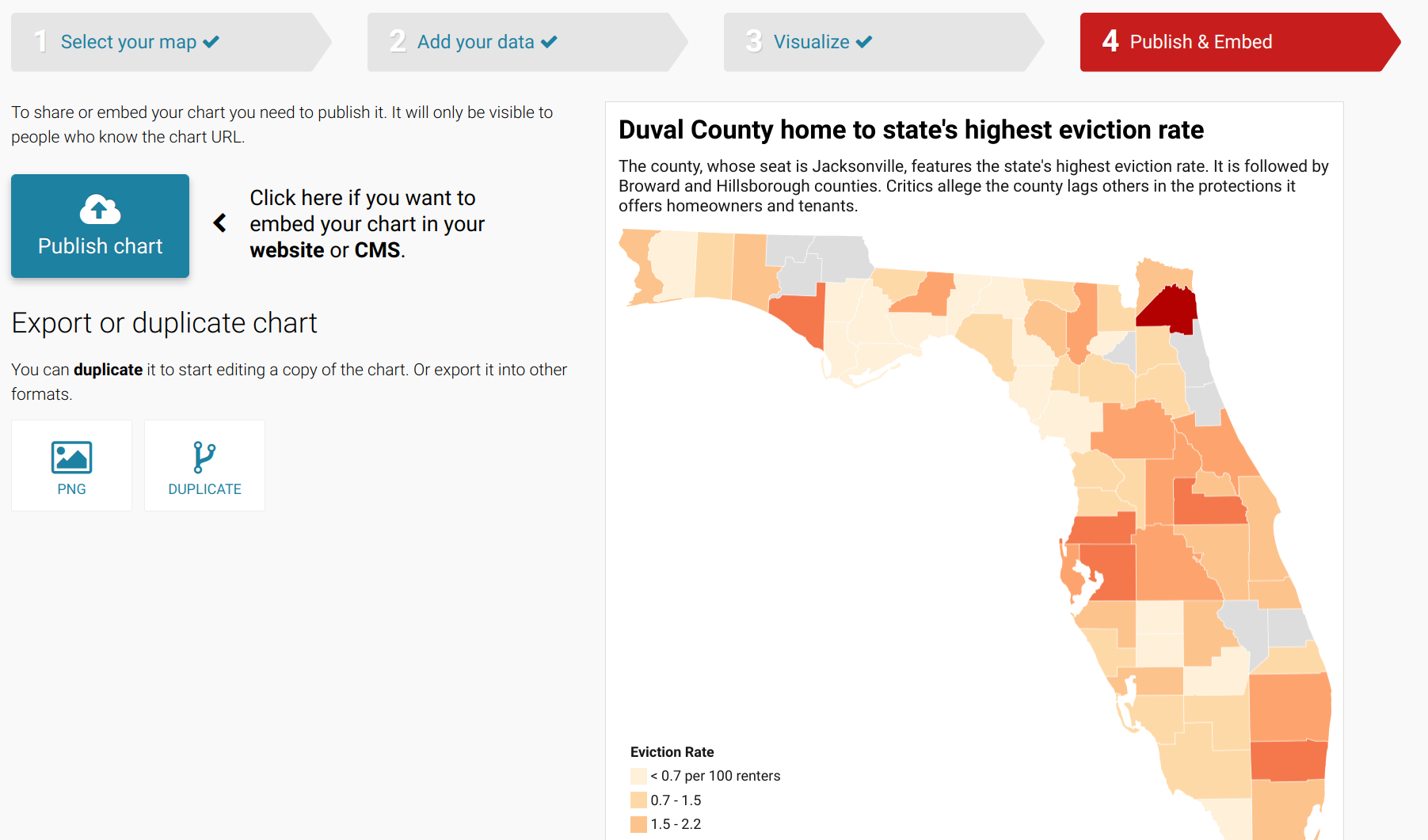
Title: Duval County home to state’s highest eviction rate
-
Description: The county, whose seat is Jacksonville, features the state’s highest eviction rate. It is followed by Broward and Hillsborough counties. Critics allege the county lags others in the protections it offers homeowners and tenants.
-
Data source:
Eviction Lab -
Link to data source:
https://www.evictionlab.org -
Byline:
Rodrigo Zamith -
Tooltips (Customize): Title is
{{ name }}, Body isEviction Rate: {{ eviction_rate }}<br>Number of Evictions: {{ evictions }}
-
With the tooltip, you can use HTML tags to format your tooltip. For example, we use <br> to insert a line break.
When you’re finished editing your map, click the Publish button at the bottom of the design options.
This will take you to a new screen that allows you to Publish chart. Click on that icon to generate a final chart. (You can later revise and republish it.)
You will then be provided with links to the chart for sharing and embedding the map.
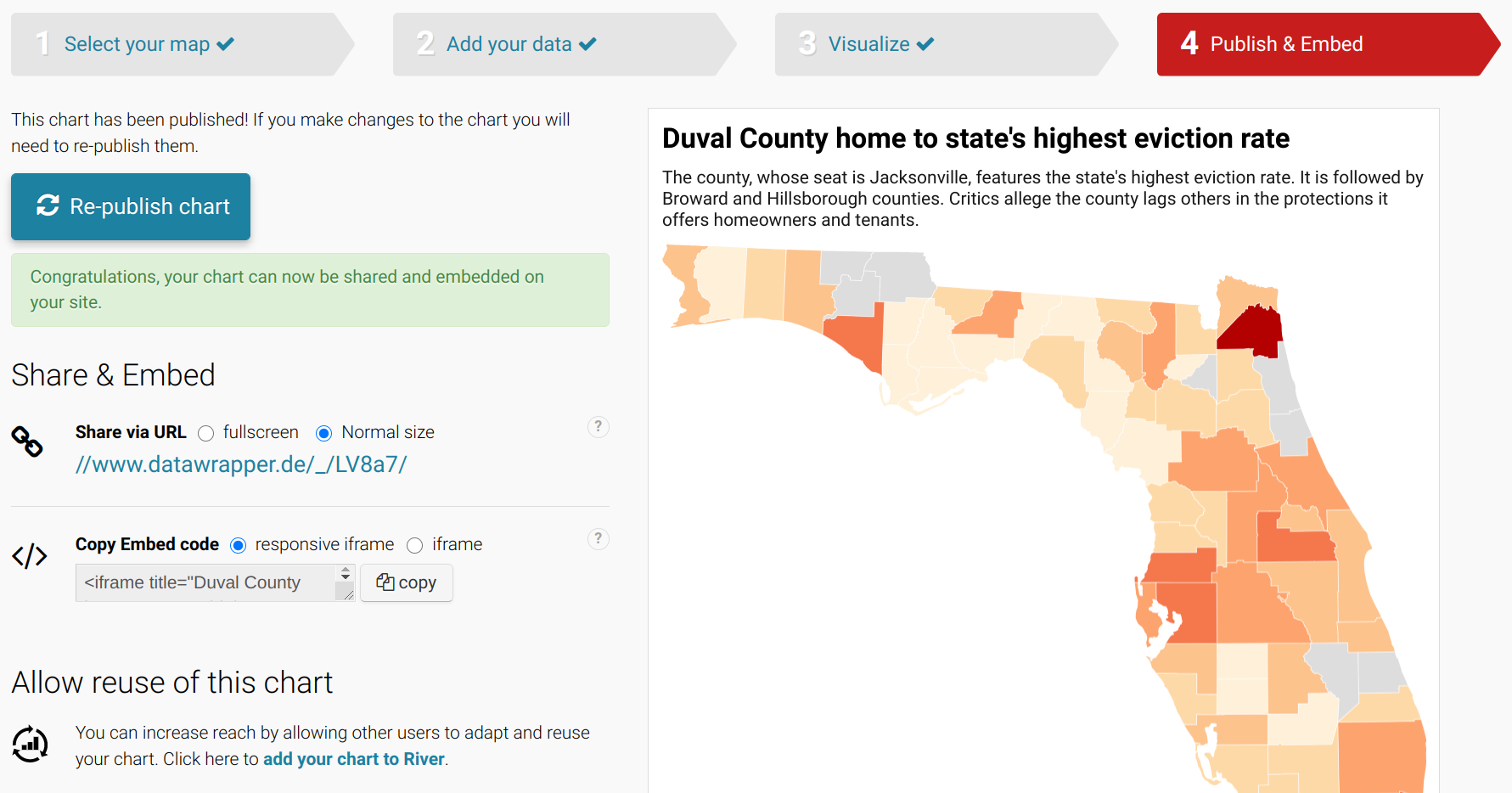
Voila! You’ve created and are now able to share and embed a professional-looking map.