Creating Interactive Charts with Infogram
Introduction
For this tutorial, we will be visualizing eviction data aggregated at the state level for (most) U.S. states using the Infogram web tool. The data we’ll be using come from the Eviction Lab, which is led by Matthew Desmond. (See the data dictionary.)
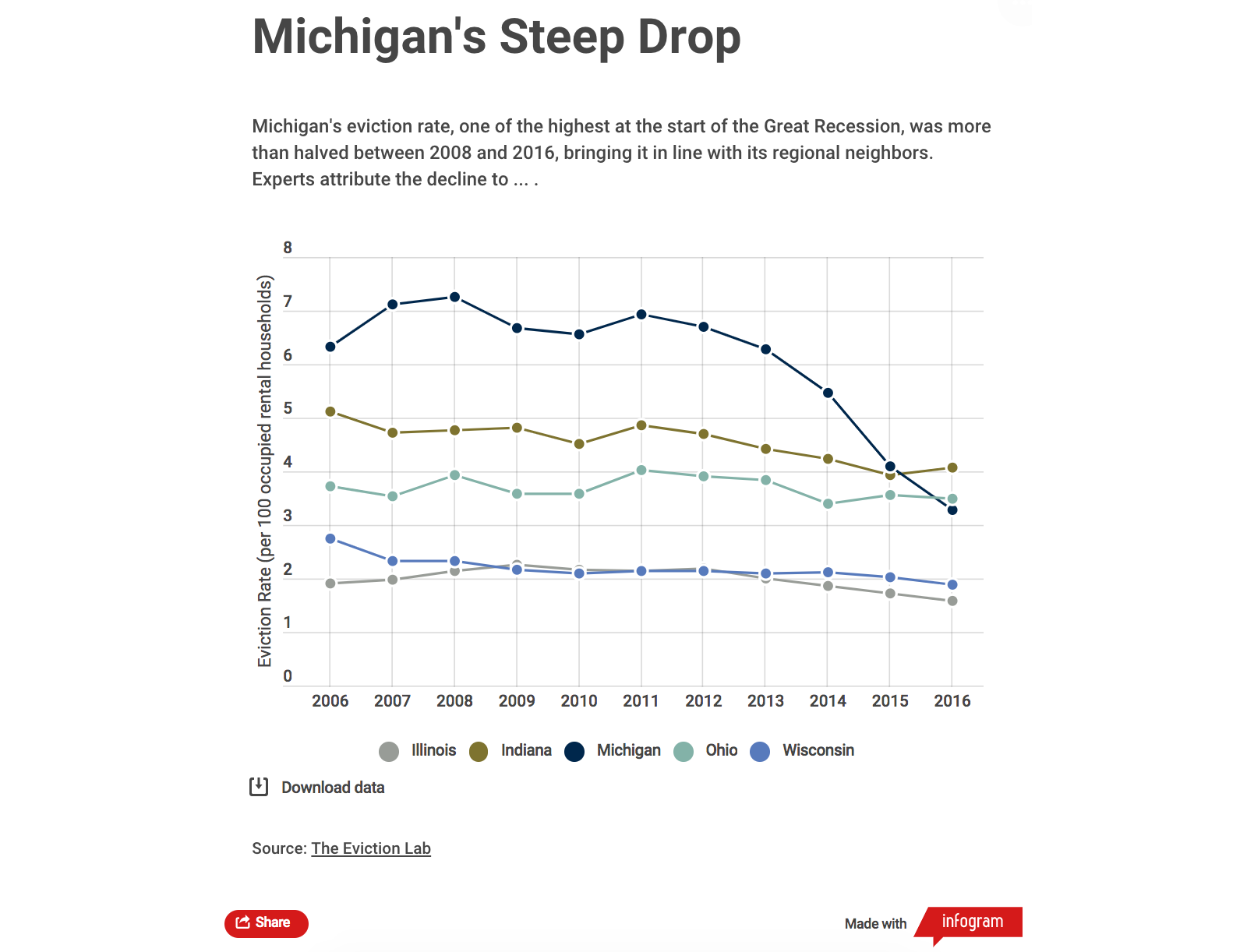
By the end of the tutorial, we’ll have produced a simple interactive chart about eviction rates in the Midwest that looks like this:
Data Processing
To create a data visualization, we need to provide tools like Infogram with data. CSV files are universally accepted by data visualization tools. We can use R to help us create such a file.
Load the Data
The first step, as usual, is to read in the source data. Like before, we’ll use the readr::read_csv() function to read data from this CSV file.
library(tidyverse)
## ── Attaching packages ─────────────────────────────────────── tidyverse 1.3.1 ──

## ✓ ggplot2 3.3.5     ✓ purrr   0.3.4
## ✓ tibble  3.1.3     ✓ dplyr   1.0.7
## ✓ tidyr   1.1.3     ✓ stringr 1.4.0
## ✓ readr   2.0.1     ✓ forcats 0.5.1

## ── Conflicts ────────────────────────────────────────── tidyverse_conflicts() ──
## x dplyr::filter()     masks stats::filter()
## x dplyr::group_rows() masks kableExtra::group_rows()
## x dplyr::lag()        masks stats::lag()
all_states <- read_csv("https://dds.rodrigozamith.com/files/evictions_us_states.csv")
## Rows: 867 Columns: 27

## ── Column specification ────────────────────────────────────────────────────────
## Delimiter: ","
## chr  (3): GEOID, name, parent-location
## dbl (24): year, population, poverty-rate, renter-occupied-households, pct-re...

##
## ℹ Use `spec()` to retrieve the full column specification for this data.
## ℹ Specify the column types or set `show_col_types = FALSE` to quiet this message.
Here’s a sample of the data:
| GEOID | year | name | parent-location | population | poverty-rate | renter-occupied-households | pct-renter-occupied | median-gross-rent | median-household-income | median-property-value | rent-burden | pct-white | pct-af-am | pct-hispanic | pct-am-ind | pct-asian | pct-nh-pi | pct-multiple | pct-other | eviction-filings | evictions | eviction-rate | eviction-filing-rate | low-flag | imputed | subbed |
|---|---|---|---|---|---|---|---|---|---|---|---|---|---|---|---|---|---|---|---|---|---|---|---|---|---|---|
| 01 | 2000 | Alabama | USA | 4447100 | 16.10 | 255910 | 27.54 | 447 | 34135 | 85100 | 24.8 | 70.29 | 25.86 | 1.71 | 0.49 | 0.7 | 0.02 | 0.88 | 0.06 | 7585 | 4583 | 1.79 | 2.96 | 0 | 0 | 0 |
| 01 | 2001 | Alabama | USA | 4447100 | 16.10 | 486061 | 27.54 | 447 | 34135 | 85100 | 24.8 | 70.29 | 25.86 | 1.71 | 0.49 | 0.7 | 0.02 | 0.88 | 0.06 | 20828 | 10106 | 2.08 | 4.29 | 0 | 0 | 0 |
| 01 | 2002 | Alabama | USA | 4447100 | 16.10 | 495329 | 27.54 | 447 | 34135 | 85100 | 24.8 | 70.29 | 25.86 | 1.71 | 0.49 | 0.7 | 0.02 | 0.88 | 0.06 | 21070 | 9603 | 1.94 | 4.25 | 0 | 0 | 0 |
| 01 | 2003 | Alabama | USA | 4447100 | 16.10 | 456138 | 27.54 | 447 | 34135 | 85100 | 24.8 | 70.29 | 25.86 | 1.71 | 0.49 | 0.7 | 0.02 | 0.88 | 0.06 | 15750 | 7379 | 1.62 | 3.45 | 0 | 0 | 0 |
| 01 | 2004 | Alabama | USA | 4447100 | 16.10 | 446058 | 27.54 | 447 | 34135 | 85100 | 24.8 | 70.29 | 25.86 | 1.71 | 0.49 | 0.7 | 0.02 | 0.88 | 0.06 | 13508 | 6170 | 1.38 | 3.03 | 0 | 0 | 0 |
| 01 | 2005 | Alabama | USA | 4633360 | 12.86 | 449922 | 29.24 | 621 | 41216 | 111900 | 29.3 | 68.50 | 26.01 | 2.81 | 0.46 | 1.0 | 0.03 | 1.10 | 0.08 | 15426 | 8300 | 1.84 | 3.43 | 0 | 0 | 0 |
| 01 | 2006 | Alabama | USA | 4633360 | 12.86 | 508148 | 29.24 | 621 | 41216 | 111900 | 29.3 | 68.50 | 26.01 | 2.81 | 0.46 | 1.0 | 0.03 | 1.10 | 0.08 | 20196 | 10882 | 2.14 | 3.97 | 0 | 0 | 0 |
| 01 | 2007 | Alabama | USA | 4633360 | 12.86 | 537224 | 29.24 | 621 | 41216 | 111900 | 29.3 | 68.50 | 26.01 | 2.81 | 0.46 | 1.0 | 0.03 | 1.10 | 0.08 | 17688 | 9322 | 1.74 | 3.29 | 0 | 0 | 0 |
| 01 | 2008 | Alabama | USA | 4633360 | 12.86 | 546421 | 29.24 | 621 | 41216 | 111900 | 29.3 | 68.50 | 26.01 | 2.81 | 0.46 | 1.0 | 0.03 | 1.10 | 0.08 | 17888 | 10866 | 1.99 | 3.27 | 0 | 0 | 0 |
| 01 | 2009 | Alabama | USA | 4633360 | 12.86 | 555619 | 29.24 | 621 | 41216 | 111900 | 29.3 | 68.50 | 26.01 | 2.81 | 0.46 | 1.0 | 0.03 | 1.10 | 0.08 | 16049 | 9687 | 1.74 | 2.89 | 0 | 0 | 0 |
Getting the Data We Need
The next thing we’ll want to do is extract only the information we need for creating the chart. While it can be harmless to include additional data, it can sometimes (a) confuse the software being used to create the chart; (b) make it unwieldy to select options using those software; and (c) exceed the dataset size limitations of the software, especially if you’re on a free tier.
In our case, we only need data from the Midwestern states around Michigan and between the years 2006 and 2016. Additionally, we only need data from three variables to cover the X axis (year), Y axis (eviction-rate), and the legend (name).
We can thus use a combination of the dplyr::filter() and dplyr::select() functions.
all_states %>%
  filter(between(year, 2006, 2016) & name %in% c("Illinois", "Indiana", "Michigan", "Ohio", "Wisconsin")) %>%
  select(year, name, `eviction-rate`)
We introduced two new wrinkles with that code. The first is the dplyr::between() function, that gives us a shortcut for assessing if a value is greater than or equal to the second argument and less than or equal to to the third. (That is, it is functionally equivalent to filter(year >= 2006 & year <= 2016)), but shorter.)
The %in% operator allows us to search for multiple strings within a single, simple filter() statement. It basically notes that the value for the variable name must appear in the vector we specify with the c() function. If there is a match with any element on that vector, the observation is included (filtered in). If there is no match, it is excluded (filtered out).
Here’s the result of our operation:
| year | name | eviction-rate |
|---|---|---|
| 2006 | Illinois | 1.91 |
| 2007 | Illinois | 1.98 |
| 2008 | Illinois | 2.14 |
| 2009 | Illinois | 2.26 |
| 2010 | Illinois | 2.17 |
| 2011 | Illinois | 2.15 |
| 2012 | Illinois | 2.18 |
| 2013 | Illinois | 2.00 |
| 2014 | Illinois | 1.87 |
| 2015 | Illinois | 1.72 |
| 2016 | Illinois | 1.58 |
| 2006 | Indiana | 5.12 |
| 2007 | Indiana | 4.73 |
| 2008 | Indiana | 4.76 |
| 2009 | Indiana | 4.81 |
| 2010 | Indiana | 4.51 |
| 2011 | Indiana | 4.85 |
| 2012 | Indiana | 4.70 |
| 2013 | Indiana | 4.43 |
| 2014 | Indiana | 4.24 |
| 2015 | Indiana | 3.94 |
| 2016 | Indiana | 4.07 |
| 2006 | Michigan | 6.32 |
| 2007 | Michigan | 7.11 |
| 2008 | Michigan | 7.25 |
| 2009 | Michigan | 6.67 |
| 2010 | Michigan | 6.56 |
| 2011 | Michigan | 6.93 |
| 2012 | Michigan | 6.70 |
| 2013 | Michigan | 6.29 |
| 2014 | Michigan | 5.47 |
| 2015 | Michigan | 4.09 |
| 2016 | Michigan | 3.28 |
| 2006 | Ohio | 3.72 |
| 2007 | Ohio | 3.54 |
| 2008 | Ohio | 3.94 |
| 2009 | Ohio | 3.58 |
| 2010 | Ohio | 3.59 |
| 2011 | Ohio | 4.02 |
| 2012 | Ohio | 3.91 |
| 2013 | Ohio | 3.83 |
| 2014 | Ohio | 3.39 |
| 2015 | Ohio | 3.55 |
| 2016 | Ohio | 3.49 |
| 2006 | Wisconsin | 2.75 |
| 2007 | Wisconsin | 2.32 |
| 2008 | Wisconsin | 2.32 |
| 2009 | Wisconsin | 2.16 |
| 2010 | Wisconsin | 2.09 |
| 2011 | Wisconsin | 2.15 |
| 2012 | Wisconsin | 2.14 |
| 2013 | Wisconsin | 2.10 |
| 2014 | Wisconsin | 2.11 |
| 2015 | Wisconsin | 2.02 |
| 2016 | Wisconsin | 1.89 |
Producing a CSV File
If we want to get our data out of R, we’ll need to export it. The readr package (part of tidyverse) makes it easy for us to produce a properly formatted CSV file with its write_csv() function.
That function requires us to provide it just two arguments: the object (data frame) we’d like to export and the filename of the CSV file.
The CSV file will be saved in your working directory, unless you specify a different path.
all_states %>%
  filter(between(year, 2006, 2016) & name %in% c("Illinois", "Indiana", "Michigan", "Ohio", "Wisconsin")) %>%
  select(year, name, `eviction-rate`) %>%
  write_csv("evictions_plot_data.csv")
Because we’re piping the information, the first argument (the data frame) is already filled in for us. Thus, we only need to specify the filename for where to save the data.
Our Preliminary CSV File
You can download a copy of the CSV file we will be using below by clicking here.
Creating an Interactive Plot Online
One popular tool for creating interactive data visualizations is Infogram. Infogram allows us to create a single chart or compile multiple visualizations into a single interactive infographic.
For this example, we’ll use a single chart. (You’ll often want to produce multiple individual charts for a digital news story, so you can embed them at different points of the story. However, there are times when an infographic is better to quickly compare different kinds of data.)
The first step is to create an account with Infogram. As is the case with many online visualization tools, Infogram provides you with a limited free tier and more feature-loaded paid tiers. The free tier will be good enough for our purposes.
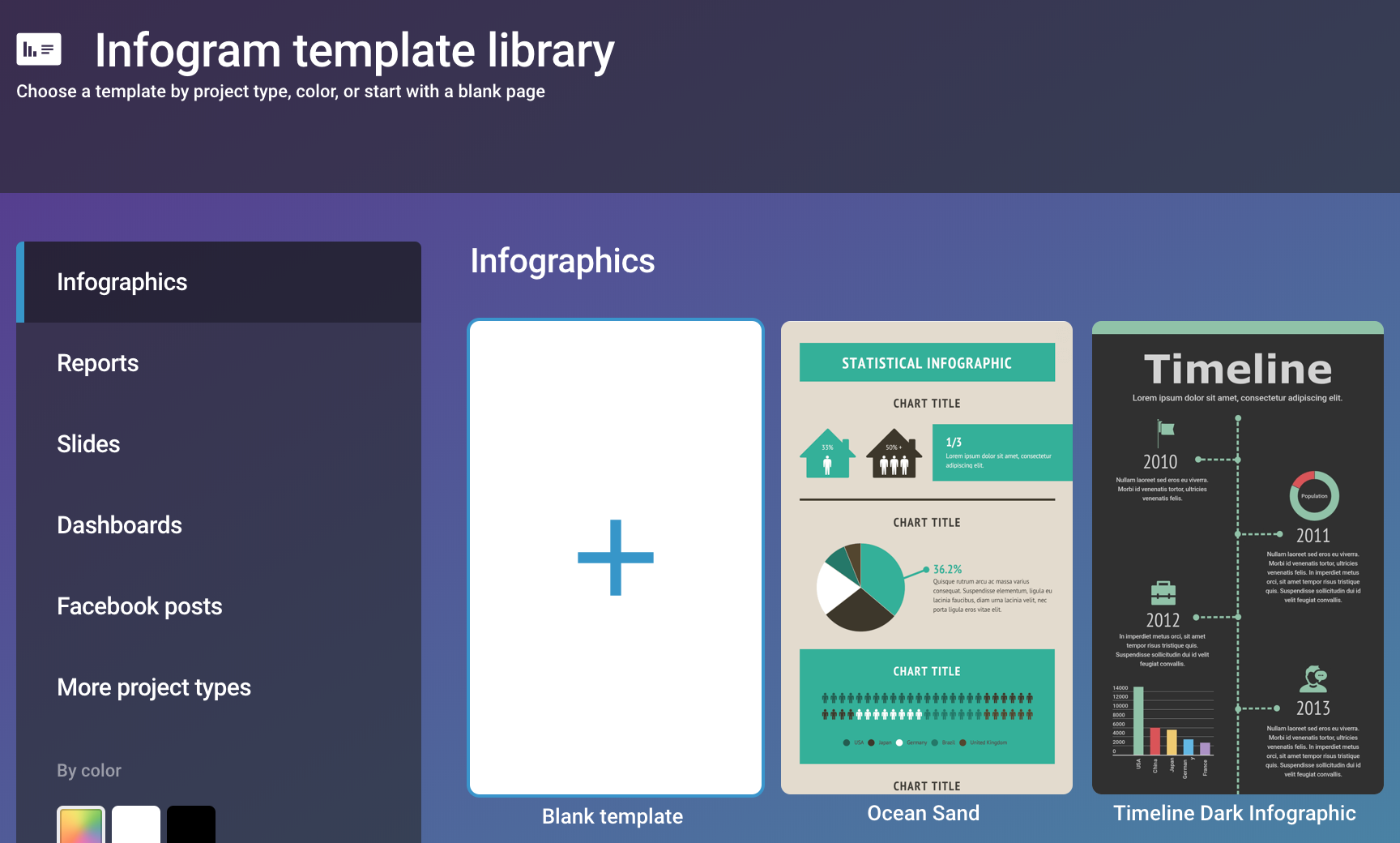
After you create your account, you should be presented with a dashboard that looks like this:

Click on the “Infographics” icon to create a new chart. Then, select the “Blank template” since we’re familiarizing ourselves with the program.
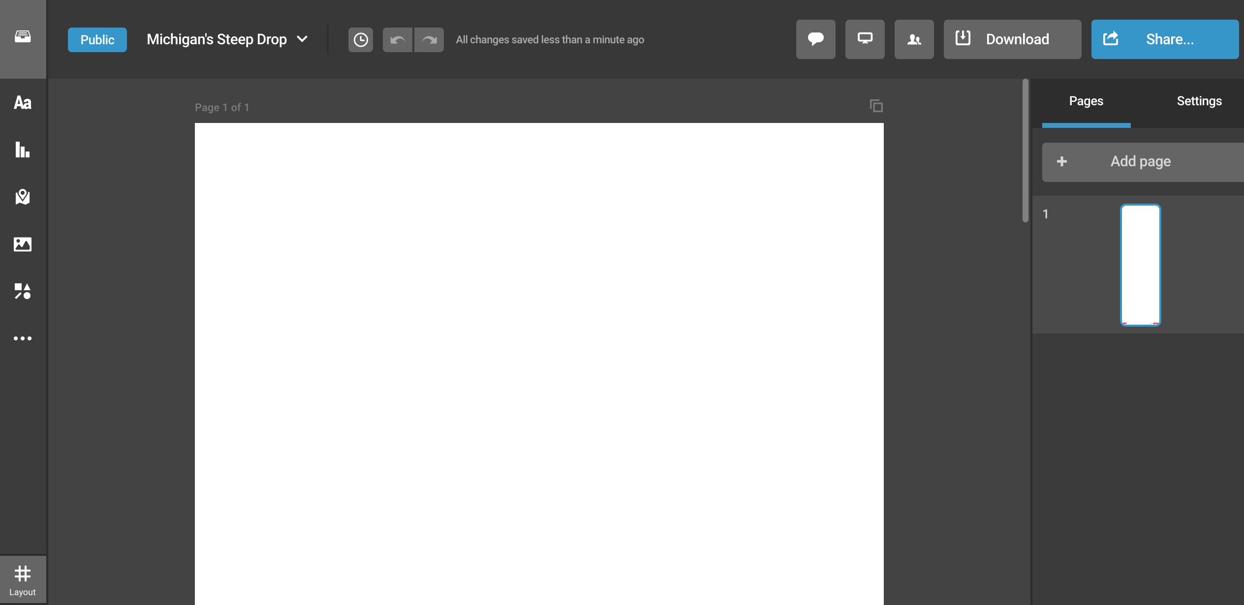
A screen will pop up asking us to name our project We can give it any name that’s useful for our organizational purposes—that name will appear in the URL, so be thoughtful—such as “Michigan’s Steep Drop”. Because we’re using the free tier of Infogram, select the “Public” option.
After advancing from that screen, you’ll be presented with Infogram’s chart-building tool.
The first thing we’ll want to do is click on the “Add text” icon on the left menu and select a “Title” heading. When we click on it, a text box will appear that allows us to give our chart a title. Then, select “Add text” again, and select the “Body text” option, where we can describe something interesting about the chart.
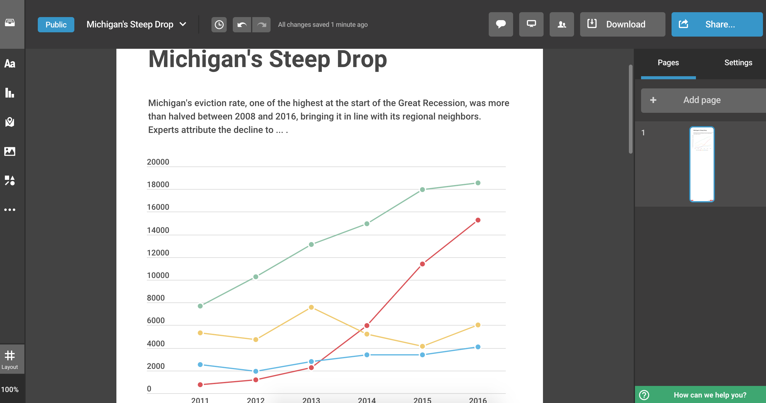
Second, you’ll want to add a visual element—in our case, a line chart. Click on “Add chart” and select the “Line” option. You’ll see a basic line chart auto-populated with some irrelevant data.
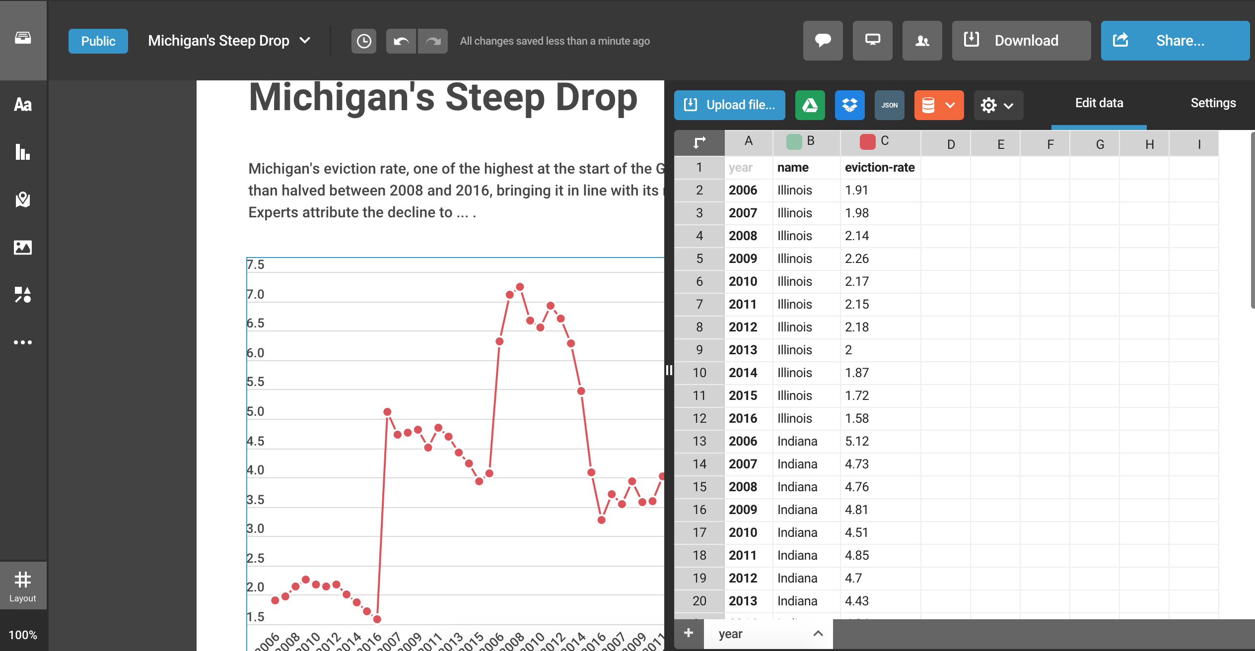
Once we have those basic elements in place, we’ll want to click on the line graph. A slight blue border should appear around it and some new options will appear on the right bar. Click the “Edit data” tab. It will open up a spreadsheet-like viewer like the one below:
We can either manually enter the data or just upload the CSV file we’ve just created. Let’s go with the latter option. Select the blue “Upload file…” button and find the CSV file we just created (evictions_plot_data.csv).
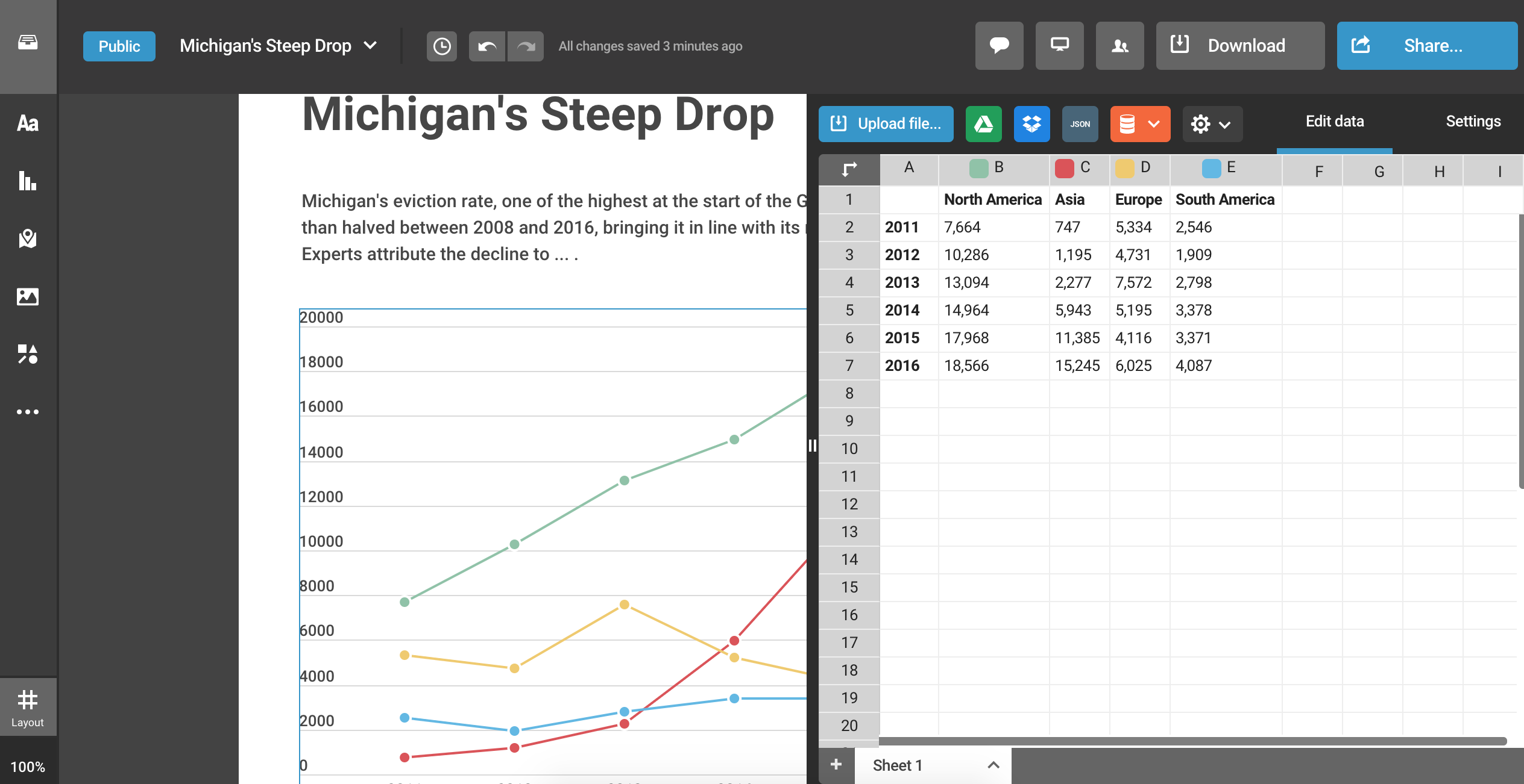
You may find that your chart doesn’t look particularly helpful, though:
Going from Long to Wide
That’s because Infogram likes its source data to look a certain way. In fact, you’ll find that different tools have different expectations, which may require you to reshape your data to fit those expectations. It’s frustrating but, thankfully, easily solved with R.
Specifically, Infogram expects the CSV to contain data that are in wide (as opposed to long) format for a line chart. This is, of course, in contrast to how ggplot likes things.
We can quickly reshape our data with the dplyr::pivot_wider() function like so:
all_states %>%
  filter(between(year, 2006, 2016) & name %in% c("Illinois", "Indiana", "Michigan", "Ohio", "Wisconsin")) %>%
  select(year, name, `eviction-rate`) %>%
  pivot_wider(id_cols=year, names_from=name, values_from=`eviction-rate`)
What we’re doing with the pivot_wider() function is telling R to use the year variable to identify unique observations in our dataset (each year becomes a separate row), create variables (columns) based on the unique values in the name variable, and populate the new cell values with the associated values stored in the eviction-rate variable.
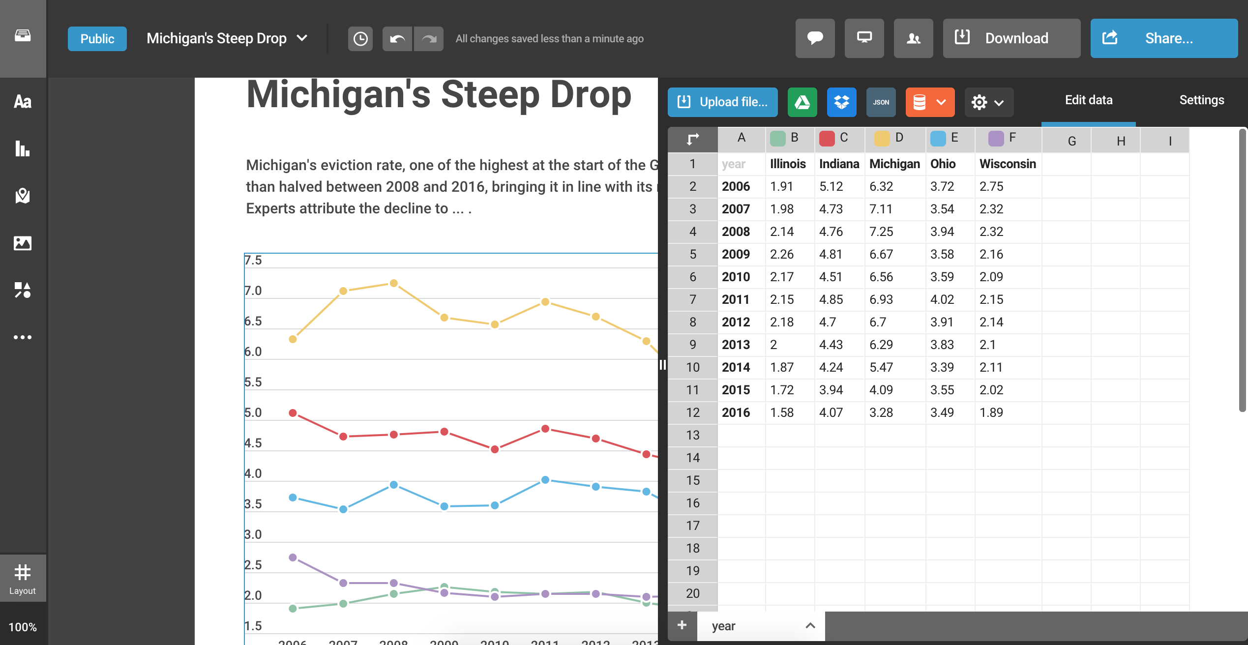
Here’s what the wide dataset looks like:
| year | Illinois | Indiana | Michigan | Ohio | Wisconsin |
|---|---|---|---|---|---|
| 2006 | 1.91 | 5.12 | 6.32 | 3.72 | 2.75 |
| 2007 | 1.98 | 4.73 | 7.11 | 3.54 | 2.32 |
| 2008 | 2.14 | 4.76 | 7.25 | 3.94 | 2.32 |
| 2009 | 2.26 | 4.81 | 6.67 | 3.58 | 2.16 |
| 2010 | 2.17 | 4.51 | 6.56 | 3.59 | 2.09 |
| 2011 | 2.15 | 4.85 | 6.93 | 4.02 | 2.15 |
| 2012 | 2.18 | 4.70 | 6.70 | 3.91 | 2.14 |
| 2013 | 2.00 | 4.43 | 6.29 | 3.83 | 2.10 |
| 2014 | 1.87 | 4.24 | 5.47 | 3.39 | 2.11 |
| 2015 | 1.72 | 3.94 | 4.09 | 3.55 | 2.02 |
| 2016 | 1.58 | 4.07 | 3.28 | 3.49 | 1.89 |
We can export the wide-format data using the previous code, updating just the file name (evictions_plot_data_wide.csv):
all_states %>%
  filter(between(year, 2006, 2016) & name %in% c("Illinois", "Indiana", "Michigan", "Ohio", "Wisconsin")) %>%
  select(year, name, `eviction-rate`) %>%
  pivot_wider(id_cols=year, names_from=name, values_from=`eviction-rate`) %>%
  write_csv("evictions_plot_data_wide.csv")
Our Final CSV File
You can download a copy of the final CSV file we will be using below by clicking here.
Back to our Chart
Click the blue “Upload file…” icon again and reupload the wide-format CSV file we just created (evictions_plot_data_wide.csv). The default chart should look much nicer now!
From there, we can toggle the “Settings” tab and customize our chart. Some of my suggested customizations for this chart include include:
-
Downloadable data:
Yes -
Grid:
All -
Y-axis title:
Eviction Rate (per 100 occupied rental households) -
Y-axis range:
0-8
Adding Labels
The chart is just one piece of a journalistic data visualization. The surrounding context is also essential.
When writing a title, my recommendation is to make it the most interesting point made by the data in the chart, as it pertains to the story. Then, use the text below it to briefly detail that take-home point.
For example, if the story was about eviction rates in the Midwest, I might title the chart: “Michigan’s Steep Drop”. Then, I’d add the following subheading: “Michigan’s eviction rate, one of the highest at the start of the Great Recession, was more than halved between 2008 and 2016, bringing it in line with its regional neighbors. Experts attribute the decline to … .” This helps guide the viewer’s attention and reduces their cognitive load, making them feel like they can quickly get the main point of the visual.
At the bottom, you may also add a note. This can include explanatory text (e.g., if there are some important missing data) as well as the source of the data. We can do this by clicking on “Add text” and selecting “Caption text”. Then, we can write something like: “Source: The Eviction Lab”. We can hyperlink “The Eviction Lab” by selecting that part of the text, and on the right menu, going down to the “Add link” option. You can also use that right menu to change the font face, size, style, etc.
Tweaking Colors
Colors can offer important visual cues in data visualizations, and the default options aren’t always the best ones. In this case, we want to draw the viewer’s attention to the state of Michigan. It thus makes sense to give that state a familiar color (like the University of Michigan’s primary color), and making sure it stands out from the rest by surrounding it with more muted or neutral colors. (An alternative would be to select each state’s primary color.)
You can change the colors of the lines by selecting the line chart and tweaking the entries under “Color” on the right bar.
Adding Charts to an Infographic
Infogram allows you to add more charts to your infographic (or blocks of text) by clicking on the icons on the left vertical menu. This can be useful for making comparisons, especially when it makes sense to produce data using different types of charts.
In our case, we just need to resize the height of the infographic by selecting the slider at the bottom and dragging it to the bottom of our final object (the source text label).
Publishing your Data Visualization
When you are satisfied with your data visualization, you can click the “Share” button at the top-right corner of the screen. It will include an option to generate a link as well as embed code that can be used to incorporate the visualization into your story on another platform.
If you used the options listed above, your visualization should look just like this one.